Busy Weekend

This weekend I finally had a chance to print my new relief plates. Overall I pulled about 25 prints over the course of the evening. For each print I made a test print on newsprint, followed by a proof on Masa, and then a good print on Hosho.

The total includes a number of redos after boo boos. It turns out there are a million ways to mess up a print. It really helps to get a good process that you follow every time to reduce the chance of mistakes. Here is what I do

  • Make sure the roller doesn’t have too much ink.
  • Roll the ink carefully onto the plate in multiple passes and multiple directions.
  • Carefully inspect the plate for areas that don’t have enough ink.
  • Carefully inspect the plate for any dust or hair that may have fallen in the ink.
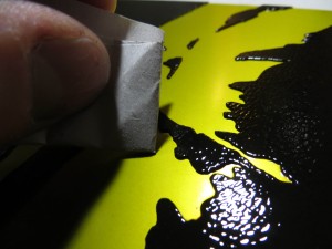
  • Carefully inspect the plate for drops or splotches of ink in the whites. Remove this ink with paper towels and newsprint tortillons.
  • Wipe ink off the sides of the plate from the bottom.
  • Wipe off any ink that may have made it to the back side of the plate.
  • Wipe off the printing press bed which may have ink from the previous plate.
  • Place the plate on the press bed.
  • Inspect bed for ink from the current plate.
  • Make sure hands are clean!
  • Pick up printing paper. Carefully inspect for dents and blemishes. Decide which side will be printed and which orientation minimizes flaws in the paper.
  • Place paper on plate.
  • Inspect protective cover paper for ink from previous plate.
  • Place protective cover paper over print paper.
  • Carefully place blankets on top of print.
  • Finally, run the print through the press.
  • Remove blankets.
  • Remove protective cover paper.
  • Peek at print and remove.

It sounds like a lot, but after a while you get in a rhythm and things go smoothly. Here are some photos.

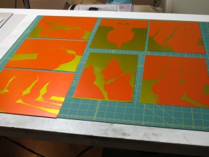
Here are my seven brand new relief plates, ready to print.

For these prints, I want perfect contours and clean whites. I try to be very careful not to get any ink in the whites, but a little bit always makes its way on the plate, sometimes because I am rolling too fast with too much ink and other times just because it feels like it. I find it is helpful to fold a newsprint tortillon to wipe up the stray dots of ink.

I may be a perfectionist or I may need more practice rolling ink onto the plate, but currently I spend about 20 minutes per print on inking, detailing, and printing.

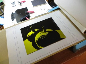
This plate has been inked and detailed. It is ready to move to the press. Note that the plate is sitting on top of a magnetic block that holds it up off the table so that I can roll ink all the way to the edges without making a mess.

I’ve placed this plate onto the bed of the printing press. The plate sites on a piece of protective mylar that covers a template that helps me position the paper on top of the plate. The template has markings for the plate and for the two paper sizes I am using.

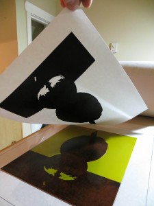
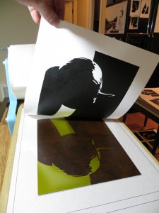
Lifting an almost perfect impression off the press!

Another great looking print!

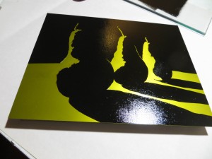
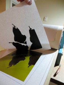
A large version of the three pears. This plate has always been hard to ink.

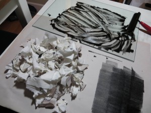
I’ve finished the run and all that remains is cleanup. The large pile of paper scraps is the result of detailing about 25 inked plates.

Another Papercut Value Study

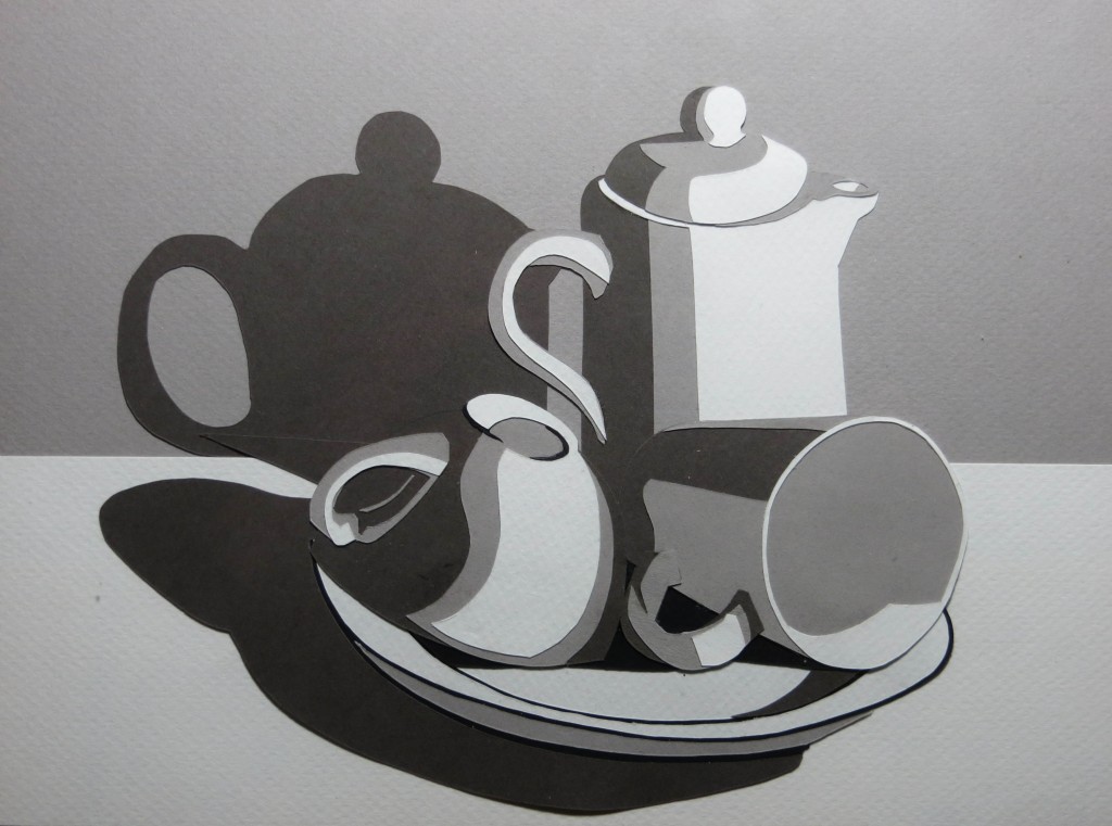
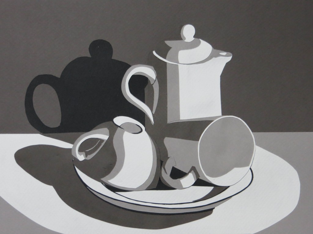
Just finished my second papercut value study for class – this time a still life that I set up in my studio. One of the nifty things about using cut paper is that I was able to try out two different value schemes for the background and the tabletop before gluing everything together.

In the end I decided to go with a dark gray background, a light gray table, and a shimmering pool of pure white light.

Nikki McClure Workshop

This weekend I attended the Nikki McClure workshop at the Bellevue Arts Museum. Nikki is a fantastic instructor and the fourteen students were all very talented. It was great to see a bunch of amazing and inspiring pieces at the end of the day.

Nikki began with a quick history and tour of papercut samples from around the world. It turns out the oldest known papercut is from fifth century China. The art of papercut has spread throughout cultures around the world, but it is especially prevalent in Japan.

Nikki did a demo of her technique and then we tried an exercise cutting a pattern that transitioned from black to white. Nikki’s example was leaves of a bush that started out thick and mostly black at one end and then gradually thinned out to white sky at the other end. I chose to use the reflection of pine trees in a pond for my exercise.

After the exercise, we spent the rest of the morning drawing our ideas for the afternoon project. I brought a lot of reference material, but in the end decided to work from a photograph of a couple crossing a busy street at night during a blizzard in Boston. The picture was challenging to render in just black and white, so I ended up something that was very stylized.

Probably the biggest challenge was getting enough white behind the couple so that some of their silhouettes would show up. Before cutting I did some experiments to see how I could make the headlights spill more white into the scene behind the people. The most promising approach was to add white streaks of snow around the headlights. I didn’t have time for this much cutting during the workshop so I just simplified.

I liked the final result and think that if I have some time to revisit the picture I can make something more faithful to that stormy day.

Papercut Value Study

This week’s assignment is to create a four-level mastercopy value study using cut paper. The goal of the assignment is to learn how to simplify an image and convey three dimensional form with a limited number of values. We use paper cuts instead of paint for two reasons: using paper ensures we don’t cheat by blending some extra shades of gray and the act of cutting discourages elaborate detail.

I chose to do Edward Hopper’s New York Office. The whole project took about nine hours and at one point I felt like I was playing with paper dolls. One big take away is that there are many ways to approach the design and some are better than others for structural and asthetic reasons. After a three hour false start, I realized it is better to layer the paper in the same order as the items in the scene – in other words, the background should be on the paper towards the back and the forground should be on paper towards the front. I also learned that it is often easier to cut holes that reveal the layer underneath than to cut small pieces to glue on top.

It turns out you can still cheat with papercuts by taking advantage of texture and shadows. One can represent subtle tonal changes with compositions of shapes that are all the same color. One can also use shadows between layers with the same color to represent very fine lines.

Meanwhile back at the atelier . . .

You might think that with all of the printmaking and woodworking going on that nothing was happening in the atelier. Au contraire, mon frère – we are all busy learning to render. Rendering in charcoal is a very slow process and learning to render is even slower, so I don’t have a lot to show even though I have been working hard.

Our goal was to learn to render a white sphere lit by a single light source. The easy part was learning what the sphere is supposed to look like – there is actually a lot of nuance in the play of the light and shadow, but you can see it once you know what you are looking for. The really hard part – and the part that takes all of the time is learning to make smooth gradations of gray with charcoal.

You would think this would be easy, but the surface of the paper is actually covered with tiny ridges and valleys, and the ridges tend to pick up charcoal and get darker, while the valleys stay white. This leads to a sparkly look. To get the tone completely smooth requires many many very light passes of charcoal. You need to hit the same spot of paper over and over again in order to break down the paper’s sizing and open up the surface to accept the charcoal. Press too hard, though, and the surface will get too dark before you are able to lay down enough layers to get a smooth tone. And heaven help you if you sneeze.

Musicians practice scales before concertos. As artists, our first rendering exercise is value scales. This scale, which is made of 1″ squares, took me about six hours and it is still a bit sparkly. Must learn patience, grasshopper.

Before rendering spheres, we practice value scales.

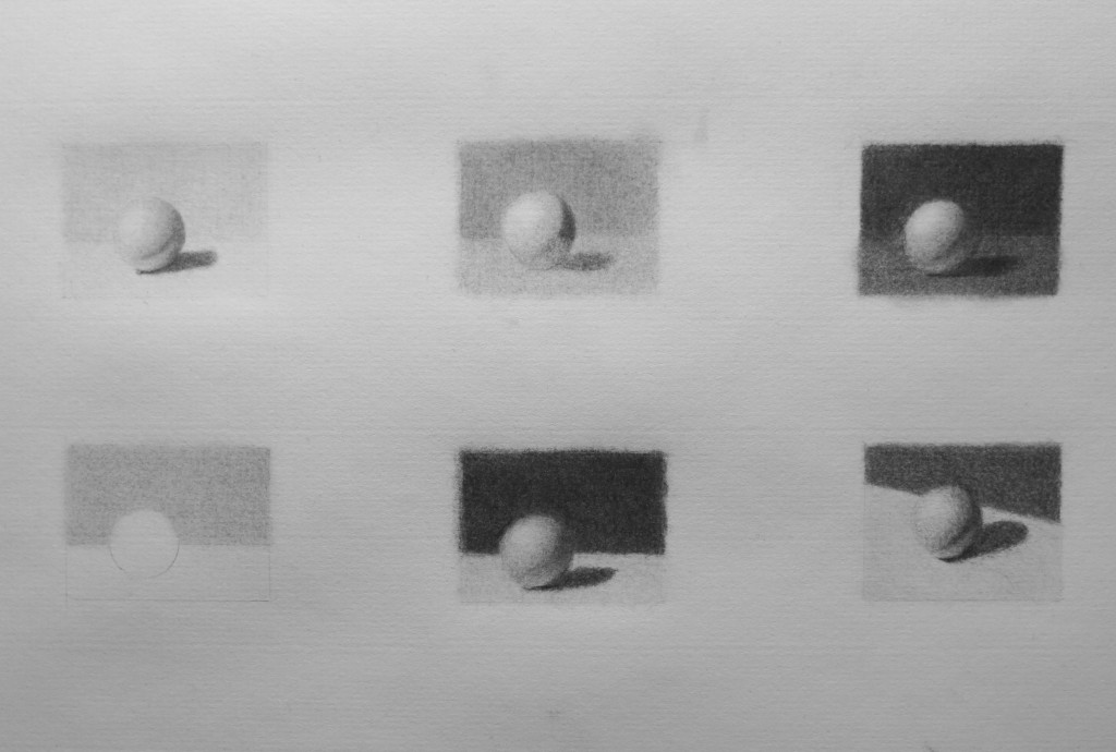
After doing value scales on two different types of paper (Strathmore 500 Charcoal and Canson Mi Teintes), I was ready to move on to value studies. Since a fully rendered sphere takes about 30 hours, we really wanted to look before leaping, so each of us made a number of postage stamp value studies. I was able to do these six in about 4 hours.

A carefully rendered sphere can take 30 hours so we do a bunch of value studies first to make sure we will like the outcome.

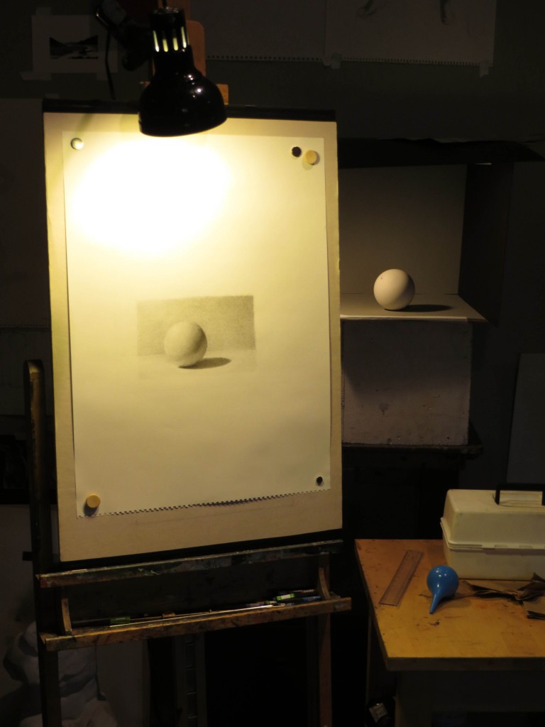
Finally the big day came and I was ready to embark on the sphere itself. The first step was to get a really good flat white sphere – I used a Christmas ornament, but others have had good success with light bulbs. The sphere is placed in a box that shields it from most stray light so that the shadows stay really clean. It is lit from a single light source which is clamped in place behind my easel. This setup took a lot of careful effort and adjustment, but it was important since the rendering will take 30 hours. In the image below, I’m about 6 hours into rendering and have what Juliette calls a good under painting or ghost image to work from. Now my challenge is to get the charcoal really smooth.

Sphere rendering setup. The blue ear wash bulb is to blow charcoal off the paper. Many a student has learned the hard way never to blow on a charcoal drawing. A single, microscopic drop of spittle can lead to tears.

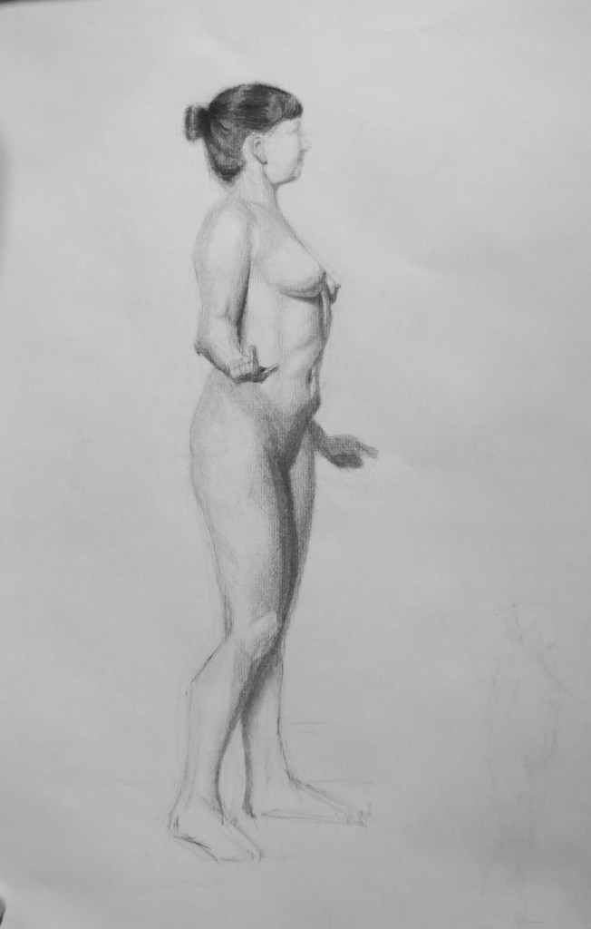
Of course, the ultimate goal is not to draw spheres – it is to learn to render and turn form so that we can draw the figure, still life arrangements, and landscapes. We continue to draw from a model each morning in the life room and the poses are getting longer and longer. We begin each session with 20 minutes of gestures from a variety of poses, but the remaining two and a half hours are dedicated to a single pose the lasts about a month.  This drawing was from right before the holidays. It was about a three week pose and I probably drew 9 days because I am part time. One challenge for me is that I never get a month long pose because I come in every other day. At some point, later in the year, I may have to switch my schedule so that I draw every morning and then work at Microsoft in the afternoons and evenings. This would give me an entire month on one pose, but I would lose out on the coaching I get in the afternoon studio sessions. Life is full of tradeoffs.

We continue to draw longer and longer poses in the mornings in the life room.

Picture Frame From Hell

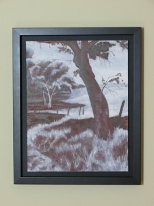
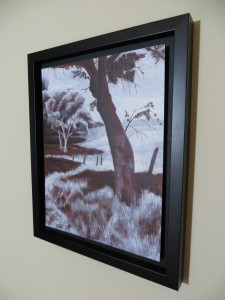
I have a piece in Lay of the Land: Student Landscape Exhibition at the Rosen Gallery at Gage Academy. The opening reception is Friday, January 18 from 6pm to 8pm and will feature a reception, lecture, and book signing for Tom Hoffmann’s Watercolor Painting: A Comprehensive Approach to Mastering the Medium. The exhibit runs until February 15th.

My painting looks great, but it was a nightmare to frame. The nightmare started long before I started the painting, when the supply list for a course suggested in error that we bring gesso’d watercolor paper on the first day. It turns out the supply list was for a different course, but I had already spent hours lovingly applying gesso and sanding and I was determined to use the paper. Unfortunately the paper was also metric.

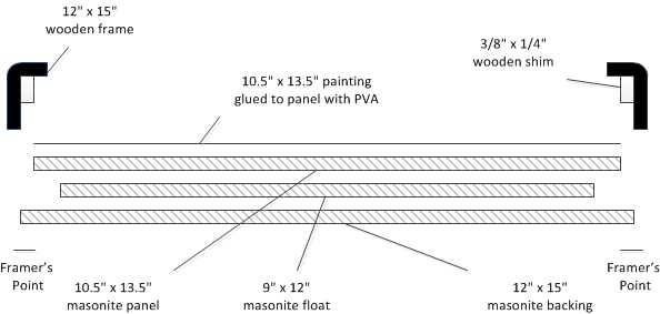
When it came time to frame the piece I had to mount the paper on a board specially cut to the metric dimensions and then I had to jury rig my own float frame because the metric painting wouldn’t fit in a standard-sized frame. Here’s what the entire stack looked like:

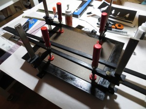
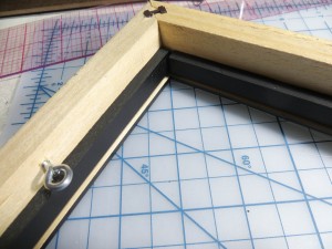
It took quite a while to locate and cut all of the pieces, especially the 3/8″ x 1/4″ shims that ensure the floating painting is positioned behind the front of the frame. Then I had to clamp and glue all of the pieces and apply lots of black paint. To look good, the edges of the painting panel had to be black, along with the shims which are visible from the front, and the backing panel which is also visible through the gap between the painting and the frame.

I tried painting first by hand using acrylic paint, but it was glossy and the brush strokes looked horrible. I then sanded it off and switched to flat black spray paint which looked better, but didn’t work well on the unprimed masonite. The masonite just kept absorbing the black paint and getting darker, but it still looked brown. Then after many coats, I got drips in the paint and when I tried to wipe them off with a piece of newsprint, it disintegrated, leaving fibers all over the paint. After lots of painting and sanding and repainting I finally got something that looks pretty good. Then I went over all of the bad miter joints with a fine point black marker and called it a day.

My lessons for the future are to use standard size supports for my paintings (which would have allowed me to purchase a ready-made frame) and to use canvas on stretchers (which are trivial to float mount, compared to watercolor paper).

Platemaking with Paper Stencils

I found a really great way to make SolarPlate relief plates using paper stencils. For weeks I had been trying to develop a process that would allow me to make really crisp and clean relief plates with fine details. After many weeks of experimentation, I had managed to make a couple of excellent plates from negatives made out of glass covered with black adhesive vinyl. These negatives worked because the flat nature of the glass ensured perfect contact with the plate during exposure and the opaque black vinyl on the clear glass gave me super-high contrast.

While I was thrilled to be able to make these plates, I was a little disappointed because the process was complex and expensive and required lots of time with my mind outside of the artistic space as I scanned my artwork, adjusted it in Photoshop, converted edges to vectors in Illustrator, cut the vinyl with a Silhouette craft cutting machine, and transferred the vinyl to glass using special adhesive transfer paper. The plates were beautiful, but I felt like a technician and the process was stressful and riddled with opportunities for failure at every step.

My breakthrough came while touring the Nikki McClure exhibit at the Bellevue Arts Museum. Nikki specializes in papercut and the gallery was full of these beautiful, intricate works that looked just like prints, but were each cut from a single sheet of black paper. I realized that afternoon that I could dispense with the scanner, computer, and craft cutter if I picked up an X-ACTO knife and cut the paper by hand.

It wasn’t until I made my first plate from a paper stencil that I understood the true benefits of the approach. The paper stencils are great for reducing costs, but the approach really shines because it keeps me in the artistic space the entire time and the simplicity and fluidity of the process allows me to rapidly try out ideas and visualize the results as I go.

The reason it works so well is that paper is easy to cut and as I cut the negative I get a paper positive which gives me a pretty good idea of what the print will look like as I am working. I can easily rework an area or even cut a new piece if I make a mistake. With no risk of destroying the plate, I am free to try out different compositions, edge contours, and cutting styles – you name it – I can try it quickly and easily.

Then, once I get something I am really happy with, I can make a plate and I get to keep the positive to hang on the wall. The prints from the plate are hand-made original artist prints, but now I have this even more original, hand-made master stencil to admire. I also have the satisfaction of knowing that the entire process involved my direct touch instead of the cold hand of a computer.

An added benefit is that I don’t have to paint the original artwork. Don’t get me wrong – I really enjoy painting, but much of the emphasis in relief printmaking is on the edges of the shapes – not the interiors. When painting a flat image in gouache, some of the time goes into the edge work, but a lot of it is spent massing in the shapes. When cutting a paper stencil, you only pay for the edges and you get the masses of the shapes for free.

I think this approach has huge potential for learning design for printmaking – it teaches simplification and you can use it to prototype a multi-plate color print before going to the time and expense of creating the plates. Even if you are working in linoleum or wood block, it is nice to try out an intricate idea before committing.
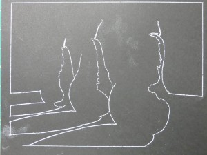
The first step is draw the image directly on black paper or copy it with transfer paper. I use a white chalk pencil or white transfer paper because it is easy to see, but graphite transfer paper has the advantage of not being as visible in case you want to clean up the positive stencil to save as another piece of original art. I used Strathmore Artagain paper because it is thin, making it easy to cut and smooth enough to give good contact with the plate during exposure.
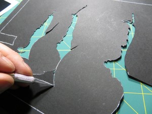
I use an X-ACTO knife to cut the stencil. This photo shows a knife that tightens at the bottom near the blade. The Gripster version of the knife that tightens at the top is much better for this sort of work because the blade won’t unscrew as the knife goes around sharp curves.
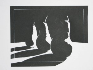
Cutting the stencil is a two-for-one proposition since you get the parts to make two stencils – one negative, and the other positive. The negative stencil is used to expose the plate. The positive stencil gives you a realtime preview of the final printed image, allowing you to make creative decisions as you cut. In the end you get a printing plate and a one-of-a-kind stencil suitable for framing.
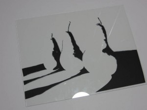
Once the stencil is cut, the negative portions are glued to a piece of glass using a gluestick. It is important to use a piece of glass that is slightly larger than your plate so that the edges of the glass don’t cast shadows on the plate during exposure. I use glass from inexpensive 8.5″ x 11″ document frames. You can get these frames for about $3 at places like Walmart.
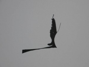
Another benefit of paper stencils is that you can recut individual portions of the negative if you make a mistake or just want to try another idea.
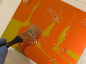
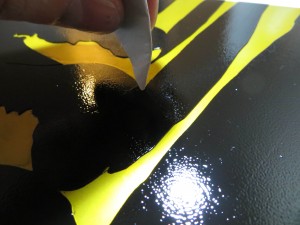
The last step is to expose and develop the plate. The stencil is perfectly flat and very high contrast, so it is easy to get a perfect exposure. Be sure that the paper-side of the glass is in contact with the plate during exposure.
 

Papercut Pear Studies

I’ve been experimenting with a new relief plate technique which uses hand-cut paper stencils as negatives for SolarPlate exposures. I got the idea while touring the Nikki McClure exhibit at the Bellevue Arts Museum.

One of the great things about using paper stencils is that I can see exactly what the print will look like as I am cutting. This allows me to make decisions about composition and shape as I go. It all feels very fluid and it keeps my head more in the artistic space.

The pictures below are all cut paper positives. These are the scraps I leave on the cutting room floor (or frame and hang on the wall) after reserving the other pieces to make the negatives that make the printing plates. Stay tuned for a post on making plates with papercut negatives.

Nikki McClure

I strongly recommend the Nikki McClure exhibition, Cutting Her Own Path, 1996 – 2012, at the Bellevue Arts Museum. Nikki has been creating paper cuts since 1996 and her work is compelling on many levels. As graphical designs, the pieces are interesting because the shapes are simplified to the absolute essentials, and yet they are still intricate. The compositions are strong and the knife work is excellent, but the thing that really makes the collection sing is that everything Nikki does communicates her life experience and philosophy. Her values and the world she lives in come across easily and naturally.

The exhibit showcases the papercuts, but it also includes many of Nikki’s calendars, books and album covers, along with essays from her friends in the music industry and an explanation of her process. My favorite book was The Great Chicken Escape. Check out the pictures in the book and then read the note at the end.

The exhibit runs through February 3rd, 2013.