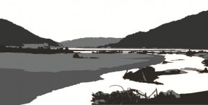
Here’s an update on the Keechelus print design. I’ve added more detail in the foreground and clarified the left riverbank. The silhouetted mountain ridges work well, but I’m struggling to get a more three-dimensional form along the riverbank and in the landmass on the left. I also need to make some decisions about whether to simplify or go for detail in the mass of sticks and branches in the lower right – not sure whether the details add or detract and I probably won’t know until I get some more detail in the lower left corner for balance. I’ve also experimented with cropping – using a panoramic format allows me to zoom in quite a bit without exceeding the width of my etching press. Can’t wait to start carving!

Michael J Hopcroft
Learning Art and the Art of Software
