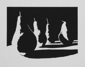
A better way to transfer drawings to linoleum

One challenge I’ve encountered with linocut prints is transferring my design to the block of linoleum. In the past I’ve used Saral and Richeson transfer papers, but I was never happy with the amount of detail that would be lost as I traced my design with a ball point pen. I’d read about ways to transfer a laser print or photocopy directly using nail polish remover or ChartPak blending markers as a solvent, but I never managed to get these methods to work, probably because the toner or the solvents have been reformulated.

Today I stumbled upon another technique which is simple, seems foolproof, and really works. The idea is to use an inkjet printer on a piece of slippery, non-absorbant paper. Since the ink doesn’t soak into the paper, it can be easily transferred onto another surface. McClain’s actually sells special paper that works this way, but it turns out you can get the same effect with freezer paper from your local supermarket. Here’s an outline of the process:
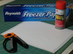
Before printing, I used spray adhesive to glue the freezer paper to a piece of regular printer paper. This adds a bit of stiffness to prevent curling and it gives the printer a bit more traction.
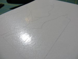
This is the freezer paper right after it came out of the printer. The lines are crisp and I had no problems with smearing or jamming.
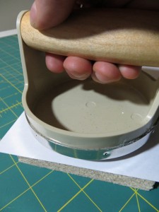
I used my inexpensive Speedball baren to transfer the wet ink from the freezer paper to the linoleum.
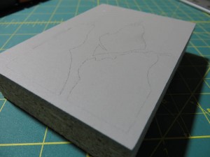
The fine lines transferred perfectly and they seem fairly robust. I attempted to wipe away a line on the left side of the block immediately after the transfer and it only smudged a bit.

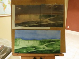
 

Frederic Church Master Copy

My son has a school project to do a master copy painting. He got to choose the artist and the piece. I urged him to pick something less ambitious like Malevich’s White On White, but he decided to go with Frederic Edwin Church’s Horseshoe Falls, Niagara. At least he didn’t choose The Heart of the Andes!

I am excited because I get to act as advisor – as long as I keep my mits off the brushes. My recommendation was that he start with a two-color wipeout underpainting with French Ultramarine for the sky and the darkest waves and Terre Verte for the waterfall. Here’s the underpainting at the end of the first session. I think it looks fantastic!

My son’s mastercopy project after completing a wipeout underpainting.

Lauren

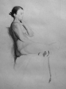
Lauren posed for four weeks in January. Normally this would translate to 20 three-hour sessions for a full time student. I got about eight sessions with this pose. I started with a very loose block in the first session, then started a second block in for the next session, and then transferred that block in to a clean piece of paper for the third session. This approach has its pros:

  • One can draw very freely and more easily maintain the gesture while learning the pose.
  • One can take risks and make changes without worrying about damaging the paper in a way that will hurt the final drawing.
  • Doing multiple block ins from scratch really helps in seeing and learning the pose.

and its cons:

  • The extra block ins take up time that could be used for rendering.
  • When you transfer the block in to another sheet of paper, you almost always lose subtle visual cues that give the drawing life and cohesion.

I wasn’t very happy with the drawing at the end of the last session, but it has grown on me and it looks great in the photo.

Still Rendering . . .

I’m on my third attempt at rendering a sphere and my rendering has really improved. Most of the time I am able to get a smooth tone on top of the textured lines in the Strathmore paper. My paper is no longer turning to felt from abrasion, and I no longer create visible strokes in the drawing. Here are a few things I’ve learned:

  • Work very slowly, adding charcoal a molecule at a time.
  • Make multiple passes, moving the charcoal in many different directions.
  • Don’t move the charcoal quickly because the hard impact with ridges will leave marks.
  • Keep the stick of charcoal close to perpendicular to the paper so that only the point touches – don’t lay the charcoal on its side.
  • It is essential that you sharpen the charcoal as you go – sometimes every few minutes. You can sometimes sharpen the stick on the paper as you draw by rotating it, but when you hit a soft part of the stick and the point dulls you will need to resort to sandpaper to restore the fine point.
  • Lift off dark flecks of charcoal with a tortillon folded from newsprint or paper towels.
  • Also use the tortillon to smooth out any ridges that appear.
  • Don’t use the tortillon to smudge the charcoal in attempt to get a smooth tone. This will break down the paper and the smudge doesn’t look as good as a hand-rendered tone. The tortillon should only be used to move grains of charcoal from one place to another.
  • Often flaws are more apparent from a distance. I am near sighted and find that if I remove my glasses I can easily spot light and dark patches that I can’t see with focused vision.

My renderings are still a bit sparkly. If you look at them closeup, you will see lots of black dots of charcoal and white patches without charcoal. Some of my classmates in the atelier are able to make their drawings look like airbrush paintings. I still have a ways to go, both in quality, and in rendering speed.

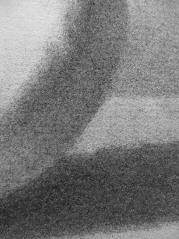
This is a closeup of the sphere, the table it sits on, the core and cast shadows, and the background. My rendering has improved to the point where the charcoal is fairly smooth, even on textured paper.

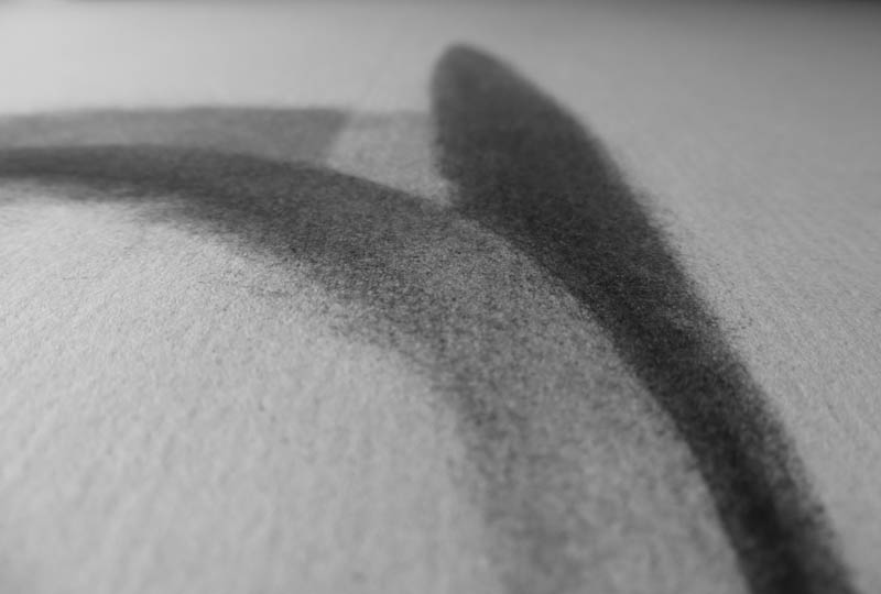
In this picture you can see the ridges in the paper. My technique has now improved to the point where the charcoal stays smooth across the rigdes and valleys. The lines you are seeing are the shadows cast by the ridges.

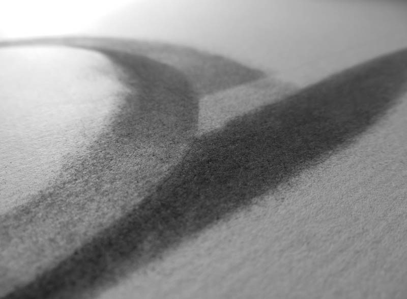
Here’s one more view of the ridges in the paper.


Cutting Plastic

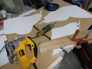
I’m back at work at the 24″ x 30″ plate for the three pears. Today I transferred the design to a sheet of FPVC and started cutting, first with the jig saw, and then with the Proxxon rotary tool. The FPVC cuts like butter and the edges come out clean, but the material is a bit brittle, so I am being careful with the finer cuts around the stems. The Proxxon kicks up a ton of plastic dust that gets on everything, but it doesn’t seem to be small enough to require a respirator. Once I finish cutting, I will probably use a file or an emory board to clean up the edges an then I will glue the pieces to another sheet of FPVC to complete the plate. I can’t wait to see how it prints!

I’ve used Richeson graphite transfer paper to copy the pattern to the FPVC. I thought I would have to reenforce the lines with a Sharpie, but it turns out the FPVC takes the graphite very well.

I roughed in the larger shapes with the jigsaw using a 20 TPI blade. Then I switched to the Proxxon rotary tool with a milling bit for precision edgework.

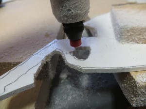
The Proxxon rotary tool makes a lot of plastic dust.

Giant Relief Plate

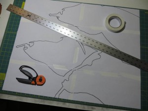
Call me crazy, but I am working on a 24″ x 30″ version of the three pears. I enlarged a line drawing of the original 5″ x 7″ artwork onto 6 sheets of 11″ x 17″ paper. My plan is to use graphite transfer paper to copy the image to a sheet of FPVC that I picked up at TAP Plastics. I chose FPVC because it is inexpensive and easy to cut. It also has a slightly rough surface that should hold ink well. My plan is to use a jig saw and scroll saw to rough in the shapes and then move to the Dremel tool and then a hand file for the detail work. Once I have cut all of the pieces, I will glue them to another piece of FPVC and then try to print it by hand using a baren. I have no idea if it will work so I am starting with one of my simpler designs. Stay tuned for the next exciting episode!

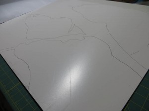
The pattern for the plate is made up of six pieces of 11″ x 17″ paper.

One More Pear Study

SolarPlate relief print. 8″ x 10″ plate on 12″ x 14″ Hosho. Akua Intaglio Mars Black.

This weekend I finished the final of nine plates from my Less Is More series of black and white notan studies of pumpkins and pears. Your can see the entire collection of prints here.

I’ve reworked the second pear from the left and am still not happy with it, so I might make this plate one more time. If I do this, I will probably thin out the white outline on the right side of the leftmost pear. I really like the rightmost pear – both the shape of its stem and the shadow cast by the second pear.