Wine and Apples Full Scale Drawing

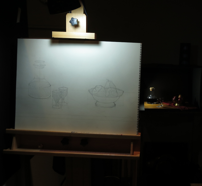
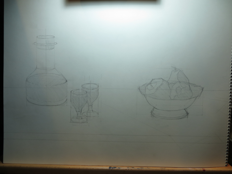
Made a bit of progress on my still life over the weekend. After finishing the color study, I did an 18″x24″ sketch in graphite to figure out the composition and the aspect ratios of the various ellipses. I tried a number of scales and small adjustments in item placement before settling on this design.

18″x24″ graphite drawing on paper.

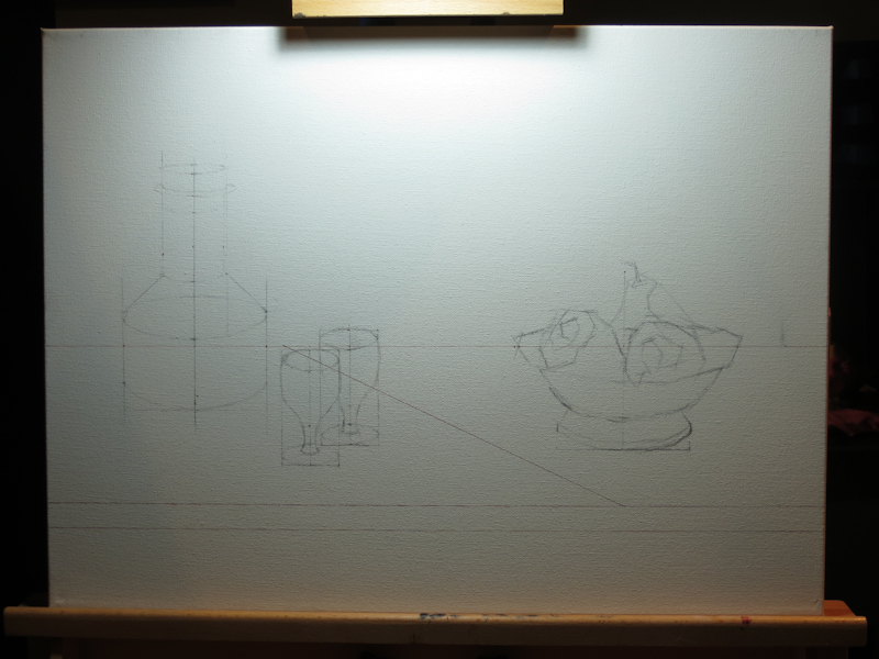
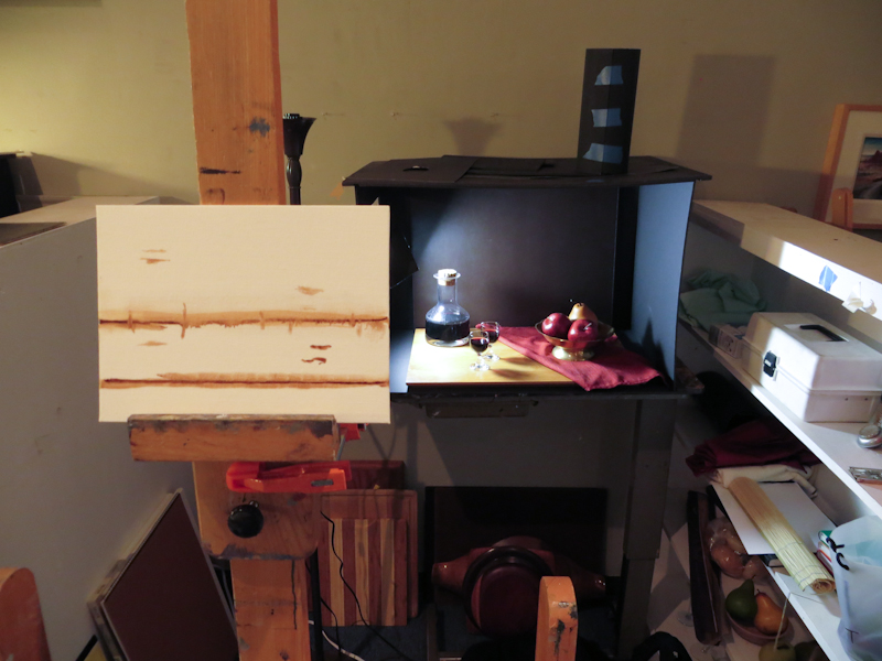
I redrew my design on my canvas using an Indian Red ink pen for the horizontals in the tabletop and the strong diagonal. My plan is to do an under painting in burnt sienna, so I’m hoping the inked lines will mostly disappear into the paint. The remaining items were sketched in vine charcoal. I didn’t use a fixative and am expecting the charcoal to fall away as I find the exact edges in paint.

18″x24″ canvas with Indian Red Faber-Castell Pitt pen and vine charcoal.

Originally my plan was to do all the drawing with a paintbrush directly on the canvas, but I had so much fun with graphite compositional study that I just continued on the canvas. I still expect that I will make significant adjustments with the brush in the under painting.

Tomorrow I will start an underpainting in burnt sienna.

Towering Easel

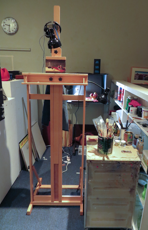
I really like my new easel, but I’m glad I’m 6’6″ tall as it must have been designed for basketball players. It is good that the the bottom tray goes really high because the top canvas holder does not go low. When I work with an small study, it is high in the air – about eye level for me while standing. I may have to make a magnetic backing board to position my smaller studies at a more reasonable altitude.

This is about the lowest possible position for my 6″ x 9″ study.

Small Study – Big Brush

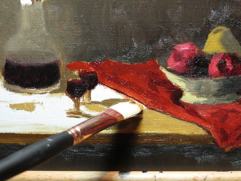
During class I worked on finishing up the table top and the cork in the wine bottle. I am now getting used to using the large brush and working faster. For those that are interested, the brush is a very affordable #6 filbert Blick Masterstroke Pure Interlocking Bristle. Gary recommends these brushes.

It is amazing what you can do with a large brush.

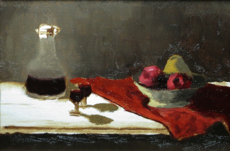
Wine and Apples Color Study Update

In my last session, I assembled a new easel, balanced my lamps, and started mixing colors. My old easel was broken so Gage gave me a new Blick Studio Medium-Duty H-Frame Easel. This is a really nice easel for $89 and it even comes with the screwdrivers needed for the assembly. All of the components were well packed and well marked and the instructions were reasonably clear. One nice thing about this easel is that the carriage tray can be positioned anywhere from a few inches off the ground to five feet up. The high position is useful when working on really small pieces, like this 6″ x 8″ study, which I wanted at eye level.

Gary dropped by the studio after his perspective lecture and caught me with a tiny synthetic brush and told me to go back to the #6 bristle. He was right and I almost want to do another quick study with just the #6.

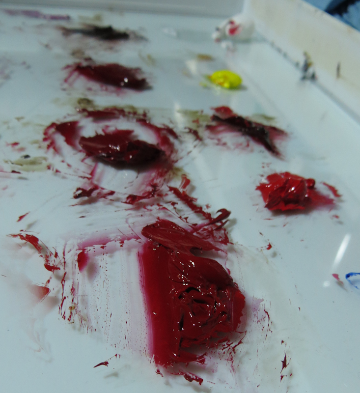
This string of reds for the apple included a tint of Daniel Smith Permanent Red, various combinations Permanent Red and Alizarin Crimson, and finally combinations of Alizarin Crimson with Burnt Umber. I liked everything but the tint (not shown), which looked like strawberry toothpaste.

At this stage, I’ve painted the two darkest reds and the two darkest neutrals.

All that remains for this study is the table top. After that, I’d like to revisit the colors in the apples and the pear and the metal bowl, either in this study or a new one.

Homegrown

When I tell people that I go to art school, I often get one of two reactions. The first is nostalgic excitement. They tell me about the art courses they took in college and about their aspirations around art or music or some other lifelong passion. They are excited to hear my story because I am living, breathing proof that one can find a way to follow their dreams, even later in life. The other reaction is to tell me how they are artistically illiterate and not gifted enough to create art of any sort. They suggest that they would embarrass themselves and disappoint others if they were to even try – kind of like the reaction you’d expect, if during the intermission to Aida, you urged your date to go up on stage, grab a mic, and sing an aria.

Last night I was frustrated with an assignment from class and felt that I was artistically challenged – that maybe I couldn’t do art. I was working on the Word-of-the-Week assignment for the Still Life Atelier. Each week the class chooses a word which we use as inspiration for an image that we bring to crit the following week. There’s no expectation that we create a finished, polished work in a week. The goal of the exercise is to create a visually impactful representation of the essence of the word. You can turn in a painting, but a sketch will do, or even a collage of images cut from magazines. Almost anything will work as long as it is an image. Gary says the only real way to fail would be to write an essay.

This week’s word was “homegrown” and I had a bunch of ideas I liked, but finally settled on a windowsill in a home with an avocado plant suspended by toothpicks in a mason jar of water. I knew I didn’t have a lot of time, so I decided to do a line drawing, viewing the jar straight on, without perspective.

My hope was to make a compelling case for “home” by showing lots of detail in the molding around the window along with some tangled venetian blinds just above the plant. I wanted it to be clear that the plant was some kid’s project, kind of squeezed in with all the other detritus of domestic life. My plan was to emphasize “grown” by showing a lush tangle of vines and leaves that are ready to burst out of the window, if only the blinds and their tangled mess of cords weren’t in the way.

Things got off to a good start, but I quickly realized that it was hard to draw something that unambiguously read as a window, using only lines and no perspective – all I got was a bunch of nested rectangles corresponding to the facets of the molding.

At this point I decided to switch to a very subtle one-point perspective, so that I could use a bit of shading to separate all of the planes of the molding. This worked well, but it was really slow going and I had to adjust the vanishing point and start over a few times before getting a composition that I liked.

By the end of the evening, I felt like I knew how I could go about drawing a compelling window frame, but hadn’t even started on the mason jar, the venetian blinds, and the plant itself. I was disappointed because it was 2am and I had nothing to show. I could have used the time for a color and value study for my first still life arrangement.

I was a bit grumpy and tossed and turned that night, but during my morning bike ride, I realized that the problem wasn’t my artistic ability – it was having an unreasonable expectation of what could be accomplished in a certain amount of time.

You see, art does require skill and practice, but one of the most important ingredients is time. After a year in Juliette Aristides’ Classical Atelier, I of all people should know this. After all, I spent a month shading a sphere and another month copying a Bargue plate of a foot – and I was the guy that was drawing part time. Nothing is quick in art if you have high standards for the finished work.

The error I made last night, was to forget that great art takes time. When I think back to the bottle drawings I did last year, it should have been clear to me that there is no way to make a perfect window frame in an evening – after all I spent two nights doing a line drawing of a single bottle, and this was after a bunch of hours learning how.

My problem wasn’t that I couldn’t do art – it was that my Word-of-the-Week project was too ambitious for the time allotted. One of the keys to following my dreams is keeping life in balance. Between work and family and art, there is barely enough time just to get by. It is important to pick and choose where to place my  emphasis.

In the end I decided to simplify the project by making a Photoshop montage. It really is supposed to be an avocado plant, but I think most people will want to smoke it.
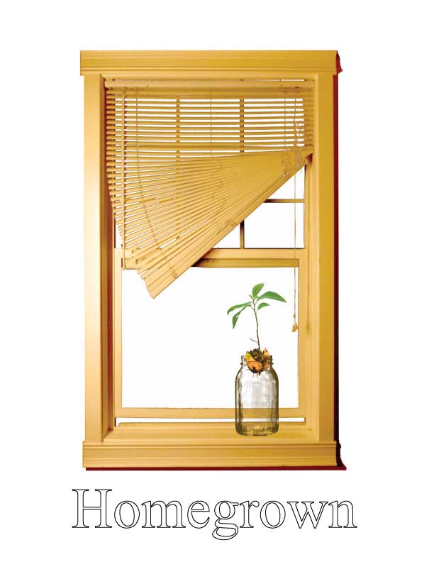
This is supposed to be an avocado – really!

Wine and Apples Color Study

After organizing my space and cleaning palette boxes and brush tanks, I finally got a chance to work on a color study for my wine-and-apples scene. Gary suggested working small and spending no more than two hours. This was to ensure that the painting remained in the realm of a study.

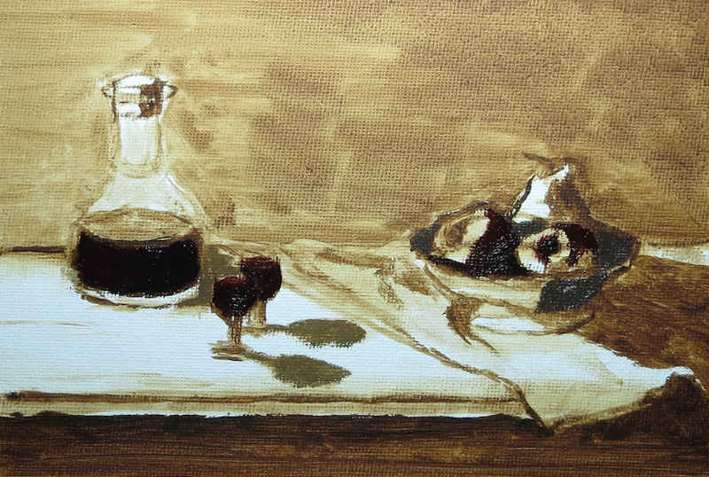
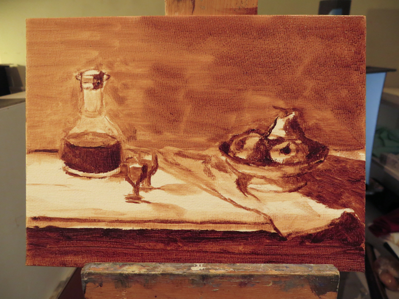
I decided to do a 6″ x 8″ study for a painting that will likely be 18″ x 24″. My approach was to draw the image with a paintbrush using burnt umber thinned with OMS, and then block in the value masses.

I spent about an hour working with burnt umber and had just started mixing up colors for the apples when I realized that the incandescent lamp on my easel didn’t match the 5500k daylight bulb on the scene. When I matched the paint perfectly at the easel and then brought a sample into the scene, it looked like a garish bluish purple. I decided to call it a day so that I could get another 5500k lamp for the easel.

As I was heading out, one of my classmates asked my why I did an under painting for a color study, instead of just laying color directly on a bare canvas. I suppose the answer was that I did it out of habit. When I started, my intention was to just draw the outlines in burnt umber, but then I got into it and kept adding more shadows and details until I had an under painting. I guess this is why Gary suggested keeping the entire exercise under an hour.

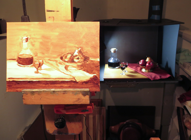
Blocking in the top and bottom of the tabletop, the decanter, and the bowl. Note that I have adjusted my viewing angle so that the vertical positions on the canvas align with the corresponding positions in the scene.

Here’s the view at the end of the session.

I spent about an hour blocking in the scene in burnt umber.

Preparations

I went in to the atelier this morning to paint a color study for my first still life assignment, but ended up spending a bunch of time preparing for my first brush stroke. When I joined the Classical Atelier last year, I put painting on the back burner while I focused on charcoal drawing and then printmaking. Now as I turn my focus back to oil painting, I am facing a seemingly endless amount of preparation, from cleaning palette boxes to finding matching light bulbs to excavating my shadow box from the closet to sorting paint. I know it will all be worth it and I will really enjoy my space and my tools, but still I want to be painting . . .

I really should have cleaned my palette when I finished my last painting, but I didn’t know back then that I was done . . .

Popping Tags

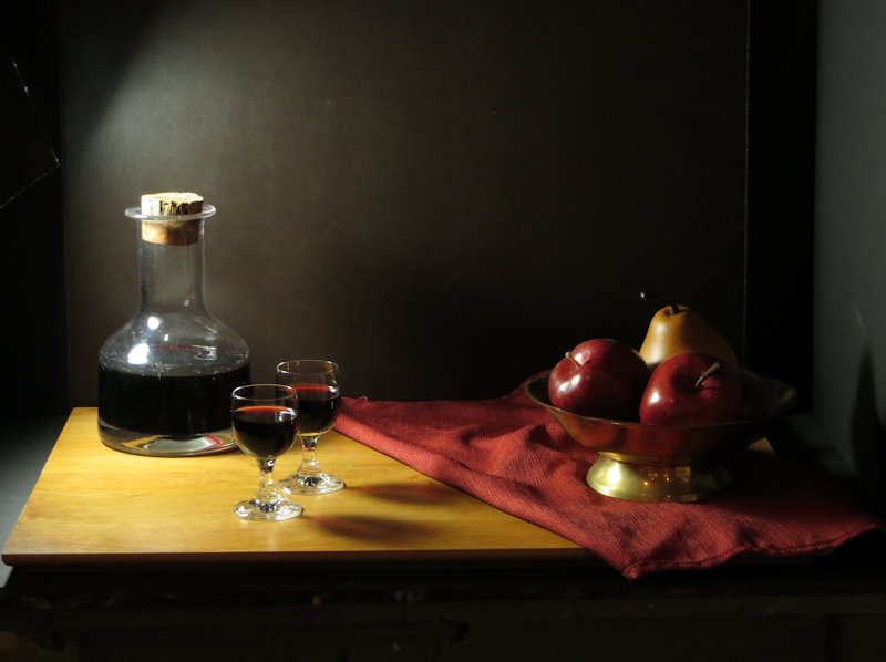
Went thrift shopping for props. Got a lot of interesting items which I can’t wait to paint. Here’s the first tableau. The wine is real, but the apples are fake. My classmates warned me that wine “evaporates” very quickly in the atelier and that I would need to top it off daily.

The actors are on the stage.

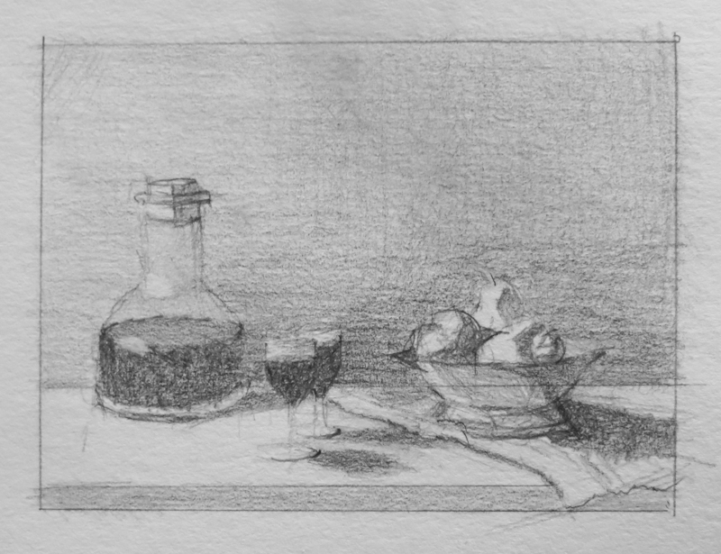
I spent about an hour trying out various arrangements and viewpoints before settling on this one. Then it was time to do a small value study before breaking out the paint brushes.

Twenty minute value study in graphite, 3″ x 4″.

Back to School

As summer draws to a close, we see less of the sun in Seattle and the nights grow cooler. It is time sharpen those pencils and head back to school!

This year I will be studying under Gary Faigin along with six other students in the Still Life Atelier at Gage Academy. I really enjoyed my time last year in Juliette Aristides’ Classical Atelier, but found that it was hard to keep up with the full time students while balancing work, family, and art.

Gary’s program is designed for part time students. Since the models are wine bottles and bananas, we can work any time of the day or night, and we never have to pay overtime. This is great for me, because I can put in a full week at Microsoft and still do art on evenings and weekends.

Our first class was a discussion and critique of summer projects. Now I am gradually moving in while acquiring props at the thrift shop and art supplies at Dick Blick. I already have most of what I need, with the exception of canvases.

One thing I learned in the first class is that still life is traditionally taught with life size paintings. When I asked Gary what size canvas or board to get, he said not to work with anything smaller than 18″ x 24″. It reminded me of my first year of figure drawing where we never worked smaller than 18″ x 24″ and sometimes worked even larger to get practice drawing with our arms instead of our wrists. I don’t think I have ever done a painting larger than 9″ x 12″, so this will be fun!

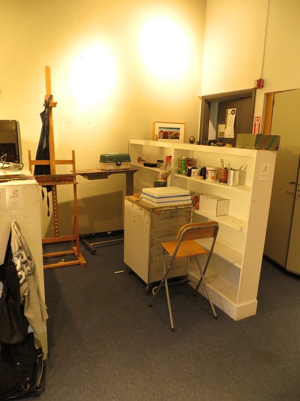
Move-in day, first day of classes, Gary Faigin’s Still Life Atelier. This is my studio space – probably the cleanest you will see it all year.

Epson 3880 Roller Problems

“Theory and practice are the same, in theory, but different in practice.”

My first attempt at eliminating track marks on my ImagOn emulsion was to make a window mat carrier, the theory being that the rollers on the border of the window would lift the center rollers above the surface of the ImagOn.

My plan was to make a window mat carrier that would lift the top rollers above the surface of the ImagOn in order to avoid track marks.

I tried a bunch of different window mat carriers and found they either had no impact on the track marks or they got hung up on the top edge of the window mat. A quick look inside the printer and a perusal of the service manual showed me the problem (see page 53 and section 5.3.17).

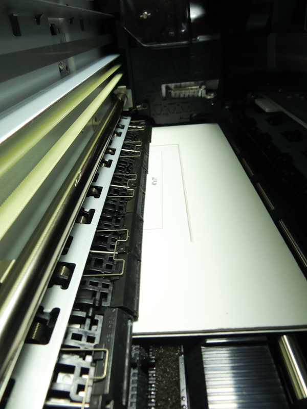
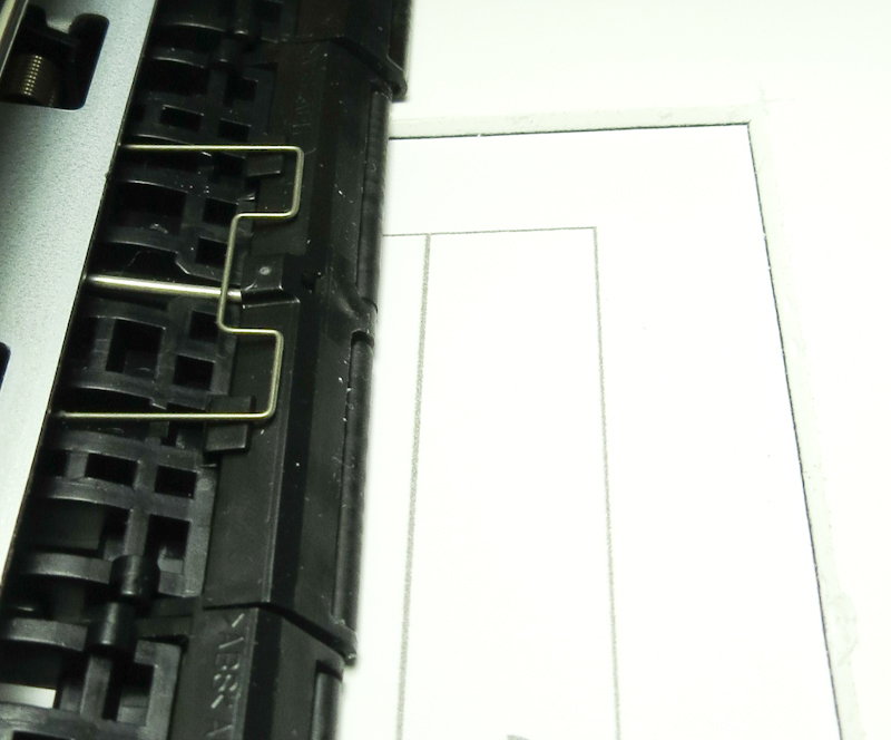
The top side of the Epson 3800 paper feeder has 8 roller assemblies, each 2″ wide and holding two small rubber rollers. The rollers are organized into an assembly called the grid roller. The paper passes from back to front under the grid roller on the way to the print head. The grid roller presses the paper against a steel paper feed roller that actually pulls the paper forward.

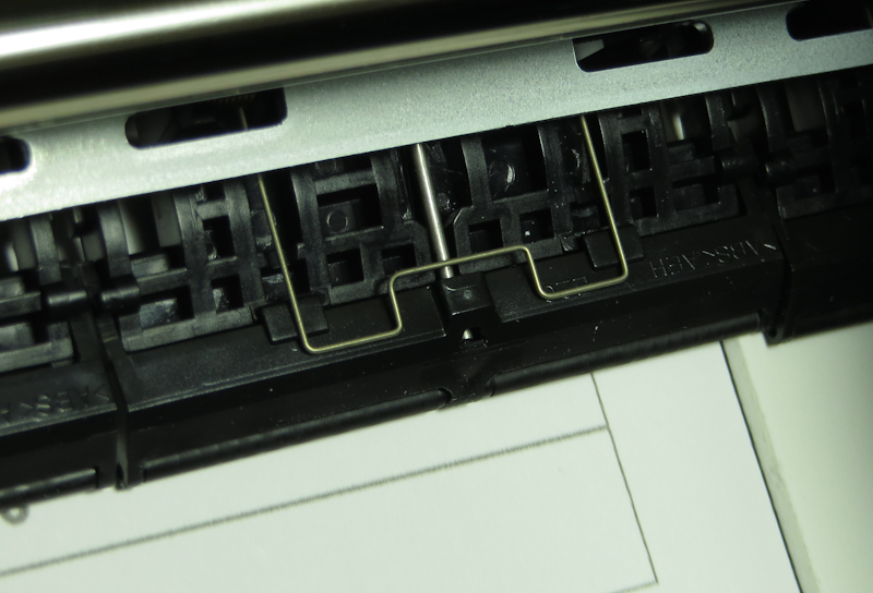
Each roller assembly is free to move up and down independent of its neighbors. A metal spring clip holds the roller assembly firmly against the paper.

Because the roller assemblies can move independently, the ones inside the window will roll across the surface of the plate. This roller is partially inside the window mat with the top edge riding on the edge of the mat.

In practice, the rollers fall into the window in the mat and run across the surface of the emulsion, leaving track marks.

Once I had a good understanding, I tried a couple of ideas without success:

  • Ran a printer cleaning sheet in case dust or goop on the rollers was responsible for the marks.
  • Attempted to reduce the pressure on the rollers by increasing the paper thickness setting. My hope was that this setting would prevent the Paper Guide Upper Assembly (see page 53 in the service manual) from pressing down quite as hard.
  • Attempted to reduce the pressure on the rollers by setting the paper type to glossy. My hope was that the printer might use less pressure when printing on glossy.
  • Tried printing on a very thin plate consisting of ImagOn laminated to a piece of Pictorico OHP transparency film. This plate was thin enough to run through the sheet feeder. My hope was that the Paper Upper Guide Assembly might not be able to exert as much pressure on really thin media.

I’ve considered, but not tried the following ideas

  • Somehow pull the middle 6 roller assemblies up against their spring clips so that they can’t touch the emulsion. This would leave the 2 roller assemblies on the end to move the plate. I don’t plan to try this because it might void my warranty and because the rollers are probably necessary to keep the media flat as it goes under the print head.
  • Make the ImagOn surface more resistant to scuffing by removing the protective plastic and letting the plate dry, exposed to air before printing.
  • Make the ImagOn surface more resistant to scratching by heating the plate. Not sure if heating the plate will harden or soften the emulsion.
  • Make the ImagOn surface more resistant to scratching by cooling or even freezing the plate. This approach may have problems with condensation.
  • Make the ImagOn surface more resistant to scratching by pre-treating it with vinegar. I don’t know whether the plate is still light sensitive after being treated with vinegar.

As you can see, I’m pretty close to being out of ideas. It is possible that ImagOn DTP only works with high end printers like the 4900, 7890, 7900, 9890, 9800, and 9900 that use vacuum suction to hold the paper in place without touching the top surface.

It is also possible that my 3880 is defective and pressing down too hard. I will know tomorrow whether my printer is defective. If it is not, I may have to give up on DTP and make a strategic retreat to single exposure ImagOn. This means I will need a vacuum frame, but I won’t need a calibrated light source.