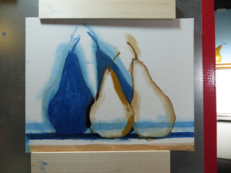
Before working on the background, I adjusted the pear shapes to be a little less generic. Adjustments were in Yellow Ochre and Prussian Blue. Note in particular the restating of the lower left edge of the left pear to show a larger triangle of light blue background. The upper right edge of the left pear was restated to make the shape less generic.
