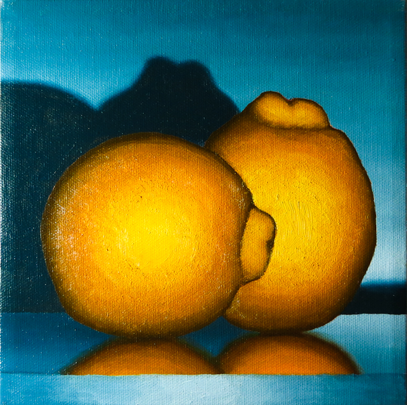
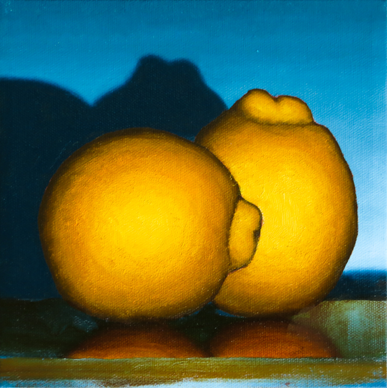
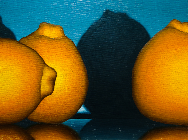
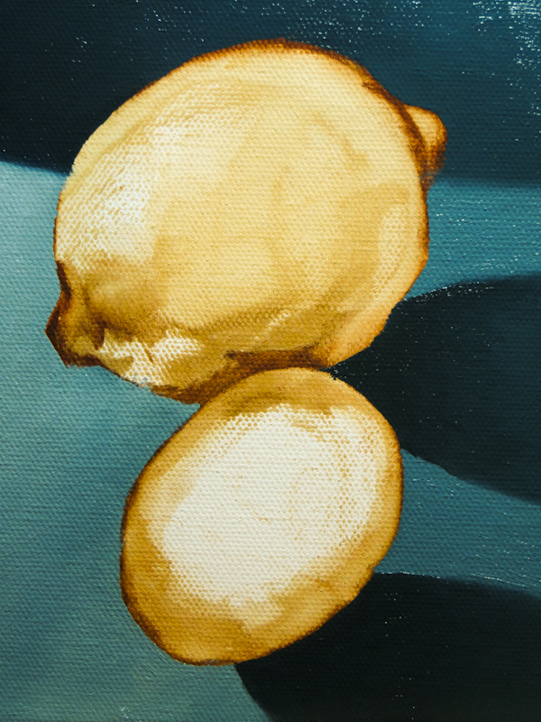
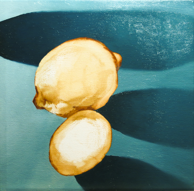
Today Gary demonstrated glazing on one of my Minneola paintings. He felt that the table top was too blue and that the reflections were too bright, so he simultaneously shifted the hue, lowered the saturation, and darkened with a glaze of Sap Green and Burnt Sienna, thinned with linseed oil. Check out the before-and-after:
Monthly Archives: May 2014
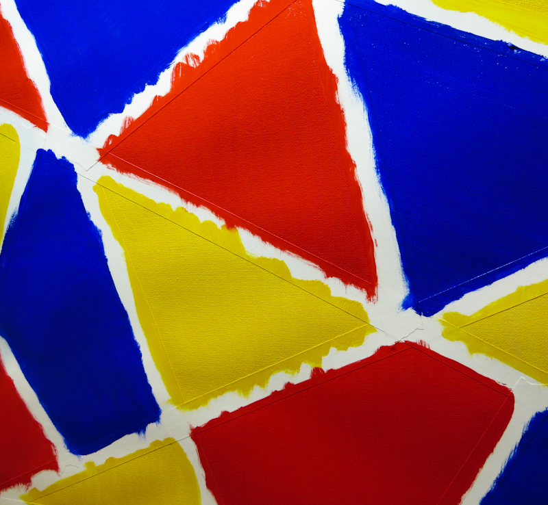
Mondrian or Calder?
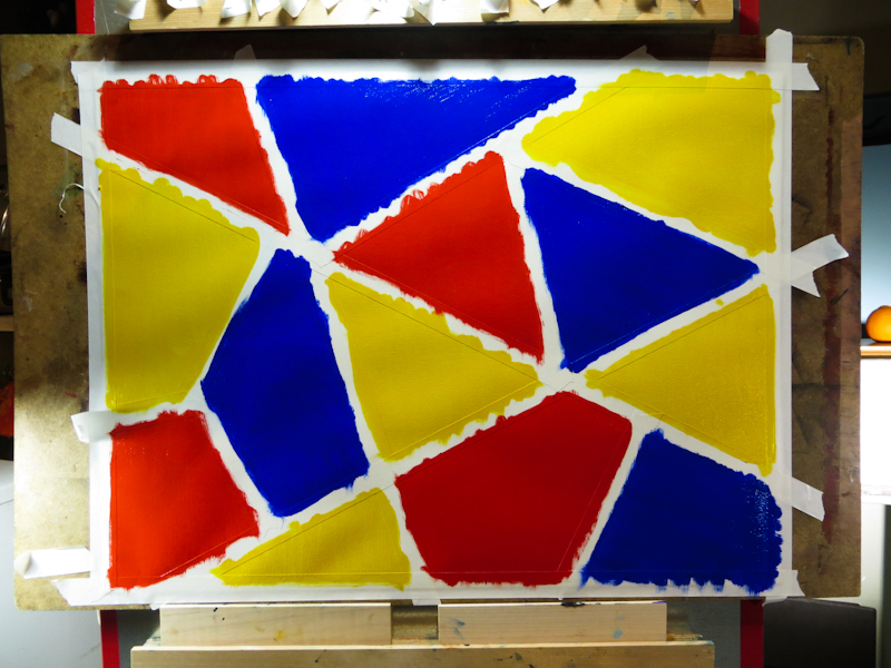
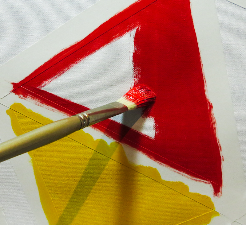
Is it a Mondrian or a Calder? Actually neither. I painted this backdrop to incorporate in a still life tableau with transparent glass containers filled with water. I’m hoping that the colors in the backdrop will make interesting shapes and patterns when viewed through the water. Once the paint dries, I will remove the masking tape and then add black pinstripe borders to each of the colored shapes.
Finished Another One!
Portrait Study II
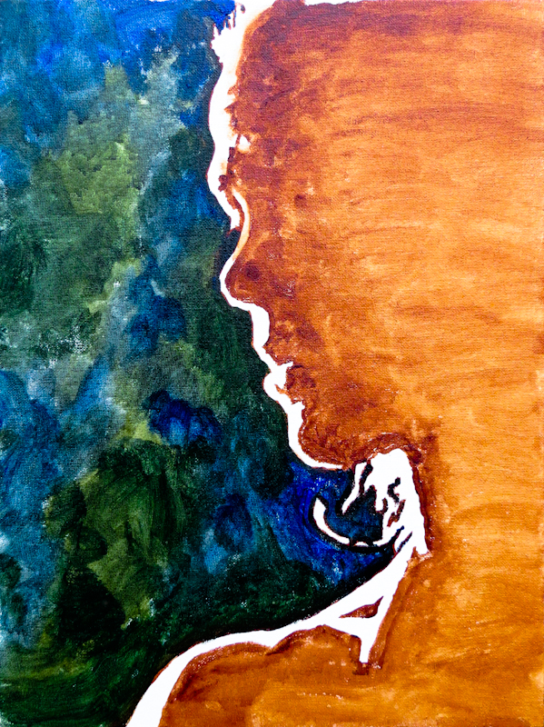
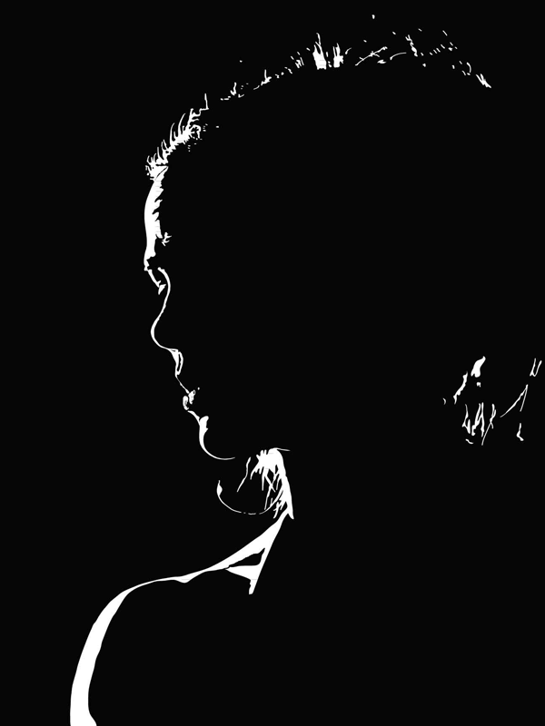
This second study is an 12” x 16” under painting in oil. I am trying to explore how to leverage the shape information that I captured in my print design, while using the vocabulary of paint in a way that adds something valuable in its own right.
I was inspired by Gary’s demo of broken color and by my own experiments with impasto and warm/cool relations. My plan for the oil study is to go much darker, using cool broken colors for the background, and warm unbroken colors for the shadow part of the head. I will probably indicate the ear, eye, sternocleidomastoid, and hairline with diffuse darker marks. I’m thinking the portions of the head in the light will turn form, but use pretty heavy, almost impasto paint and I plan to make the background dark on the left to contrast with the rim light, gradually lighten towards the right to pick up more of the skull and hair in silhouette.
Portrait Study I
May 3, 2014
Finished One!
I just finished this 8″ x 8″ painting for the Maple Valley Arts Ten-Twenty-Forty show.

