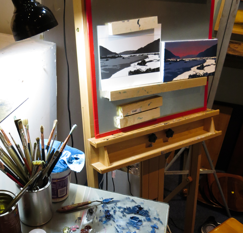
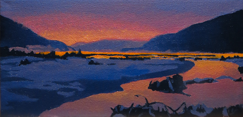
Just finished a small, 6″ x 12″, oil study for my Keechelus Lake painting. I’ve been noodling around with this idea for over a year, starting with a gouache painting and progressing to a simple Illustrator drawing, and then a more complex illustrator drawing.
The color scheme for the study uses a single string, anchored with Cadmium Orange and Prussian Blue. Most steps include a bit of Quinacridone Violet and Titanium White. The darkest step also has Burnt Umber.
I’d like to try a few more color schemes, including Red/Green and Blue/Yellow or Violet/Yellow. Also want to look again at Blue/Orange, but with a lighter sky. After that, I will probably try a slightly larger study to figure out atmospheric perspective in the hills and the ground.


