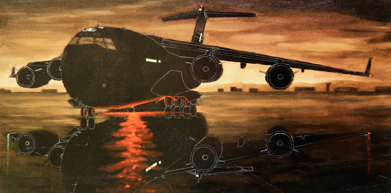
I spent the evening doing color studies for the C-17, painted directly on 5″ x 10″ photographs of the larger painting. Here’s the photo before any paint has been applied. At this point, I was concerned that the image may be too monochromatic.
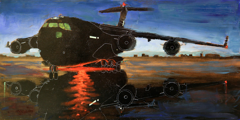
First I tried making the sky dark blue, but it just didn’t look right. The painting had lost the moody feeling along with all of the interesting clouds in the sky. I did like the glowing green cockpit lights, but they came at a cost – the windows were no longer unified with the sky.
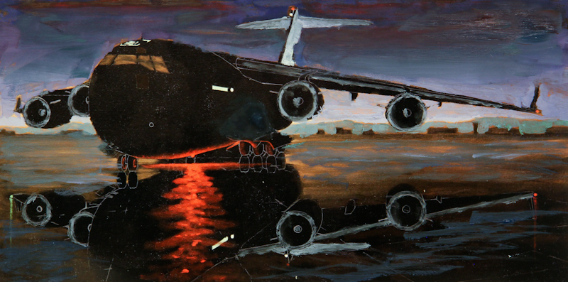
I wanted to retain the moody feeling of a stormy industrial sky at midnight, so for my second attempt, I introduced broken green and purple in the sky. This was a bit more successful than the blue sky, but the change that really made a difference was illuminating the tail and the leading edges of the wing and the engines.
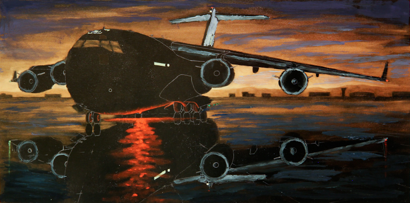
Here’s the third study. This time, I tried to retain the orange clouds, while introducing violet in the sky and teal on the tarmac. This was the most successful study of the evening, but it still didn’t have the mood of the industrial night sky. Part of the problem is that orange clouds against a violet sky read as sunrise or sunset, and this works against the mood of a dark giant in the dead of night.
My key learnings from the studies are
- The sky cannot be blue because even a very dark blue will read as a clear day, just before the dawn. Purple and orange work well for post-midnight industrial sky. Next time I will try a green sky.
- The design is much better when the tail and wing and engines are illuminated.


