Holiday Cards

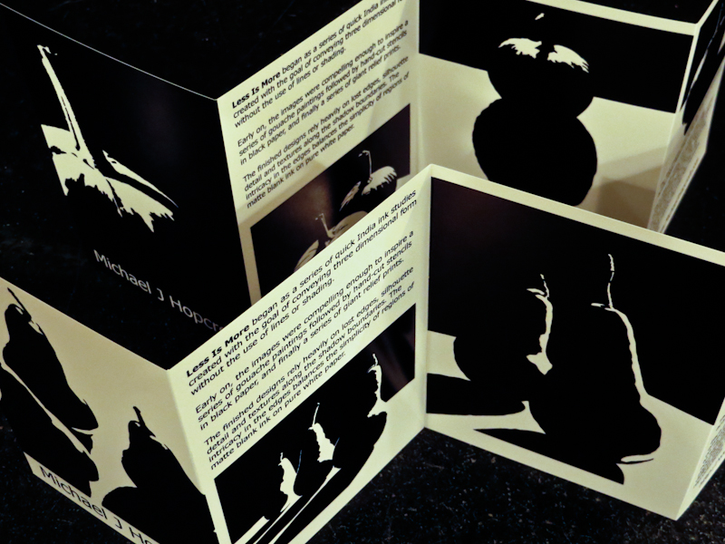
This evening I worked on holiday cards for friends, family, and galleries. I wanted to create something distinctive that would show off a complete series of prints. I experimented with a number of ideas including stacks of trading cards (with bubble gum) and a large square collage in a custom square envelope, but in the end I borrowed an idea from New Yorker cartoonist Mark Ulriksen.

Over the summer I heard him speak about climbing the ladder as a young illustrator and he mentioned that he used an accordion fold design for an early portfolio mailing and found that it worked well because people would leave it standing up on their desks.

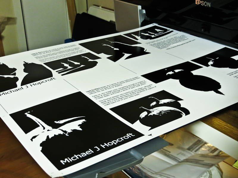
The idea sounds simple enough, but it took a long time to prepare reproductions of each of the prints and then lay everything out in Adobe Illustrator. I also made a bunch of test prints on various papers from a Red River Paper sampler pack before ordering the large sheets and envelopes for the actual cards.

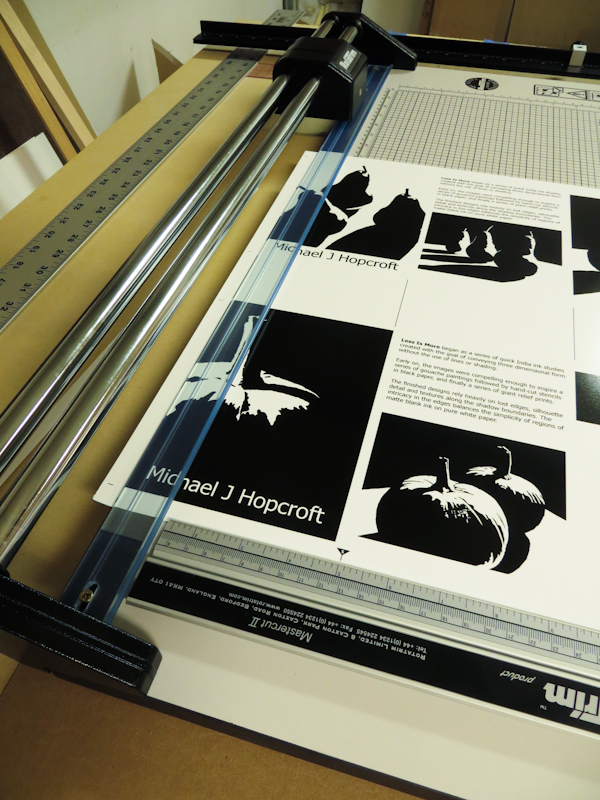
A single 17″ x 25″ sheet has room for two accordion fold cards. Here I’m using 68lb Ultrapro Satin Version 3.0 from Red River Paper.

The 17″ x 25″ sheets barely fit in my trimmer. It took quite a while to work out the locations of the various alignment marks. Since I can’t see exactly where the blade will land, I use alignment marks like the triangle on the bottom of the page. In this example, I need to align the triangle with the 5″ mark on the ruler in order to get a perfect cut.

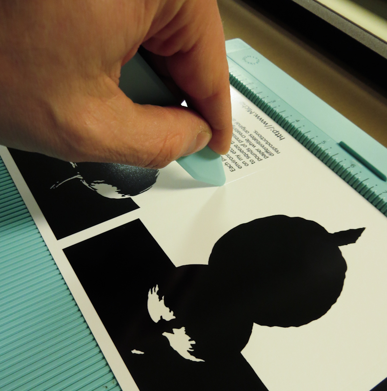
Using a $10 Martha Stewart bone folder from Michael’s to score the folds. It turns out that not all papers are suitable for folding. Red River has a very nice 86lb double sided glossy paper, but I couldn’t use it because it had a tendency to disintegrate when I scored it.

The accordion fold cards are visually appealing and stand on their own.

Flathead Lake Montana

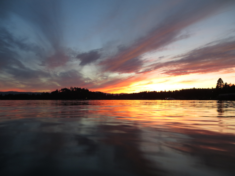
I love watching sunsets, both for their natural beauty and as inspiration for artwork. Last week I had the good fortune to be at Flathead Lake, Montana during this spectacular sunset. At first it seemed that the sun was just going sink into a mass of gray haze that had been building all afternoon and I almost stayed inside reading, but then at the last minute the sky lit up with colors. I probably took about a hundred photos and I learned a new technique. Read on to hear how I shot these photos.

These photos were taken with a Canon SX260HS point-and-shoot camera. I used three techniques to help improve color saturation and make the compositions more appealing. These techniques are probably well known to experienced photographers, but two of them really surprised me.

The first technique, which I’ve always used for sunsets is exposure compensation. By underexposing by 1-2 f-stops it is possible to get saturated colors in the sky and the water at the expense of detail in the trees. I will take a silhouetted treeline any evening if it means I can get saturated clouds and sky. I found it was easiest to pick an exposure in program mode using the exposure compensation dial and then lock it in using the manual exposure setting. Using manual mode prevents the exposure from changing as I move the camera around.

The second technique was to place the camera about an inch above the surface of the water. The picture below shows the same scene, but from eye level. In my opinion, this picture is much less interesting than the water level shot because the colors in the water are chopped into little pieces. The water level shot has these gorgeous glossy waves that create interesting patterns and bring out reflections of the distant shoreline and sky.

The third technique was to switch the camera into macro mode. I’m not sure exactly how macro mode works on these simple point-and-shoot cameras, but what it seems to do is adjust the auto-focus system to focus at a point that puts more of the image depth into focus. These tiny cameras already have superb depth of field, but the macro mode seems to put the focus center closer to the viewer so that less depth of field is wasted beyond infinity.

Here’s another water level shot . . .

And here’s the same, less interesting eye level version . . .

Here are a few more of my favorites from the evening . . .

Big Plate On The Big Press

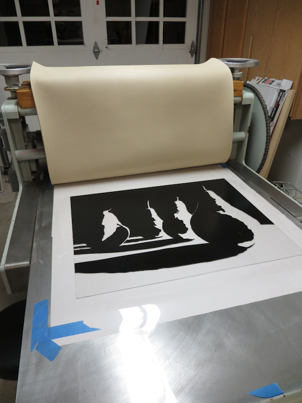
Over the weekend I made my first large relief print on the Glen Alps press. These 24″ x 30″ prints typically take me over an hour when printing by hand with a baren. I still spent quite a bit of time inking up the plate, but I was able to print it in a matter of minutes.

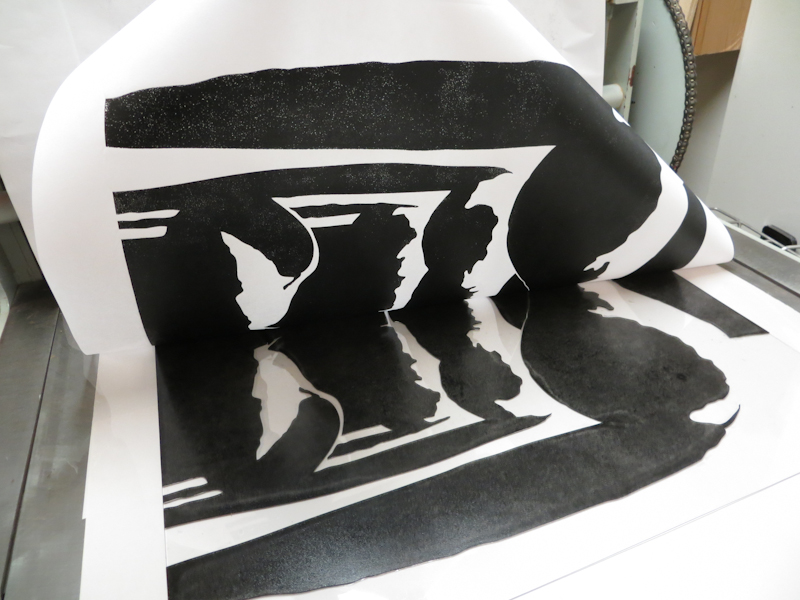
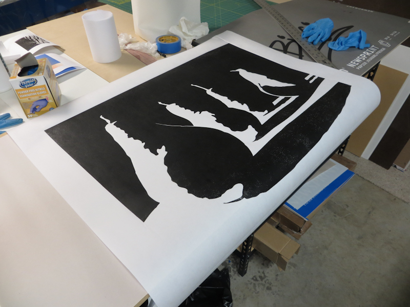
I printed this first test on the rough side of a piece of dry Masa paper and as you can see in the pictures below, I still need to tune the process. There are two problems. The first is that I’m not getting full ink transfer and this is causing a lot of white speckles in the blacks. I suspect this is because I am using a soft rubber Whelan Press blanket instead of a stiff wool blanket. With the soft rubber blanket, I need to keep the pressure low to prevent the blanket from ripping the paper on the edges of the relief plate. The second problem is that the embossing is so deep that the paper is wrinkling. I think I can fix both problems by putting a piece of stiff card stock between the blanket and the paper.

I’m ready for my first test with a large relief plate on the Glen Alps press.

I just love seeing these abstract designs come off of the press. This is my first peak of a large relief print on the new press. Note the white speckles at the top of the photo.

My first test print is promising, but I need to adjust the pressure to get better ink transfer with less embossing.

Working on a Bargue Plate

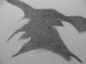
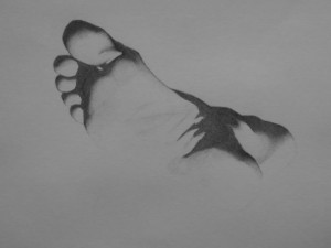
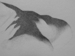
Now that I’m able to render smooth tones in charcoal, I’ve started on a new Bargue plate copy. The plate I am copying is from the Charles Bargue Drawing Course which is a set of plates used to train classical artists in the late nineteenth century. The course begins with simple drawings from casts, initially focusing on individual body parts. It progresses to portraits, torsos, and finally full figures. Vincent van Gogh copied the complete set of plates in 1880 and 1881 and then again in 1890.

I’m using my magnetic drawing board to hold a copy of the Bargue plate while I draw. My goal here is to precisely locate all of the edges and shadow edges and then build up a uniform base level of shading in all of the shadow regions. At this point, I am not using intermediate tones to convey three dimensional form. This will come later once I am sure of the shapes and their locations.

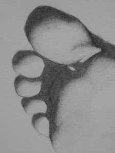
In this closeup of the toes, I have just begun to flat shade the shadows.

Here I am going back to clarify the locations of the core shadows before turning form. All of the shadow regions are still flat.

Here’s an overview of the plate shortly after starting to turn form. When the plate is finished, most of the transitions will be softer and very little will be pure white.

By this point, I have started to use shading to show the fullness and roundness of the toes. I have also clarified the sharp edges caused by cast shadows.

I’ve just started to lightly shade in the turning forms of the ankle. Once I have located all of the major structures, I will go back and increase the intensity of the middle tones.

Adventure in Moving

The Glen Alps press presented a bit of challenge when it came time to move it from Vashon Island to my studio on the mainland, but this was also part of the appeal. Had I purchased a new press, the manufacturer would have arranged for a motor freight company to drive it to my studio and drop it off with a forklift. In the case of the Glen Alps press, I could have hired movers, but the cost would have been exorbitant, and I relished the idea of an adventure on the ferry and a challenging engineering project.

Fortunately Tom, the seller, had a lot of experience moving heavy items by hand, and together we were able to come up with a pretty good plan. The idea was to use sections of ¾” steel gas line pipes as rollers to move the press across the shop to a truck with a liftgate. This worked out pretty well, taking a couple of hours for three of us to load the press. The main challenges were getting the press up a 3” ramp at the edge of the liftgate and rolling the press across the gaps between the liftgate and the truck bed.

We used a 4” x 4” x 8’ board as a pry bar to get the press onto the rollers and to turn the press and get it moving. When we got to the ramp, we had to pry the press up a half an inch at a time and build up a stack of boards underneath until the press was as high as the top of the ramp. We used a block and tackle to pull the press on its rollers into the truck and used the pry bar to help us across the cracks.

My friend, Kevin, a third year student from the Aristides Atelier, helped me unload the press. Since there were only two of us, I rented a pallet jack and this greatly simplified the unloading.

Brains are more important that brawn when moving heavy objects by hand. The reason is that in many cases you and your helpers won’t be strong enough to rectify the situation if the load gets off balance and starts to tip over or rolls away from you on a ramp. The key is to think everything through before starting and then move inch by inch while constantly communicating and reevaluating the situation. You need contingency plans in case you get stuck – every move should be reversible. Also, keep fingers and toes and larger limbs well away from the load and anywhere the load might go if a support failed. Avoid applying strong and abrupt forces – it is easy to pull a muscle or push the load into a dangerous position.

The photos below tell the story of the press’s journey from Vashon Island to my studio.
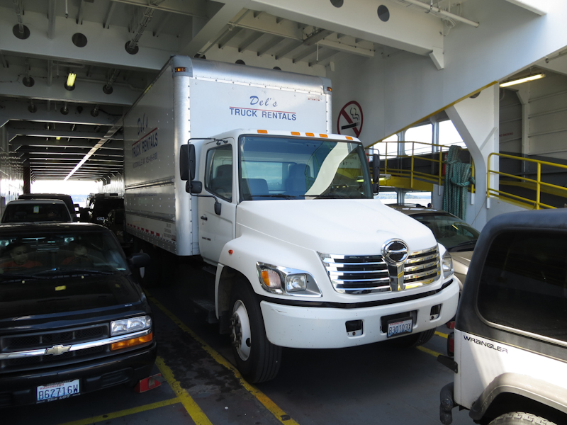
I set out right after the morning rush hour to pick up the press. The trip involved a ride on the Vashon Island Ferry. It was a bit of a squeeze getting the truck onto the ferry, but that was nothing compared to the ticket booth which had about 2″ clearance on either side. I also got to learn about air brakes. It turns out that the truck’s air pressure will deplete completely if you are sitting motionless, say in a line to board a ferry, and you leave you foot on the brake. This approach works fine in a car, but in a truck with air brakes, you need to go into park from time to time to let the air pressure build up.
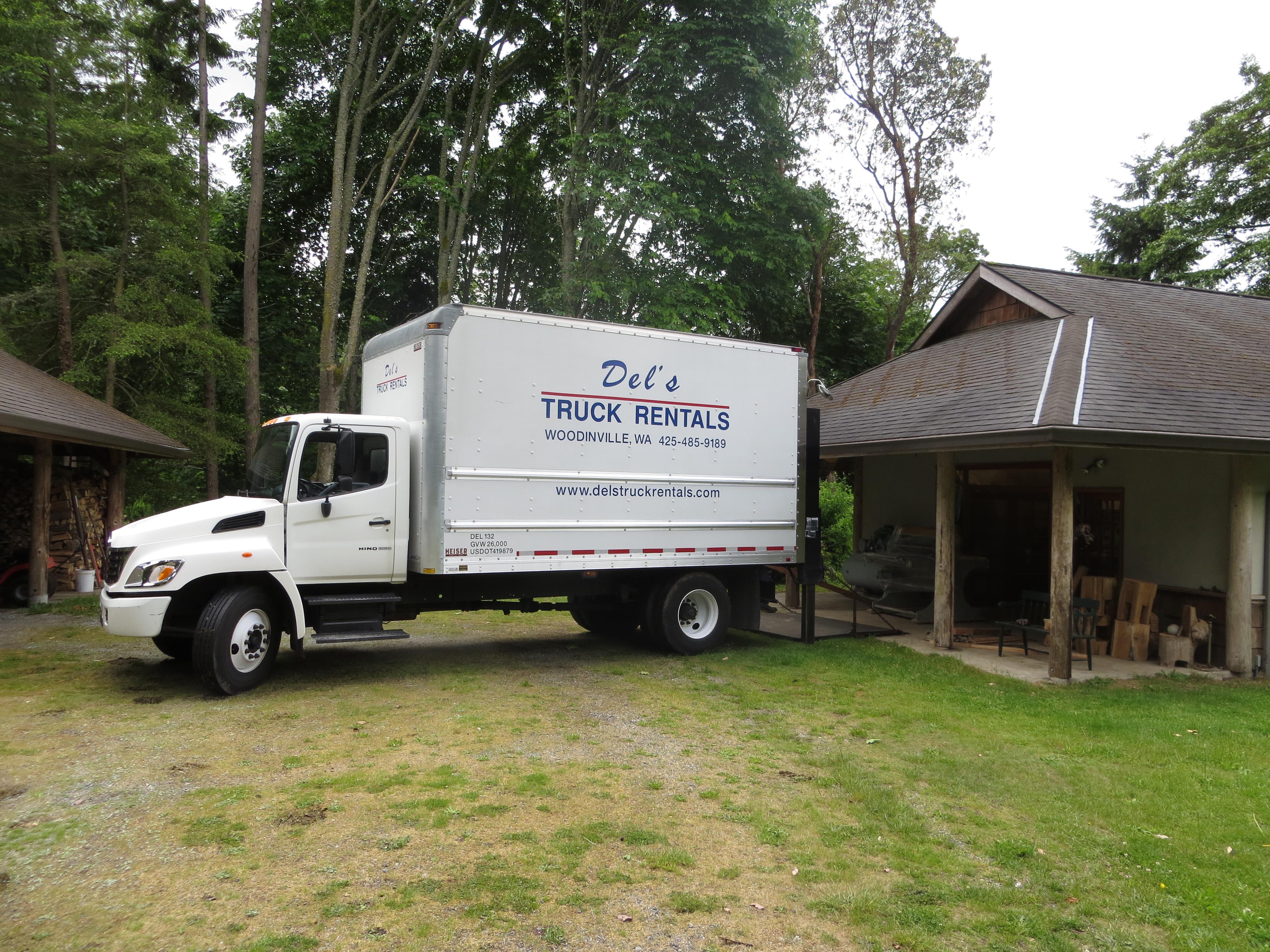
Here is Tom’s shop on Vashon Island. After a bunch of backing and filling, the truck was ready for loading.
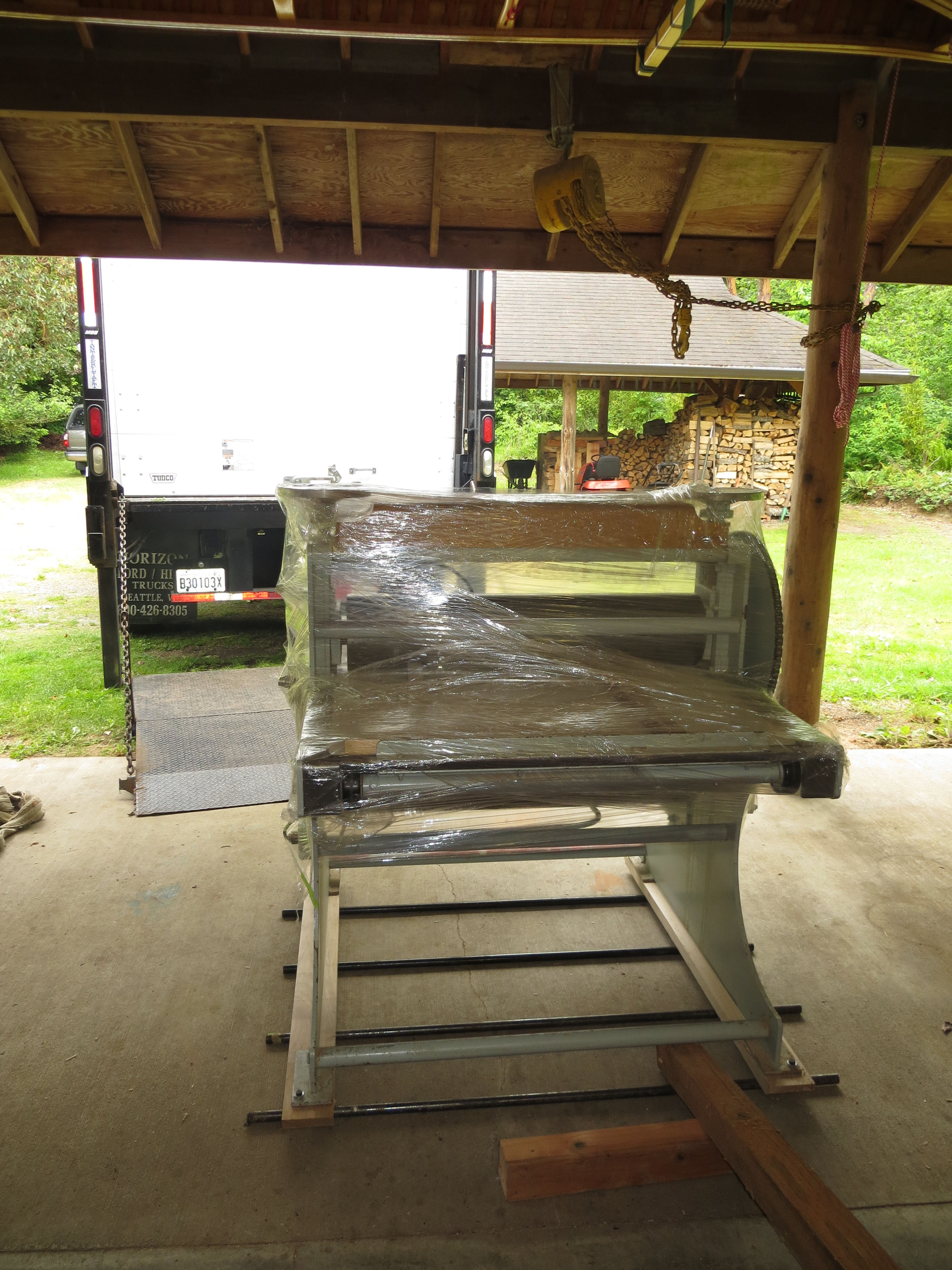
We used four pieces of 3/4″ steel gas pipe as rollers to move the press out of its old home. The rollers worked really well when moving the press straight ahead. Turns were another story altogether. We used an eight foot long 4×4 as a pry bar to rotate the press a few degrees at a time.
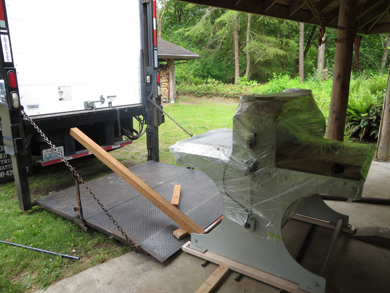
This eight foot long 4×4 came in handy as a pry bar for putting the press on the rollers and moving it onto the lift gate.
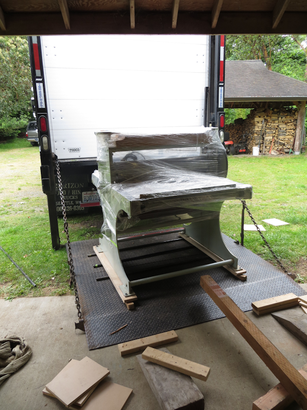
After about an hour of work, we managed to wrestle the press onto the lift gate. The blocks of wood on the ground were used to raise the press up to the level of the lift gate. We’d pry the press up with the 4×4, insert more blocks, and repeat until it was 3″ off the ground.
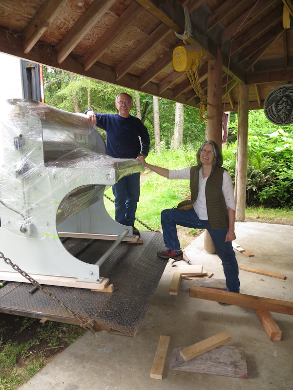
Tom and Mary pose with the press that they have owned since Glen Alps built it for them in the 70s.
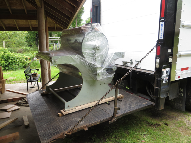
Wedges keep the press from rolling while I pull the truck out from under the workshop roof.
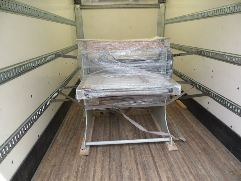
Once the truck was clear of the workshop, it was pretty easy to run the lift up to the level of the truck bed. We used a block and tackle to pull the press into the truck.
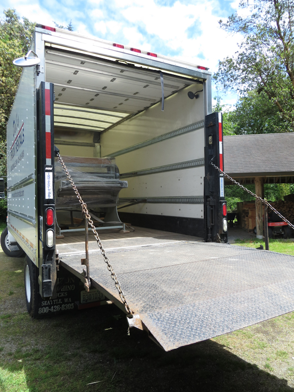
The press is secure and I’m ready to head back across the Puget Sound.
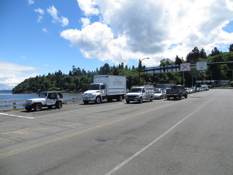
Waiting for the ferry.
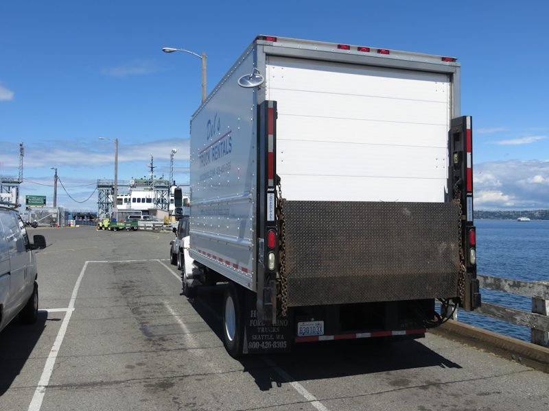
There’s not a lot of room for the truck in the narrow ferry lanes. Fortunately the lane to my left was not in use.
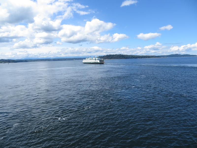
Passing the other ferry on the way home.
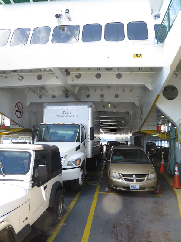
The truck barely clears the roof of the ferry.
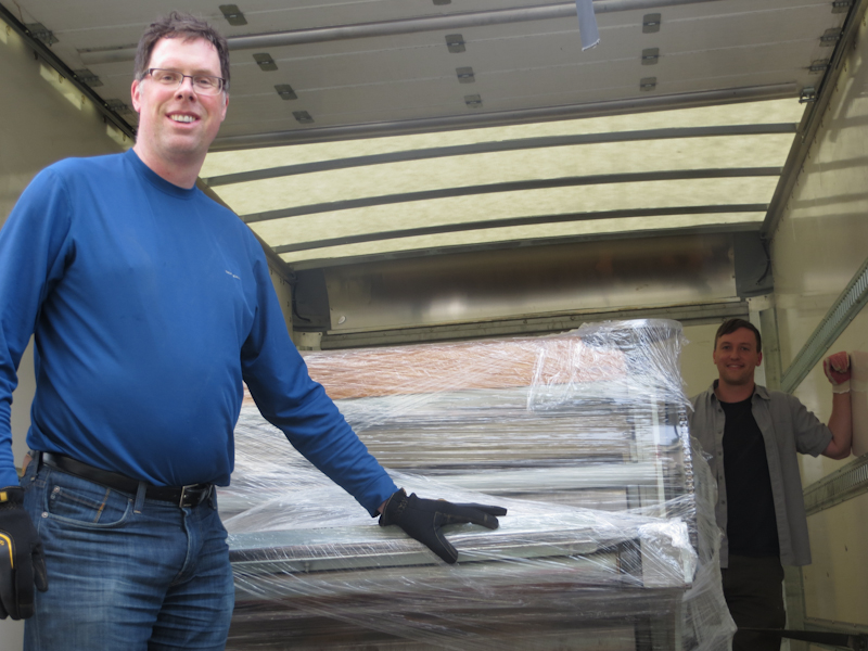
My friend Kevin from the Aristides Atelier helped me unload the press. Kevin is a 3rd year student. His dog, Bo, came along to give moral support.
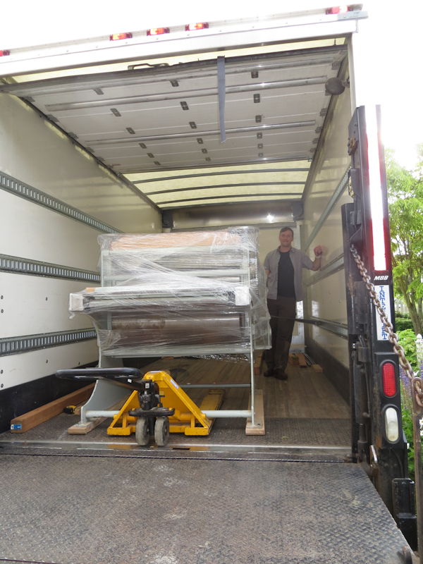
I’ve backed the truck right up to my studio and we’re ready to unload. After the morning’s adventure in loading, I decided to borrow a pallet jack which greatly simplified the unloading.
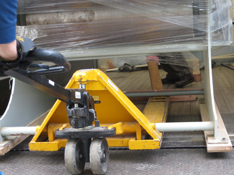
Here’s a closeup of the pallet jack in action. It takes five pumps of the handle to lift the press and it can be gently lowered with the flick of a switch. Kevin is behind the press, prying with a 4×4 while I pull the jack from the front.
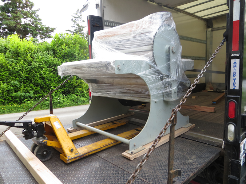
The main challenge in unloading was that the truck bed tilted down towards the lift gate. Our fear was that if we lost control of the press it could shoot off the back and fall to the ground. In the end we used a tie down strap to belay the press from above and we placed a 4×4 at the end of the gate to act as a barrier in case the strap failed. Before starting we made sure that we were strong enough to push the press back up hill and into the truck in case we got the press halfway out and ran into a problem. It turned out to be simple matter to ease the press down inch by inch and we had excellent control the entire time.
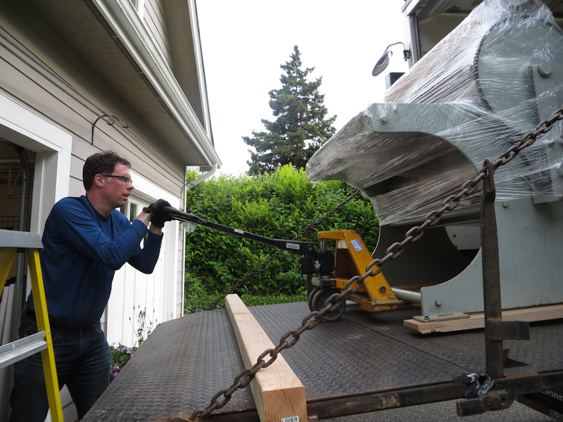
This shot gives a good idea of the slope we were working with. I am beginning to jack up the press so that its entire weight rests on the wheels of the pallet jack. The jack works like those long-handled automotive jacks. It takes about five pumps of the lever to lift the press completely off the ground. Note the 4×4 jammed against the chains. We placed it there in an abundance of caution to catch the press if it suddenly started rolling and the strap failed to hold it.
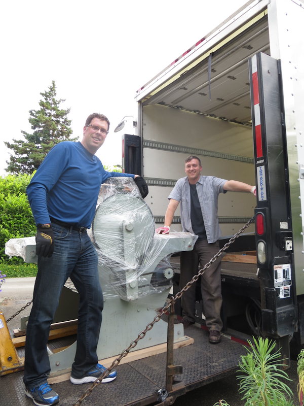
A brief pause for a celebratory photograph now that the press is safely on the lift and halfway down to the ground. The hard work is mostly behind us and we’ve safely dealt with the biggest risks.
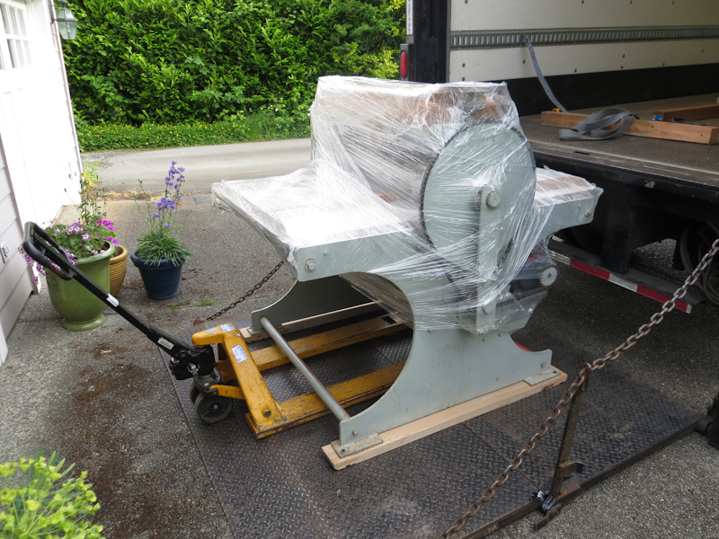
The press is safely on the ground and ready to roll into the studio. The only remaining challenge is to work the press off of the lift gate and keep from getting stuck when it high sides. We were able to get across the edge of the ramp by adjusting the pallet jack height, why levering the press forward with the 4×4.
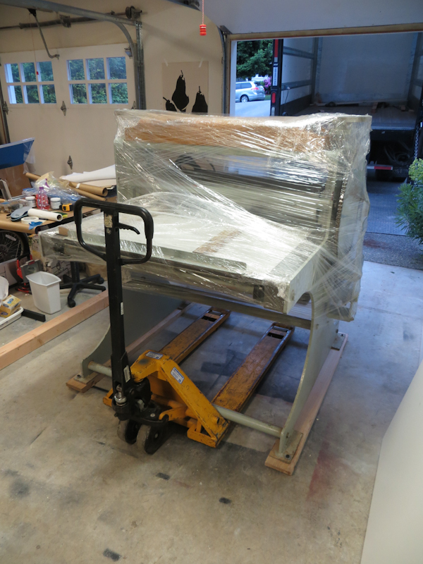
The press looks great in its new home! Now I just need to get some big felts and I will be ready to print.
Laser Cutter

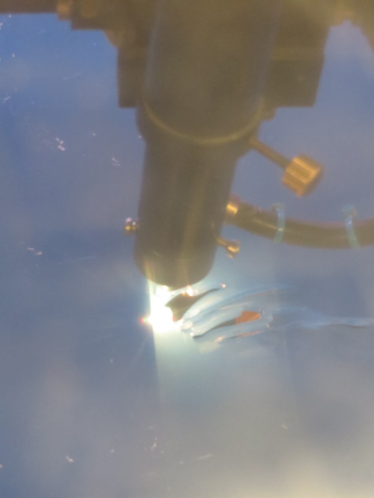
I’m trying a new approach to making giant relief plates. Instead of cutting FPVC by hand with a jig saw, rotary tool, and file, I am using a laser cutter to burn a plate from a sheet of clear acrylic. Goodbye dust and noise and goggles and respirators. Hello fire!

Laser cutters are huge and very expensive. Fortunately Metrix Create: Space in Seattle has one available for hire at really reasonable rates. They charge by the minute, with rates varying depending on your membership level. My 24″ x 30″ plate had about 700″ of cuts and we were cutting at about 10mm/s, so the whole job took about 30 minutes. From reading the laser manufacturer’s documentation, it appears that it can cut my 3/32″ acrylic at 40mm/s which would reduce the cutting time and the cost dramatically.

Today I cut the plate and glued the pieces together. If all goes well I am hoping to pull a print tomorrow!

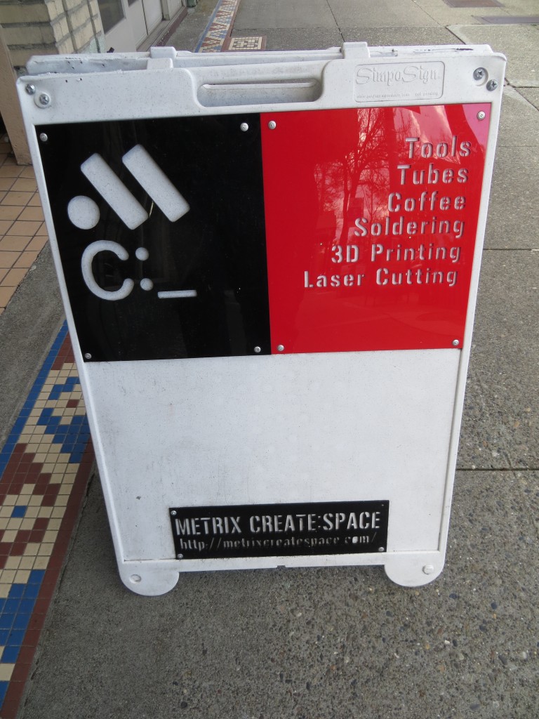
Metrix Create: Space on Capitol Hill near the intersection of Broadway and Roy. In their own words, “Part techshop, part hackerspace, part coffeeshop”. Metrix Create: Space has all sorts of goodies including laser cutters and 3D printers.

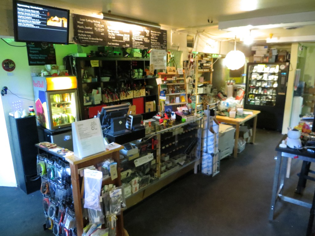
Matrix Create: Space is well stocked for all of your hacking/making/building needs. It is a great place to hang out and meet other builders and the staff are super friendly, knowledgable, and helpful.

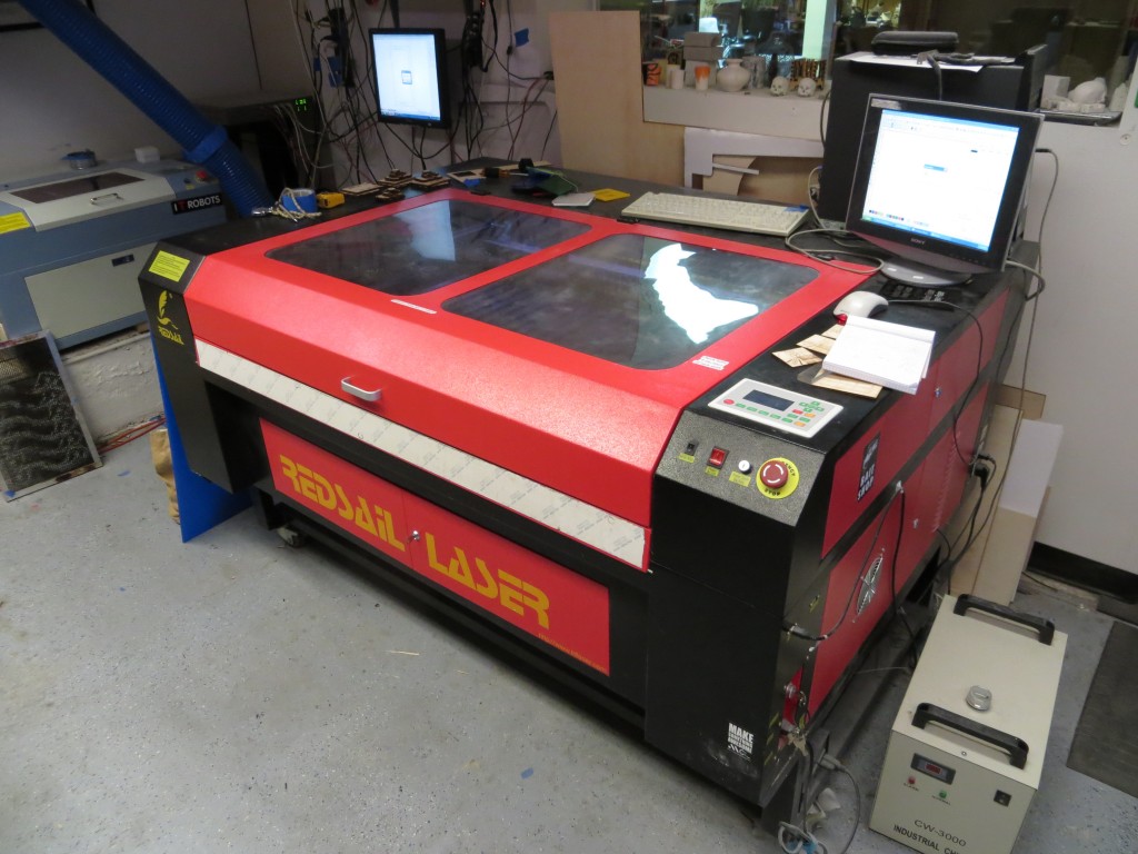
This monster is a 100W FullSail laser cutter. It handles material up to 32″ x 45″. Cuts acrylic and wood like butter at about 1000 dpi.

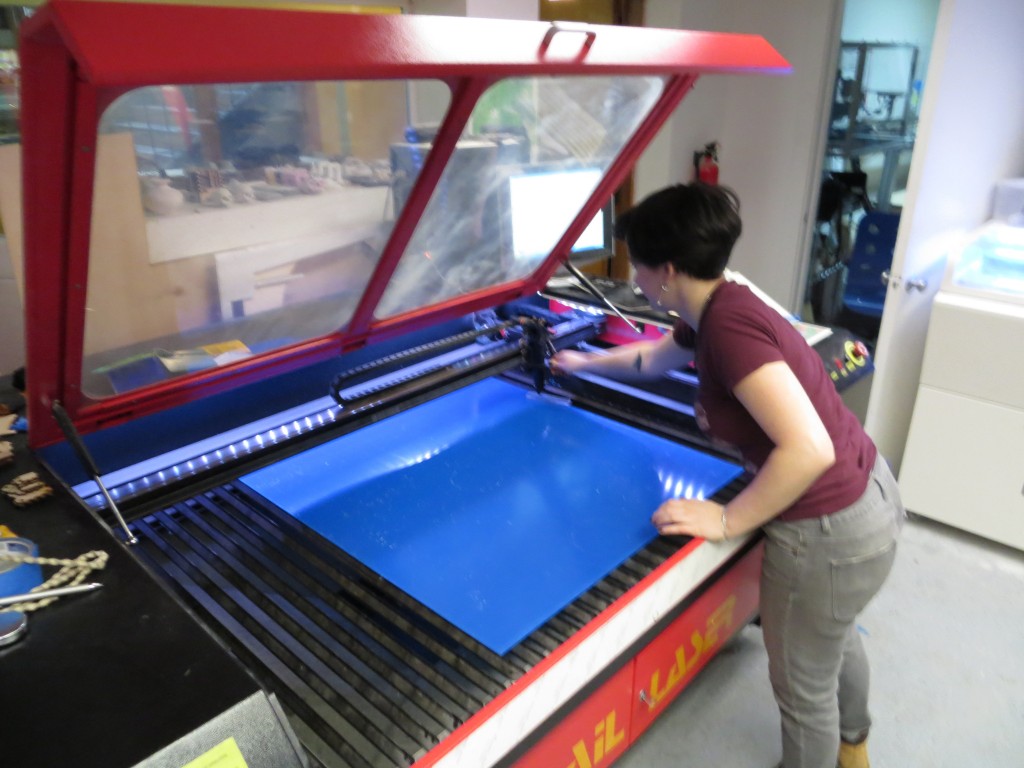
Lauren loads my sheet of acrylic into the laser cutter.

Laser cutter in action!

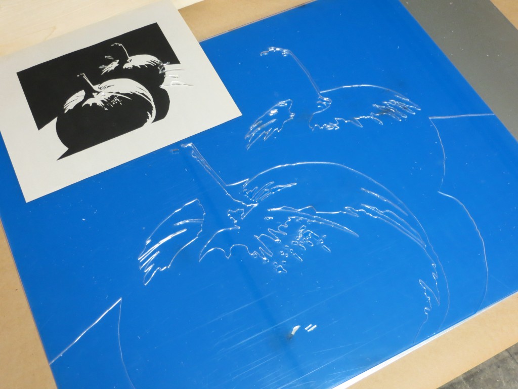
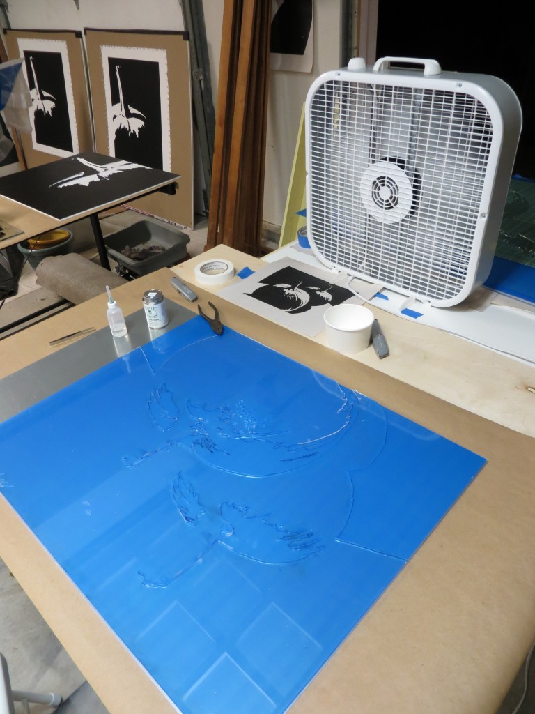
Here’s what the plate looks like fresh from the laser cutter. I am using clear acrylic. The blue that you see is a protective film.

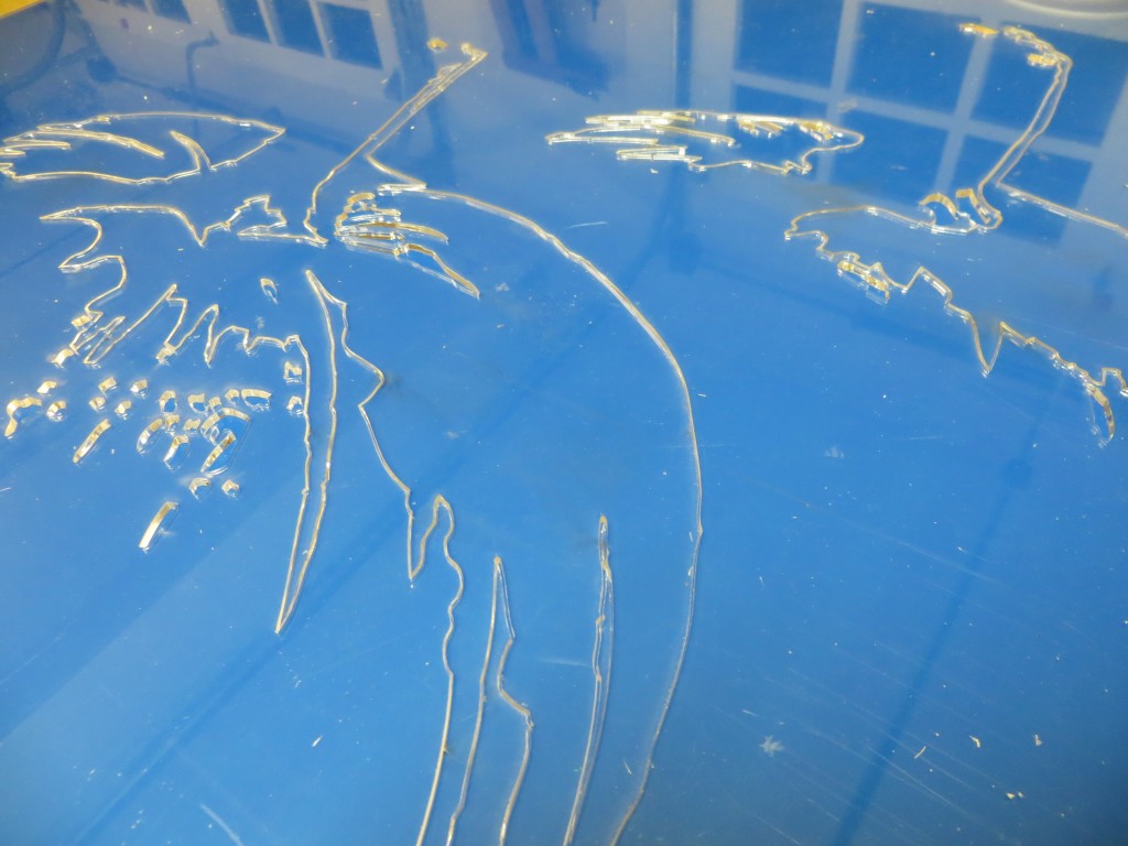
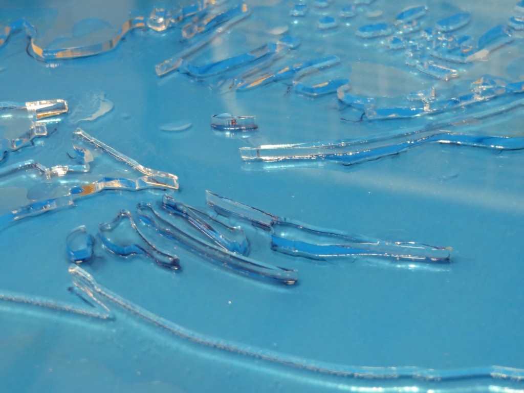
Closeup of the plate after cutting. The clear acrylic sparkles like jewels.

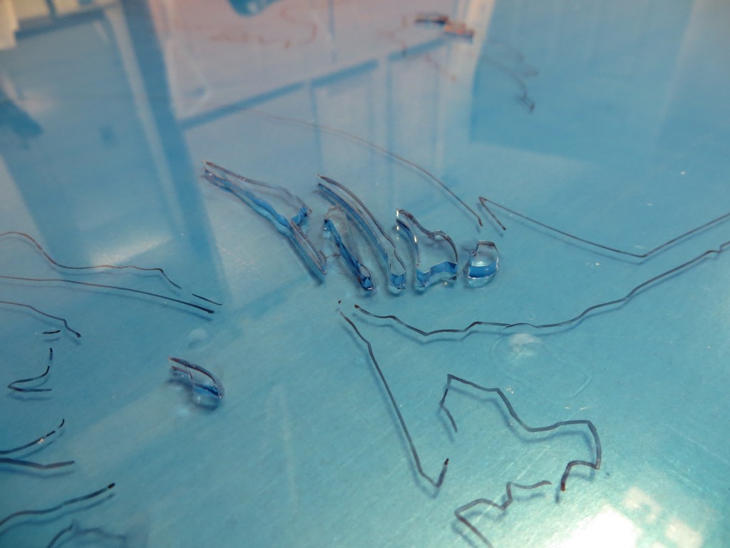
At this point I have just started to cement the small, isolated pieces.

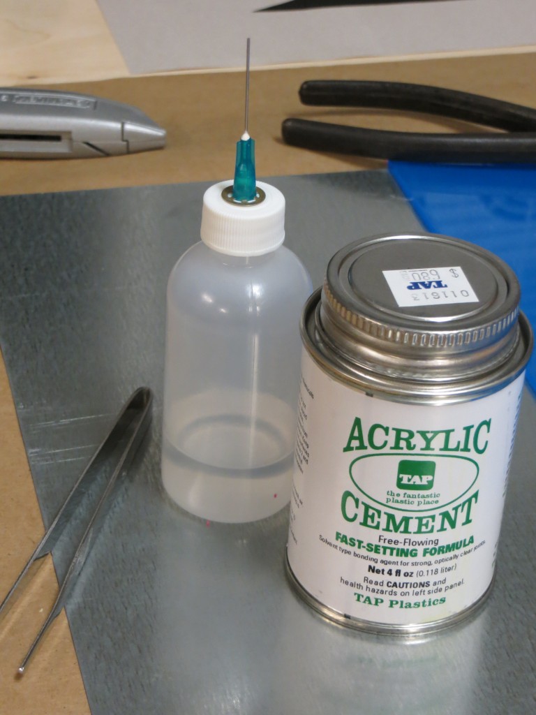
I am using acrylic cement from TAP Plastics to assemble the plate. The syringe bottle shown on the left is a huge help in spreading the cement and containing the fumes. The great thing about the syringe is that you can run it along the joints and they will draw in the cement through capillary action.

Acrylic cement contains methylene chloride and other nasty chemicals that dissolve your brain and latex and nitrile gloves. Use PVA gloves and be sure you have plenty of ventilation!

Closeup of the fully assembled plate.

Ski Lift

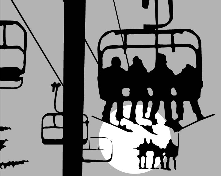
Feeling inspired after a recent trip to Snoqualmie Pass. Thought I’d try a two-plate linocut – something simple, but compelling to practice multi-plate registration and the interactions between ink colors. Here’s an initial design done in Adobe Illustrator.

Cutting Plastic

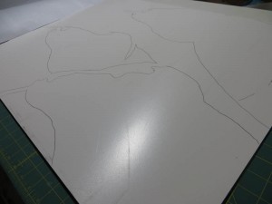
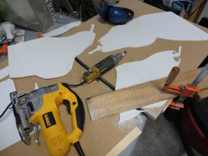
I’m back at work at the 24″ x 30″ plate for the three pears. Today I transferred the design to a sheet of FPVC and started cutting, first with the jig saw, and then with the Proxxon rotary tool. The FPVC cuts like butter and the edges come out clean, but the material is a bit brittle, so I am being careful with the finer cuts around the stems. The Proxxon kicks up a ton of plastic dust that gets on everything, but it doesn’t seem to be small enough to require a respirator. Once I finish cutting, I will probably use a file or an emory board to clean up the edges an then I will glue the pieces to another sheet of FPVC to complete the plate. I can’t wait to see how it prints!

I’ve used Richeson graphite transfer paper to copy the pattern to the FPVC. I thought I would have to reenforce the lines with a Sharpie, but it turns out the FPVC takes the graphite very well.

I roughed in the larger shapes with the jigsaw using a 20 TPI blade. Then I switched to the Proxxon rotary tool with a milling bit for precision edgework.

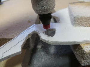
The Proxxon rotary tool makes a lot of plastic dust.

Another Papercut Value Study

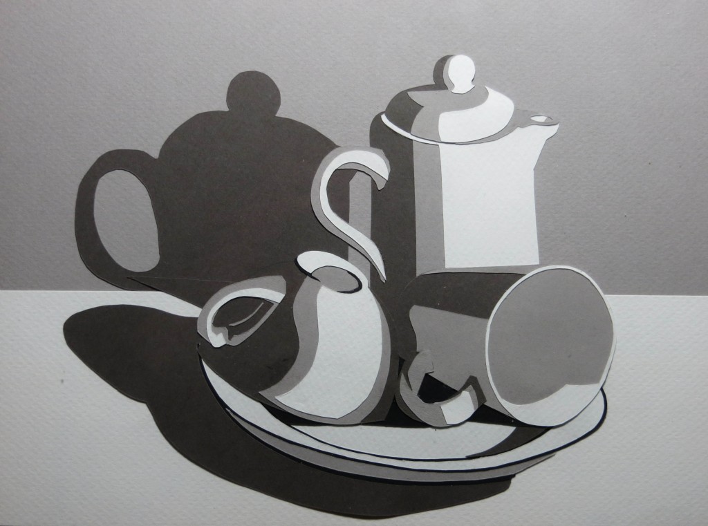
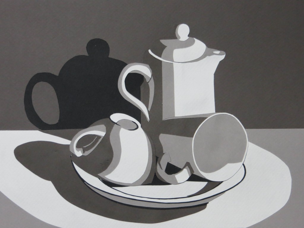
Just finished my second papercut value study for class – this time a still life that I set up in my studio. One of the nifty things about using cut paper is that I was able to try out two different value schemes for the background and the tabletop before gluing everything together.

In the end I decided to go with a dark gray background, a light gray table, and a shimmering pool of pure white light.

Papercut Value Study

This week’s assignment is to create a four-level mastercopy value study using cut paper. The goal of the assignment is to learn how to simplify an image and convey three dimensional form with a limited number of values. We use paper cuts instead of paint for two reasons: using paper ensures we don’t cheat by blending some extra shades of gray and the act of cutting discourages elaborate detail.

I chose to do Edward Hopper’s New York Office. The whole project took about nine hours and at one point I felt like I was playing with paper dolls. One big take away is that there are many ways to approach the design and some are better than others for structural and asthetic reasons. After a three hour false start, I realized it is better to layer the paper in the same order as the items in the scene – in other words, the background should be on the paper towards the back and the forground should be on paper towards the front. I also learned that it is often easier to cut holes that reveal the layer underneath than to cut small pieces to glue on top.

It turns out you can still cheat with papercuts by taking advantage of texture and shadows. One can represent subtle tonal changes with compositions of shapes that are all the same color. One can also use shadows between layers with the same color to represent very fine lines.