Some image ideas for the word, “Glut”. A bit of an homage to Wayne Thiebaud. Cake courtesy of Safeway.

Some image ideas for the word, “Glut”. A bit of an homage to Wayne Thiebaud. Cake courtesy of Safeway.
As the glorious summer fades and the nights grow cooler, it is time to head back to school. I’ve moved back in to my studio at Gage and joined three returning classmates and met four new ones. After a bunch of organizing and unpacking, I started on my first still life for the atelier.

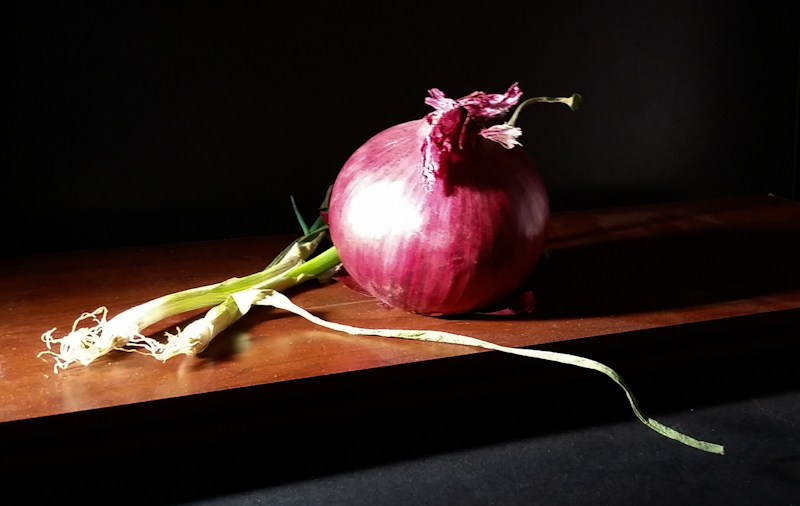
I thought I’d start the year with green and purple chiaroscuro. I set up the scene about three weeks ago, but didn’t get around to painting it until this week. Was happily surprised that nothing spoiled and that the green onion began to take on interesting shapes as its shoots dried.

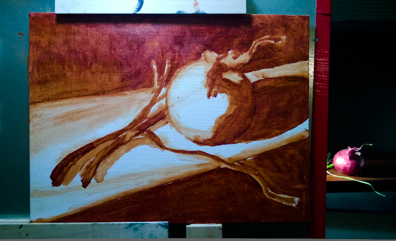
Here’s the combined sketch/underpainting. I’m getting much faster now. I drew the shapes with a paintbrush and then blocked in the values all in about 30 minutes.
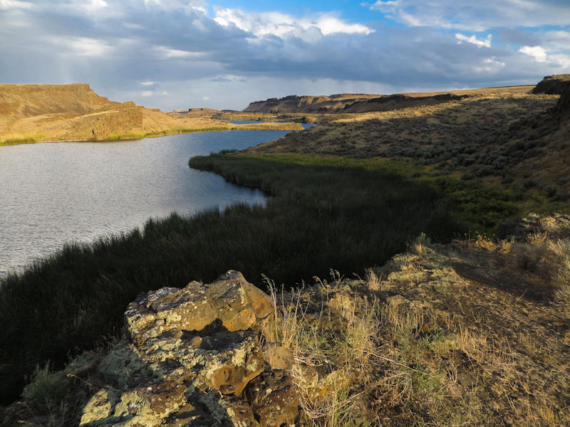
I took a weekend trip to the Columbia National Wildlife Refuge near Moses Lake to do some plein air painting. The area near the Potholes Reservoir Dam is great for plein air. The desert scenery is fantastic and the network of dirt roads has lots of pullouts and parking and access to restrooms and a nearby general store. It’s about twenty miles from Moses Lake.
After a year of studio painting I had forgotten how hard it is to do plein air. The problem is time. In the studio, you can always paint an hour longer or return another day. In the great outdoors, the light is only good in the early morning and late afternoon and it changes constantly. It also takes time to scout locations, and if you are painting far from home, you really have to wrap things up because it is not practical to return.
You also have to pack carefully and make wise use of limited space.
All in all it was a great trip, but I really need more practice.

In order to get the best light and shadows, I painted early in the morning and late in the afternoon. This shot was taken about an hour before sunset.
My project for the past few weeks has been studies in acrylic for the North Cascades design. I chose acrylic because I wanted to be able to move fast and still be able to create definitive edges between the light and dark regions. My first study began as an 18″ x 24″ black and white and then I experimented with a bit of French Ultramarine in the snowfield. The blue definitely helped but I wanted to do something more interesting with the trees which, at this point were just black silhouettes.
My plan is that the final image will be 36″ x 48″. With this in mind, I worked up a second 18″ x 24″ study of a crop containing trees at the final scale. As you can see, I had a lot of difficulty getting the green paint to stick. My first stroke would go down fine, but if the brush touched the paint again before it dried, the paint would lift the paint off of the canvas. After consulting some friends and a quick check of the internet, I determined that the problem was the surface of the canvas pad, which one post on WetCanvas described as “painting on waxed paper”.
I did like addition of the warmer greens and browns and the fact that the tree at the bottom no longer merges with the black background.
While doing the second study, I realized that a triangle of the lower left represents a rounded hill that is closer than the snowfields above. My third study attempted to differentiate these two snowfields, while doing a better job rendering the tree silhouettes. I used a bit of Prussian Blue in the background. The trees are Raw Umber, lightened in some places with Light Green (Blue Shade).
I chose these specific colors because they are some of the most opaque in the Golden Heavy Body Acrylic line. I also switched to a piece of pre-primed Dick Blick canvas which took the paint better than the Fredrix Canvas pad.
I like the direction the piece is going, but I have to work through a few more issues before starting on larger image.
The first challenge is differentiating the snowfields in the distance from the closer snowfields, without losing the magnificent contrast. The third study uses a uniform region of light blue, and this approach seems less effective than the streaks of blue in the first study. The first study really retains the brightness of the snowfields while using texture to indicate shape. I also like the color of the French Ultramarine in the first study more than the Prussian Blue in the third study.
The second challenge is differentiating the near darks from the far darks. I’d like the far darks to be cooler, but I don’t want to lighten them from Mars Black, so I plan to make the nearer darks warmer. Putting my darkest darks in the background will break all the rules of atmospheric perspective, but I think in this case it will look better. I may also need to use a warm gray to add some rounded form to the near snowfields. Whatever I do, it will be subtle.
The third challenge is to make the trees more interesting and less flat, while still retaining high contrast against the background snowfield. I will probably try painting the trees in multiples layers, going from dark to light, with the dark layer being almost black. The trees will be as light as those in the second study, but they will contain enough dark that they will really stand out against the white.
Finally, I plan to simplify the dark shapes in the distance, while adding more rocky and brushy texture to the nearer darks. Should be exciting!
I saw an excellent print show entitled, “The Language of Prints” at the Johnson Museum of Art at Cornell University. Runs through July 27, 2014. Here are some of my favorites.
Just finished a small, 6″ x 12″, oil study for my Keechelus Lake painting. I’ve been noodling around with this idea for over a year, starting with a gouache painting and progressing to a simple Illustrator drawing, and then a more complex illustrator drawing.
The color scheme for the study uses a single string, anchored with Cadmium Orange and Prussian Blue. Most steps include a bit of Quinacridone Violet and Titanium White. The darkest step also has Burnt Umber.
I’d like to try a few more color schemes, including Red/Green and Blue/Yellow or Violet/Yellow. Also want to look again at Blue/Orange, but with a lighter sky. After that, I will probably try a slightly larger study to figure out atmospheric perspective in the hills and the ground.