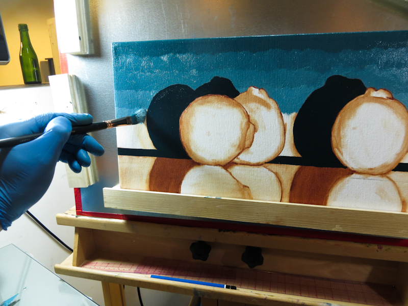
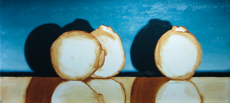
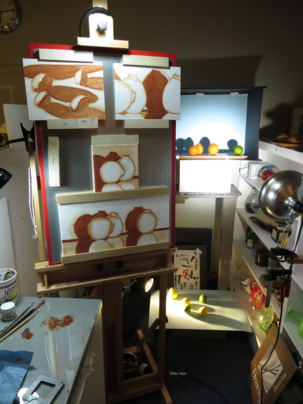
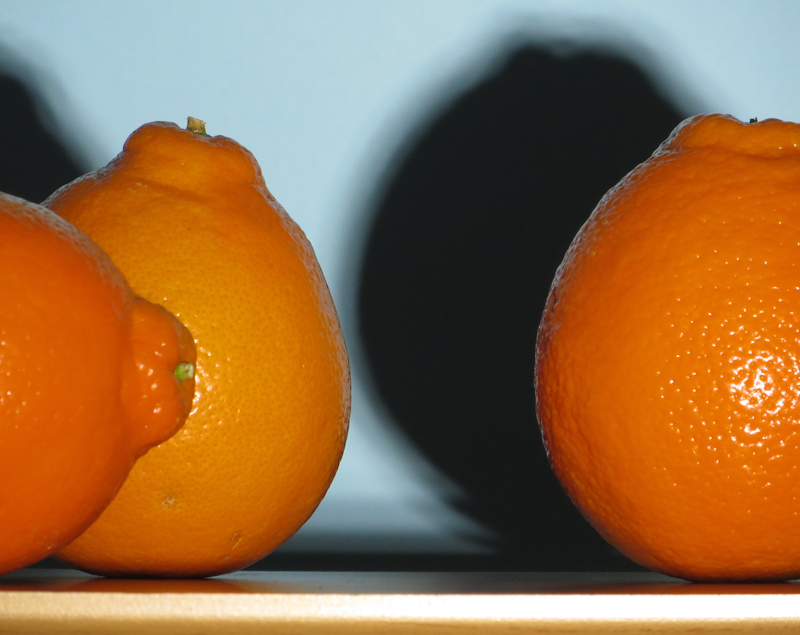
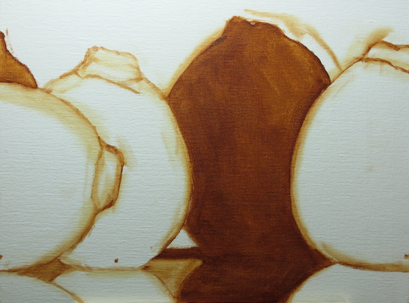
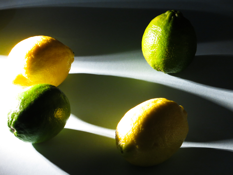
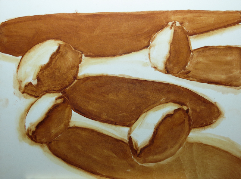
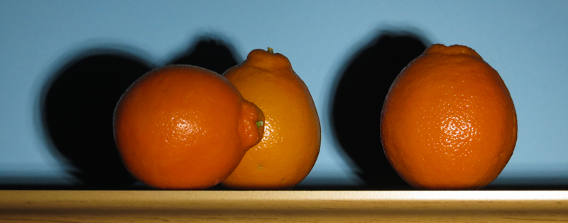
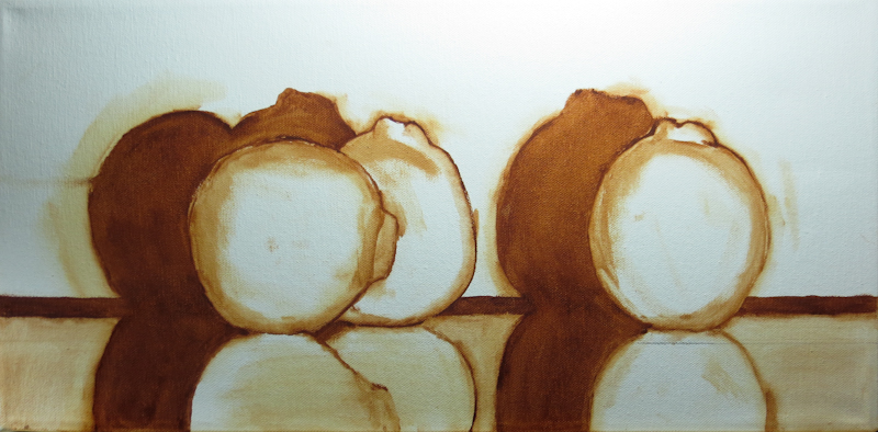
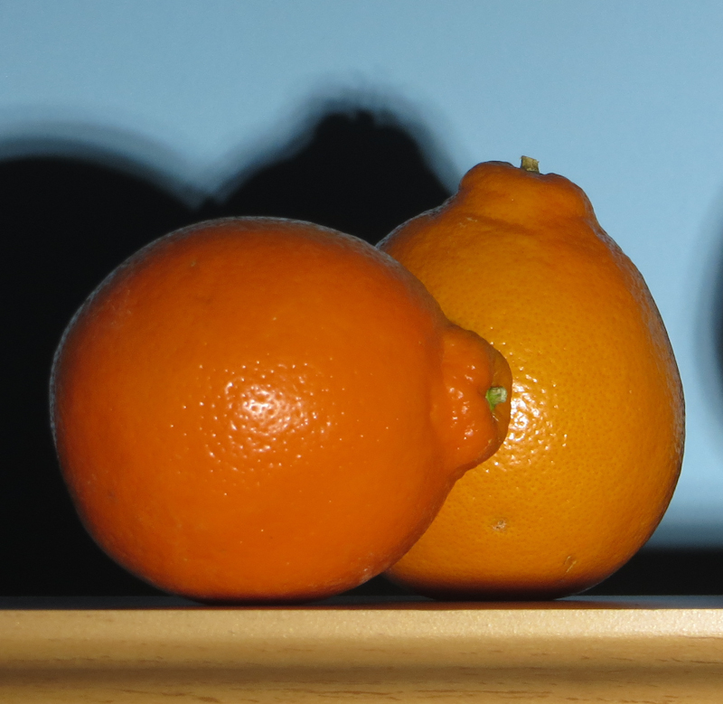
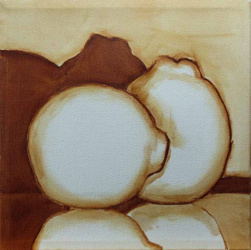
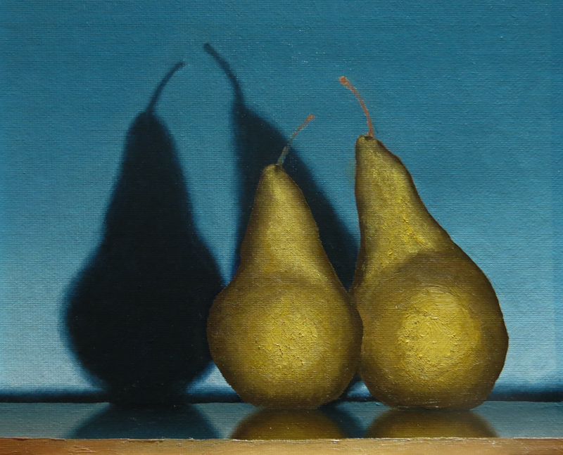
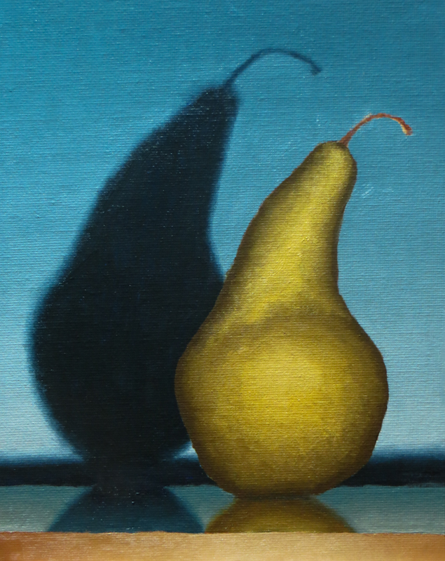
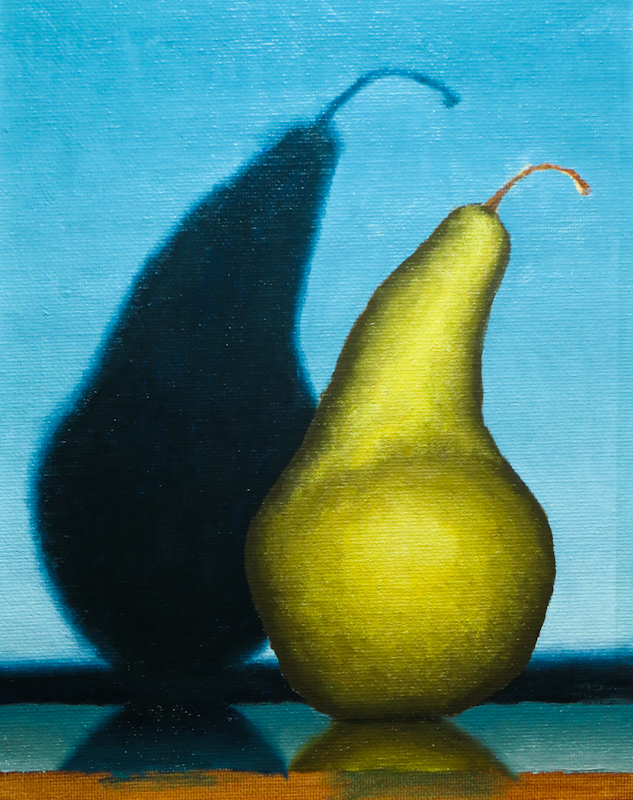
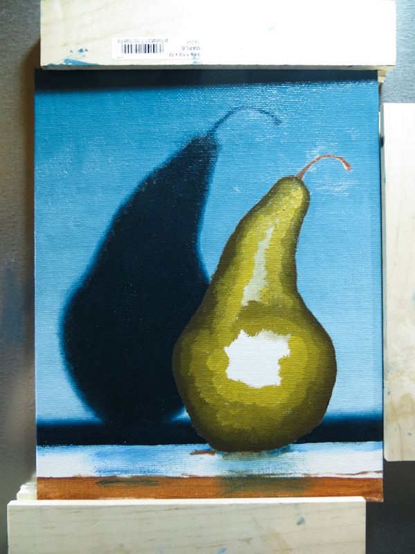
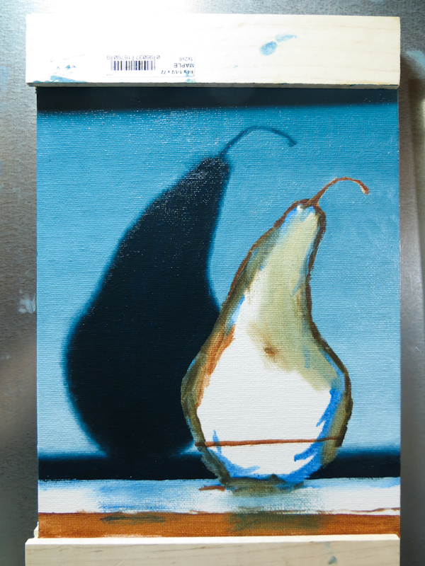
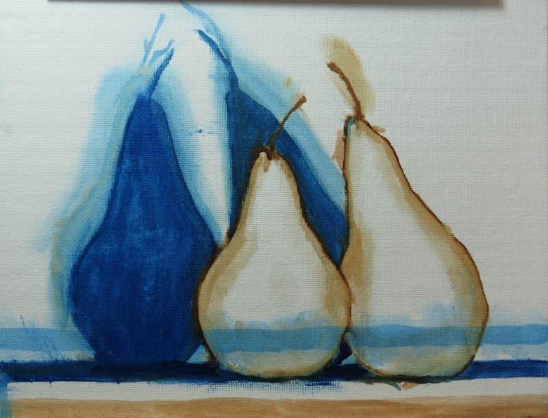
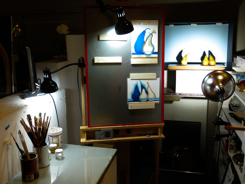
Today I blocked in the last of the four paintings and then started on the shadows and background gradient for the largest painting, which is 10″ x 20″. The large size and late hour conspired to keep me from working on the other three paintings. My hope is that in the next session, I will be able to do the shadows and backgrounds on the other three.
Category Archives: Uncategorized
Starting Four New Paintings
This may seem crazy, but in the spirit of quantity over perfection, I am starting four new paintings. I’ve found that I’m pretty good at coming up with designs, waiting for my paint to thaw, mixing the colors I need, and washing brushes. The area where I need practice is paint handling – the myriad ways of applying paint to canvas – from smooth gradients to thick palette knife impasto, to soft edges. The way I figure it, if I work on multiple paintings simultaneously, I can amortize the design, thawing, mixing, and cleanup over more hours of paint application. That’s the theory anyway.
Originally, I was going to try three paintings based on two tableau, but I added in a fourth, 8″ x 8″ painting for the Maple Valley Creative Arts Council’s Ten-Twenty-Forty fundraiser.
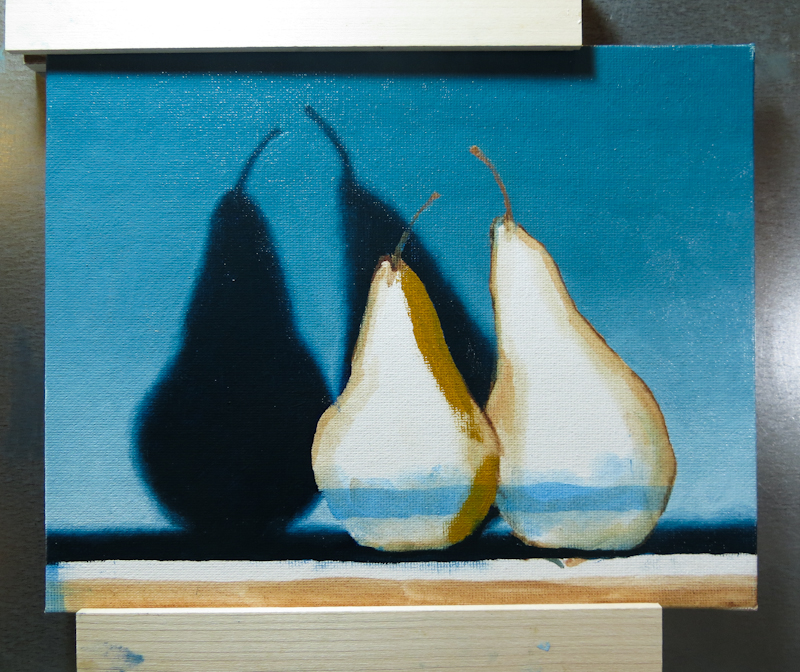
Pears Almost Finished
February 25, 2014
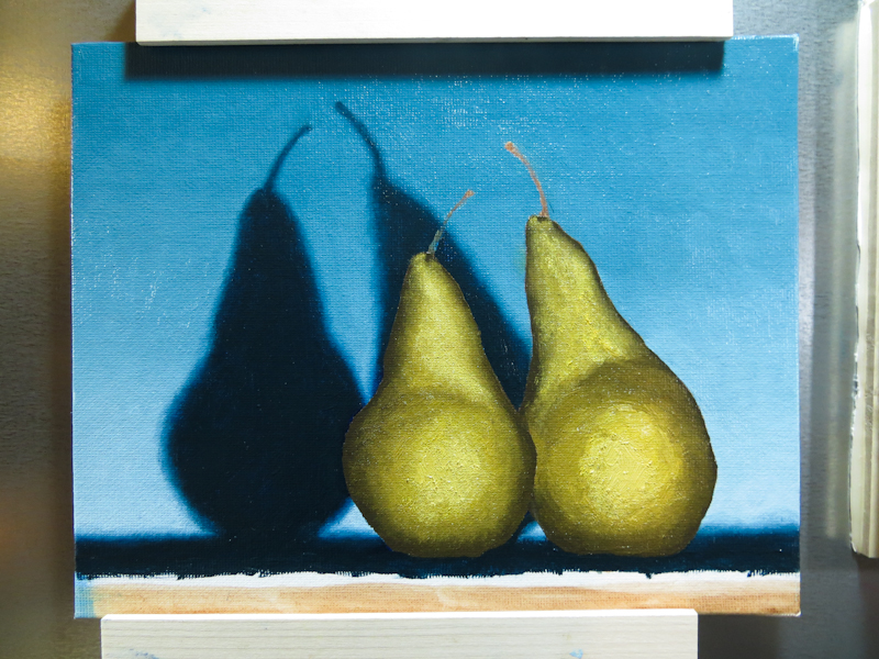
This evening I painted reflections. I’m really learning a lot about making smooth gradients. It is really important to mix a lot of steps. If you don’t start with closely spaced steps, you can blend until the cows come home and you either won’t have a gradient because everything mixed together, or it won’t be smooth. Use more steps and everything just works.
Stretched Canvas Holders
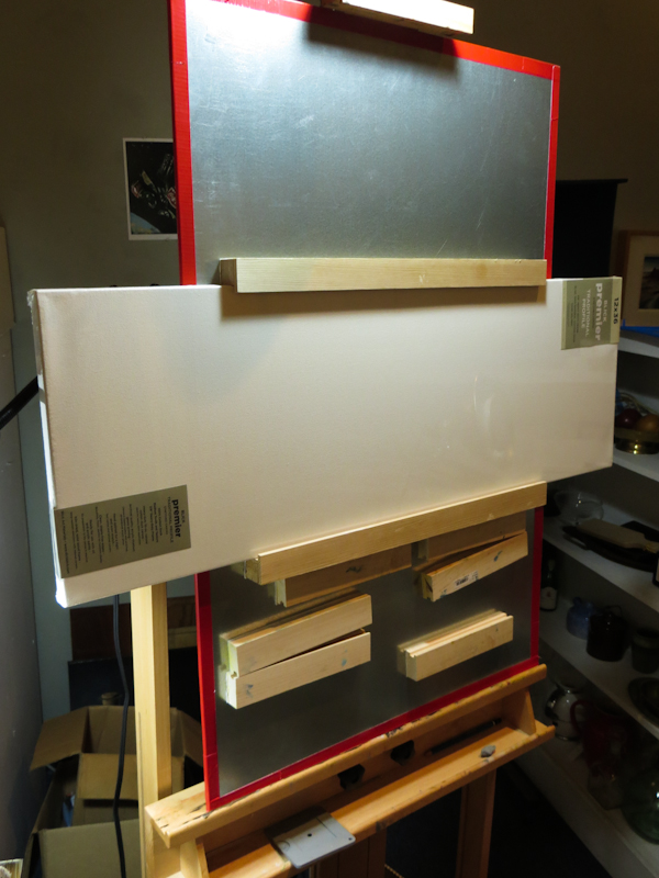
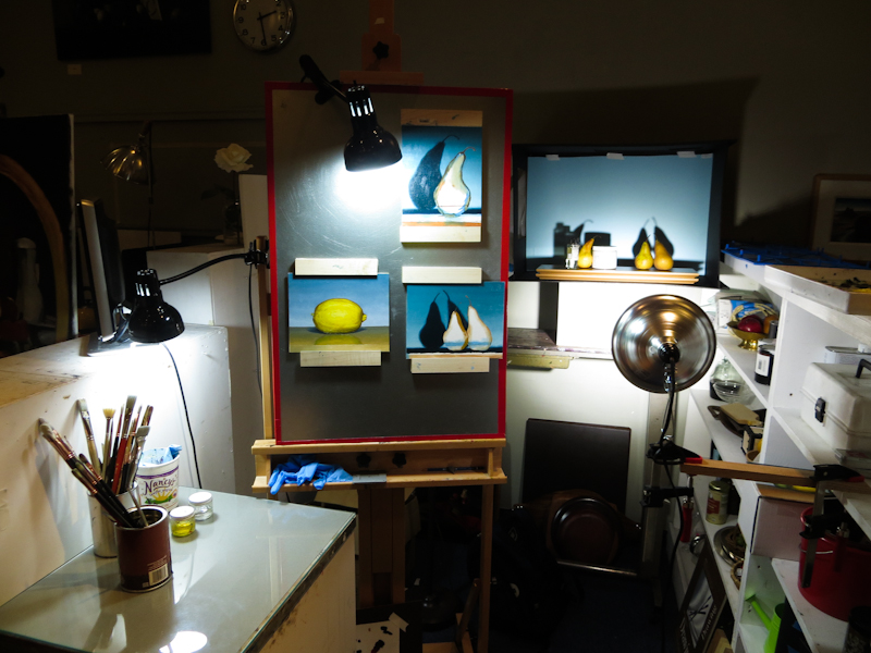
My magnetic canvas holders have been working really well and I’ve been so inspired by my small pear studies that I want to do a larger piece on a 12″ x 36″ stretched canvas. The only problem is my original magnetic holders were designed for 1/8″ panels. Over the weekend I made a pair of magnetic holders for stretched canvases that are 7/8″ deep.
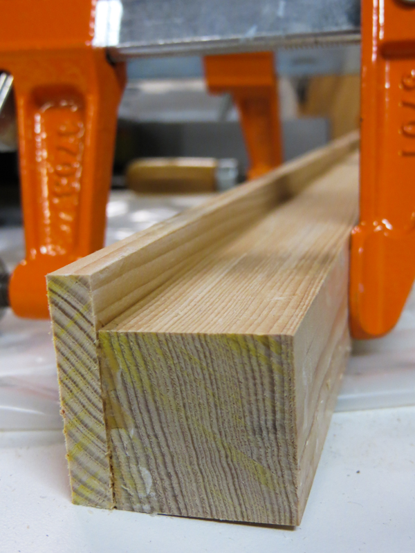
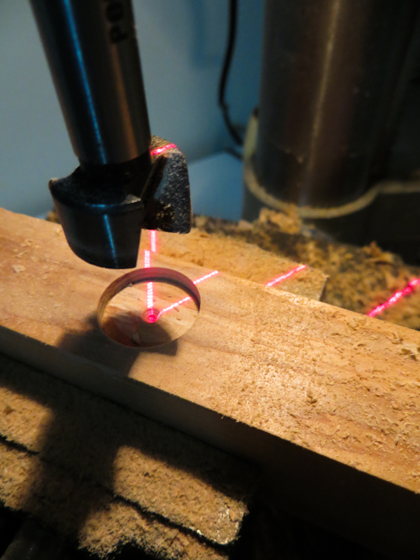
My original panel holders used a narrow slot to hold the 1/8″ thick panels in place. My stretched canvases are 7/8″ deep so I used a different design with a thin lip of lath to hold the canvas in place. In this photo, I’ve just glued and clamped a piece of 1 1/8″ lath to a piece of 1″ x 1″ stock. Once the glue dries, I will drill holes on the right side for the magnets.
New Light Bulb
Up here in the Pacific Northwest we don’t get a lot of sunlight, so we have to supplement with artificial light. For the past few years I have been working with 5000k full-spectrum fluorescent bulbs. These bulbs give off a natural looking, neutral white light and are available in a variety of styles from the traditional four-foot tubes to the coiled compact fluorescent bulbs that screw into standard light sockets. These bulbs are great because they don’t put out a lot of heat.
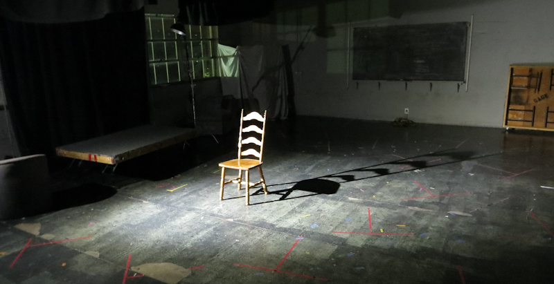
In the atelier I’ve been using a 27W CFL bulb to light my still-life tableaus. This bulb is not very bright so I have to position it close to my props and this leads to very soft shadows that are hard to discern, even when the props are in a shadow box.
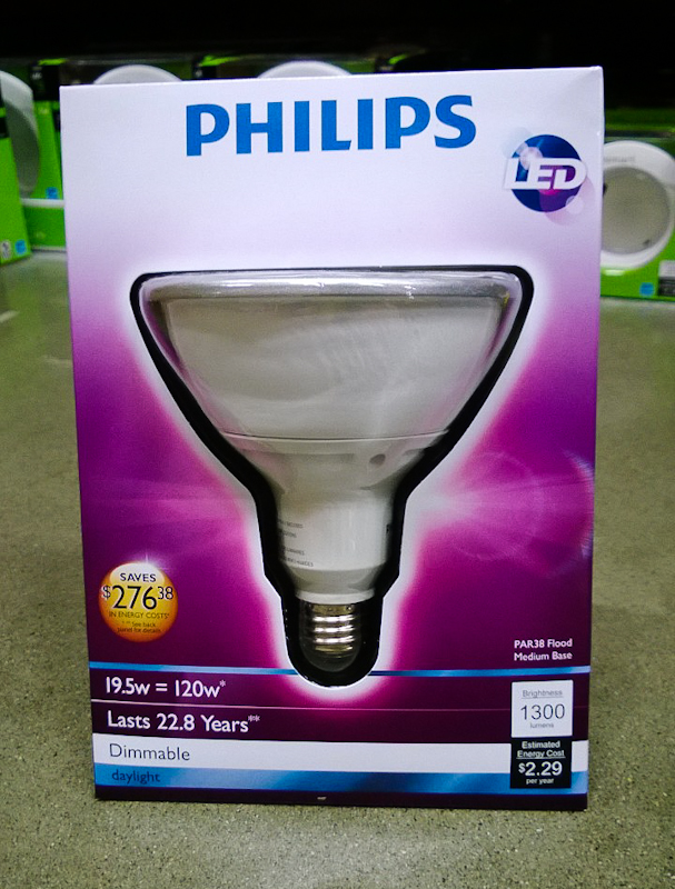
Last week as I was walking the aisles of the hardware store, looking for magnets for my canvas holders, I happened to go down the electrical aisle and saw a new 19.5W LED flood light bulb that puts out 1300 lumens at 5000k.
The LED bulb was about $40 and it has been a huge improvement over the CFL bulb. It is extremely bright and the light falls in a fairly tight, 30 degree cone. This allows me to position the bulb about 6 feet back from the set, which makes it more like a point source.
With this bulb, the form shadows and cast shadows are visible, even when all of the room lights are on. The only problem with the bulb is that it weighs about a pound and this makes it hard to position in clamp-on holder. I find that if I don’t take precautions, the lamp will tend to shift over time until it is pointing at the floor.
Orange Jar with Lid
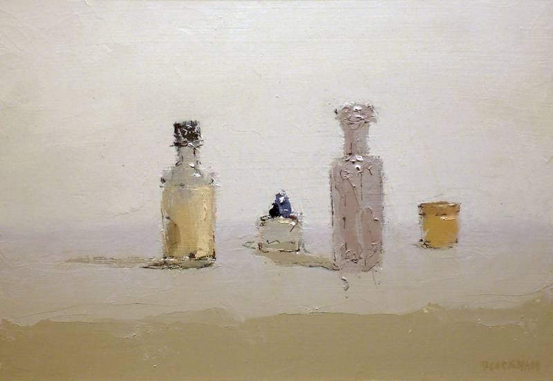
I love this simple painting by Brian Blackham. Just a few stokes of the palette knife say everything.
February 18, 2014
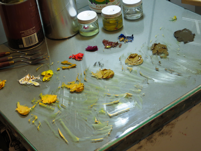
The string for the pears is made up of Cadmium Yellow Light, desaturated and darkened with Burnt Sienna and French Ultramarine. The lightest two steps also use Titanium White and Cadmium Red.
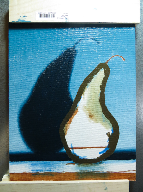
Here I’m working from the darkest step into the light. Since the pear it lit from the front, the darkest darks are around the perimeter.
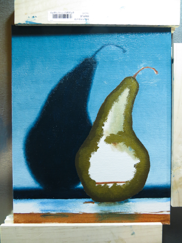
At this point the values can be deceiving with the darks appearing much darker than they should be. It is important to stick with the plan until all of the steps can be seen in context.
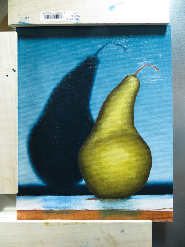
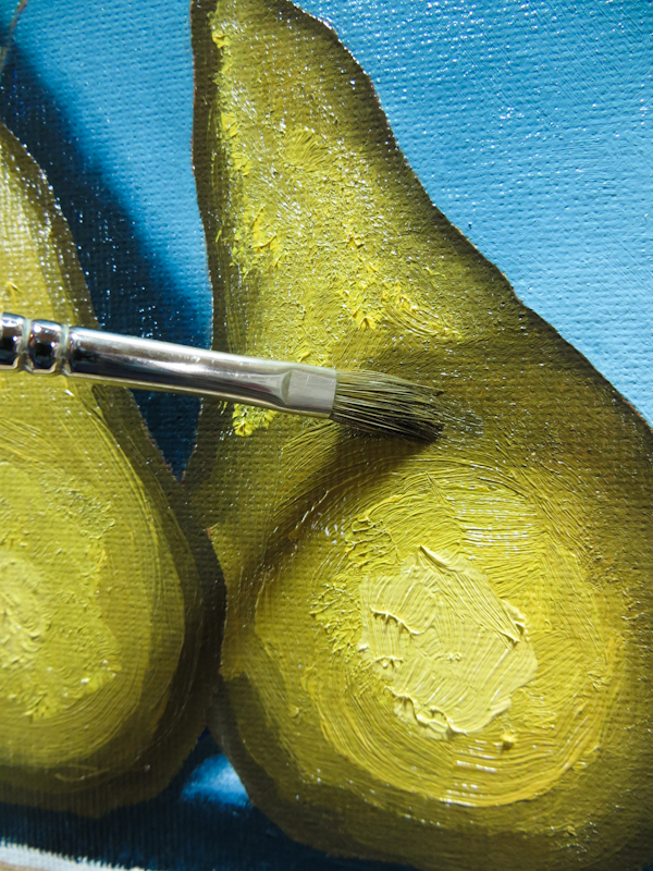
The pear after smoothing. My technique was to first smooth the gradient, using a bristle brush that was wiped clean every few strokes. Then I adjusted the form by alternately dabbing on bits of paint from two bristle brushes, one for darks and one for lights. I would tend to hold the brush perpendicular to the canvas and let the bristles splay a bit in order to get a nice texture. I found it was helpful to alternate between light and dark, working over the entire surface of the pear, instead of focusing on any single area.
February 17, 2014
I stayed up late to paint in the backgrounds of my pear and shadow pictures. I’m finding that it is easier to start with the background, particularly if it involves a smooth gradient that is darker than the foreground.
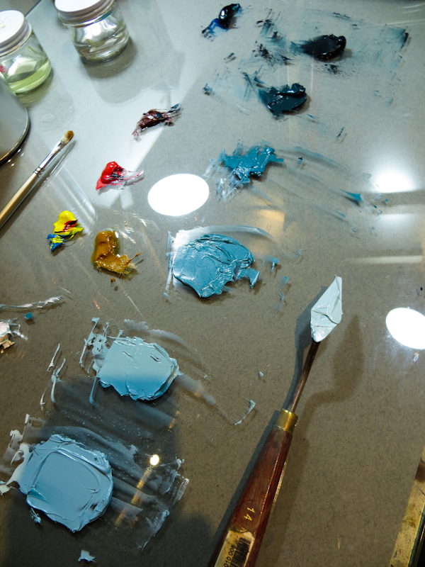
The string for the background was based on Prussian Blue. The lighter values were desaturated with Cadmium Yellow and Red and then lightened with white. The darker values used Burnt Sienna instead of Cadmium Red.
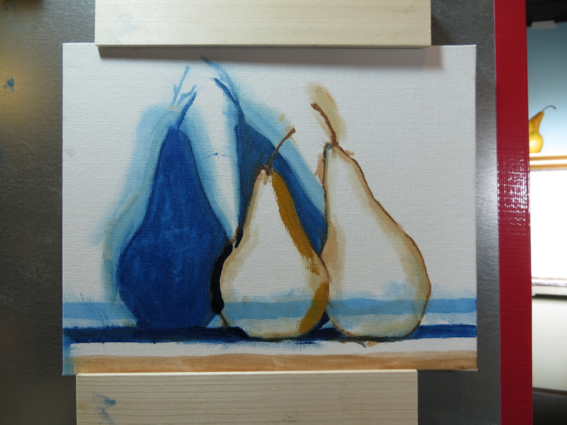
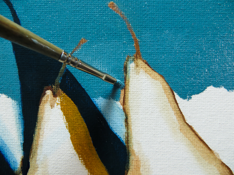
Before working on the background, I adjusted the pear shapes to be a little less generic. Adjustments were in Yellow Ochre and Prussian Blue. Note in particular the restating of the lower left edge of the left pear to show a larger triangle of light blue background. The upper right edge of the left pear was restated to make the shape less generic.
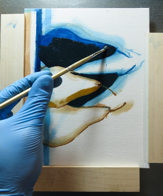
The new magnetic easel really comes in handy for exacting edge work because I can easily rotate the piece I am working on. I will still have to practice painting in all directions if I want to do large paintings.
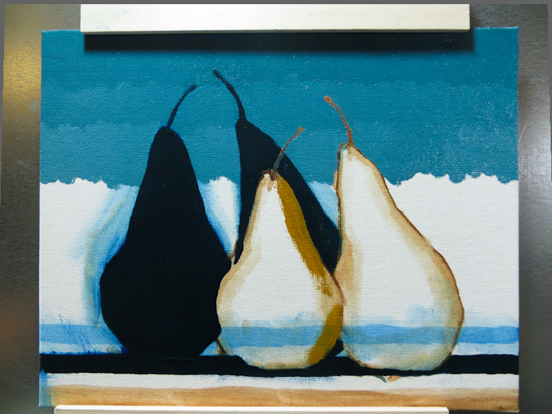
I mixed a string of four values for the background gradient, and then painted steps of these values and the three in between. I’ve found that it is best to work from the darks into the lights. When working from light to dark, the lighter values can easily obliterate the darker values because the lighter pigments tend to be opaque while the darker pigments are transparent.
Exciting Pear Pictures
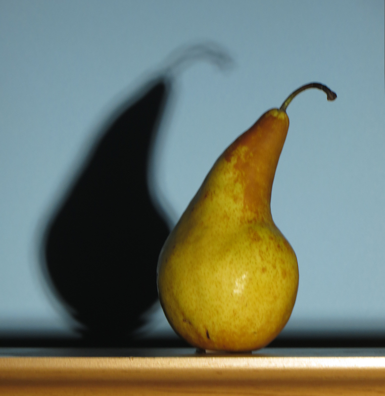
Today I stumbled upon an exciting new image idea: front-lit Bosc pears casting shadows on a sky blue background. Like many ideas in art, this one was born of serendipity. I had been painting citrus with front lighting against a light blue background when my classmate Christina remarked that the shadow of my easel on the painted background created a deep dark blue that looked really nice.
Then today I was testing out a new, super bright light bulb (Philips 120W Equivalent Daylight 5000K PAR38 Dimmable LED Flood Light Bulb) with some pears and the light was bright enough to cast visible shadows in the ambient light of the studio. The interplay between the shapes of the shadows in the background and the pears in the foreground reminded me of my Less Is More print series. It seemed that any arrangement of fruit and shadows showed promise. Here is one example:
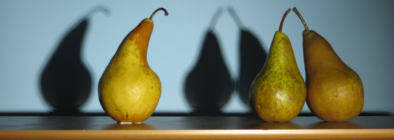
I am fascinated by the interplay of the deep blue shadow shapes and the yellow pears. This idea has lots of potential.
Since I’ve been focusing on smaller paintings recently, I decided to break the scene into two separate images, with the goal of returning to do a more complex arrangement after a bit of practice.
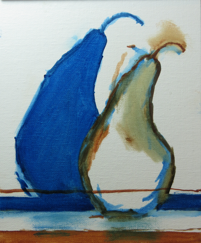
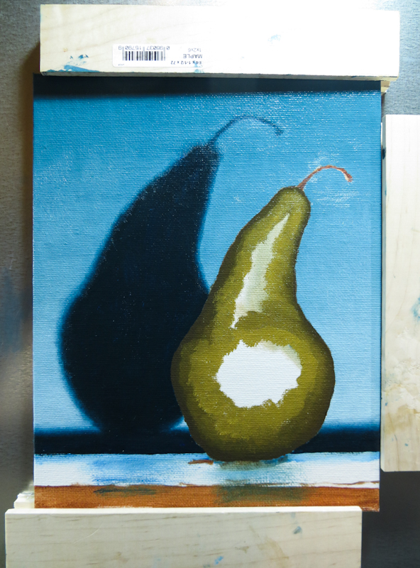
Here’s the block in. I especially like how the front of the tabletop is bright, the top of the table is mid-tone, and the shadow of the tabletop is dark.
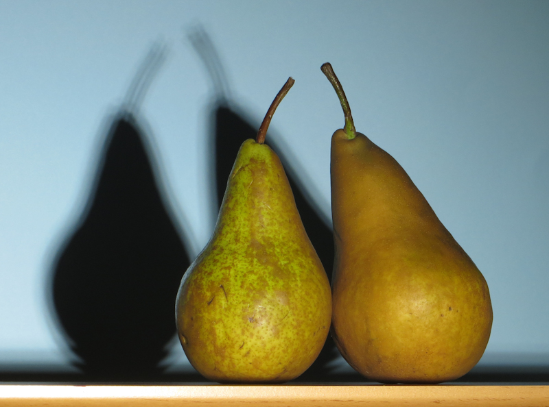
This is an interesting composition. I also like the reflection of the blue background on the left side of the left pear.

