New Wave Palette

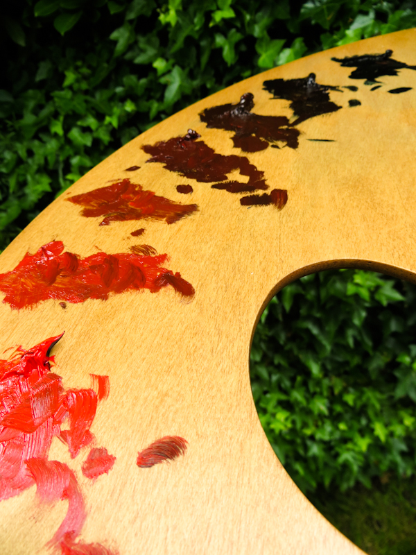
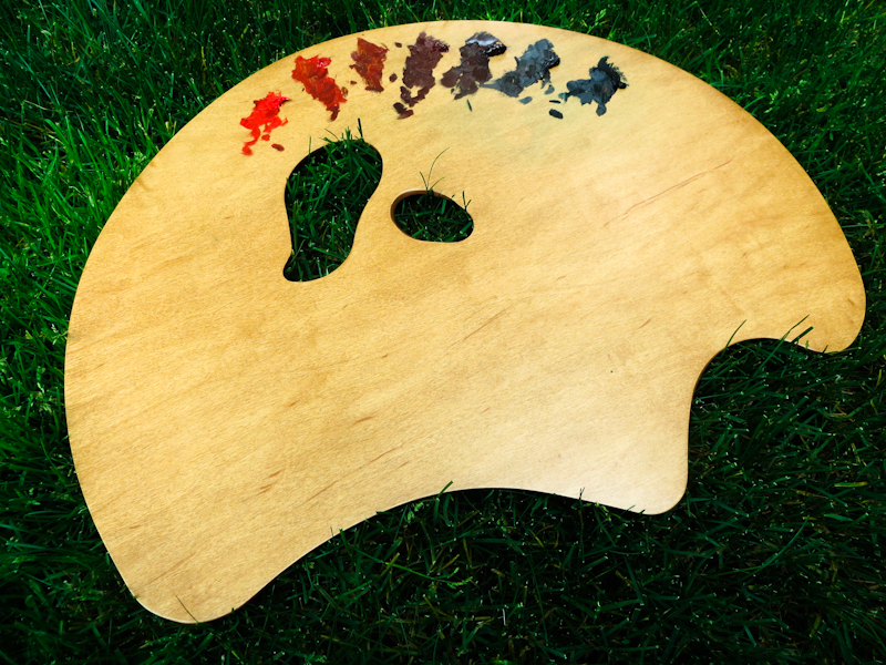
I’m trying out a new palette from New Wave – it’s their Grand View Confidant model. The palette is gigantic, but very light weight and it has an ergonomic design which rests nicely against my hip. The wood is beautiful and the finish like satin.

Before I got the palette I would mix up strings on a piece of glass, but as I’ve started working on larger paintings, I have found that I do better standing, with the palette in hand. I still use strings, but with the palette, I tend to mix each stroke individually, which leads to a more interesting and realistic painting. Painting this way also seems quicker and easier.

May 25, 2015

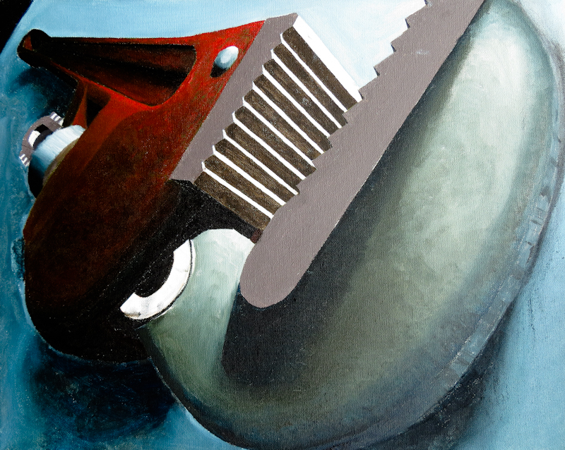
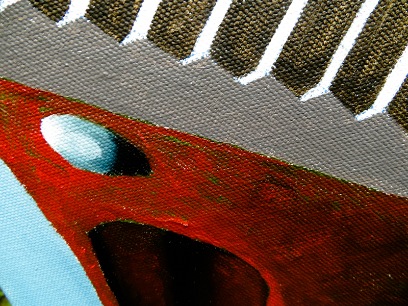
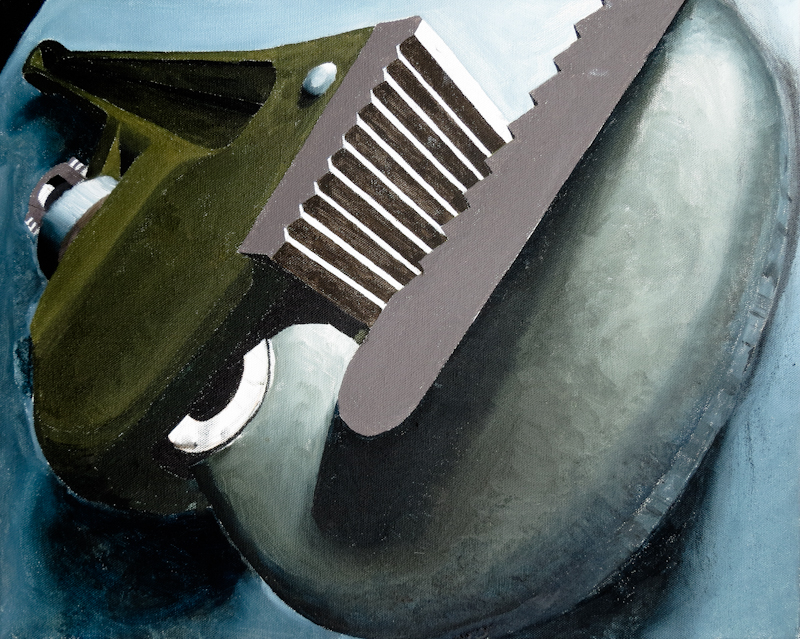
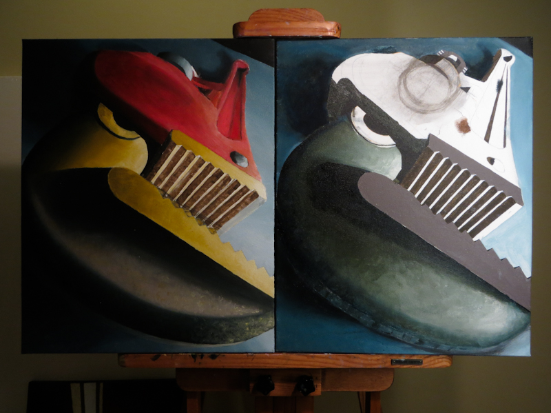
Today I painted a broken layer of red over the green on the handle. My string was based on Cadmium Red, desaturated with Terre Verte Hue, and darkened with a mixture of Raw Umber and Prussian Blue.

I really like the effect of the broken color. Painting the red went much quicker than the green, since all I was doing was changing the hue, while leaving the value alone. The technique is quite versatile – dabbing the paint gives a solid fire engine red, while rubbing it in yields anything from a desaturated red to a neutral to a green. Really cool.

May 17, 2015

I’ve covered the bottom of the handle with a dark green in preparation for a layer of fire engine red. The idea is that flecks of dark green will show through holes in the red paint. This should make it look like the paint is flaking off of the handle from years of wear.

The green on the handle is a bit warmer and lighter than I would like, so before adding the red paint, I will probably sponge on some dark blue to bring down the value while leaving patches of cooler color to show through the red.

The jaws are almost dry enough now for the next layer, which will be warmer and rust-colored.

I also need to fix some drawing errors in the linear gear and the knurled knob.

Natural Sponge Textures

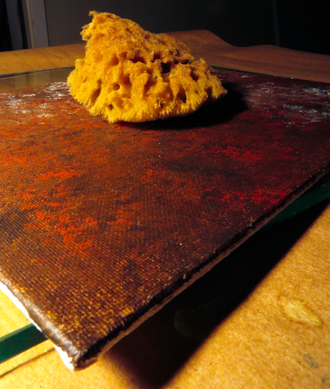
I’ve been experimenting using natural sponges to create rust textures for my Pipe Wrench study.

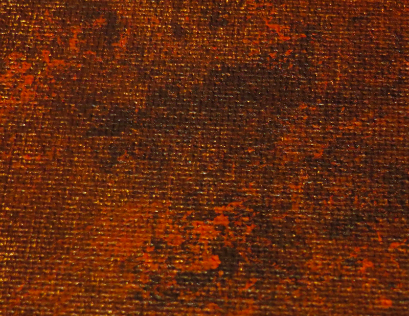
This example uses Golden Heavy Body Artist Acrylics on a canvas panel. I first painted a mixture Raw Umber and Burnt Sienna across the entire surface of the panel, using a large, flat brush. Once this was dry, I used the sponge to mottle on blobs of pure Raw Umber and Burnt Sienna.

This experiment was a great success. Next step is to repeat it in oils, and possibly add in some notes of green.

May 12, 2015

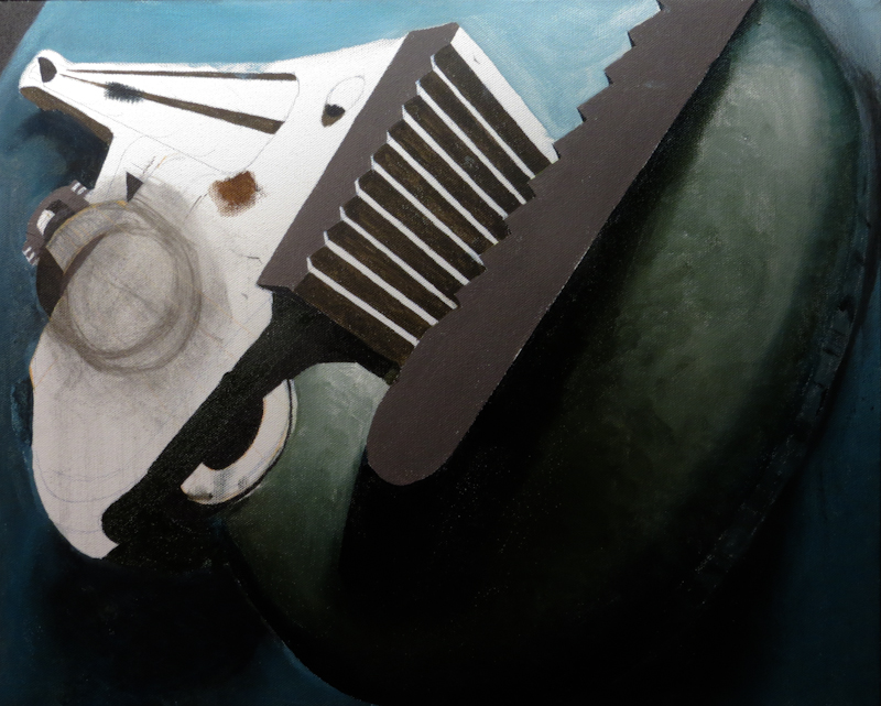
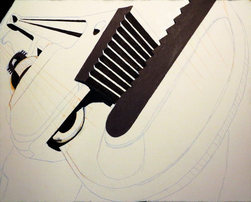
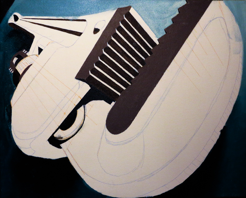
This evening I started painting the bottom layer of the metal texture for the second Pipe Wrench Study. Right now the color scheme looks dramatically different, compared with the first study, but this will change as I scumble a warmer, rust colored, texture on top of the green.

Here’s a close up view. The charcoal circles on the left are critique notes, drawn directly on the canvas.

David Shratter

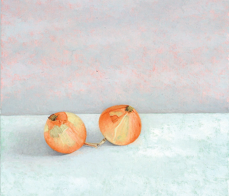
I love this painting by David Shratter. The design is the essence of simplicity, but close inspection of the craftsmanship in that paint surface reveals layer upon layer of complexity. One really nice touch is the use of broken color in the background. The top half uses a broken blue gray on a magenta ground, while the bottom uses a broken neutrals on a blue green background.

The piece is in the permanent collection at the Tacoma Art Museum and is currently on display as part of the The Still-Life Tradition in the Northwest exhibition
March 1−June 7, 2015

Duet V, David Shratter, 2002

Detail of Duet V by David Shratter

March 31, 2015

This evening I started working on the teeth on the upper half of the jaws and then on the side of the linear gear. I had to work with a bunch of new vanishing points, but am now pretty happy with the drawing. I “inked in” jaws and the linear gear in acrylic to get a feel for how they would look, before starting on the oil-based under-painting. The jaws use a blend of Paynes Gray, Raw Umber, Burnt Sienna, and Titanium White.

I finished my session by quickly painting in the table top and shadows using a thin wash of Prussian Blue, Burnt Umber, and Titanium White from Winsor Newton’s Artisan line of water mixable oils. Overall I like the look, but I think the final background should be lighter along the top edge, and probably less saturated.