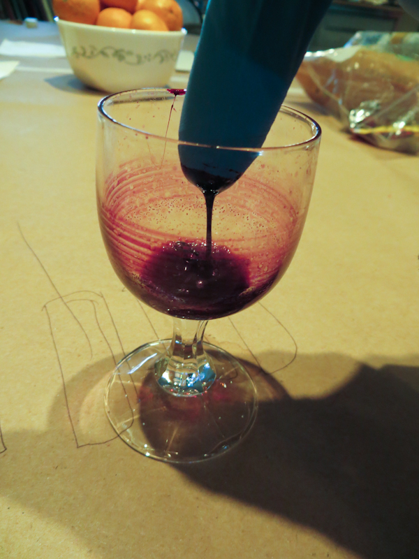
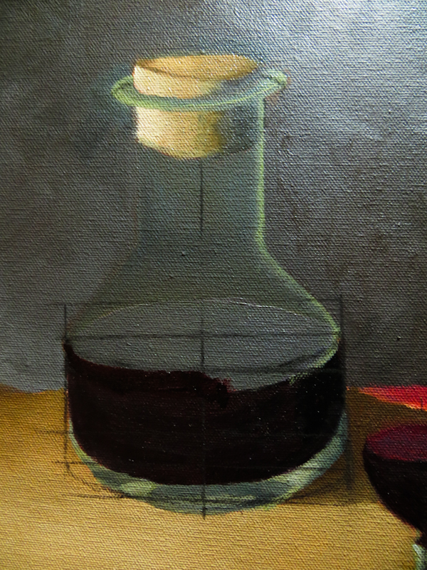
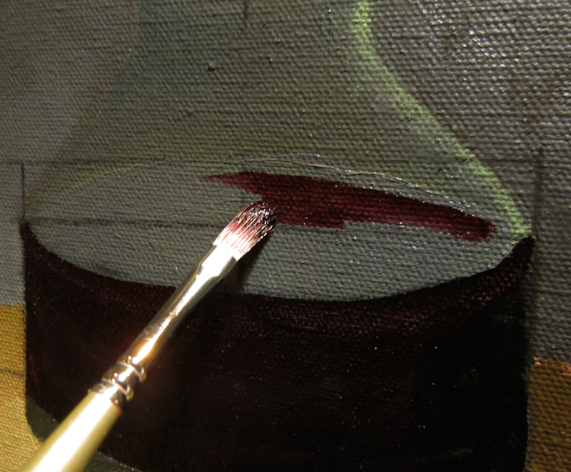
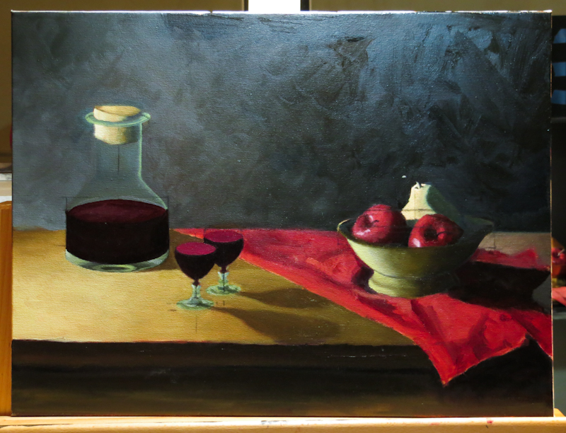
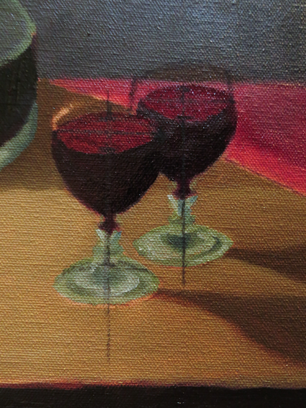
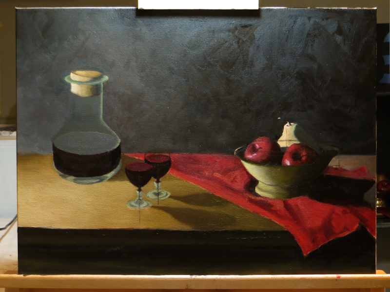
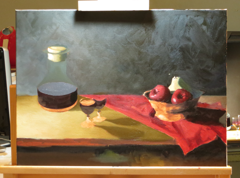
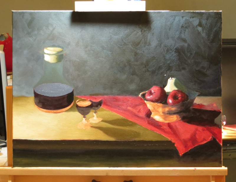
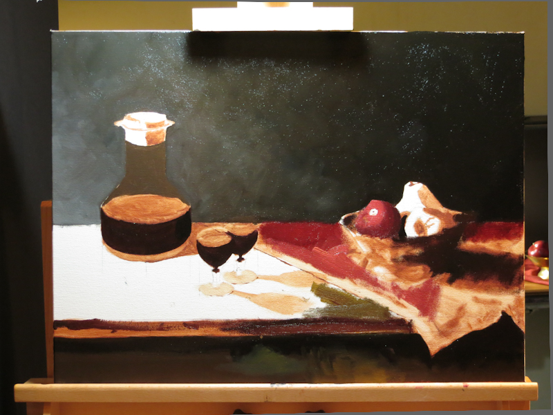
One of the many hazards of still life painting is spoiled, rotting subject matter. I started my “Wine and Apples” still life exactly two months ago. About two weeks after setting up the tableau, the fruit flies arrived. After three weeks, even the fruit flies were dead. Today I thought it might be a good idea to clean and replenish the wine glasses. Imagine my surprise when I found this gooey red wine reduction in the glass. I could probably mix it with some linseed oil and use it for painting.
What Have I Done?
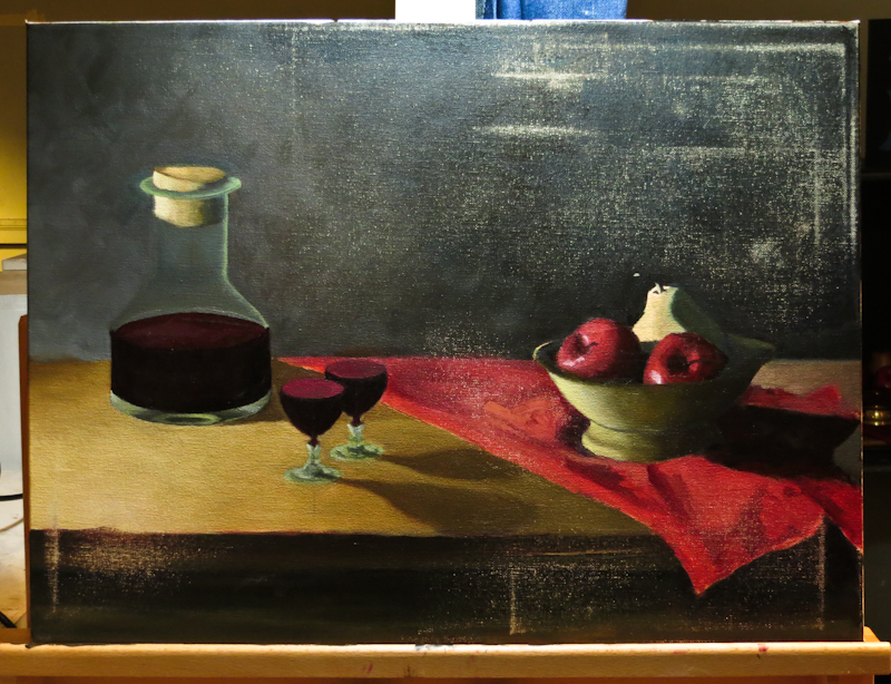
It’s always darkest before the dawn. At today’s group crit, Gary pronounced my “Apples and Wine” painting all-but-done, needing only some detail work. He predicted that I would be finished by Thanksgiving.
After class I took a sanding block to the canvas to remove some of the more offensive, ham-handed strokes. It now looks like I took a huge step backwards, but the sanding was a necessary step in creating a finished piece that I will be proud of. With the bad strokes out of the way I am now free rework the background, tabletop, and cloth, before heading into the home stretch.
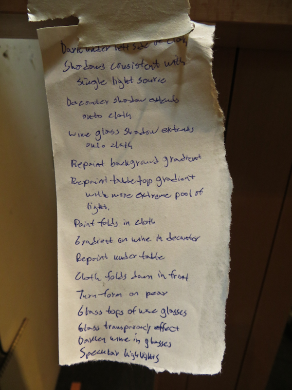
I wrote a note to myself with the list of remaining work items. I am expecting that I will now work through this list, crossing things off one by one while refraining from adding new items. The end really is in sight and I am already planning for my next painting.
Bundle
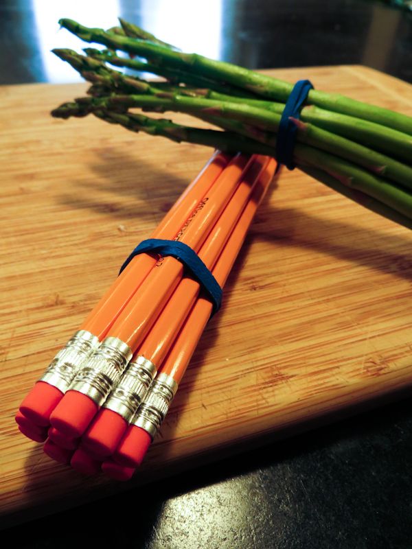
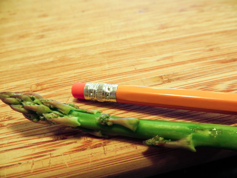
This week’s word is “Bundle”. Manet’s painting, “A Bunch of Asparagus”, immediately came to mind so I headed to my local produce department for some baby asparagus. To reinforce the theme of “bundle”, I included a second bundle, this one consisting of eleven new yellow pencils. I chose the pencils because they were roughly the same size and shape as the asparagus but lent a complementary color. My hope was that viewers would see the juxtaposition of the pencils and asparagus and immediately see that the commonality was the bundling.
I couldn’t resist a little art history joke. The picture below is an homage to Manet’s “L’asperge”. Here’s the story as told by the Musée d’Orsay:
Manet sold Charles Ephrussi “A Bunch of Asparagus” for eight hundred francs. But Ephrussi sent him a thousand francs, and Manet, who was a master of elegance and wit, painted this asparagus and sent it to him with a note saying: “There was one missing from your bunch”.
At today’s crit, I hung a few bundle ideas on the easel, returned to my seat, waited a moment, then said, “there’s one missing from the bunch” and produced this final image.
Drawing Reestablished
Today I finished adjusting the ellipses so that the painting has a consistent eye level. I think the shapes are good enough to proceed, but it is amazing how many things I can find to fix. It seems the longer you look at a painting, the more problems you find. Not really sure how you know when you are done.
This painting still has a way to go. First, I want to sand off some ugly brush strokes in the background and on the cloth. Once I’ve done this, I plan to repaint the gradients in the background and on the table top to be more dramatic. On the table, especially, I want to emphasize the pool of light on the left, while adjusting the shadows to be consistent with a single light source. Once I’ve done that, I will finish up the folds and shadows on the cloth and paint the narrow line of shadow under the left side of the cloth. Then I’ll do the reflections on the bowl, finish the fruit, and finally add specular highlights.
The end is in sight, but I still probably have a couple of weeks to go.
Severe
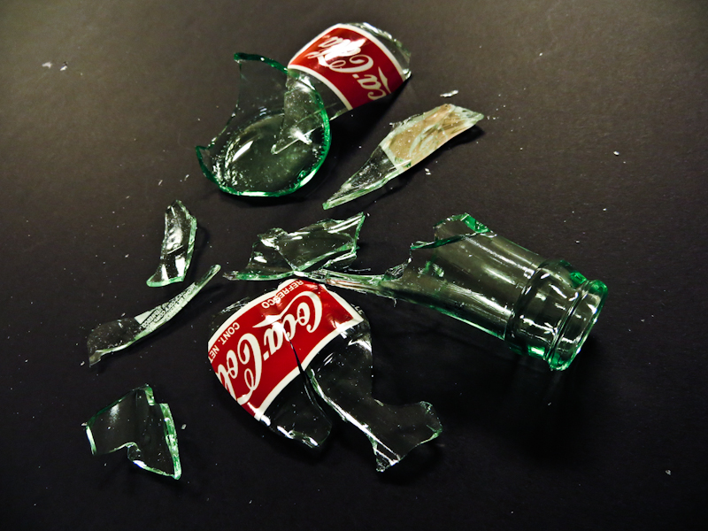
This week’s Word-of-the-Week is “Severe”. I considered severe weather, with a falling barometer on a window sill with coast guard weather flags flying in the distance against a blood red sky and I thought about a severe snow storm with snow drifting against the window sill. I also considered a severe cliff face and a severe hair style, but in the end settled on severe looking shards of broken glass that could make severe cuts.
I headed to the grocery store with the idea of a broken bottle base with sharp fingers pointing skyward, like a bombed out cathedral from World War II or the outer shell of the World Trade Center after 9/11. I had a bit of trouble finding glass bottles – nearly everything is plastic now. Thank god for Mexi-Coke.
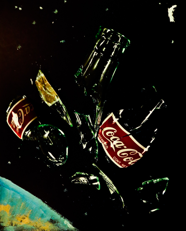
Here’s one of the images I presented in class.
Gary picked up a brush and with a few carefully placed strokes, put my bottle shards into orbit around the Earth with the moon shining above. I really like the idea and am hoping to paint it soon.
Reestablishing the Drawing
Over time, the shapes in a painting may diverge from those in the original drawing. Sometimes this is intentional, but often times, the proportions and viewpoints just get slightly off and the painting no longer reads correctly. At this point, it helps to reestablish the drawing.
This week, I put the paintbrushes down and picked up a stick of vine charcoal to correct my ellipses and adjust the various objects to be consistent with a single viewpoint. The nice thing about using vine charcoal is that you can easily erase it with a dry bristle brush.
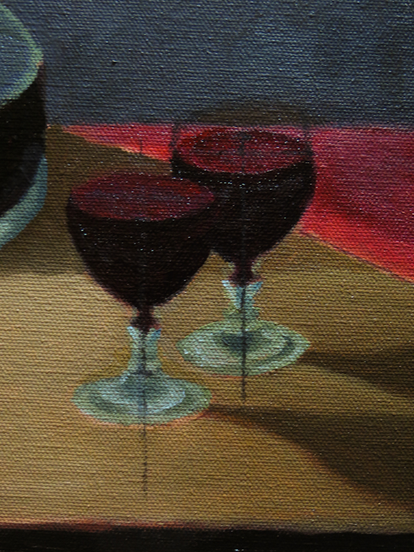
By this point, I’ve lowered the viewpoint and reduced the size of the base of the front glass. I also extended the back glass bit further to the left so that it appears to be the same size as the front glass.
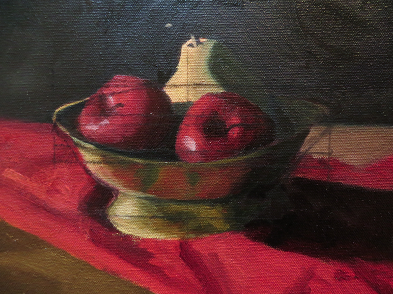
My attempt at rendering the scallops along the rim of the bowl doesn’t read correctly. The bowl looks like it is pinched and lopsided. Also, the reflections and shadows don’t really convey roundness.
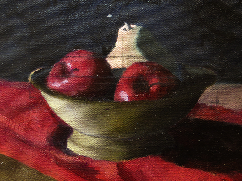
Here I’ve raised the front rim of the bowl and really worked to correct all of the ellipses. Once I was satisfied with the overall shape, I rendered the bowl, as if it were flat-shaded. Now when I go back and add in the reflections, they will be subordinate to the shading and this should help to preserve the roundness of the bowl.
On a Roll
I made a lot of progress this evening, painting glass and brass.
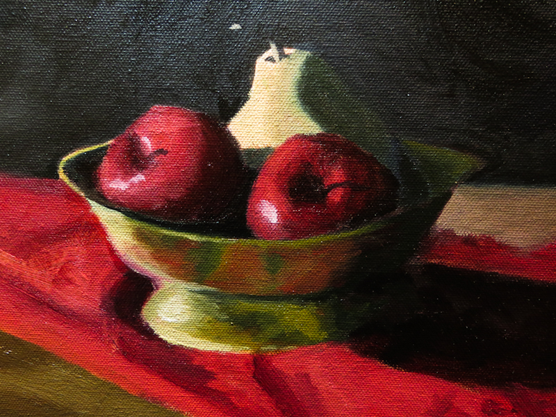
The brass bowl was actually pretty easy to paint. First I used some Permanent Alizarin to clarify clarify the shape of the bowl on the left side. Then I mixed up a greenish hue, consisting of Cadmium Yellow Light and French Ultramarine Blue, desaturated with a bit of Burnt Sienna. I painted the bowl from dark to light, and then went back with a brush loaded with a mix of Permanent Alizarin Crimson and Cadmium Red to color the reflections of the cloth and desaturate the green.
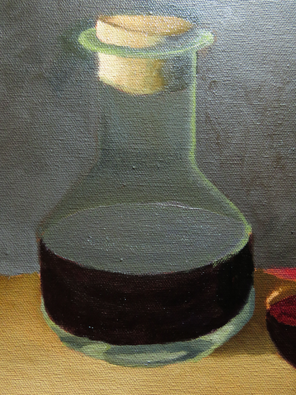
For the bottom of the decanter, I mixed up a fairly bright greenish white, using a mixture of Yellow Ochre and French Ultramarine Blue. I painted the glass at the bottom with the darkest mixture and then streaked in lighter values, in some cases, applying white straight out of the tube. I also used a thin, transparent green to desaturate the purple representing the top surface of the wine.
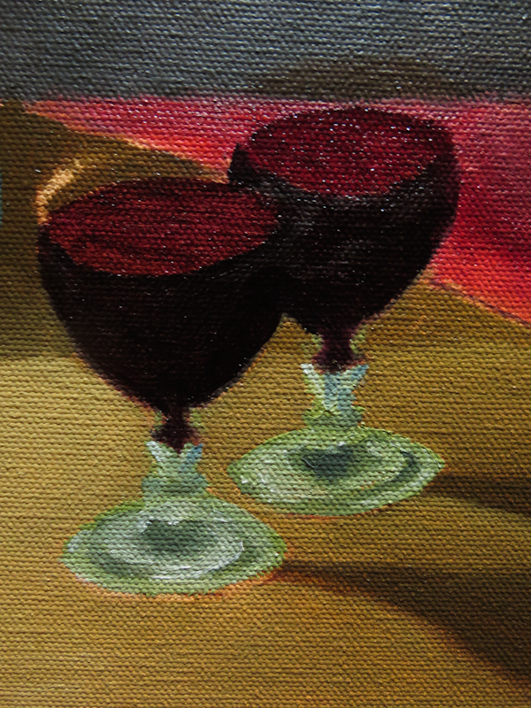
I used the same technique for the bases of the wine glasses. At this point I still need to adjust the roundness and then paint the glass at the top.
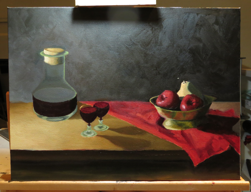
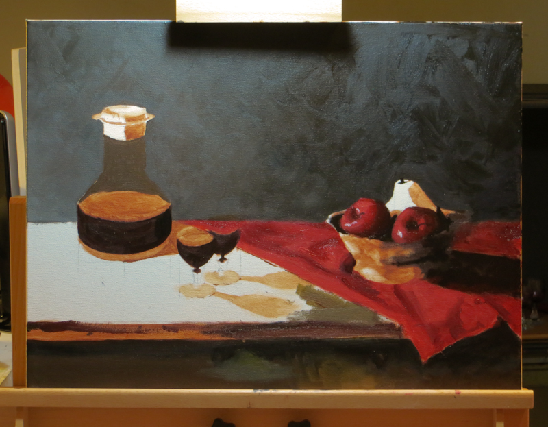
This is the painting at the end of the evening. Not bad for a few hours of painting. Now I can go over the entire painting, adjusting shapes, values and colors, while making decisions about hard and soft edges.
Here’s my punch list for the painting:
- Lighten the left side of the table.
- Darker, more painterly, scumbled background.
- Finish the top of the glasses.
- Wine glass shadows should start at stems.
- Adjust shape of glasses and bottles for consistent eye level.
- Extend decanter shadow onto cloth.
- Rework the colors and folds in the cloth for better contrast and more realism.
- Adjust color of right side of table to match left side.
- Paint glass effects in middle of decanter.
- Rework cork for more contrast and detail.
- Add details like stems and shadows under cloth, bottles, and glasses.
- Add highlights.
Value Scale
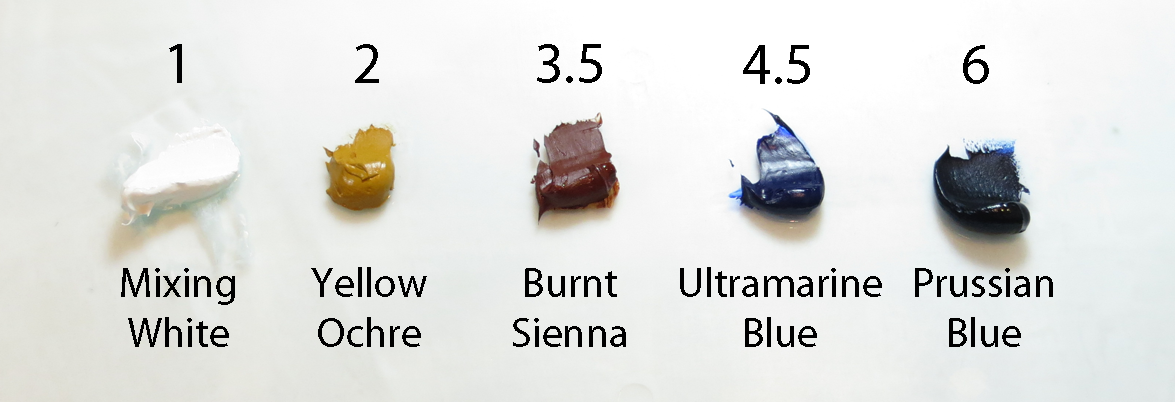
Gary showed me this simple method for judging values in my painting. He uses an eleven step value scale, much like Ansel Adams’ Zone System. Gary’s scale has six primary values, numbered 1 through 6, and five half-steps that lie in between. His insight, which seems obvious in retrospect, is that you can use standard palette colors, straight from the tube as examples of values on the scale. The picture below shows five of the standard palette colors with their positions on the value scale.
In a typical painting,
- White will be reserved for specular highlights.
- Prussion Blue will be reserved for the darkest darks.
- The shadow values will start at Burnt Sienna.
This means the bulk of the mid tones will have values in the narrow range between Yellow Ochre and Burnt Sienna. Mid tones are important – they make or break a painting – but they are hard to nail because they occupy such a narrow portion of the value scale.
Gary recommends figuring out the mid tones by process of elimination. Start with the knowns, like the blackest blacks in the shadows and the whites of the specular highlights. Then work your way up out of the darkest shadows towards the mid tones. Once your figured out the shadows and the highlights, all that is left is the mid tones, and by this point, you have a lot of paint on the canvas to help you make judgment calls.
Gary also stressed the importance of using the entire value scale in order to make the painting more interesting. It doesn’t matter whether the scene is light or dark – you use the entire range. If it is a night scene, streetlights and stars will be pure white, and the moonlit mid tones will be blues with values between Yellow Ochre and Burnt Sienna. If it is a sunny day in White Sands, New Mexico, the glint of the sun will be white, and the sunny sand will be made up of mid tone grays with values between Yellow Ochre and Burnt Sienna. In both cases, the shadows will start at Burnt Sienna and go all the way to Prussian Blue.
Making Progress Again
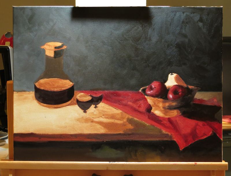
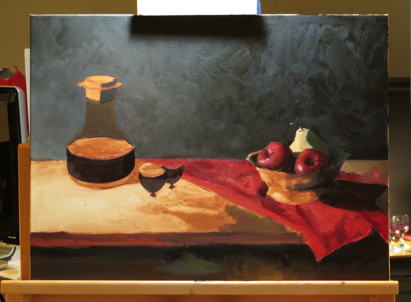
I just returned from a trip abroad, so this is my first post in a couple of weeks. Gary is at the Hermitage in St Petersburg, so Jim Phalen is our guest instructor for the week. Jim is a master of paint surface techniques and very knowledgeable about art theory and history. The photos below show my progress for the week.
Marching Orders
Had my second weekly critique today. Gary used the time to demonstrate how to choose the right values for each part of the painting. He says the hardest values to nail are the mid-tones, but it is these values that make or break a painting. The reason mid-tones are hard is that the artist actually has a choice. The lightest lights and darkest darks are easy to place because there is no choice – the limited range of values available in paint forces the darkest shadows to black while reserving white for specular highlights.
I like to think of the process as putting together a jigsaw puzzle. With a puzzle, you start with the corners then move to the edges and then the center, always moving from the known towards the unknown, always triangulating from multiple directions. In a painting, you start with the obvious known values which are the darkest shadows and brightest highlights. Once these are placed, you can work up out of the shadows and down from the highlights until the mid-tones are boxed in. At this point, the choice of suitable values is smaller and more manageable.
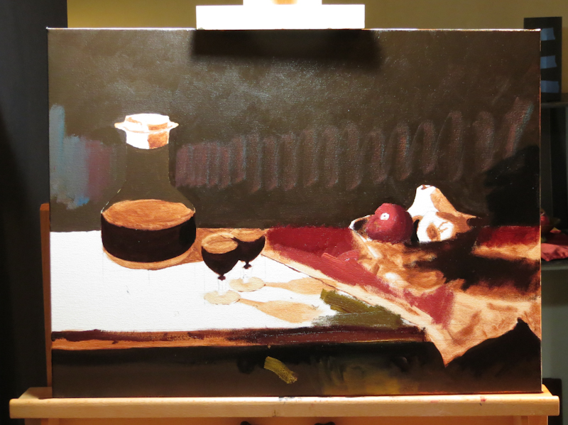
Gary has painted a number of suggestions directly on my painting: (1) the horizontal gradient in the background should start at a much lighter value on the left and go to jet black on the right; (2) the right side of the table near the red cloth will need to go very dark; (3) the wine and the shadows on the fruit and the right side of the bowl need to go almost to black; (4) the front edge of the table needs to be pretty dark.
If you look at the image above, you can see some of Gary’s suggestions, painted directly on my canvas. I find it fascinating that the background should go from a fairly light, chalky gray on the left to jet black on the right. It is also amazing that the portion of the table top adjacent to the red cloth will be a fairly dark, olive drab. If Gary has these colors spot on – and I suspect he does – they will illustrate how hard it is to nail the mid-tones without the context of the adjacent lights and darks.
Here’s the gradient, roughed in to Gary’s specifications. It actually looks pretty good and nothing like what I would have imagined from looking at the first picture.

