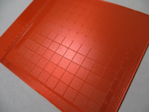
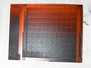
More Imagon Tests

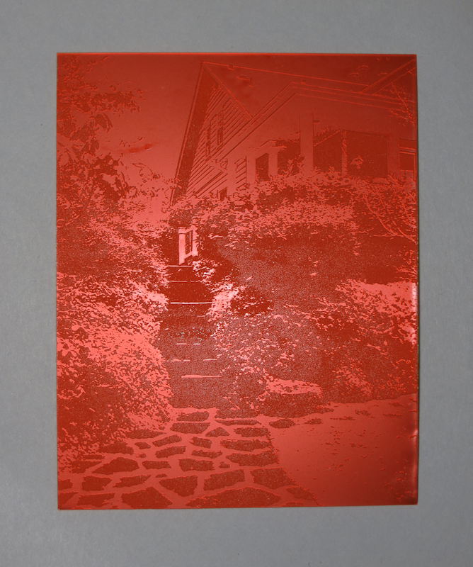
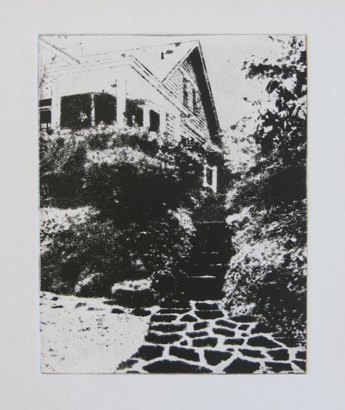
I’ve been trying to establish a baseline exposure for the aquatint screen. In my earlier session I had a lot of trouble getting consistent results and good ink transfer. After considering a long list of hypotheses, my conclusion is that my almost empty jar of ink was too old and its gummy consistency was playing havoc with my plate wiping.

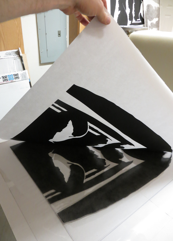
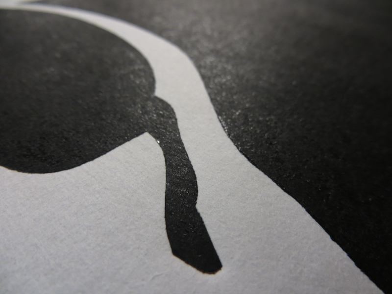
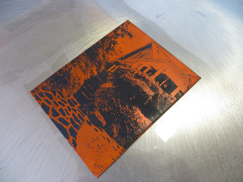
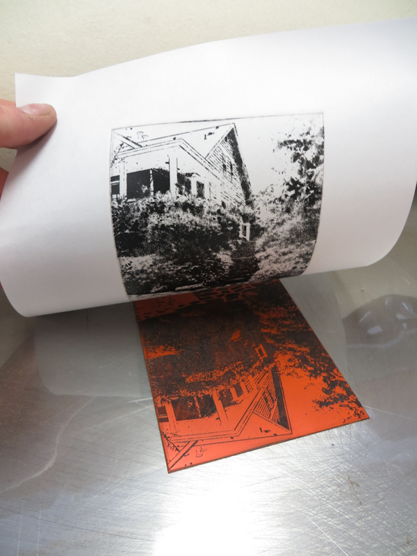
For this evening’s session, I decided to eliminate as many variables as possible. By the end of the evening, I got some good plates that printed pretty well, but I was still not able to get the density of blacks that I can reliably attain with SolarPlate.

One top theory is that the Akua Mars Black which I used for the SolarPlate tests has greater optical density or better wiping characteristics than the Akua Carbon Black that I have been using with the ImagOn. This will be easy to investigate once I get another jar of Mars Black.

The other theory is that the ImagOn emulsion simply cannot hold as much ink as SolarPlate because it is only 50 microns thick, versus SolarPlate which is almost a millimeter. The main evidence supporting this hypothesis is that I get my greatest density when the channels in the plate go all the way to the plastic.

I am printing on the smooth side of dry Masa paper, so I’m pretty sure that the Imagon will give adequate blacks on wet Rising Stonehenge, but I would still like the ability to get fully saturated transfers on dry paper if possible as using dry paper will help me with multi-plate registration by eliminating paper expansion and contraction due to moisture levels.

My next experiment will be to determine the proper baseline exposure for the second exposure. Once I nail that exposure I can proceed with a standard PDN calibration.
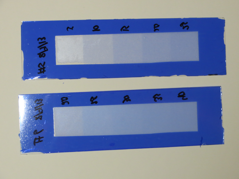
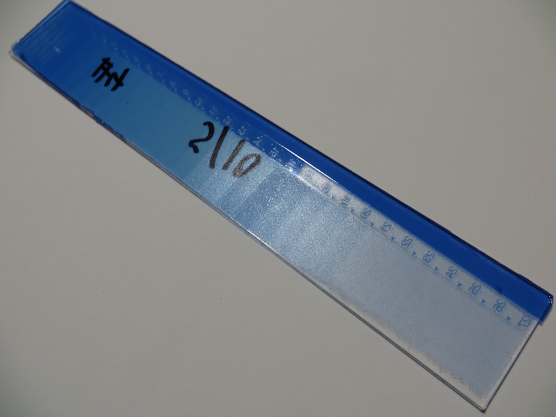
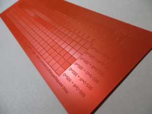
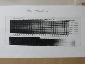
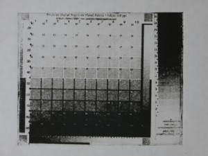
I has having a lot of problems with my previous test strips that used a single exposure, simultaneously through the Stouffer wedge and the aquatint screen. For this evening’s experiments I eliminated some variables. Instead of using the Stouffer wedge, I went old school and used a strip of cardboard to create a sequence of exposure times. I also increased the size of the exposed blocks to 1″ square and I added a fully exposed margin to simplify the plate wiping.
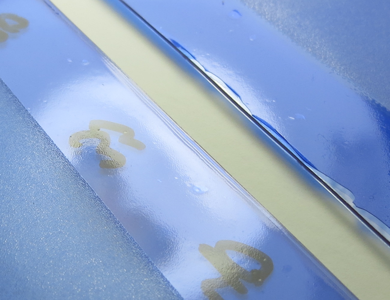
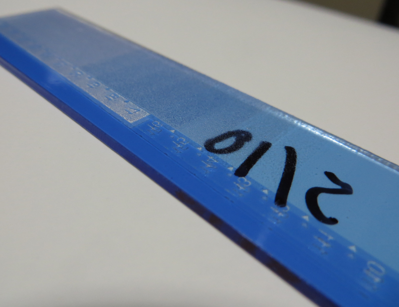
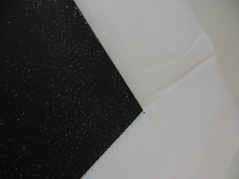
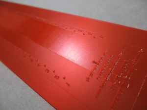
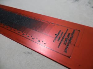
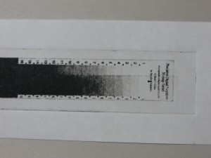
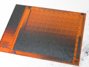
In this closeup of the two test strips side by side you can see the overexposed margins that I added to simplify wiping. I found it was really helpful to make bigger plates with one inch square steps. My Stouffer wedge has 1/4″ x 3/4″ steps which are sometimes hard to evaluate.
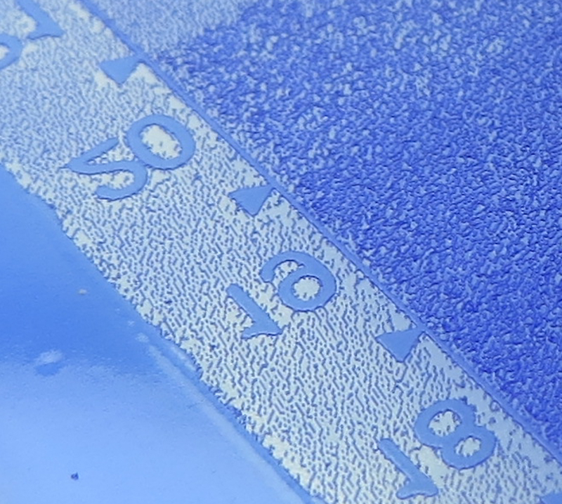
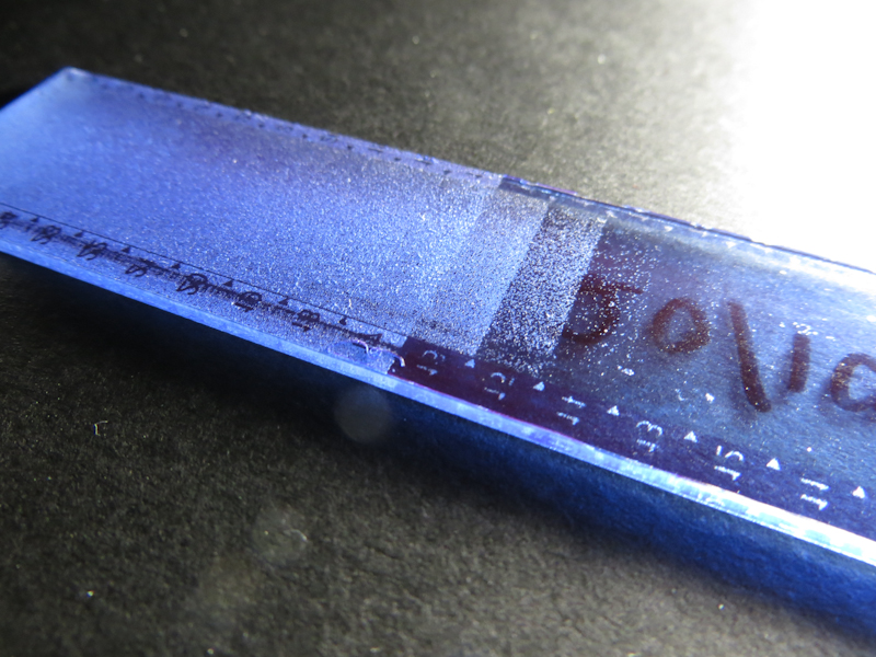
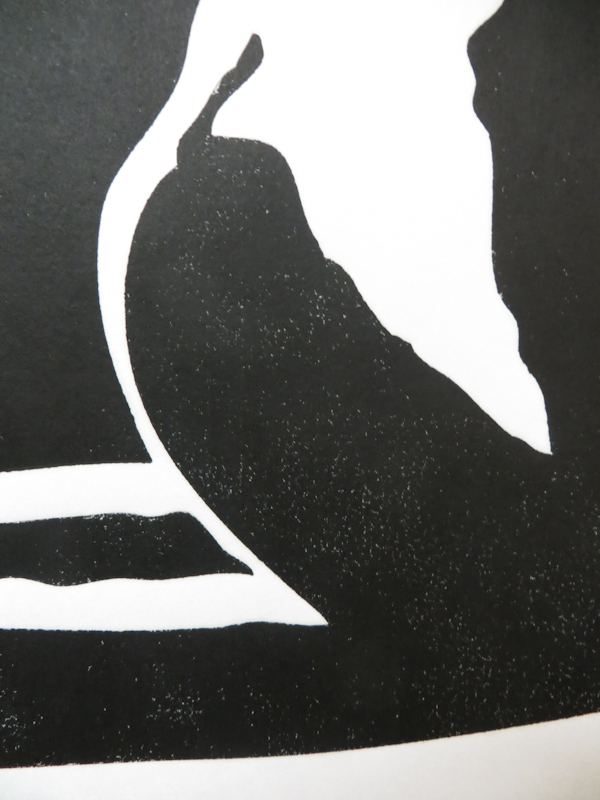
This is a closeup of a dual exposure plate from my last session. I exposed once with the aquatint screen and then a second time with the Stouffer wedge. In this example, the aquatint is underexposed. You can see this in the region around the numbers which is solid black on the Stouffer wedge. For this area to print black, it will need a more robust dot structure to avoid an open bite. It is interesting that an underexposed aquatint screen can still make fairly dense halftones as you can see on the right. Also, note that the underexposed aquatint has led to an uneven dot pattern on the right.
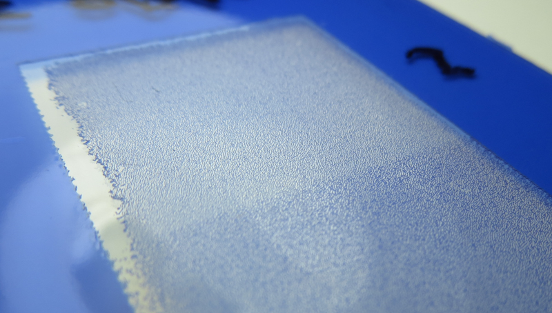
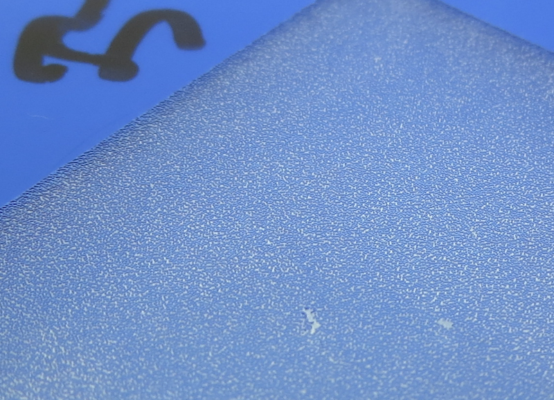
This step is underexposed to the point of open bit. Here the aquatint screen has produced a field of isolated islands. With more exposure, the islands will merge and make a field of holes and channels. Another indication that this plate is underexposed is the bare plate on the left. At this level of exposure it is very easy to lose the emulsion entirely.

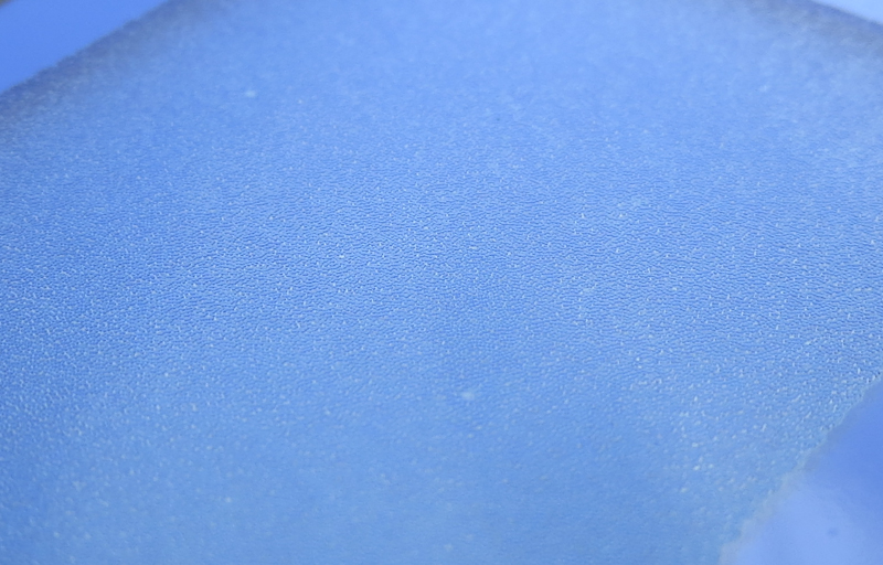
This step is overexposed. The channels appear blue because they no longer go the full depth of the emulsion.

This step is about right. The islands have merged and there are lots of channels to hold the ink. The damage to the dot field indicates that it still may be slightly underexposed. In general, I want to get a really sturdy matrix without exposing to the point that the channels start to lose depth.

Experimenting with ImagOn Film

Recently I have been experimenting with ImagOn Film for intaglio plate making. ImagOn plate making is tough process to master, but it has some advantages over SolarPlate, including cost (about $0.02 per square inch vs $0.20 per square inch for SolarPlate) and the possibility of making really large plates. ImagOn is less forgiving than SolarPlate, so I am ramping up slowly.
As with SolarPlate, my first goal was to come up with a repeatable process from exposure to development to printing. This post shows my progress in determining the correct exposure.

My main challenge so far has been to get an adequate black from just the aquatint screen. The blacks that I have been able to achieve so far are not nearly as saturated as those from my SolarPlate tests. My general impression is that my ImagOn plates have less etching than my SolarPlates. This may be because of a problem in my process or it may just be an inherent property of ImagOn to which I will have to adapt. More experiments will give me clues.

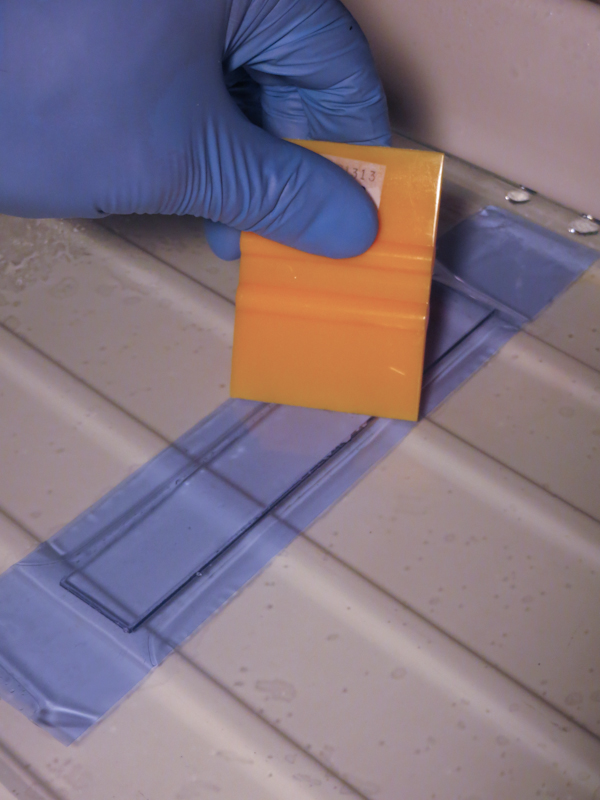
ImagOn is a a film consisting of a 0.002″ thick layer of photopolymer emulsion sandwiched between two protective layers of plastic. The first step in making an a plate with ImagOn is to laminate the emulsion to a metal or plastic plate. The process is easy, involving water and a squeegee, but it must be carried out away from any sources of ultraviolet light.

One of the differences between ImagOn and SolarPlate is the color of the emulsion. This plate uses ImagOn Ultra which is a blue like French Ultramarine. ImagOn HD is green. The emulsion for this plate is laminated to a piece of clear acrylic, giving it a very different appearance from SolarPlate which sits on a an opaque steel plate.

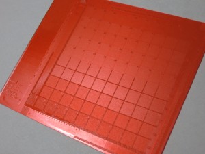
The transparent blue ImagOn Ultra plates are quite striking.

This plate is underexposed, but it gives a good idea of the layout of the step wedge.

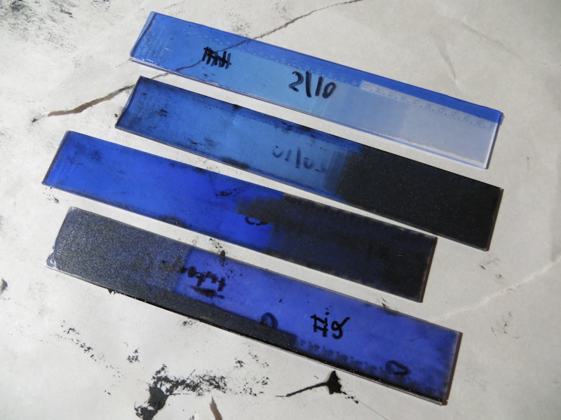
Here you can see four test strips with different exposures. The second from the bottom has the most exposure, giving it a saturated blue color due to the thicker emulsion. The top plate is underexposed and consequently has a very thin layer of emulsion.

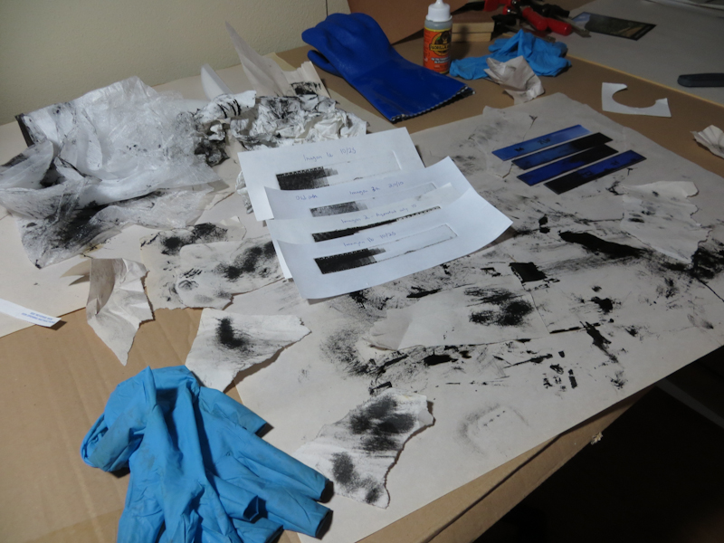
Intaglio printing is always a slow, messy business. This disaster is my studio after an evening of test strips. I will get the process dialed in and it will get better, but for now I need to plod along with the calibration.

Mysterious Sea Turtle

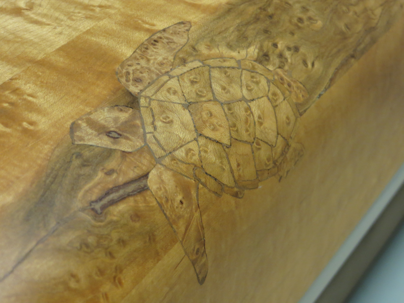
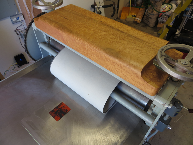
Just noticed this mysterious sea turtle for the first time. He’s an inlay in the birdseye maple cover the previous owner made to protect the pressure adjustment chains on top of the press. I recently learned that in ancient Hawaiian legend, the Honu, or sea turtle, was considered a guardian spirit and bearer of good luck. I like the idea that this Honu will watch over me as I create my prints.

Better Ink Transfer

This evening I experimented some more with large acrylic relief plates on the large press. On my previous attempt, I found that my rubber Whelan Press blanket was so flexible that it was impossible to get sufficient pressure for good ink transfer without embossing the paper to the point where it wrinkled. For that initial attempt, the press had been loaded with

  • Rubber Whelan Press blanket
  • Newsprint to keep the blanket clean
  • Masa print paper
  • Relief plate

The next two photos show the poor ink transfer and wrinkling.

Close up view of the first print, showing poor ink transfer.

In this close up view of the first attempt you can see that the paper is wrinkling, even though there isn’t enough pressure for good ink transfer.

Tonight I rectified the problem by increasing the pressure after inserting a piece of 14-ply chipboard between the blanket and the newsprint. The chipboard, which is fairly stiff, was inserted to prevent the flexible rubber blanket from pressing the paper too deeply into the recesses in the plate. My new stack was

  • Rubber Whelan Press blanket
  • 14-ply chipboard
  • Newsprint to keep the chipboard clean
  • Masa print paper
  • Relief plate

The result was a print with perfect ink transfer and just the right amount of embossing as you can see in the next two pictures.

My second attempt at printing large plates on the large press. 100% ink transfer and no wrinkling.

As you can see in this close up view, the blacks have no pinholes and the edges are sharp.

Color Gradient Experiments

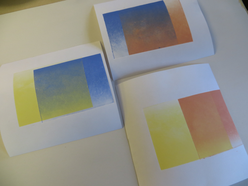
I’ve been working on some new print designs that use atmospheric effects and interesting skies. To make these prints, I need to be able to make smooth color gradients where I can change hue, saturation, and value across the page. Today I did some experiments with two-color gradients.

Each of these two-color gradients was made by printing a single gradient plate two times in with different colors and orientations. The effect works pretty well with lighter colors, but I notice that the gradient does not appear as smooth with the darker colors.

The experiment involved a 4″ x 5″ photopolymer plate with a linear gradient running from full ink at the top to clean plate at the bottom. My process was to print the plate in a light color, then rotate the plate 180 degrees and print it again in a dark color. The goal was to get a smooth transition from the dark color to the light color.

After printing so much black and white, it was refreshing to see all the colors. The prints were attractive and I was pleased to see that I could make a blue to yellow gradient without getting green in the middle.

My main problem was that my gradients weren’t very smooth. They look as if the plate is somehow mottled or even scratched. I have a number of theories but it will take some experiments to sort things out.

Here are the leading contenders

  • Over-wiping the plate
  • Non-uniform wiping
  • Color inks require a different wiping technique than black ink
  • Ink consistency
  • Not enough printing pressure
  • Plate got damaged during development
  • Poor contact between plate and aquatint screen during exposure
  • Poor contact between plate and positive during exposure

My plans are to print the plate with a known good black ink, on the small press where I am more familiar. I will use a lot of printing pressure. If I still see the problem, I will print a known good plate to verify that the problem isn’t with the press and ink.

Then, depending on the results, I may make a second gradient plate and see whether it shows the same problems.

Big Plate On The Big Press

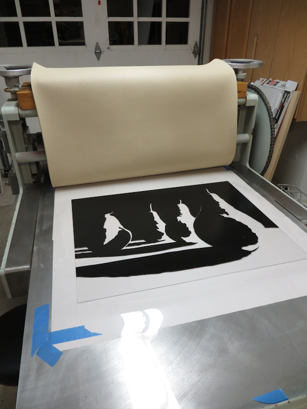
Over the weekend I made my first large relief print on the Glen Alps press. These 24″ x 30″ prints typically take me over an hour when printing by hand with a baren. I still spent quite a bit of time inking up the plate, but I was able to print it in a matter of minutes.

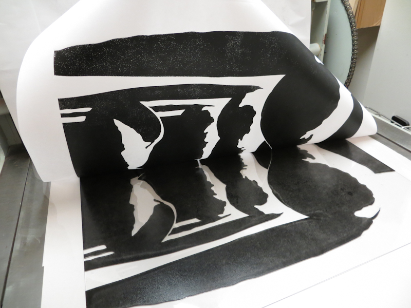
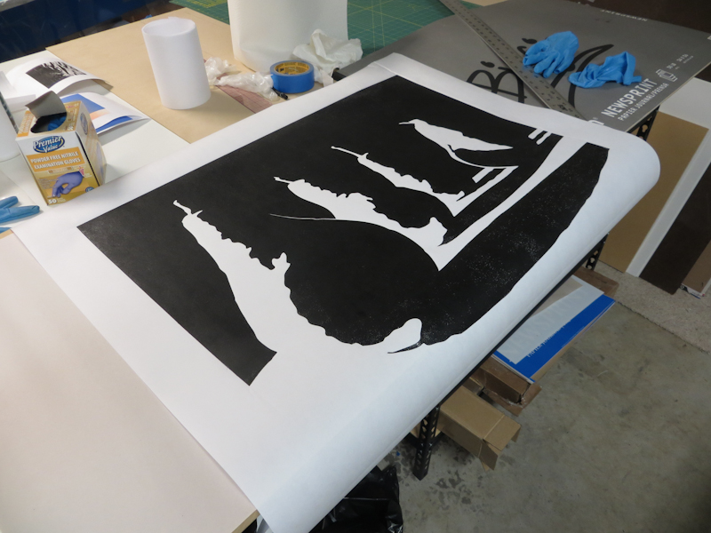
I printed this first test on the rough side of a piece of dry Masa paper and as you can see in the pictures below, I still need to tune the process. There are two problems. The first is that I’m not getting full ink transfer and this is causing a lot of white speckles in the blacks. I suspect this is because I am using a soft rubber Whelan Press blanket instead of a stiff wool blanket. With the soft rubber blanket, I need to keep the pressure low to prevent the blanket from ripping the paper on the edges of the relief plate. The second problem is that the embossing is so deep that the paper is wrinkling. I think I can fix both problems by putting a piece of stiff card stock between the blanket and the paper.

I’m ready for my first test with a large relief plate on the Glen Alps press.

I just love seeing these abstract designs come off of the press. This is my first peak of a large relief print on the new press. Note the white speckles at the top of the photo.

My first test print is promising, but I need to adjust the pressure to get better ink transfer with less embossing.

First Photopolymer Gravure Plates

After completing the Precision Digital Negatives process calibration, I was finally ready to make my first photopolymer gravure prints! For this initial round, I chose two designs – one using solid black and solid white and the other using the full value scale. The plates were 4″ x 5″ SolarPlate, exposed first with an aquatint screen and then again with a positive which was printed onto Pictorico OHP.

This photopolymer gravure plate contains no gray scales – it only has solid black and solid white.

I liked this design a lot, but was a bit underwhelmed by the print. It doesn’t know whether it wants to be photograph or a graphic. The idea still has potential so I’ll take it back to the drawing board. I think I will go with simplification over photo realism.

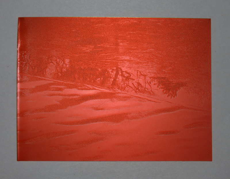
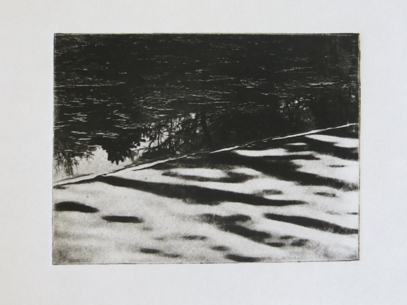
This plate is from a photograph of an ice covered pond in Boston. The plate uses the full range of gray values, calibrated with Precision Digital Negatives.

The print came out really well, especially given that it is from my first round of photopolymer gravure prints, using Precision Digital Negatives for the first time, and using the Glen Alps press for the first time.

David and Goliath

I finally got a chance to use the Glen Alps Press for the first time. It has been over a month since the press arrived, but before I could make prints I needed to get new felt blankets and level and adjust the press. Today I made my first print on the press – it was a 3″ x 5″ photopolymer gravure plate.

I chose this photopolymer gravure plate for the press inaguration.

The giant press makes the 4″ x 5″ plate look miniscule.

Here’s the big reveal of my first print on the Glen Alps press.

Precision Digital Negatives

Musicians practice scales before concertos. As an art student I practiced value scales in vine charcoal before attempting to render a sphere. Now in the printmaking domain, I am doing the same thing, only this time I am working with Mark Nelson‘s Precision Digital Negative (PDN) process to calibrate my photopolymer platemaking and printing process.

No matter how you do it, process calibration involves lots of test strips.

The goal is to develop a repeatable, end-to-end process starting from the creation of the original artwork, to exposing and developing the plate, through the final printing step. There are many variables that impact contrast, texture, the range of values, the richness of the blacks and the purity of the whites. I want to be able to control each of these variables in order to make the print that I see in my mind’s eye.

The PDN system is a general process for calibrating the production of digital negatives and positives for alternative photographic processes that use ultraviolet light to expose the final image. Mark has put a huge amount of effort into developing and refining the PDN system. His e-book is excellent and chock full of details and explanations of the process itself and related topics like image acquisition and preparation and Photoshop tips. The e-book also comes with membership to a PDN discussion forum where you can get answers to most questions. If you are making digital negatives or positives, I highly recommend purchasing the PDN book.

Creating photopolymer plates for intaglio requires exposure to a positive, rather than a negative. I print my positives onto a transparency film called Pictorico OHP, using an Epson Stylus Pro 3880. I use two types of plates – ready-made SolarPlate and plates I make by laminating ImageOn film to sheets of acrylic. I expose the plates using an old Nuarc 26-1K platemaker that I picked up on Craig’s List.

I’m most of the way through calibrating my SolarPlate process. Once I have the SolarPlate process refined and stabilized, I will repeat the calibration for the more complex ImageOn process.

At a high level, the PDN calibration process involves 4 steps:

  1. Determine the correct exposure time for clear film.
  2. Determine the mixture of ink colors in the transparency that yields the ideal density range for exposing the plates.
  3. Generate a gradient scale using the ideal color mixture
  4. Generate a set of Photoshop level adjustment curves that linearize the gradient scale.

The photos below document my journey through the initial SolarPlate calibration.

The first step is to determine the correct exposure for clear Pictorico OHP film. One could do this by experimenting with a bunch of different exposure times, but it is much quicker to make a single exposure through a step wedge that incorporates a variety of calibrated neutral densities which simulate shorter exposure times.

Here’s the step wedge plate, inked, wiped and ready to print. The darker portions of the wedge correspond to darker regions on the plate. Each step in the wedge corresponds to 1/3 f-stop.

When exposing positives for photopolymer plates, it is important to choose an exposure that just hardens the plate so that it prints pure white in areas where the film is clear. The exposure for this test strip is spot on, but it is apparent that I have a contrast problem because the plate goes from white to black in about four f-stops.

It turns out that black inkjet pigment is not well suited to producing fine tonal gradations in most alternative photographic processes. The problem is the black is just too strong and the printer can’t generate enough different gray values in the narrow range required by the photopolymer plates. Imagine trying to render a figure with a Sharpie and you get the idea. Mark’s insight is that one can choose a mixture of much weaker color inks in order to produce a positive with densities that match the response curves of the plates. By using color inks, it is possible to create hundreds of distinct values across the entire range from white to black. This is a huge improvement over black inks which are so dense they can only create a handful of distinct values in the densities useful for plate making. The squares in the test strip above represent about 150 different color mixtures. The goal is to choose the mixture that just barely yields black.

Here’s the color test strip, printed on white paper. Each of the gray boxes corresponds to a different color mixture in the inkjet positive. I chose the forth box from the left in the row labeled B=255 + R=0-255. This box corresponds to a the RGB color R=30, G=0, B=255. This color mixture just barely manages to give me black when it is at maximum intensity. Lighter versions of this color give me lighter shades of gray.
Here’s the plate for the initial gradient scale. This plate was created from a positive that used a mixture of red and blue ink, instead of black. Each square on this plate is a different shade of the RGB color R=30, G=0, B=255.

Here’s the initial gradient scale, inked, wiped, and ready to print. Already it is apparent that the plate has a contrast problem – most of the plate is very close to either black or white – only a tiny portion in the middle shows distinct gray levels.

This is the initial gradient scale, printed on white paper and showing 100 different levels from white to black. This scale is not very linear – it is quite flat in the whites, then shoots up quickly to the dark grays and then flattens out again in the blacks.

This plate was created from a new positive which combined the original gradient with the PDN process adjustment curves. The process adjustment curves should linearize the gradient.

As you can see here, the linearized gradient plate looks much smoother.

This gradient was produced by applying Photoshop process adjustment curves to the original gradient. This curve is much closer to linear.


Randy

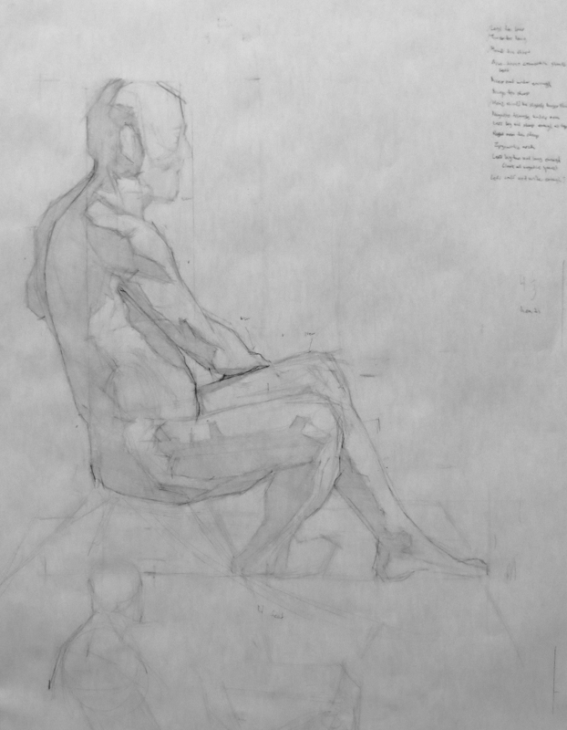
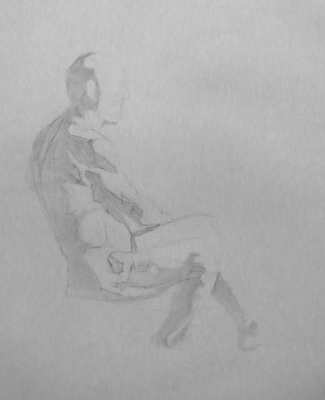
Here’s another work in progress of Randy. I started this drawing with a number of gestures and then a block in, all in graphite. Once I had a good block in, I transferred it to a clean piece of Strathmore 500 charcoal paper and continued in vine charcoal. I actually like the block in better than the charcoal drawing – the block in has more energy and more interesting line quality.