I am making slow, but steady progress on my white sphere. One of these days I will actually finish it. Here’s the update.
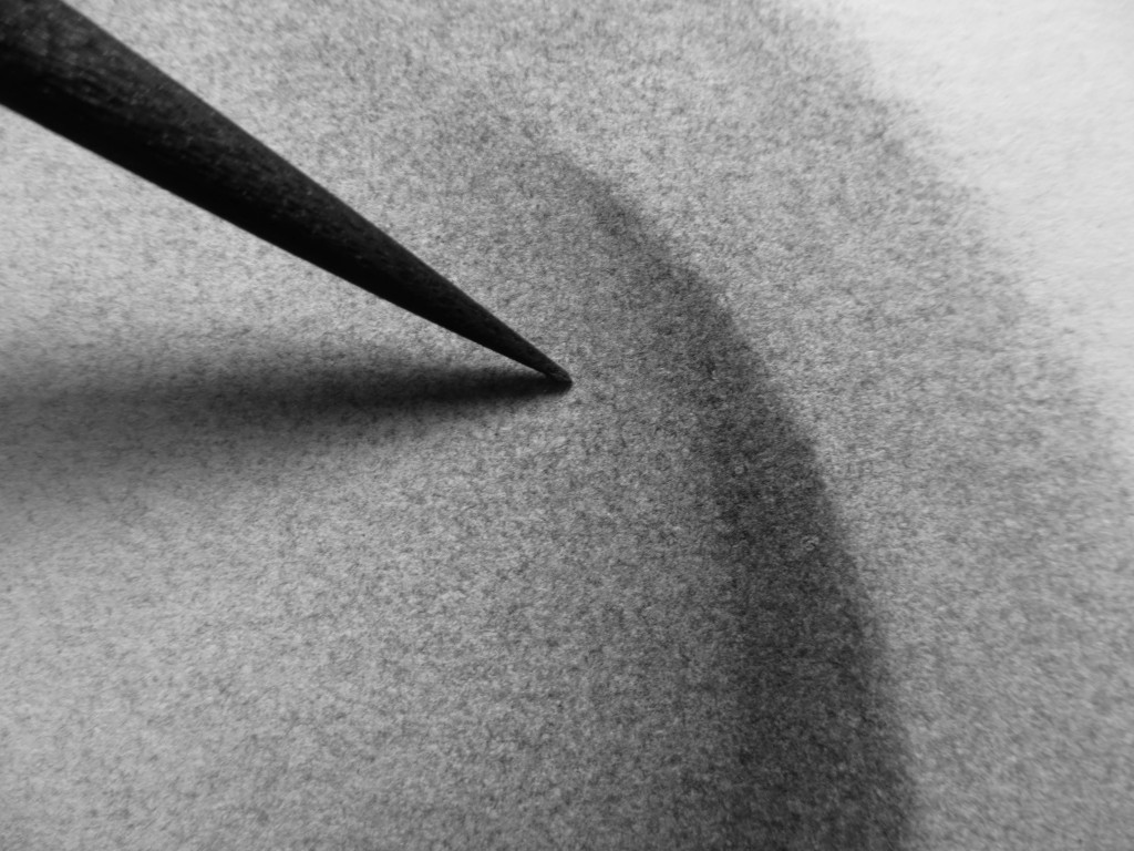
I use the very tip of a super sharp piece of charcoal to reach down inside each pit in the paper, without hitting the ridges.

I am making slow, but steady progress on my white sphere. One of these days I will actually finish it. Here’s the update.

I use the very tip of a super sharp piece of charcoal to reach down inside each pit in the paper, without hitting the ridges.
My son’s Frederic Church mastercopy is humming right along. Due date is this Friday!
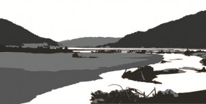
Here’s an update on the Keechelus print design. I’ve added more detail in the foreground and clarified the left riverbank. The silhouetted mountain ridges work well, but I’m struggling to get a more three-dimensional form along the riverbank and in the landmass on the left. I also need to make some decisions about whether to simplify or go for detail in the mass of sticks and branches in the lower right – not sure whether the details add or detract and I probably won’t know until I get some more detail in the lower left corner for balance. I’ve also experimented with cropping – using a panoramic format allows me to zoom in quite a bit without exceeding the width of my etching press. Can’t wait to start carving!
Bouyed by the success of the giant pear print, I began cutting the 24″ x 30″ pumpkin plate. Before starting I headed out to Lowes to pick up some safety gear, including an N95 dust respirator and face mask. I already had good ear protection.
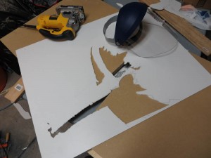
I’m guessing that the cutting is about halfway through. It is going well as I apply learnings from the pear print. First is to use hearing protection, a face mask, and respirator. Second is to leave the edges of the plate intact until all of the fine cutting is done. This reduces the chance of breaking the plate while cutting. Third is that the jigsaw can actually be used like a router or grinder, by gently sweeping the blade side to side. This works better than the end mill in the rotary tool because the end mill sometimes catches on the plastic and jerks past the cut line. The fourth learning is that ball mills and sand paper grinding wheels work better for FPVC than end mills.
I finally got some time to finish up and proof my 24″ x 30″ plate of the three pears. FPVC seems to work pretty well for plates, although I was surprised to find that the plates absorb a bit of ink. The material does give very crisp edges. The main problem with FPVC is that the cutting process produces a huge amount of plastic dust. I will have to decide whether to cut the large pumpkin out of FPVC or try another material like masonite or MDF. First I will try a print on a real printmaking paper to be sure the FPVC really works well enough.
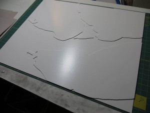
I’ve finished cutting and sanding the printing surfaces and tacked them in place with double sided tape.
I’ve started working on the design for a multi-block linocut print of Lake Keechelus. For now, I am mocking it up in Adobe Illustrator so that I can get an understanding of interactions between the shapes and colors and layers. The image below shows one idea for a sunrise color scheme. This is a work in progress, and the bottom half is still at the block-in stage.
One challenge I’ve encountered with linocut prints is transferring my design to the block of linoleum. In the past I’ve used Saral and Richeson transfer papers, but I was never happy with the amount of detail that would be lost as I traced my design with a ball point pen. I’d read about ways to transfer a laser print or photocopy directly using nail polish remover or ChartPak blending markers as a solvent, but I never managed to get these methods to work, probably because the toner or the solvents have been reformulated.
Today I stumbled upon another technique which is simple, seems foolproof, and really works. The idea is to use an inkjet printer on a piece of slippery, non-absorbant paper. Since the ink doesn’t soak into the paper, it can be easily transferred onto another surface. McClain’s actually sells special paper that works this way, but it turns out you can get the same effect with freezer paper from your local supermarket. Here’s an outline of the process:
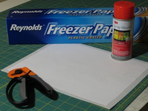
Before printing, I used spray adhesive to glue the freezer paper to a piece of regular printer paper. This adds a bit of stiffness to prevent curling and it gives the printer a bit more traction.
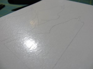
This is the freezer paper right after it came out of the printer. The lines are crisp and I had no problems with smearing or jamming.
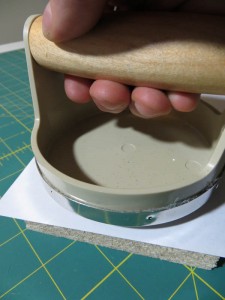
I used my inexpensive Speedball baren to transfer the wet ink from the freezer paper to the linoleum.
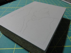
The fine lines transferred perfectly and they seem fairly robust. I attempted to wipe away a line on the left side of the block immediately after the transfer and it only smudged a bit.
My son has a school project to do a master copy painting. He got to choose the artist and the piece. I urged him to pick something less ambitious like Malevich’s White On White, but he decided to go with Frederic Edwin Church’s Horseshoe Falls, Niagara. At least he didn’t choose The Heart of the Andes!
I am excited because I get to act as advisor – as long as I keep my mits off the brushes. My recommendation was that he start with a two-color wipeout underpainting with French Ultramarine for the sky and the darkest waves and Terre Verte for the waterfall. Here’s the underpainting at the end of the first session. I think it looks fantastic!
Lauren posed for four weeks in January. Normally this would translate to 20 three-hour sessions for a full time student. I got about eight sessions with this pose. I started with a very loose block in the first session, then started a second block in for the next session, and then transferred that block in to a clean piece of paper for the third session. This approach has its pros:
and its cons:
I wasn’t very happy with the drawing at the end of the last session, but it has grown on me and it looks great in the photo.