Magnetic Canvas Board Holder

At the beginning of the semester, Gage issued me a new Blick Studio Medium-Duty H-Frame Easel. I liked the easel initially, but over time I found it wasn’t suited for small studies because the top canvas holder couldn’t be positioned low enough to hold a small canvas below standing eye level.

Back in September, I had considered making a magnetic backing board that would allow greater flexibility when positioning smaller canvases, but I didn’t take action until recently when I wanted to increase my output by working on a number of smaller pieces at once.

Over the weekend, I borrowed a page from from Ulan Moore’s playbook and built a steel-faced backing board and three pairs of magnetic canvas holders. Here’s the story:
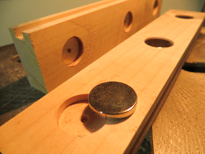
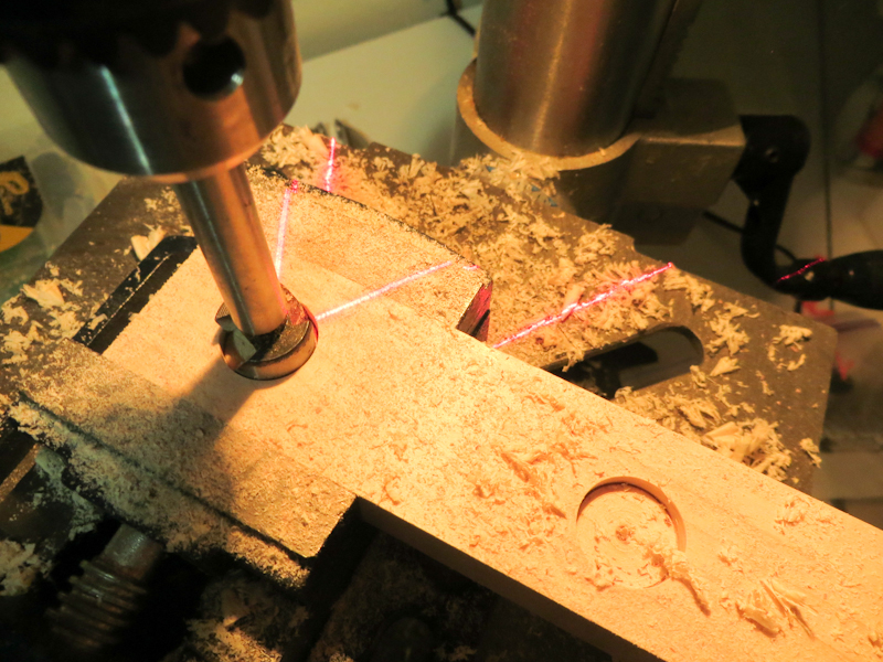
Drilling holes for magnets in 1″ x 2″ maple stock.

Each magnet will be glued into a hole. A groove along the narrow side will hold the canvas panel in place.
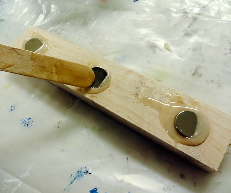
The magnets are held in place with epoxy. After inserting the magnets, I used the popsicle stick to spread the epoxy across the surface and then covered the magnets with piece of cardstock. The cardstock helps to hold the magnets in place and allows the piece to slide smoothly on the easel.
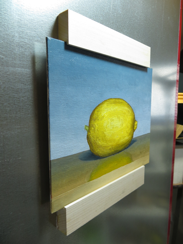
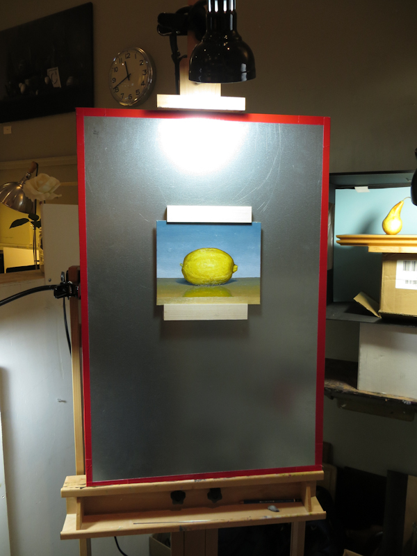
I taped a 24″ x 36″ piece of galvanized steel to a piece of Masonite and placed the whole assembly on my easel. The Masonite is important because the steel is too flexible by itself.

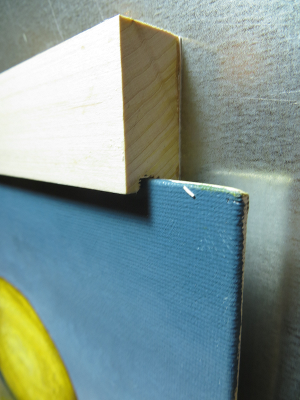
Closeup showing how the grooves in the holder grab on to the canvas panel. One of the nice things about this design is that the canvas panel is held about 1/8″ off the steel, allowing me to easily paint the edges of the panel.

I just love this setup – it works much better than I could have anticipated. It is easy to place and move the canvas panel and I can easily adjust the setup to get at all four edges.

February 11, 2014

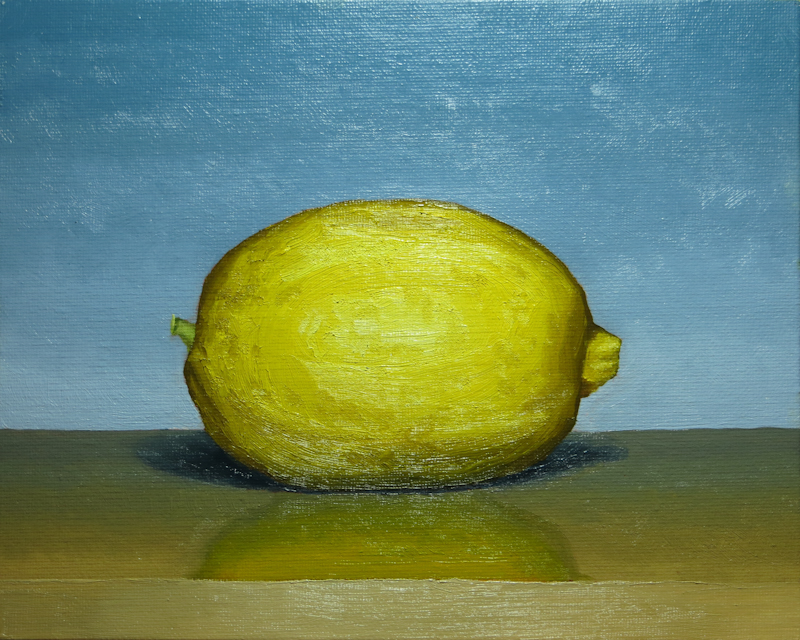
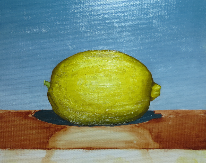
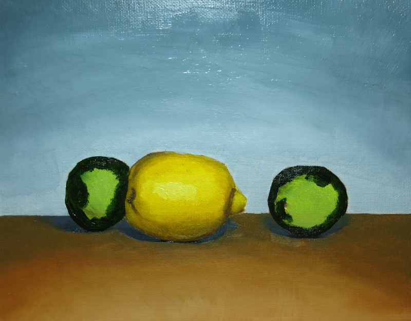
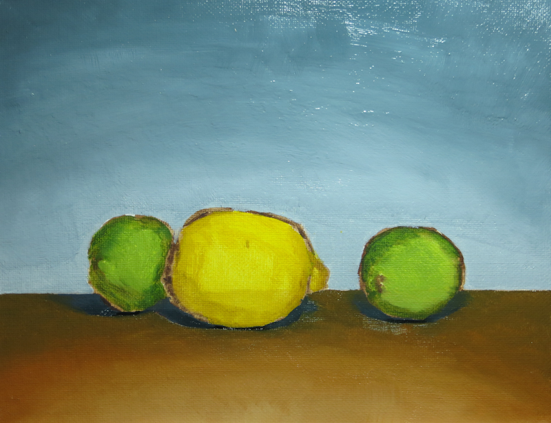
Tonight I finished my second citrus painting. I’m finding that doing a bunch of small, quick paintings is more satisfying than a single long painting. My plan moving forward is to do a few more citrus paintings to get the hang of it and then proceed through small paintings of vegetables, paper bags, jars, etc. until I have a pretty solid repertory that I can use in more ambitious paintings.

February 10, 2014

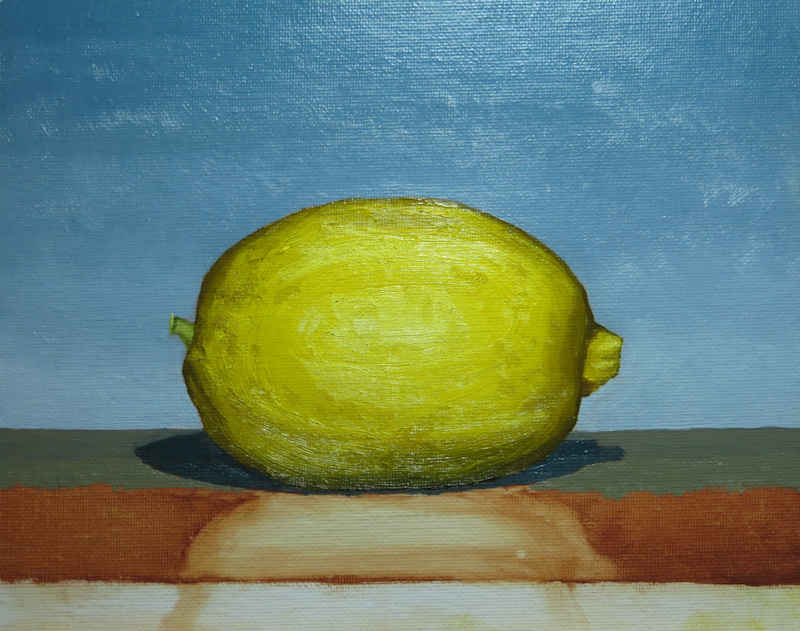
Worked on my second citrus painting this evening. I seem to be getting the hang of painting front light on citrus. This painting went much faster than the previous one and I was actually able to get some texture onto the skin of the lemon. I’m hoping to finish up in one more session – all that remains is the table top and the reflection of the lemon.

Then I have a really nice Bosc pear and some more citrus beckoning . . .

February 6, 2014

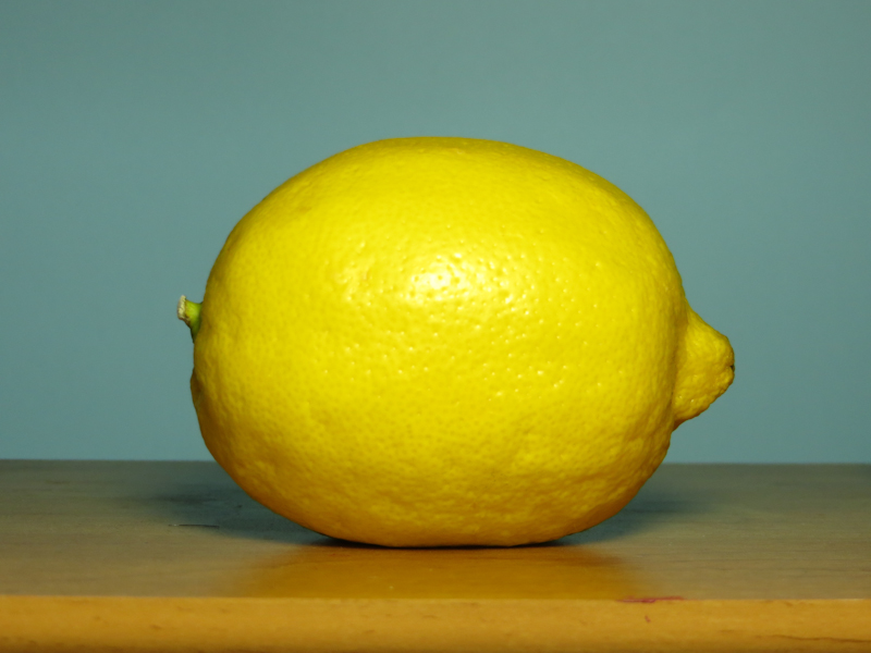
I started another lemon painting today. This time, the lemon is about double life size.

The fruit in my previous painting was too small to show the lumpy bumpy texture. For this painting, I decided to paint the lemon at about double life size so I could paint more detail.

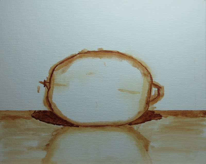
Here’s the initial sketch done in about 15 minutes in Burnt Sienna diluted with Gamsol.

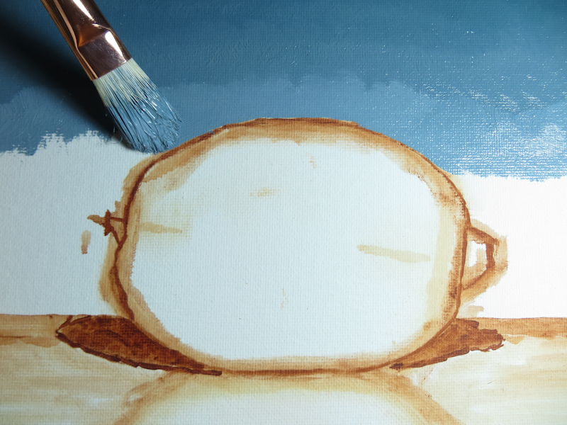
I’m getting better at doing gradients. This one was based on a string of 5 values, which, with pairwise combinations made a scale with nine steps. I applied the paint first, and then went back to smooth out the gradient.

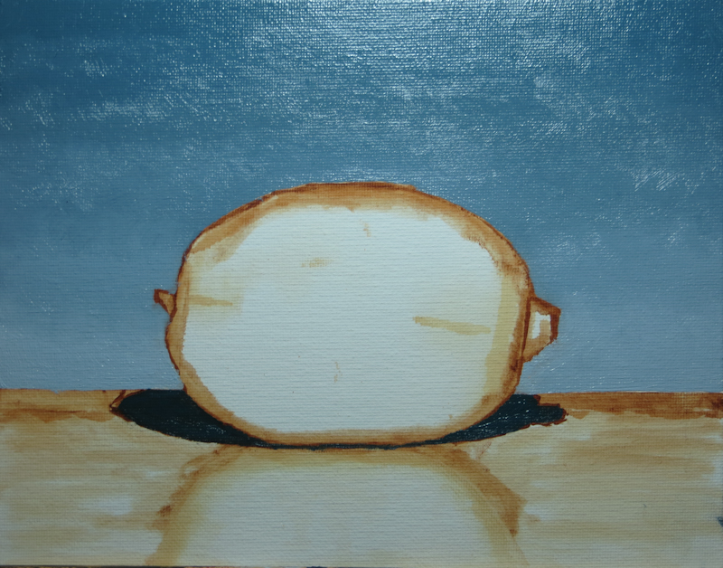
This is where I stopped after about an hour’s work.

Edges in Shadow

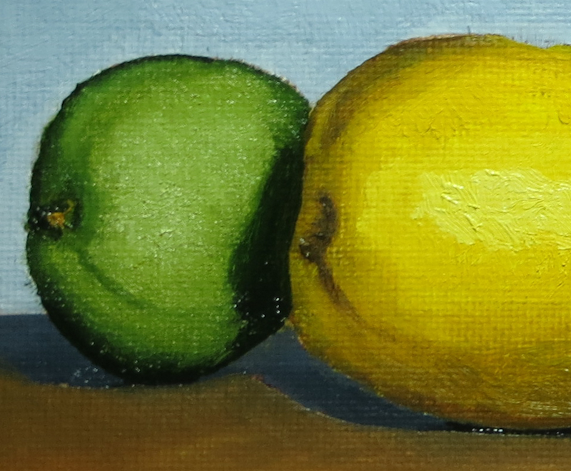
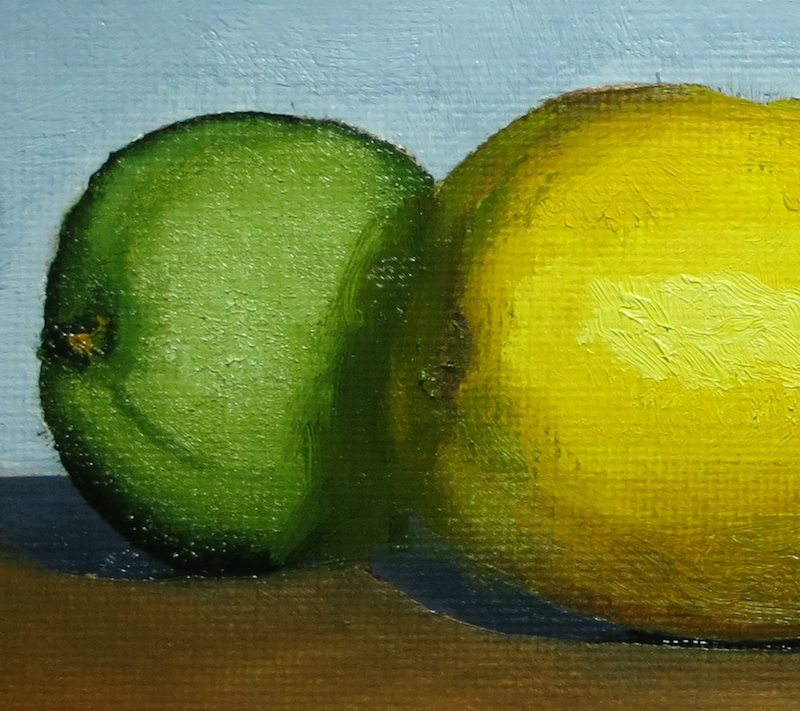
During today’s crit, Gary gave me a lesson in softening edges that are deep in shadow.

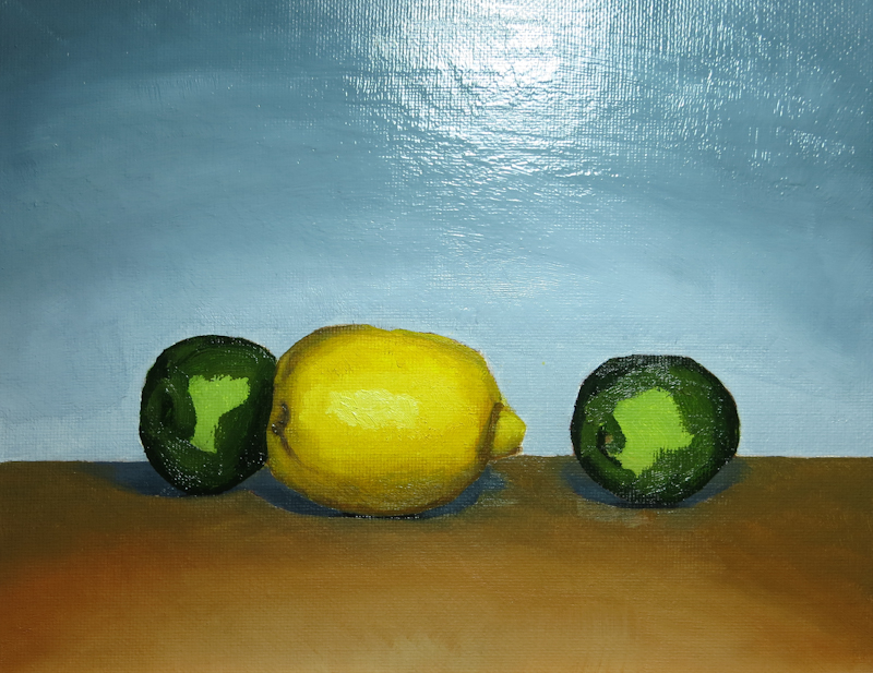
This is my original painting. Notice that the left edge of the lemon is sharp and fairly high contrast where it passes in front of the lime.

Gary picked up a small bristle brush and worked in some green, dark yellow and brown until the edge of the lime was almost lost in the darkness of the shadow.

February 4, 2014

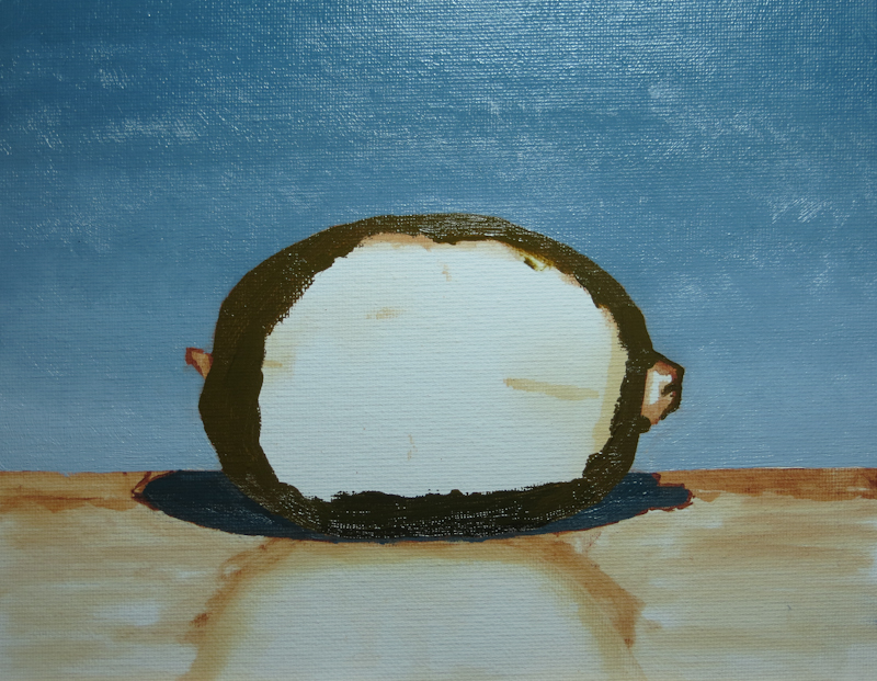
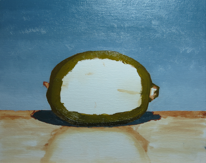
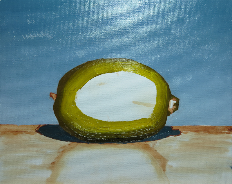
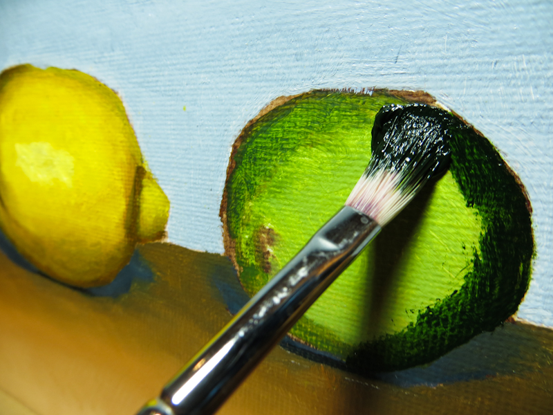
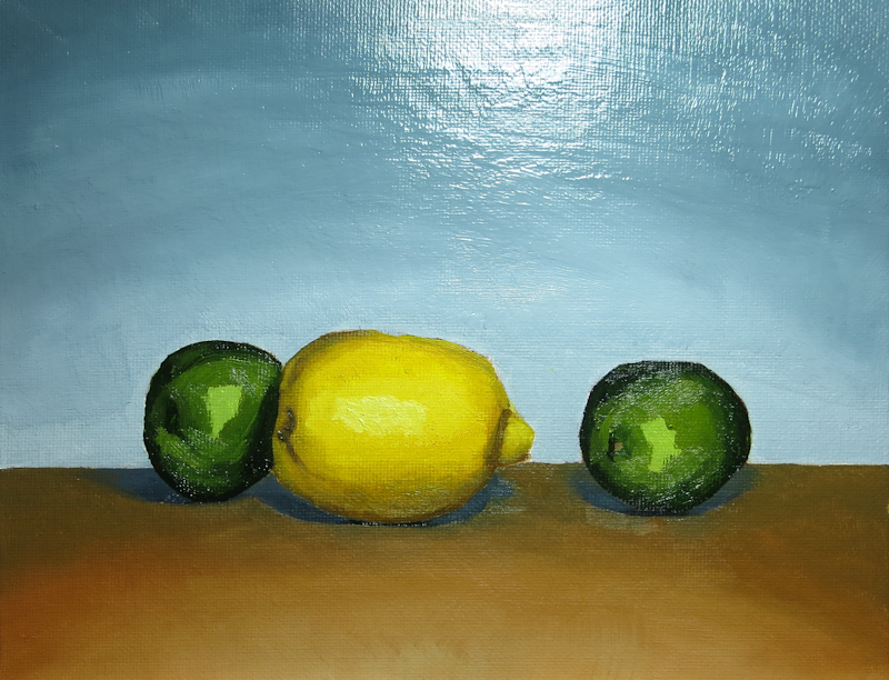
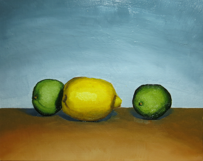
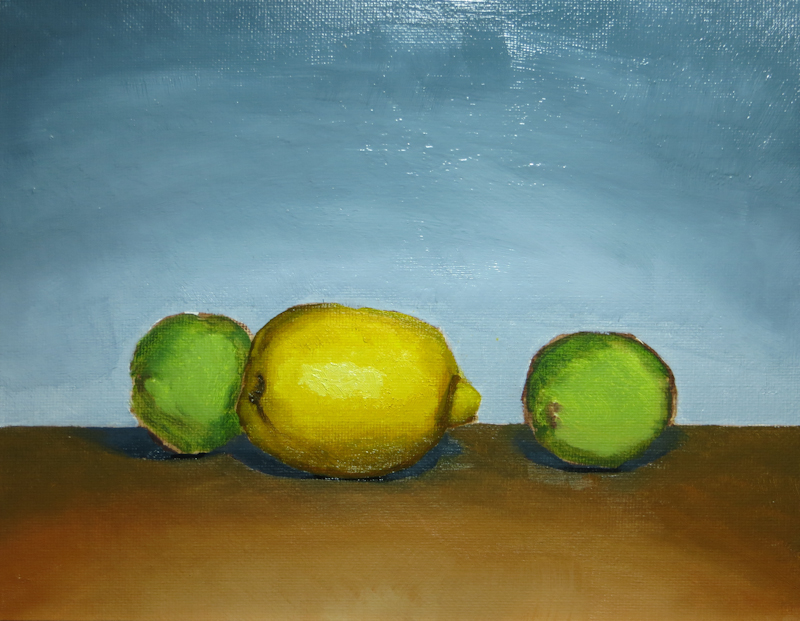
Tonight I worked on the limes. Gary had demonstrated his technique for rendering front-lit forms, which was to start with the darkest color and place it around the edges, and even completely across the form. This very flat, two-dimensional lime, then gets volume as successively lighter colors are blended into smaller concentric regions on top. Gary says to think of “sculpting” the object by building up the nearer portions with successive layers of lighter paint.

I started with the darkest color first. Darker pigments tend to be transparent, while the lighter pigments tend to be opaque. It is easy to lighten up a dark or even cover it with a light, but it is hard to go the other way.

After adding the darkest value.

Here I’ve added the second value, but I haven’t done any blending.

Now I have three values, but still no blending.

By this point, I’ve added all of the values and done quite a bit of blending to bring out the three-dimensional form. I found that I had to go quite a bit lighter than I had originally anticipated, and that the best way to apply the paint was dabbing with the brush almost perpendicular to the canvas.

January 30, 2014

On Thursday I began to shade in the form of the lemon. It took me a long time to mix up a string of yellows that didn’t head towards green in the darker values. I was really hoping to move towards an almost neutral, slightly yellow gray, but my darker values always seemed more brown than gray.

I used Cadmium Yellow Medium and Titanium White for the lightest step. The darker steps were made from the same yellow, mixed with Burnt Umber, Burnt Sienna, and Ultramarine Blue. My basic approach was to mix Yellow, Burnt Umber, and Ultramarine until I got the right value, then push it away from green, using either the Burnt Sienna or the Burnt Umber. If I went too far and it started looking like a reddish brown, I would add Ultramarine to pull it back towards a neutral.

This scene uses frontal lighting, so most of the darker values are only visible around the perimeters of the lemon and the limes. I like the modeling on the lemon, but need to work on the shape a bit, particularly on the lower left. The next step is the limes.

January 25, 2014

Today I painted the tabletop and the shadows of the fruit and then I reworked the background to have a sharper gradient. I still have a lot to learn about creating smooth gradients. My work on the background and the tabletop probably took twice as long as I had spent on the painting previously.

Not sure my changes improved the painting, mainly because the tabletop seems a bit dark. Tomorrow I will start painting the fruit.

Moving On

You’re probably wondering what happened to my Wine and Apples painting. I didn’t finish it to my satisfaction, but Gary and I agreed that I had reached the point of diminishing returns on learning to paint.

With that we declared the painting finished! What a relief! I took the painting off the easel, struck the set and moved on to Limes and Lemons.

Here are a few take-aways from my first atelier painting:

  1. The study and the underpainting seem to have more energy and personality than the finished painting.
  2. The parts that went quickly, like the initial drawing, the underpainting, the apples, and the cloth, were more satisfying and more compelling.
  3. Many of the passages where I struggled didn’t really contribute much to the success of the overall painting. Gary says these areas will improve as I get more experience.
  4. From a learning perspective, it is better to create more paintings than to endlessly rework a single painting.

Here’s a recap of the stages of Wine and Apples:

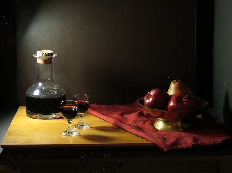
The actors are on the stage.

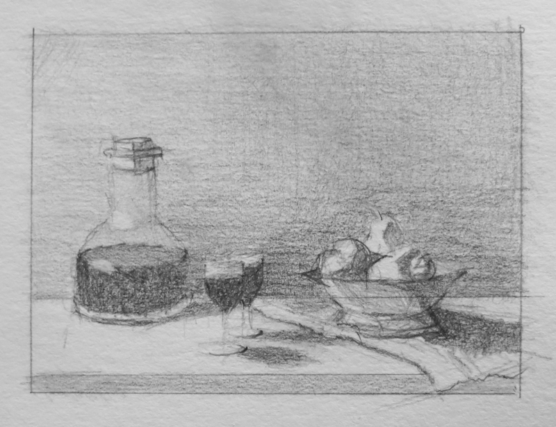
Twenty minute value study in graphite, 3″ x 4″.

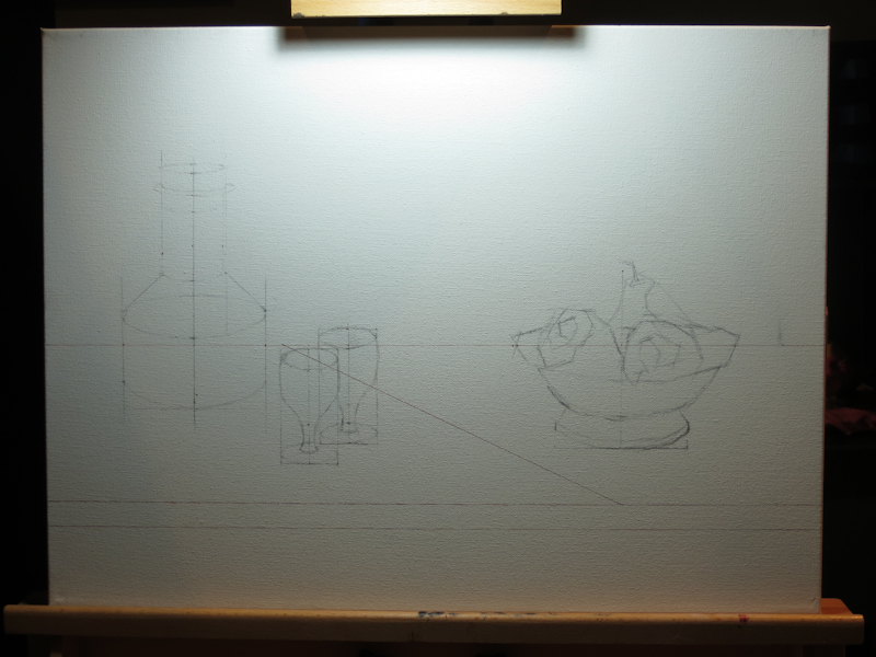
18″x24″ canvas with Indian Red Faber-Castell Pitt pen and vine charcoal.

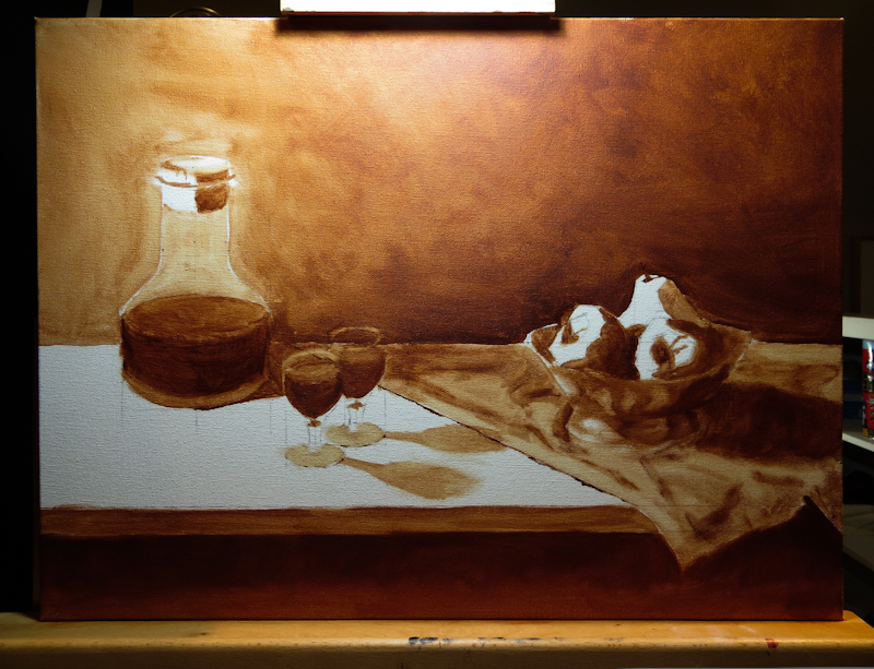
18″x24″ under painting, burnt sienna on canvas.

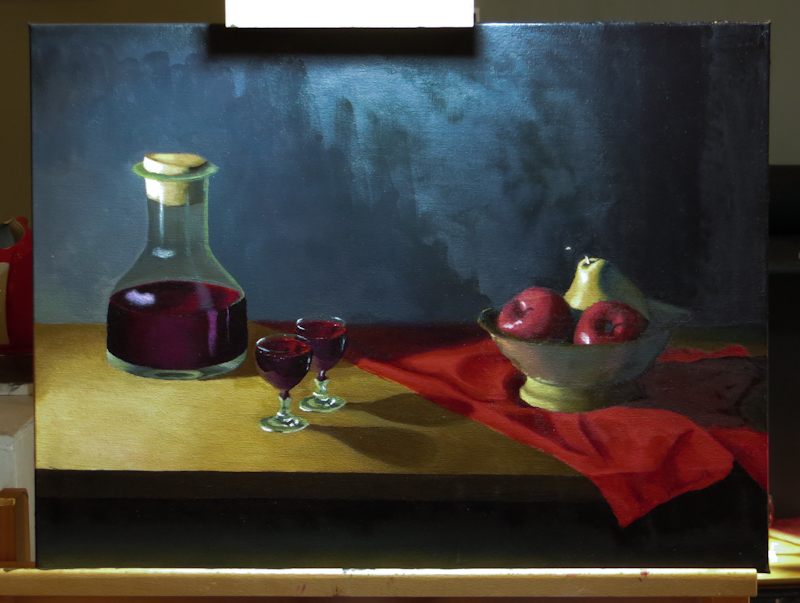
The finished painting.

Limes and Lemons

Today I started on a new painting! Gary wants me to shoot for four paintings over the next month, so I am focusing on smaller sizes and simpler, less diverse subject matter. The idea is that I will learn more in a month from four simple paintings than an entire quarter spent on a one large and complex painting. This first study is on an 8″x10″ canvas panel.

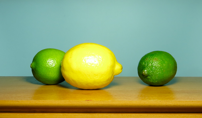
Here’s the tableau. After months of intense chiaroscuro, I wanted to do something high key with a lot of bright happy colors. Gary suggested citrus fruits since they don’t spoil too quickly and are fun to paint.

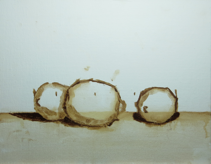
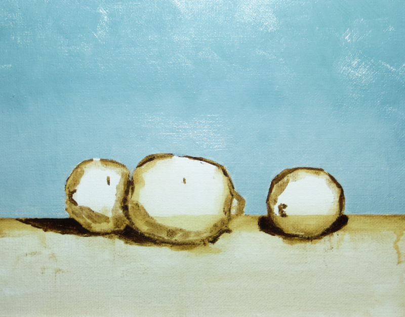
I did my initial drawing with a brush, using Burnt Umber diluted with Gamsol. My goal in using the brush, instead of charcoal, was to learn to draw directly in paint.

The background is a mixture of French Ultramarine, Cadmium Orange, Cadmium Yellow, and Titanium White. I think I did a pretty good job matching the color.

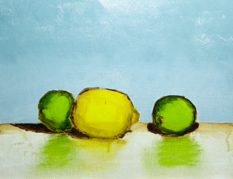
Here’s the painting at the end of the first session. It reminds me of a Cezanne because of the dark outlines around the fruit. Although I like Cezanne, my intention is to cover the dark outlines when I paint over the placeholder colors on the fruit.

Before leaving for the day, I took 5 minutes to quickly brush in some diluted placeholder colors in order to get an idea of how the image was coming together. I used Cadmium Yellow Medium for the lemon and a mixture of Sap Green, French Ultramarine, and Cadmium Yellow Medium for the limes.