Architectural Details

Tonight I experimented with a ruling pen to paint architectural shadows and highlights. My goal was to paint something that looked like a garage door with nine recessed rectangular panels. I used acrylic paint, instead of oils, so that I could quickly dry each layer before proceeding.

I found the ruling pen easy to use for lines from 1/16 of an inch down to the smallest hairline. The pen requires thin paint – about the consistency of half and half. After diluting the acrylic paint with water I found it had become nearly transparent. This wasn’t a problem for the test, but might be a bit constraining in a real painting. I also tried diluting the paint with Golden Self Leveling Clear Gel, but this was too thick for the pen.

I think the ruling pen will be good for things like powerlines, strands of hair, and sailboat rigging. It seems to work well for architecture, but I want to compare it with a liner brush and with the technique where, instead of painting the line, you paint the areas around it.

It will be interesting to see how the ruling pen works with oils.
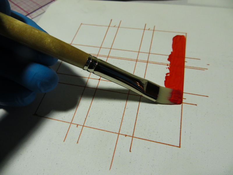
I used a clear plastic gridded rular to draw guidelines.

I let the guidelines extend beyond the bounding rectangle so that I would be able to locate them after applying the first layer of paint.
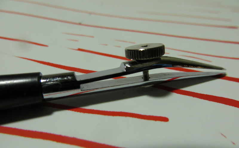
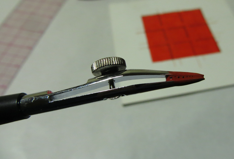
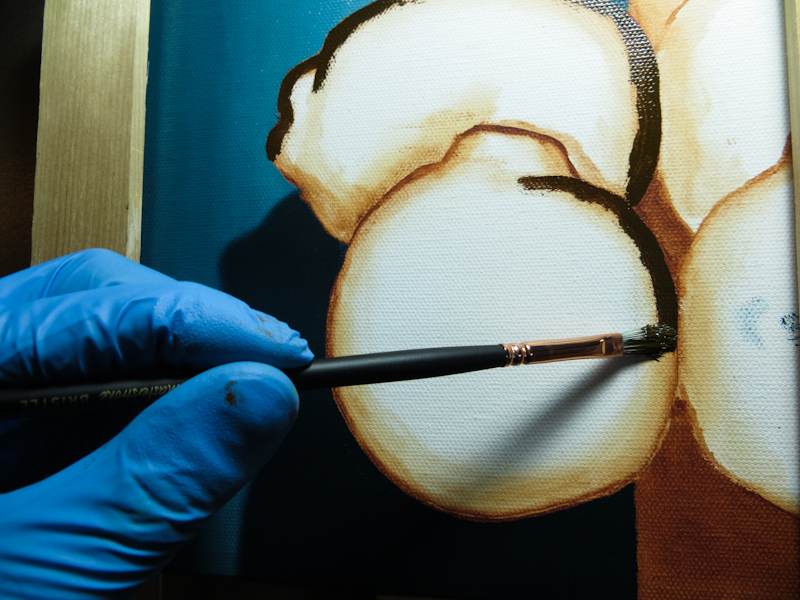
I used a ruling pen to make narrow straight lines. The ruling pen has two prongs that hold ink, or in this case, diluted acrylic paint, between them. The thumbscrew adjusts the spacing between the prongs which sets the thickness of the line.

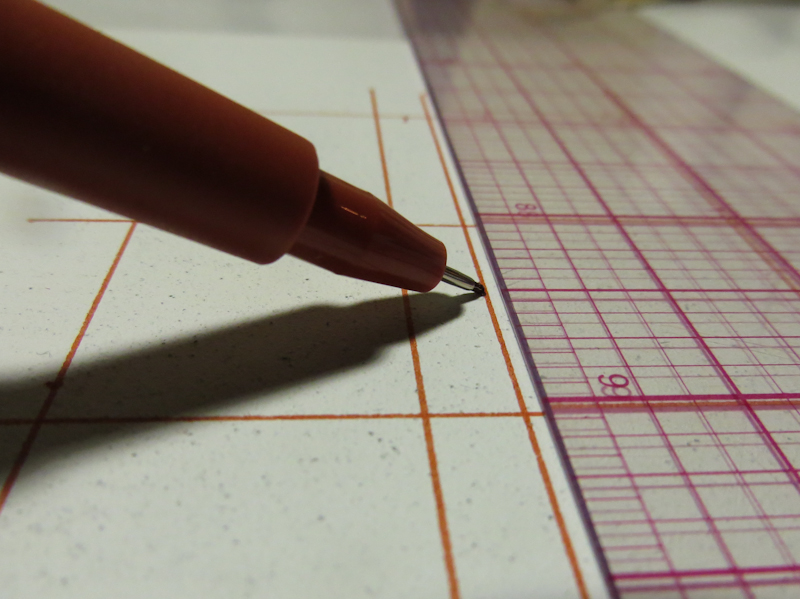
Here’s the ruling pen with a fresh load of paint.

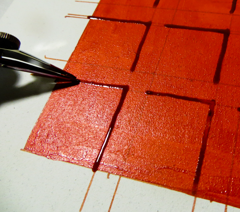
It is easy to draw straight lines with the ruling pen.

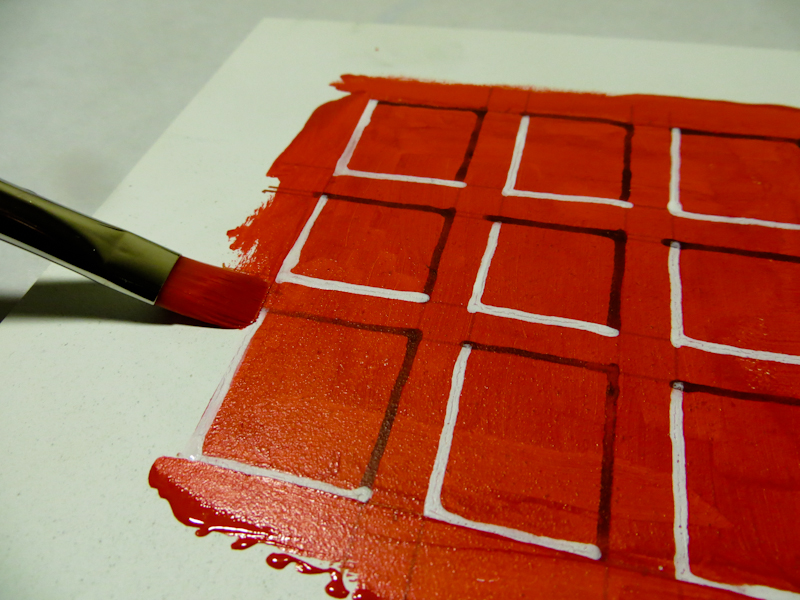
After drawing in the shadows and the highlights, I painted a border outside the original bounding box. This covered up the ends of the guidelines.

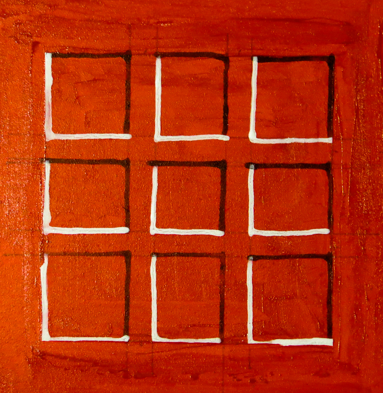
Here’s the final piece. It is about 3″ x 3″. Overall, pretty successful, given the amount of effort.

Art is always visual

One of the cool things about art school is that the instruction is fundamentally visual. Years ago when I first attended Gary Faigin’s class on perspective, I was delighted to find that the entire lecture was conducted in drawings. Sure Gary spoke to us, but for the entire 90 minutes he was also drawing with charcoal and chalk on a giant, 4′ x 8′ piece of sheetrock, continually morphing the image from one scene to another as he made different points.

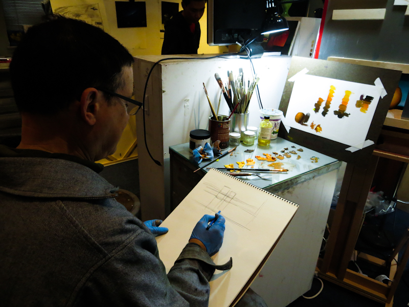
I was thinking about this recently in crit as Gary painted an orange to illustrate brushwork and then grabbed my sketchbook to make a point about eye level.

It makes complete sense that writing is taught with words and art is taught with images, but I am still surprised and delighted every time I get to see a demo.

March 17, 2014

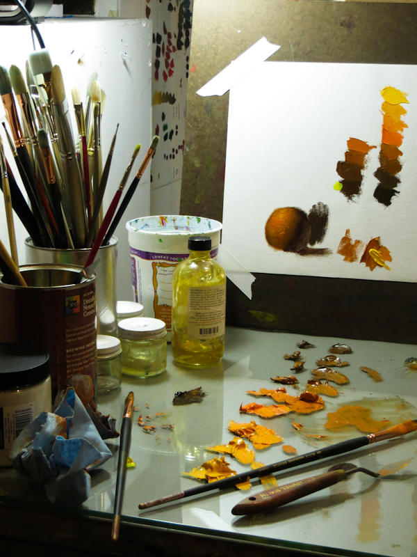
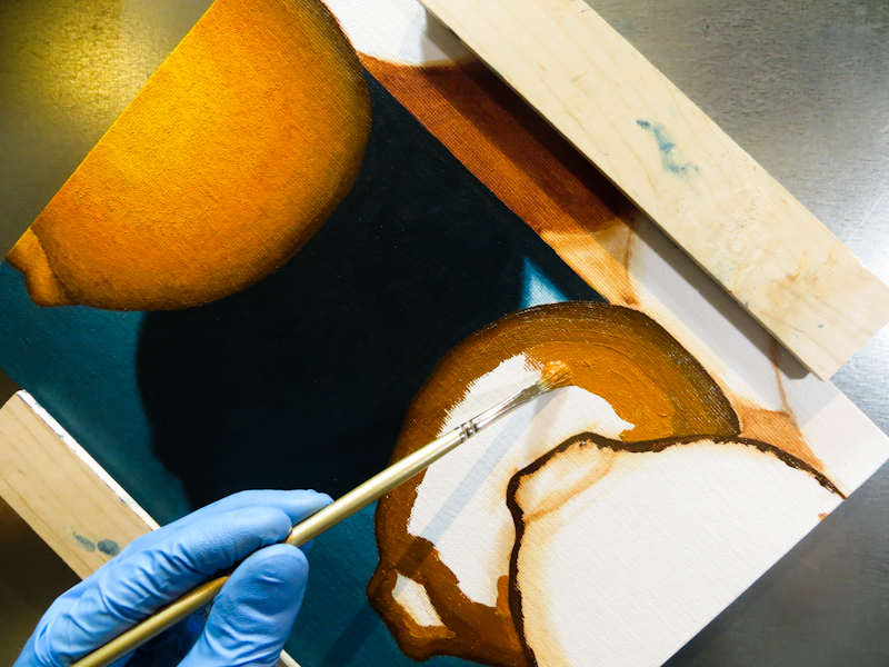
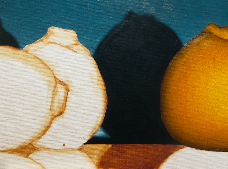
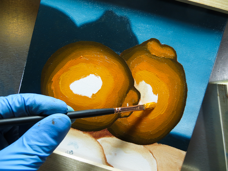
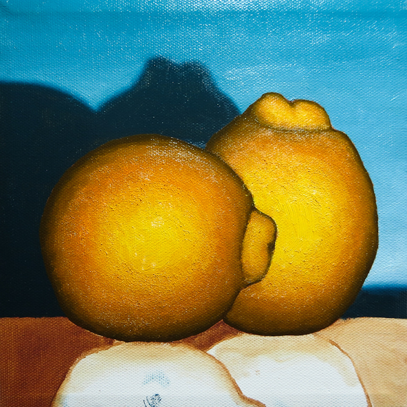
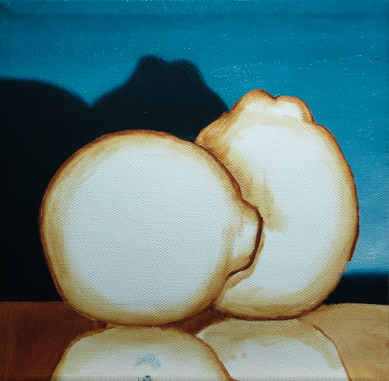
After a lot of shades of blue, I am now working with orange paint. My string was based on Cadmium Orange, with Cadmium Yellow and Titanium White at the lighter end, and Prussian Blue and Burnt Umber at the dark end. The results are pretty good, but I found the process harder than when I was painting the pears – this session took me almost four hours, and two of the hours were spent readjusting the form and then evening out the gradient.

I think the next one will go smoother if I paint with finer gradient steps and I get the initial placement of the paint more accurate. One thing that slowed me down was that I made the darker regions too wide and this caused me to adjust and readjust the gradient many times over. If I had painted the dark regions in the right place, at the right size, the first time, I would only have had to smooth the gradient once.

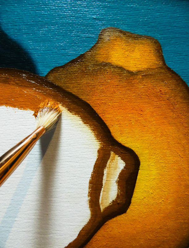
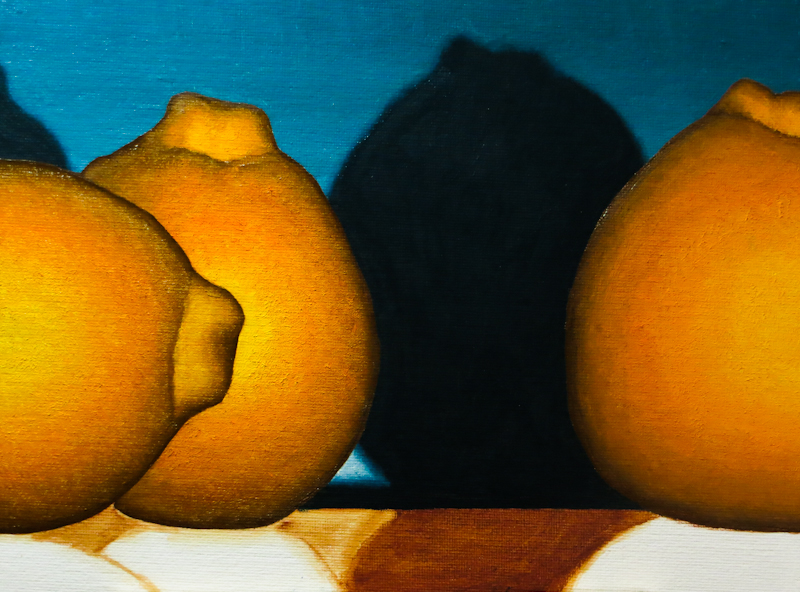
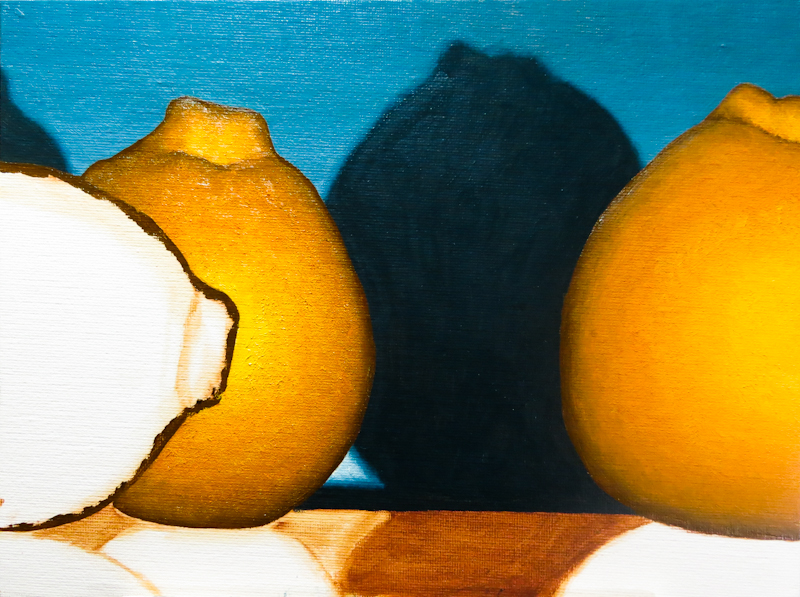
The other thing I want to improve is subtlety of the transition between the body of the Mineola and the lump where the stem attaches. In the picture, below, the transitional region is too dark.