Eliminating head strikes

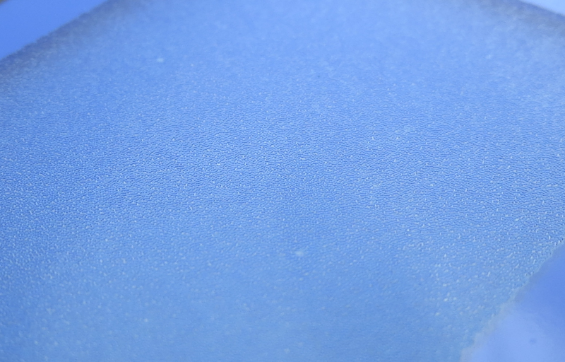
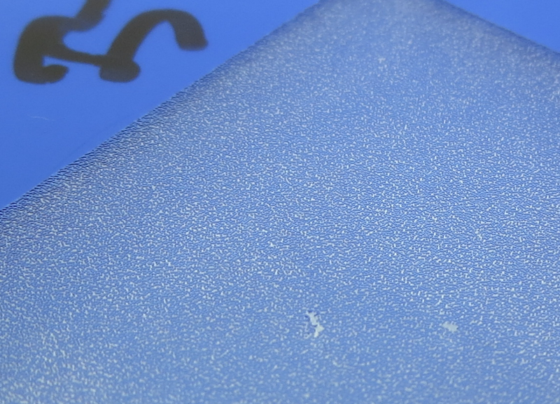
In my earlier ImagOn direct-to-plate experiments, I managed to print an aquatint pattern with sufficient density by running my plate through the front slot of an Epson 3880 printer. The dot structure in the matrix looked fantastic, but it was interrupted by streaks which I determined were the result of the print head striking the plate.

When I printed the plate, I set the platen gap to the maximum, but for some reason this wasn’t sufficient the prevent the head strikes. It turns out the problem was in the design of the plate carrier.

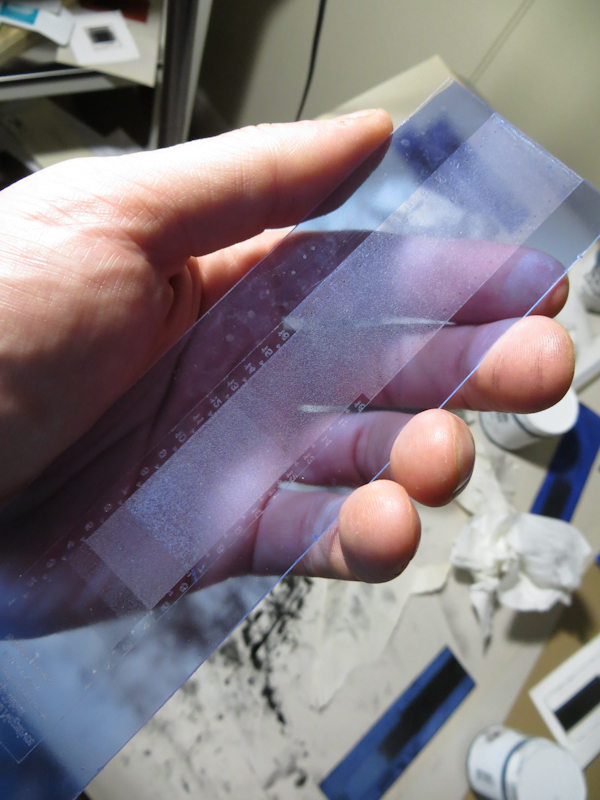
One of the nice things about ImagOn is that it is transparent. Transparency allows one to spot inking and wiping problems by holding the plate up to the light and it helps in registration when printing with the paper under the plate.

The problem with transparency is that the Epson 3880 uses an optical sensor to detect the paper, and it can’t see the plate because it is transparent. The solution is to attach the plate to some sort of an opaque carrier. Some people just use a sheet of paper.

For my first attempt, I constructed a carrier with a window mat on top and a piece of cardstock on the bottom. The plate was held firmly in place inside the window with some Tombo removable adhesive strips.

The Epson 3880 specifications allow a maximum paper thickness of 1.5mm. With this in mind, I chose to make my first carrier out of Strathmore 400 4-ply Bristol and Epson Brochure and Flyer Paper. The combined thickness is about 1mm, and well under the limit for the Epson printer. The problem is that the Bristol is 0.030″ thick – the same thickness as the polycarbonate plates. When the plate sits on top of the adhesive strips, a portion of the plate and the ImagOn emulsion protrude above the surface of the carrier, just begging for a head strike. Any warping in the plate will only make matters worse.

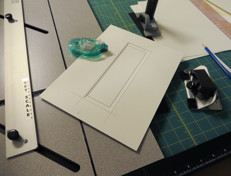
This carrier is too thin. The ImagOn plate protrudes above the surface of the carrier, increasing the probability of a head strike.

Today I tried a thicker plate design and it worked. I ended up using Crescent 4-ply mat board on the top and Strathmore 400 4-ply Bristol on the bottom. This carrier has a total thickness of 2.25mm, but it seems to work fine in the printer.

This 2.25mm carrier seems to work fine in the Epson 3880 front feeder and it eliminates head strikes.

When making the carrier, it helps to print the outline of the plate directly onto the Bristol that will become the bottom layer. Print this sheet using the front feeder so that the plate outline will be aligned correctly.

Here are some pictures of the second carrier.

My new carrier uses a layer of Strathmore 400 4-ply Bristol on the bottom and a piece of Crescent 4-ply matboard on the top. Note that I have printed the plate outline onto the Bristol.

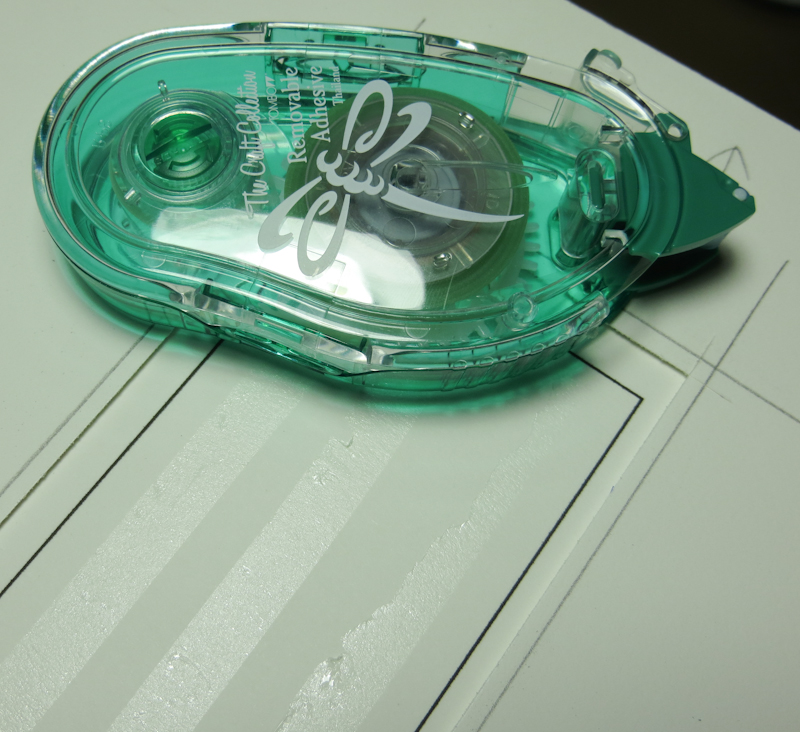
The plate is held in place with strips of Tombo Removable Adhesive.

ImagOn Lamination Tip

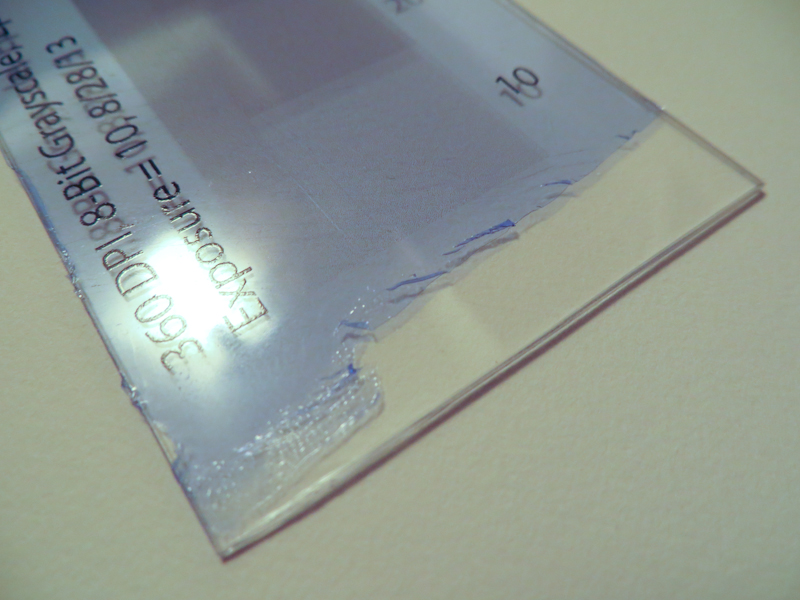
I got a little carried away with the hair dryer while making this test plate and ended up fusing the protective plastic layer to the ImagOn emulsion. When it was time to print the design onto the plate, I was unable to separate the protective layer from the emulsion until I peeled the both up off of the plate and used two pieces of tape, one on top of the plastic and one on the underside of the emulsion, to peel the protective layer away. I wish I could get the emulsion to stick to the plate the way it stuck to the plastic!

Anyway, lesson learned – don’t overheat the plate after laminating.

ImagOn DTP Update

I spent last night printing – just not with the etching press. Instead I used my Epson 3880 to make test strips – a lot of test strips.
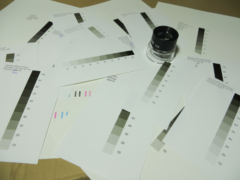
This is way too many test strips, but it seems like there are a million variables to explore.

My goal was to figure out the right printer settings and workflow in order to print directly to ImagOn plates, bypassing the need for transparencies and eliminating the dedicated aquatint exposure.

As I mentioned in my earlier post, it is possible to incorporate an aquatint-like structure into the image to provide the small ink wells that prevent an open bite in the dark areas. I am currently aware of four approaches for incorporating the aquatint into the inkjet output:

  1. Printer Driver Dither. In this approach, a gray scale image is converted to a dither pattern of solid black dots in the manufacturer’s printer driver. If your printer driver has a black-only mode, this is one of the best approaches because the dither can be accomplished at any of the printer’s native resolutions.
  2. 3rd Party RIP Dither. Some printers like the Epson 3880 limit black-only mode to lower resolutions. This can lead to a grainy image in the matrix. One can use a 3rd party RIP like QuadToneRip to generate a maximum resolution dither pattern. The downside of this approach is that it involves a lot of experimentation to get the RIP configured correctly. I’ve also found that the Epson driver seems to generate a smoother dither.
  3. Photoshop Diffusion Dither. In this approach, a grayscale image is converted to a bitmap using Photoshop’s diffusion dither. Conceptually this is similar to the algorithm in the printer driver and the RIP. In practice, it can generate a lower quality dither on the plate because the dithered image from Photoshop may get dithered again in the printer driver or RIP. One can reduce this effect somewhat by choosing bitmap resolutions that are power-or-2 factors of the printer’s resolution. One can also eliminate any print-time processing by using a driver like GutenPrint.
  4. Photoshop Stochastic Screen Layer. I describe this approach in my earlier post. The goal is to more accurately mimic the effect of an aquatint screen. In the first three approaches, the density of dots decreases as the image gets lighter. This can have the impact of reducing resolution in the lighter shades. A stochastic screen layer has a uniform dot density across the value scale, and uses gray levels or even colored inks to adjust the value. This approach has a couple of downsides. As with the Photoshop diffusion dither, one has to guard against additional dithering in the printer driver and RIP. The other downside is resolution – the printer only has a limited ability to adjust drop size, so gray levels will still need to generated by some amount of dithering. This means that each pixel in Photoshop will need to correspond to a handful of pixels in the printer.

Last night I focused my efforts on the first two approaches, with my first test using the Epson printer driver at 720dpi. My goals were to figure out sufficient dot density while avoiding excessive dot gain and banding. Factors that impact density include choice of ink, print resolution, print speed, and the color density setting in the advanced media control options. Factors that impact dot gain and banding are paper thickness, platen gap, and drying time per print head pass.

After examining many test prints under a loupe, I finally arrived as some settings that seem like a decent starting point. The results shown below are from the Epson driver with the following settings:

  • Media type: Epson Singleweight Matte Paper (this is one of only two media choices that enable black-only printing – other Epson printer models enable black-only printing for a wider variety of media and resolutions).
  • Color: Black
  • Ink: Matte Black (only choice allowed for this media type)
  • Print Quality: Quality (720dpi – the only resolution supported for black-only)
  • Paper thickness: 15 (1.5mm)
  • Platen Gap: Wider
  • Color Density: default value
  • Drying Time per Print Head Pass: default value

Using these settings, I printed a test strip directly onto a plate consisting of ImagOn laminated to 0.030″ polycarbonate. The plate was laminated the day before printing and I waited another 24 hours after printing before exposing and developing. The plate was exposed on a Nuarc 26-1K exposure unit for 20 units. I did not use the vacuum frame. Development was the standard 9 minutes in a room temperature solution consisting of 10g soda ash per liter of distilled water.

Overall the plate looks pretty good.
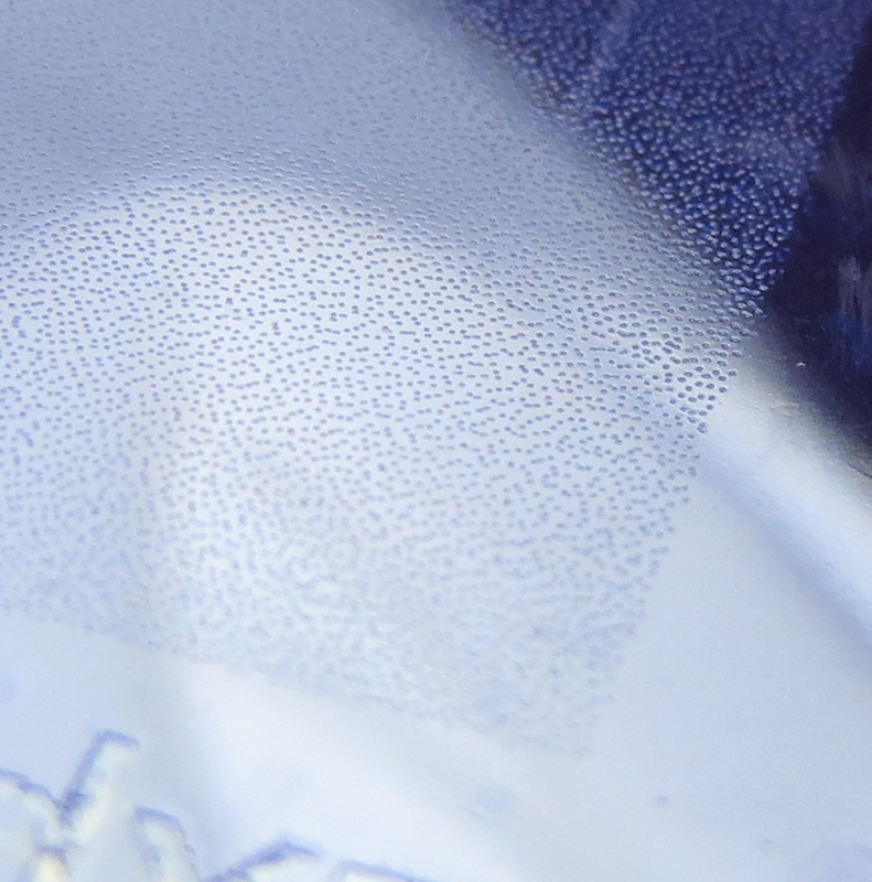
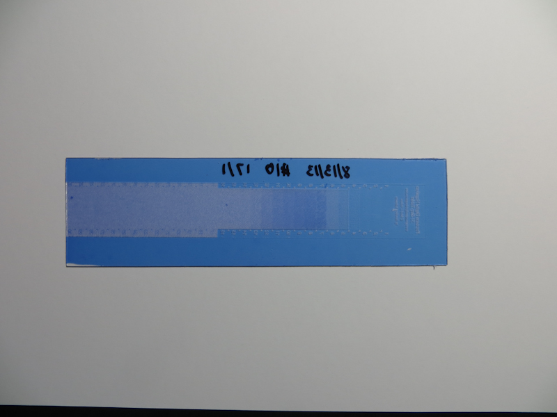
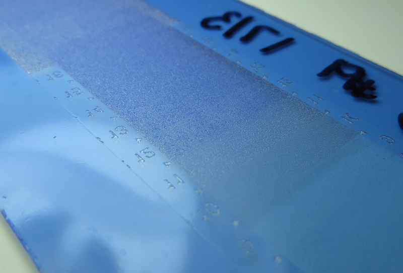
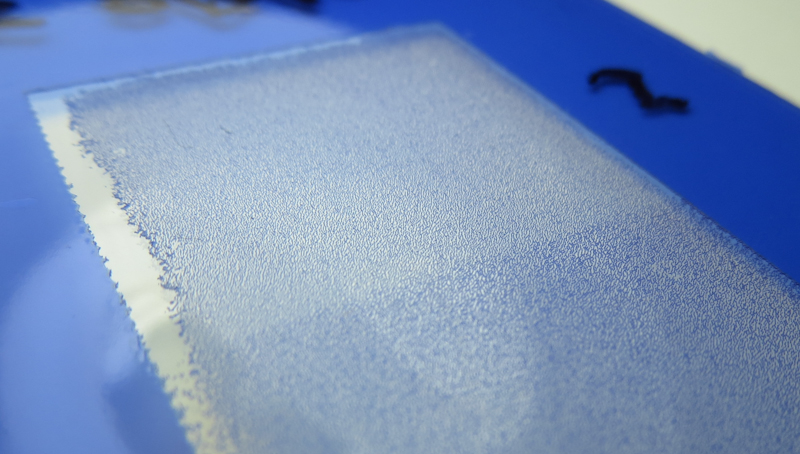
Here’s a closeup of the 10% density portion of the plate. The pits are well formed and go all the way to the surface of the polycarbonate plate.
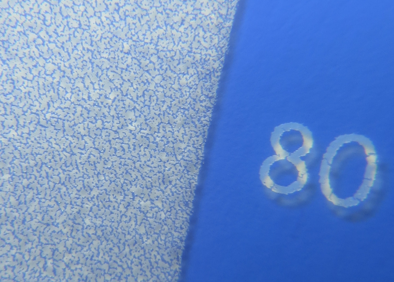
Here’s the pattern on the plate at 80% density. Again, the pits go all the way to the polycarbonate plate, and the ridges seem full thickness. This matrix looks very similar to the best plates I’ve made with an aquatint screen.

The aquatint pattern in the matrix on this plate is almost perfect! Unfortunately the matrix shows an unacceptable amount of printer banding.
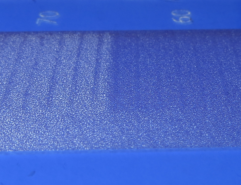
The big unresolved issue is the banding you can see here at 60% and 70%. The banding appears throughout the value scale, but is more pronounced in the darks.

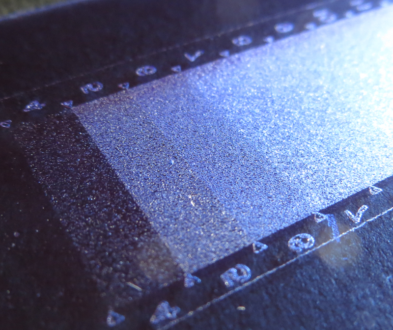
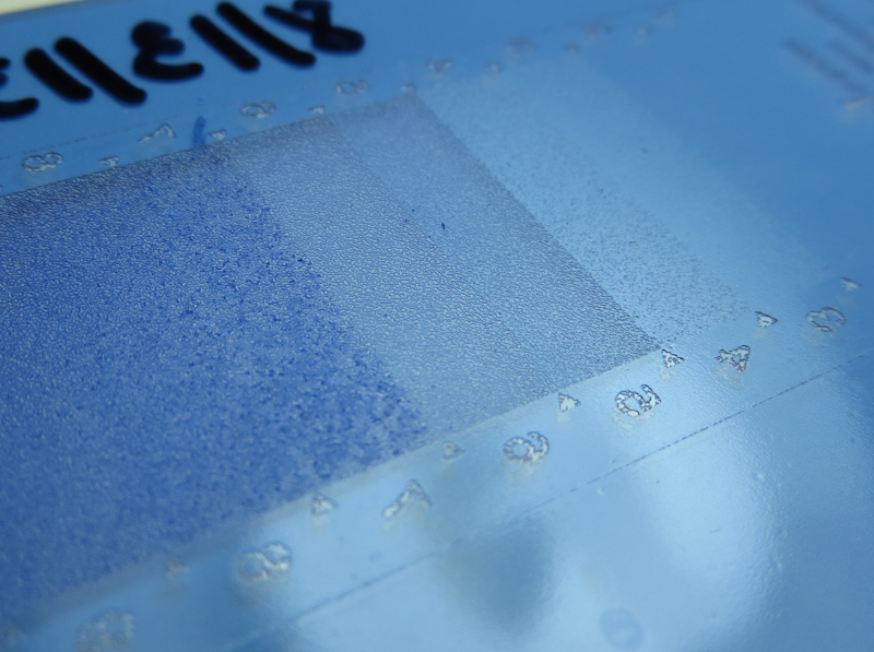
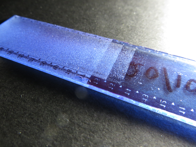
Printer banding has many potential causes, but the most common are misaligned print heads and head strikes due to incorrect paper thickness, insufficient platen gap, dust and particulate on the print head itself, and warped media. The photo below shows clear evidence of head strikes. The fact that the banding does not go all the way across the plate suggests that the plate wasn’t completely flat, allowing a head strike for a portion of the scan.
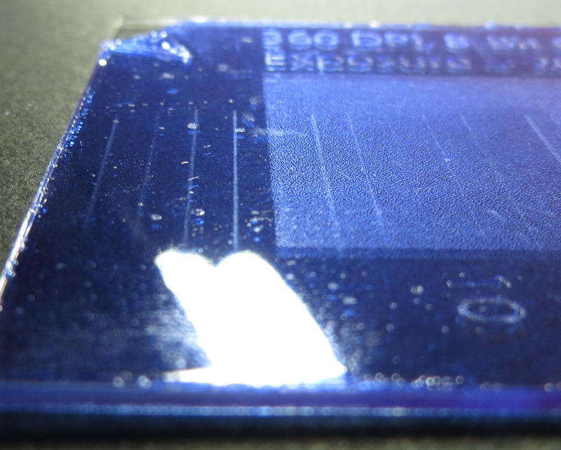
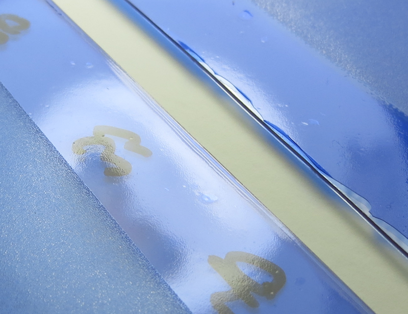
This image shows evidence that the banding is produced by head strikes. The vertical scratches on the left of the plate are in a non-printing area, thus indicating that the head is dragging across the plate.

It’s been a lot of work to get to this point, but I am pretty happy with the results. I am confident that I can address the banding and then I will do a PDN-like calibration to generate Photoshop adjustment curves to linearize the ImagOn response. Stay tuned for another exciting episode!

Why ImagOn?

I am sometimes asked why I put so much time and effort into learning to make plates from ImagOn when I could be using high-quality, ready-made photopolymer plates like SolarPlate or Toyobo KM plates. The reason has to do with my artistic vision which involves large, two, three, and four foot intaglio prints made from multiple plate impressions using image decompositions similar to those found in reduction linocuts and Moku Hanga. I chose intaglio over relief methods because I wanted to create tonal gradients unavailable in linocuts and textures unavailable in woodcuts. I also wanted the ability to incorporate very small details that are hard to obtain with hand-cut relief plates. Seriography and lithography were also options, but intaglio felt like the most promising technique for the images I have in mind. Also I love the embossing.

ImagOn is a challenging material to master but it has two huge advantages which are potentially unlimited plate size and lower cost. Ready-made plates are simply not available in the sizes I need and those sizes that are available run about $0.20 per square inch, compared with ImagOn which costs $0.02 per square inch. ImagOn is currently available in 24″ wide rolls and if I can tolerate a seam, I can butt together two pieces of ImagOn to create a plate almost 4′ wide.

My vision involves large prints, but I make lots of smaller prints along the way and for these I still prefer ImagOn because of its lower cost. My rationale is not as simple as merely saving money – one could argue that the time I spend designing and executing a print is worth more than I would would ever spend on plates and paper and ink.

The real reason is psychological and it has to do with creativity. Because ImagOn is inexpensive and I make the plates myself, nothing is precious and I am free to experiment to my heart’s content. I know that I am more careful when using a large piece of SolarPlate or painting on an expensive canvas. With ImagOn, I don’t even think about ruining the material and this leads to greater output and more paths followed.

I have been using Mark Nelson‘s Precision Digital Negatives process to calibrate my ImagOn plate making process. Most PDN users are from the alternative photographic process world and those that work with photopolymer are typically trying to achieve a “printerly” effect in a piece that is essentially a photograph. My use of ImagOn and digital stochastic screens is unusual for this community. For the most part, their goals are to reduce grain in the image and render very subtle tonal changes across the entire range. I want this, too, but my images aren’t photographic in nature so I am much more willing to sacrifice grain and tonal subtleties for the ability to print large. Also in many cases, I deliberately incorporate coarse aquatint texture into my designs.

I do require absolute control over my processes because I am making a huge investment in time and money to put together a large print from multiple plates. In order to remain creative, I need high confidence that my 4′ plate will work as planned. PDN gives me this confidence.


Direct-to-Plate ImagOn

In December 2011 Don Messec uploaded a pair of videos that demonstrate his direct-to-plate approach for creating ImagOn printing plates. Take a look at Photopolymer Gravure Direct to Plate and Photopolymer Gravure, Direct to Plate: Sun Exposure. I was really excited when I saw these videos because of the opportunities to make really large plates at lower cost. Let me explain.

The approach that Don demonstrates combines three key ideas:

  1. Printing directly to the unexposed ImagOn plate.
  2. Incorporating a digital stochastic screen into the image file.
  3. Using only black ink to create a pattern of dots that reads as gray scale.

The first idea saves time and money by eliminating the the positive transparency. Instead of printing to transparency film which will be used for the exposure, one simply inserts the unexposed ImagOn plate into the printer.

The idea becomes much more powerful when a digital stochastic screen is incorporated into the image file. If the image file doesn’t incorporate the screen, one must first expose the plate with an aquatint screen before printing the image onto the plate. Aquatint screens are expensive and to get a good aquatint matrix, you really need a vacuum frame to hold the screen in close contact with the plate and high wattage point source light for the exposure. It is still fairly easy to find used platemakers like the NuArc 26-1K, but the 26″ square vacuum frame limits the plate size. When printing a stochastic screen directly onto the plate, one eliminates the need for a vacuum frame because the ink is already in direct contact with the plate.

The third idea of printing the gray scale image using only black ink reduces exposure time sensitivity to the point where one can get repeatable results from sunlight. When exposing with gray scale, it is necessary to nail the exposure within about a half of an f-stop and this is hard to do without using a light integrator. When the image consists only of high density black dots, the exposure latitude increases greatly because any exposure that hardens the unprinted emulsion without hardening the printed emulsion will work. This increase the exposure latitude makes solar exposures feasible and in combination with the first two ideas allows one to eliminate the platemaker, vacuum frame and aquatint screen along with many of the limitations they impose on plate size and cost.

Now let’s take a look at digital stochastic screens. Suppose you have a gray scale image like the one below.

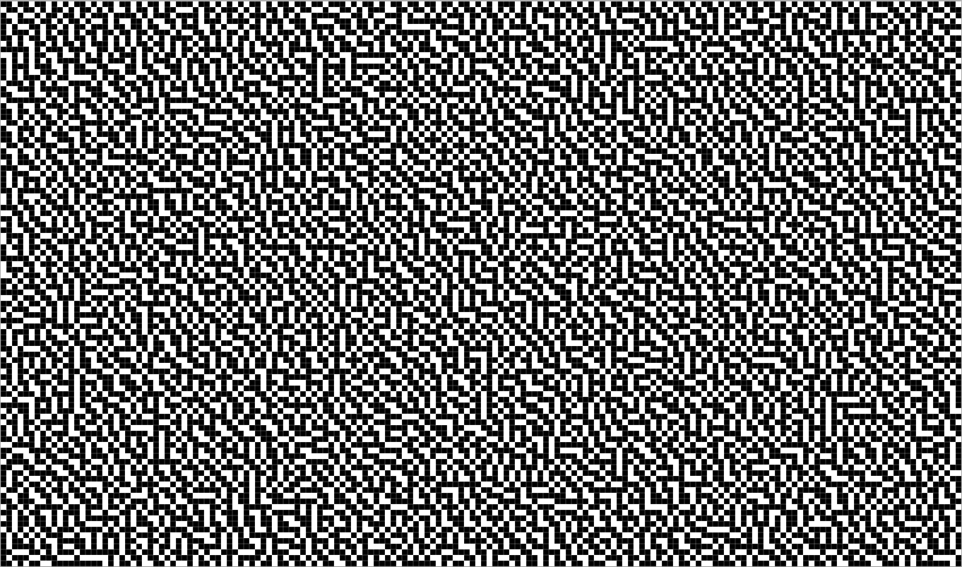
If you have Adobe Photoshop it is easy to translate the gray scale to a black and white dither pattern that reads as gray scale but provides the small ink wells needed to avoid open bite. One way to do this is

  • Use Image -> Adjustments -> Curves to compress the densities so that black translates to about 80%. The reason for this step is that even the darkest black still needs to incorporate a scattering of white dots in order to avoid an open bite. You will need to experiment to find the exact maximum density for the curves adjustment. One way to do this is to make a plate based on a gradient from 0 to 100% and then pick the density where black first appears.
  • Use Image -> Mode -> BitMap with the “Diffusion Dither” method to convert the gray scale image into a black and white image based on a random dot pattern similar to the dots in an aquatint screen.
  • If your printer supports black-only printing, you are in luck and can proceed to print directly to the plate.
  • If your printer doesn’t support black-only printing in the factory driver, you can use a third party driver like the one in QuadToneRip (Windows) or IceFields (Mac) to print black only. If you use a low enough image resolution and the resolution evenly divides into your printer resolution, you may also be able to get away with normal printing since the printer will mainly use black ink.

The result will be a plate with wide exposure latitude, suitable for solar exposure.

I am also interested in a middle ground that gives me better resolution and tonality while eliminating the the vacuum frame and aquatint screen. The tradeoff is that I will still have the narrow exposure latitude of a gray scale image. I think I can manage this exposure sensitivity by using the light integrator in my exposure unit or building my own light integrator for solar exposures.

Here’s my thinking. I will first create an digital aquatint screen as follows:

  1. Create a “grayscale” image with the same dimensions as my artwork.
  2. Fill the entire image with 80% gray.
  3. Convert the “grayscale” image to a bitmap using diffusion dither.

Then I will incorporate the aquatint pattern into to my artwork as follows:

  1. In my artwork, add a new “Normal” layer with 100% opacity and fill and then add a layer mask.
  2. Paste the aquatint bitmap pattern into the layer mask.
  3. Fill the layer itself with white.

The resulting image still has the aquatint structure, but it more closely mimics the light patterns created by the dual exposures of an aquatint screen followed by an image. In this plate, the depth of each ink well is based on the density of the original image. My expectation is that this approach will give me better tonality and more detail in the lighter shades. Note that this approach does not require a special driver from QuadToneRip or other packages because it uses all shades of gray.

If I am willing to accept the narrow exposure latitude associated with gray scales, I can use this same technique in conjunction with Mark Nelson‘s Precision Digital Negatives approach. Here’s the workflow:

  1. Determine the correct ink color mixture using PDN as normal.
  2. In the artwork, add a “Screen” layer with 100% opacity and fill.
  3. Fill this entire layer with the PDN color.

The result will be an image like the one below.

Stay tuned for the results of my experiments.

Imagon Improving

Tonight I tried printing my ImagOn test plates on damp Rising Stonehenge and found that I was able to get full ink density in my prints. I am still somewhat puzzled as to why I can get full density on dry paper using SolarPlate, but not ImagOn. In addition to this difference, I found that ImagOn has much higher contrast when compared to SolarPlate. ImagOn seems to do a great job reproducing the aquatint structure in the matrix and it seems capable of producing very fine detail. The ImagOn emulsion does seem more delicate than SolarPlate, and it is very easy to accidentally scrape off some of the texture. It is also easy to chip the edges of the plate. Photos below document my observations.

This ImagOn film is laminated onto a piece of transparent PETG plastic. The transparent plate has a number of advantages – you can easily see inking problems and it offers opportunities for easy, but precise registration when printing with the plate on top of the paper.

For this session, I made exposures of a Stouffer step wedge after first exposing the aquatint screen.

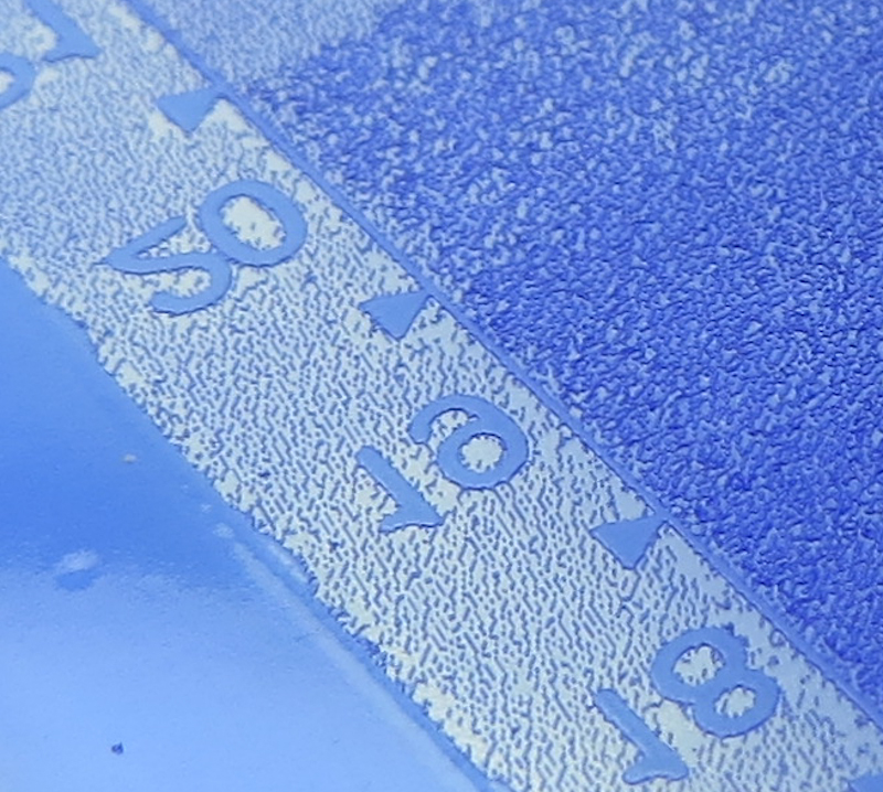
This plate used my best aquatint exposure, followed by an exposure of the Stouffer step wedge. A decent aquatint pattern has developed in the matrix.

Another closeup of the aquatint pattern.

I am puzzled by the blue globs of emulsion sitting on top of the aquatint matrix on the left side of the image in steps 7 and 8. I could try rubbing them off during development, but am worried that I might damage the matrix.

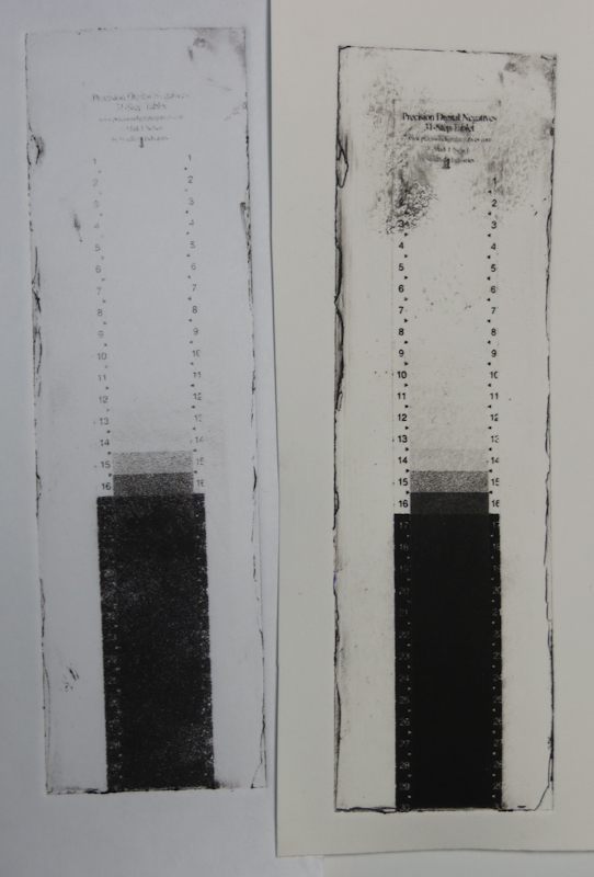
The test strip on the left is printed on the smooth side of dry Masa paper. The strip on the right is printed on damp Stonehenge. Clearly it is possible to print a maximum density black using ImagOn and damp paper. I am puzzled as to why I can get maximum density from SolarPlate on dry paper.

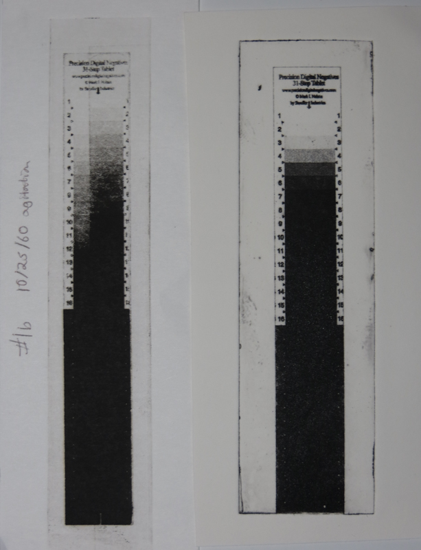
The test strip on the left is SolarPlate on the smooth side of dry Masa. The strip on the right is ImagOn printed on damp Stonehenge. The ImagOn seems to hold a finer grain in the aquatint, but it is very contrasty, compared to the SolarPlate. This is a case where the Precision Digital Negatives approach should really shine. My guess is that it will recommend a really low UV density ink like red in order to control the contrast.

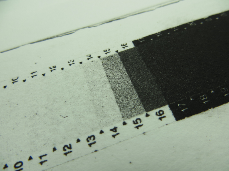
This closeup shows the fine detail that is possible with ImagOn. This is as good or better than prints I have made with SolarPlate.

More Imagon Tests

I’ve been trying to establish a baseline exposure for the aquatint screen. In my earlier session I had a lot of trouble getting consistent results and good ink transfer. After considering a long list of hypotheses, my conclusion is that my almost empty jar of ink was too old and its gummy consistency was playing havoc with my plate wiping.

For this evening’s session, I decided to eliminate as many variables as possible. By the end of the evening, I got some good plates that printed pretty well, but I was still not able to get the density of blacks that I can reliably attain with SolarPlate.

One top theory is that the Akua Mars Black which I used for the SolarPlate tests has greater optical density or better wiping characteristics than the Akua Carbon Black that I have been using with the ImagOn. This will be easy to investigate once I get another jar of Mars Black.

The other theory is that the ImagOn emulsion simply cannot hold as much ink as SolarPlate because it is only 50 microns thick, versus SolarPlate which is almost a millimeter. The main evidence supporting this hypothesis is that I get my greatest density when the channels in the plate go all the way to the plastic.

I am printing on the smooth side of dry Masa paper, so I’m pretty sure that the Imagon will give adequate blacks on wet Rising Stonehenge, but I would still like the ability to get fully saturated transfers on dry paper if possible as using dry paper will help me with multi-plate registration by eliminating paper expansion and contraction due to moisture levels.

My next experiment will be to determine the proper baseline exposure for the second exposure. Once I nail that exposure I can proceed with a standard PDN calibration.

I has having a lot of problems with my previous test strips that used a single exposure, simultaneously through the Stouffer wedge and the aquatint screen. For this evening’s experiments I eliminated some variables. Instead of using the Stouffer wedge, I went old school and used a strip of cardboard to create a sequence of exposure times. I also increased the size of the exposed blocks to 1″ square and I added a fully exposed margin to simplify the plate wiping.

In this closeup of the two test strips side by side you can see the overexposed margins that I added to simplify wiping. I found it was really helpful to make bigger plates with one inch square steps. My Stouffer wedge has 1/4″ x 3/4″ steps which are sometimes hard to evaluate.

This is a closeup of a dual exposure plate from my last session. I exposed once with the aquatint screen and then a second time with the Stouffer wedge. In this example, the aquatint is underexposed. You can see this in the region around the numbers which is solid black on the Stouffer wedge. For this area to print black, it will need a more robust dot structure to avoid an open bite. It is interesting that an underexposed aquatint screen can still make fairly dense halftones as you can see on the right. Also, note that the underexposed aquatint has led to an uneven dot pattern on the right.

This step is underexposed to the point of open bit. Here the aquatint screen has produced a field of isolated islands. With more exposure, the islands will merge and make a field of holes and channels. Another indication that this plate is underexposed is the bare plate on the left. At this level of exposure it is very easy to lose the emulsion entirely.

This step is overexposed. The channels appear blue because they no longer go the full depth of the emulsion.

This step is about right. The islands have merged and there are lots of channels to hold the ink. The damage to the dot field indicates that it still may be slightly underexposed. In general, I want to get a really sturdy matrix without exposing to the point that the channels start to lose depth.

Experimenting with ImagOn Film

Recently I have been experimenting with ImagOn Film for intaglio plate making. ImagOn plate making is tough process to master, but it has some advantages over SolarPlate, including cost (about $0.02 per square inch vs $0.20 per square inch for SolarPlate) and the possibility of making really large plates. ImagOn is less forgiving than SolarPlate, so I am ramping up slowly.

As with SolarPlate, my first goal was to come up with a repeatable process from exposure to development to printing. This post shows my progress in determining the correct exposure.

My main challenge so far has been to get an adequate black from just the aquatint screen. The blacks that I have been able to achieve so far are not nearly as saturated as those from my SolarPlate tests. My general impression is that my ImagOn plates have less etching than my SolarPlates. This may be because of a problem in my process or it may just be an inherent property of ImagOn to which I will have to adapt. More experiments will give me clues.

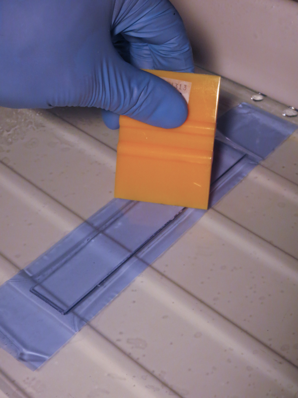
ImagOn is a a film consisting of a 0.002″ thick layer of photopolymer emulsion sandwiched between two protective layers of plastic. The first step in making an a plate with ImagOn is to laminate the emulsion to a metal or plastic plate. The process is easy, involving water and a squeegee, but it must be carried out away from any sources of ultraviolet light.

One of the differences between ImagOn and SolarPlate is the color of the emulsion. This plate uses ImagOn Ultra which is a blue like French Ultramarine. ImagOn HD is green. The emulsion for this plate is laminated to a piece of clear acrylic, giving it a very different appearance from SolarPlate which sits on a an opaque steel plate.

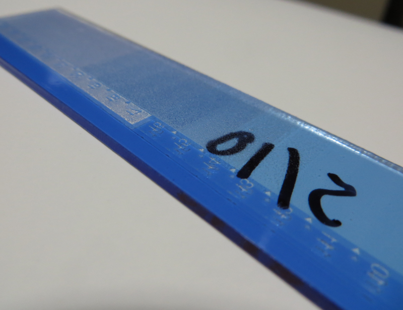
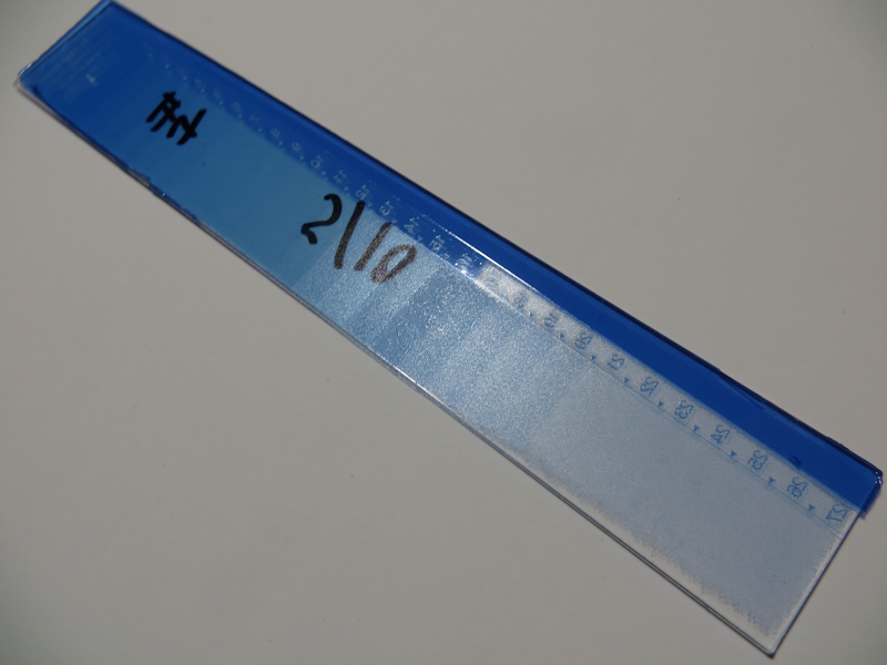
The transparent blue ImagOn Ultra plates are quite striking.

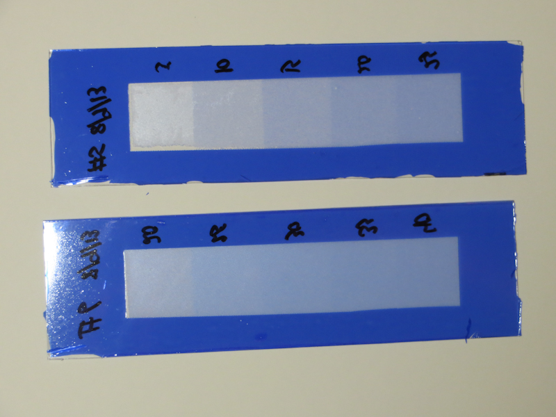
This plate is underexposed, but it gives a good idea of the layout of the step wedge.

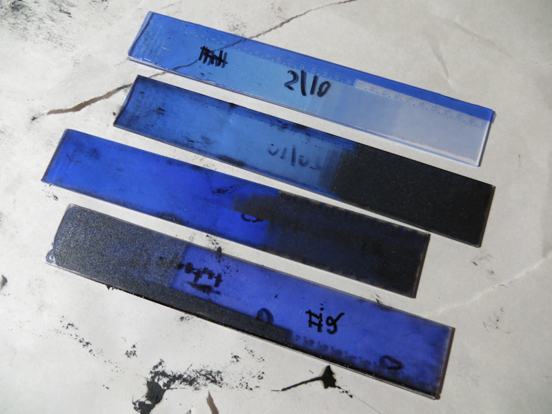
Here you can see four test strips with different exposures. The second from the bottom has the most exposure, giving it a saturated blue color due to the thicker emulsion. The top plate is underexposed and consequently has a very thin layer of emulsion.

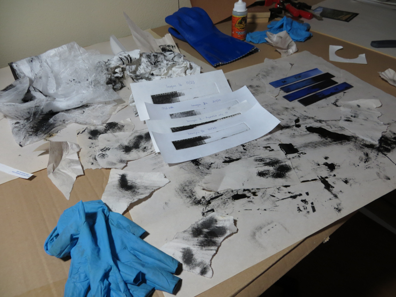
Intaglio printing is always a slow, messy business. This disaster is my studio after an evening of test strips. I will get the process dialed in and it will get better, but for now I need to plod along with the calibration.

Color Gradient Experiments

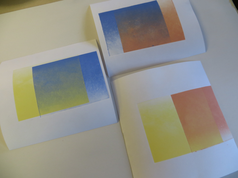
I’ve been working on some new print designs that use atmospheric effects and interesting skies. To make these prints, I need to be able to make smooth color gradients where I can change hue, saturation, and value across the page. Today I did some experiments with two-color gradients.

Each of these two-color gradients was made by printing a single gradient plate two times in with different colors and orientations. The effect works pretty well with lighter colors, but I notice that the gradient does not appear as smooth with the darker colors.

The experiment involved a 4″ x 5″ photopolymer plate with a linear gradient running from full ink at the top to clean plate at the bottom. My process was to print the plate in a light color, then rotate the plate 180 degrees and print it again in a dark color. The goal was to get a smooth transition from the dark color to the light color.

After printing so much black and white, it was refreshing to see all the colors. The prints were attractive and I was pleased to see that I could make a blue to yellow gradient without getting green in the middle.

My main problem was that my gradients weren’t very smooth. They look as if the plate is somehow mottled or even scratched. I have a number of theories but it will take some experiments to sort things out.

Here are the leading contenders

  • Over-wiping the plate
  • Non-uniform wiping
  • Color inks require a different wiping technique than black ink
  • Ink consistency
  • Not enough printing pressure
  • Plate got damaged during development
  • Poor contact between plate and aquatint screen during exposure
  • Poor contact between plate and positive during exposure

My plans are to print the plate with a known good black ink, on the small press where I am more familiar. I will use a lot of printing pressure. If I still see the problem, I will print a known good plate to verify that the problem isn’t with the press and ink.

Then, depending on the results, I may make a second gradient plate and see whether it shows the same problems.

First Photopolymer Gravure Plates

After completing the Precision Digital Negatives process calibration, I was finally ready to make my first photopolymer gravure prints! For this initial round, I chose two designs – one using solid black and solid white and the other using the full value scale. The plates were 4″ x 5″ SolarPlate, exposed first with an aquatint screen and then again with a positive which was printed onto Pictorico OHP.
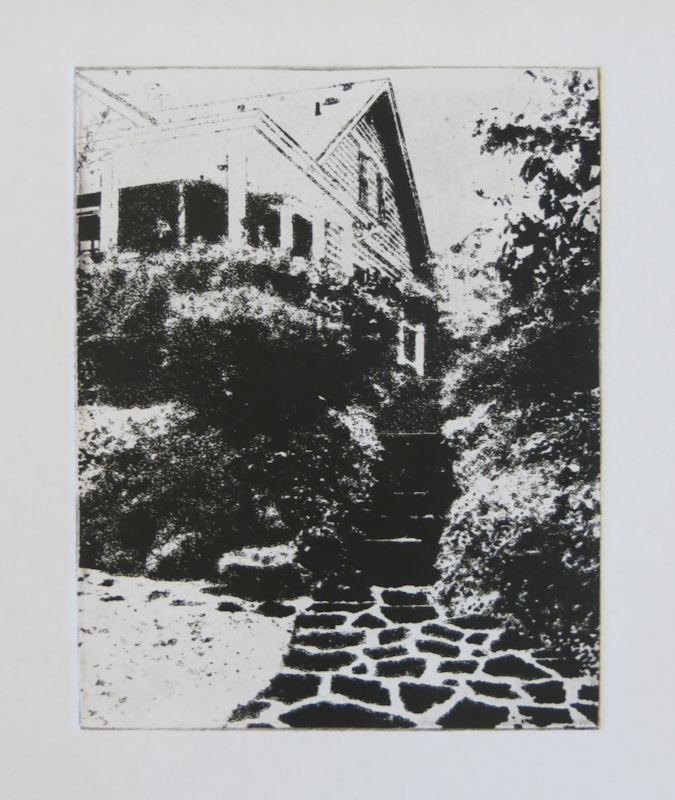
This photopolymer gravure plate contains no gray scales – it only has solid black and solid white.

I liked this design a lot, but was a bit underwhelmed by the print. It doesn’t know whether it wants to be photograph or a graphic. The idea still has potential so I’ll take it back to the drawing board. I think I will go with simplification over photo realism.

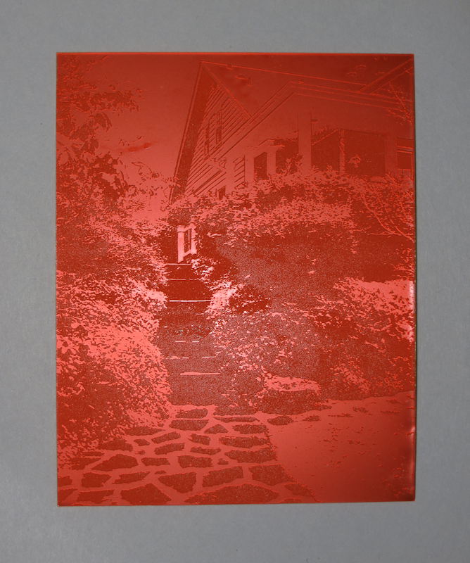
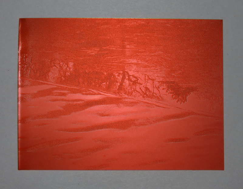
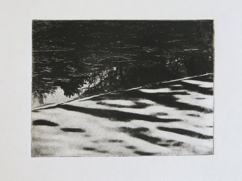
This plate is from a photograph of an ice covered pond in Boston. The plate uses the full range of gray values, calibrated with Precision Digital Negatives.

The print came out really well, especially given that it is from my first round of photopolymer gravure prints, using Precision Digital Negatives for the first time, and using the Glen Alps press for the first time.