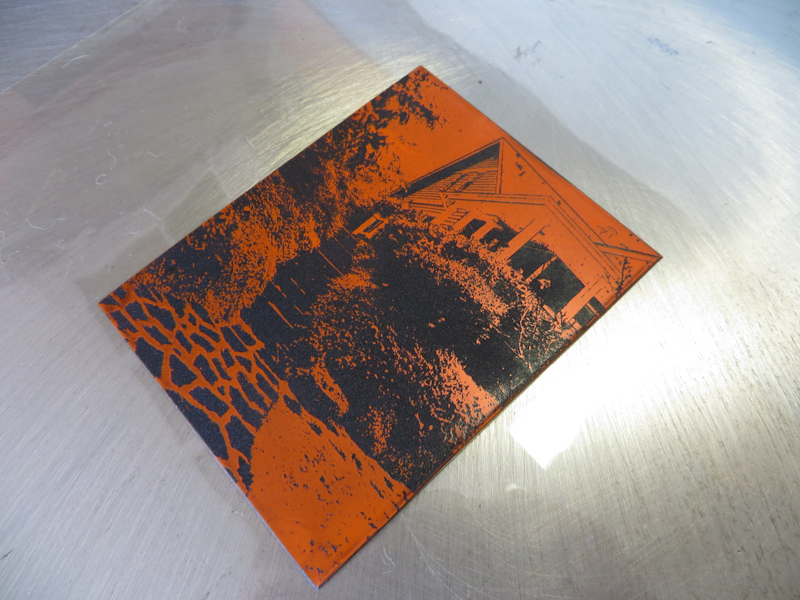
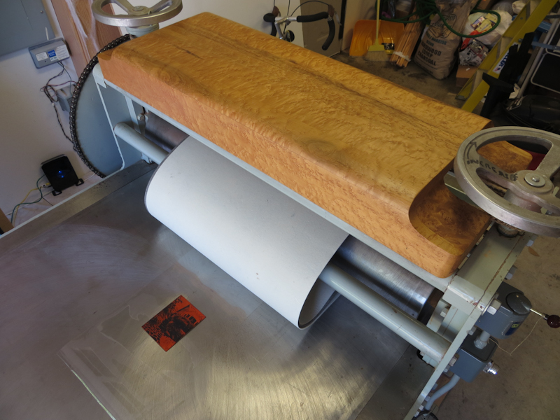
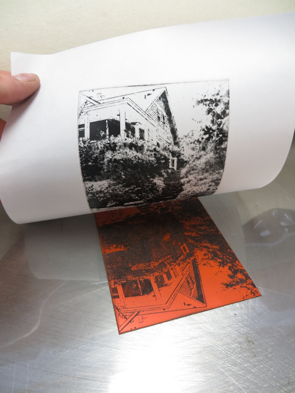
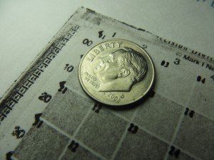
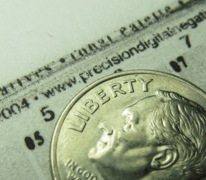
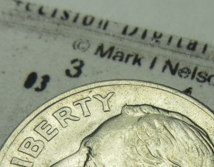
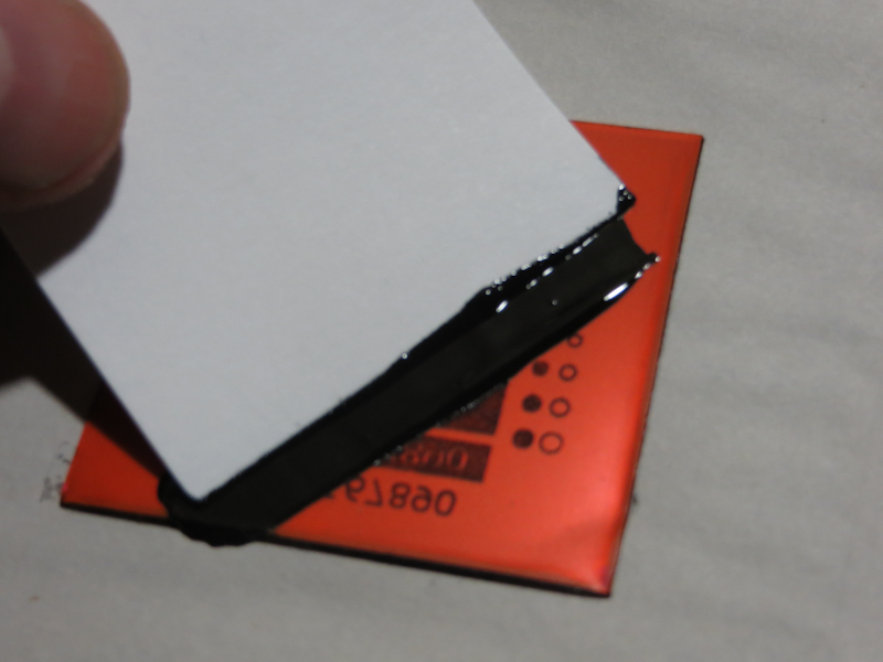
I finally got a chance to use the Glen Alps Press for the first time. It has been over a month since the press arrived, but before I could make prints I needed to get new felt blankets and level and adjust the press. Today I made my first print on the press – it was a 3″ x 5″ photopolymer gravure plate.
Tag Archives: intaglio
Precision Digital Negatives
Musicians practice scales before concertos. As an art student I practiced value scales in vine charcoal before attempting to render a sphere. Now in the printmaking domain, I am doing the same thing, only this time I am working with Mark Nelson‘s Precision Digital Negative (PDN) process to calibrate my photopolymer platemaking and printing process.
The goal is to develop a repeatable, end-to-end process starting from the creation of the original artwork, to exposing and developing the plate, through the final printing step. There are many variables that impact contrast, texture, the range of values, the richness of the blacks and the purity of the whites. I want to be able to control each of these variables in order to make the print that I see in my mind’s eye.
The PDN system is a general process for calibrating the production of digital negatives and positives for alternative photographic processes that use ultraviolet light to expose the final image. Mark has put a huge amount of effort into developing and refining the PDN system. His e-book is excellent and chock full of details and explanations of the process itself and related topics like image acquisition and preparation and Photoshop tips. The e-book also comes with membership to a PDN discussion forum where you can get answers to most questions. If you are making digital negatives or positives, I highly recommend purchasing the PDN book.
Creating photopolymer plates for intaglio requires exposure to a positive, rather than a negative. I print my positives onto a transparency film called Pictorico OHP, using an Epson Stylus Pro 3880. I use two types of plates – ready-made SolarPlate and plates I make by laminating ImageOn film to sheets of acrylic. I expose the plates using an old Nuarc 26-1K platemaker that I picked up on Craig’s List.
I’m most of the way through calibrating my SolarPlate process. Once I have the SolarPlate process refined and stabilized, I will repeat the calibration for the more complex ImageOn process.
At a high level, the PDN calibration process involves 4 steps:
- Determine the correct exposure time for clear film.
- Determine the mixture of ink colors in the transparency that yields the ideal density range for exposing the plates.
- Generate a gradient scale using the ideal color mixture
- Generate a set of Photoshop level adjustment curves that linearize the gradient scale.
The photos below document my journey through the initial SolarPlate calibration.
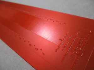
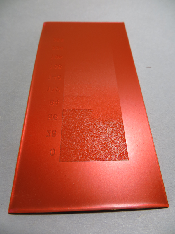
The first step is to determine the correct exposure for clear Pictorico OHP film. One could do this by experimenting with a bunch of different exposure times, but it is much quicker to make a single exposure through a step wedge that incorporates a variety of calibrated neutral densities which simulate shorter exposure times.
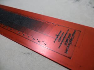
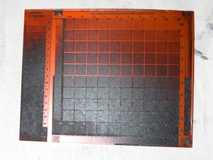
Here’s the step wedge plate, inked, wiped and ready to print. The darker portions of the wedge correspond to darker regions on the plate. Each step in the wedge corresponds to 1/3 f-stop.
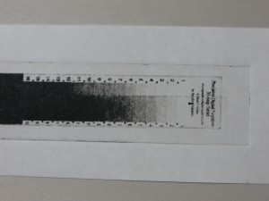
When exposing positives for photopolymer plates, it is important to choose an exposure that just hardens the plate so that it prints pure white in areas where the film is clear. The exposure for this test strip is spot on, but it is apparent that I have a contrast problem because the plate goes from white to black in about four f-stops.
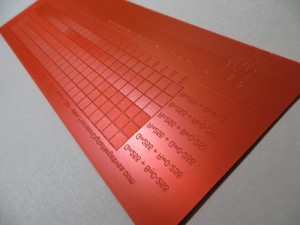
It turns out that black inkjet pigment is not well suited to producing fine tonal gradations in most alternative photographic processes. The problem is the black is just too strong and the printer can’t generate enough different gray values in the narrow range required by the photopolymer plates. Imagine trying to render a figure with a Sharpie and you get the idea. Mark’s insight is that one can choose a mixture of much weaker color inks in order to produce a positive with densities that match the response curves of the plates. By using color inks, it is possible to create hundreds of distinct values across the entire range from white to black. This is a huge improvement over black inks which are so dense they can only create a handful of distinct values in the densities useful for plate making. The squares in the test strip above represent about 150 different color mixtures. The goal is to choose the mixture that just barely yields black.
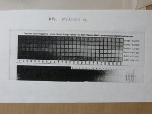
Here’s the color test strip, printed on white paper. Each of the gray boxes corresponds to a different color mixture in the inkjet positive. I chose the forth box from the left in the row labeled B=255 + R=0-255. This box corresponds to a the RGB color R=30, G=0, B=255. This color mixture just barely manages to give me black when it is at maximum intensity. Lighter versions of this color give me lighter shades of gray.
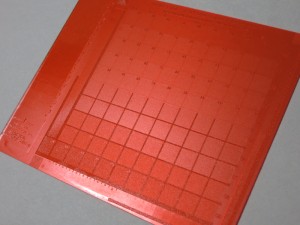
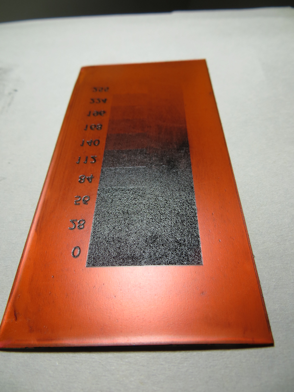
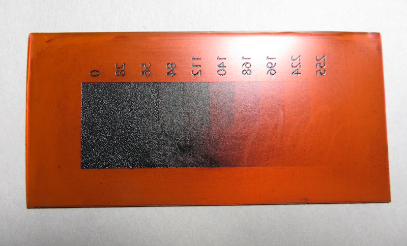
Here’s the plate for the initial gradient scale. This plate was created from a positive that used a mixture of red and blue ink, instead of black. Each square on this plate is a different shade of the RGB color R=30, G=0, B=255.
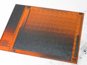
Here’s the initial gradient scale, inked, wiped, and ready to print. Already it is apparent that the plate has a contrast problem – most of the plate is very close to either black or white – only a tiny portion in the middle shows distinct gray levels.
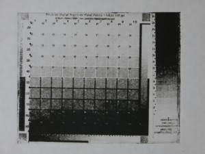
This is the initial gradient scale, printed on white paper and showing 100 different levels from white to black. This scale is not very linear – it is quite flat in the whites, then shoots up quickly to the dark grays and then flattens out again in the blacks.
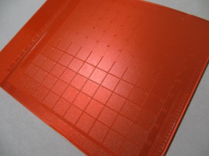
This plate was created from a new positive which combined the original gradient with the PDN process adjustment curves. The process adjustment curves should linearize the gradient.
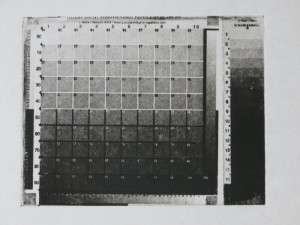
This gradient was produced by applying Photoshop process adjustment curves to the original gradient. This curve is much closer to linear.
Intagio Detail
I’m getting much finer detail now in my SolarPlate intaglio prints. It appears the improvements come from better plate wiping technique, and adjusting my press to apply significantly more pressure.
SolarPlate Intaglio Value Scale
This evening I tried my first intaglio value scale with SolarPlate. My main takeaways are that the process has very high contrast, but the results are really promising.
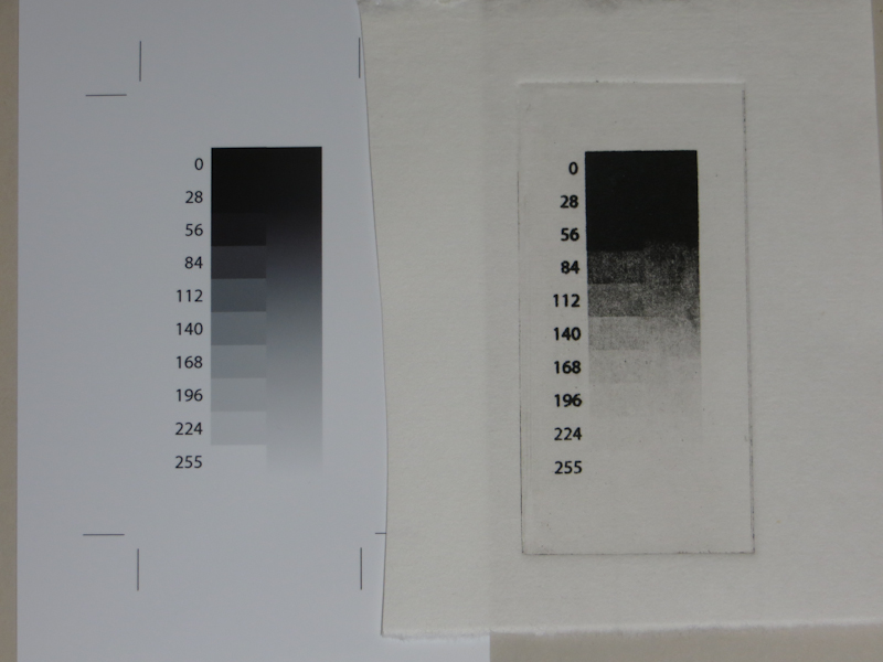
My goal is to reproduce the value scale on the left. The results, printed on Hosho, are on the right. It is readily apparent from this initial test that my SolarPlate process has too much contrast, compressing most of the dark end of the value scale into a couple of steps. My next test involves a more detailed test print that will allow me to create contrast adjustment curves in PhotoShop.
Solarplate Intaglio Experiments
This evening I made an intaglio print from SolarPlate for the first time. This is the first step in working out the details of a process that will ultimately use a NuArc 26-1K platemaker to expose Imagon HD with Pictorico OHP positives created on an Epson 3880 printer. The first experiment was to determine the correct exposure and development to get a good solid black from the aquatint screen.
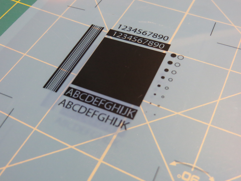
For this first test, I am just trying to get the correct exposure for the aquatint screen. The goal is to get an exposure and development process that gives a rich black with good edge detail. Once I get a good black from the aquatint, I can start to experiment with gray scales. This test pattern was printed with an Epson 3880 on Pictorico OHP. The central rectangle is an inch square, and the text is 12pt.
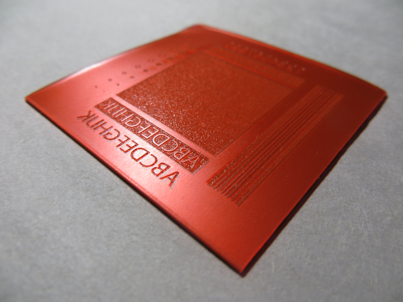
This 2″ x 2″ plate was exposed on a NuArc 26-1K Mercury platemaker. I first exposed the aquatint screen with 10 exposure units which took about a minute. Then I exposed my test pattern with 25 exposure units. I developed in water for one minute with gentle abrasion from a paint brush. The plate was blotted and then dried with a hair dryer and then exposed one more time with 25 exposure units to fully harden the photopolymer.
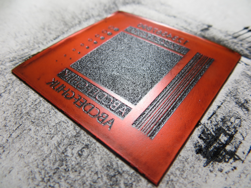
Here’s what the plate looked like after wiping with tarlatan cloth and then newsprint. I didn’t realize it at the time, but the region with the white letters on black actually needed more wiping.
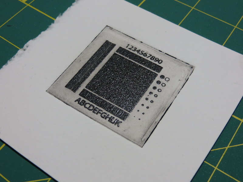
Here’s my first intaglio print from SolarPlate. The paper is wet Rising Stonehenge. The impression is nice for a first try, but the plate had too much ink. This resulted in solid black rectangles where the white letters should be and too much plate tone. I printed a second piece of paper off the same plate without reapplying ink and got a decent print.
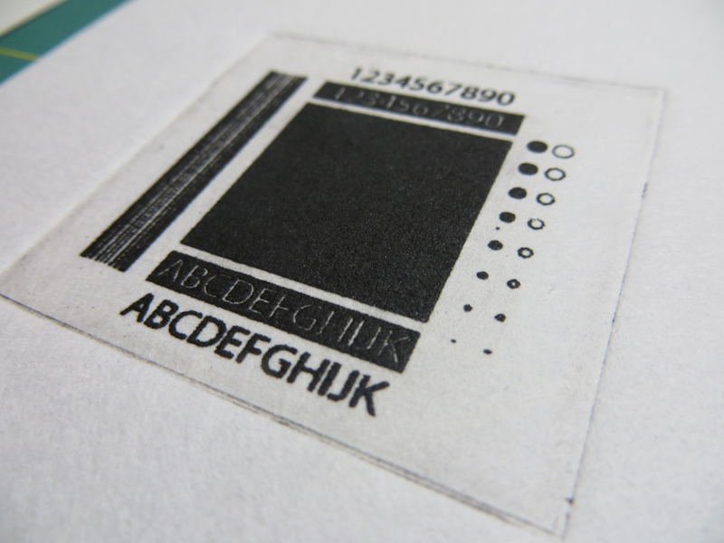
This print is on a dry piece of Hosho. I wiped the plate a bit more carefully, and this improved the print quality.
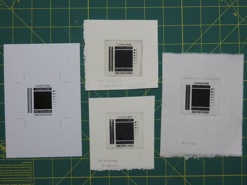
This photo shows the test pattern on the left, wet and dry Stonehenge in the center, and dry Hosho on the right. Overall, pretty satisfactory results for my first stab at intaglio with SolarPlate. I want to continue experimenting with exposure, inking, wiping, paper types, moisture levels, and roller pressures until I can reliably reproduce details down to a quarter point. Then I will start to work on gray levels.

