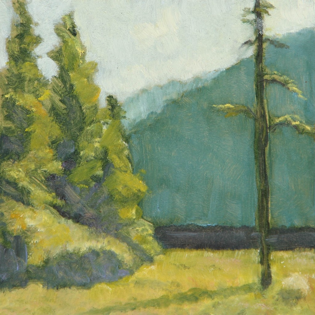
After a long run of citrus still life paintings, I decided to pull out some old landscape color studies and do a larger painting. Here’s the first study:

First study in green and yellow on a 6″ x 6″ Ampersand Panel.
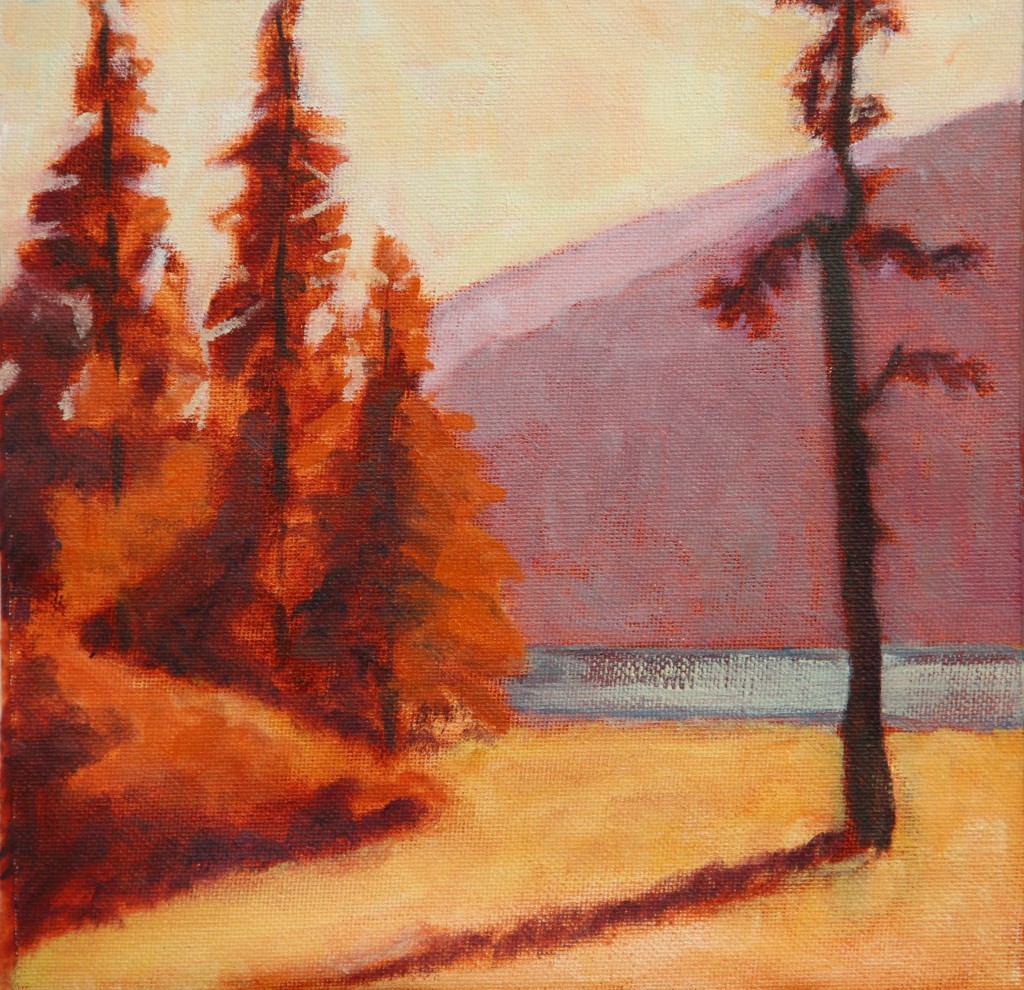
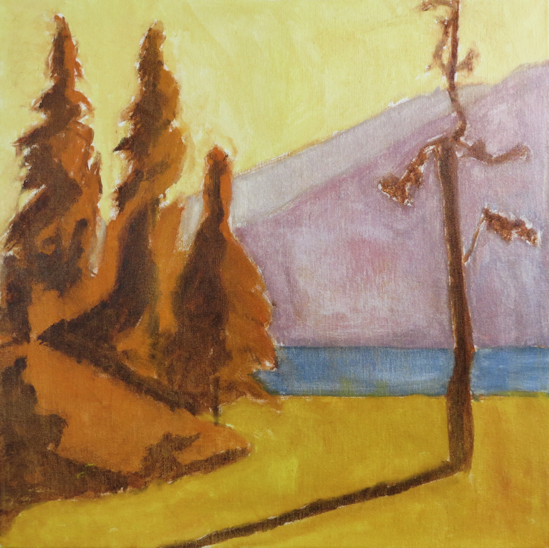
I decided to base the larger painting on the second study which has an autumn palette.

Second study in yellow and violet, 9″ x 9″, on Frederix canvas pad.
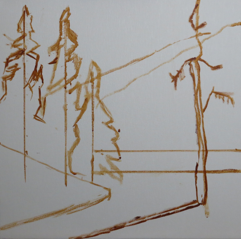
Here’s the block in on a 20″ x 20″ stretched canvas. My goal was for the trees and bushes to pick up and emphasize the diagonals and counter-diagonals of the ridgeline.

Block in on 20″ x 20″ stretched canvas using water miscible Burnt Sienna, thinned with water.
The under painting was done with water miscible Duo Aqua Oils by Holbein. I thinned the paint with lots of water in order to just stain the canvas, but found that the paint didn’t stick very well. Fearing adhesion problems in the subsequent layers, I vigorously scrubbed the canvas to remove all surface paint so that the only remaining color was from the stained fibers of the canvas. Since this was just an under painting, I didn’t take great care in mixing the colors. My intention is that the colors will better match the second study. I am hoping to use broken color in the mountains and the sky.

Under painting used dilute mixtures of Burnt Sienna, Cadmium Orange, Cadmium Yellow, Titanium White, Cadmium Red, and French Ultramarine. When I was finished painting, I scrubbed the entire canvas with paper towels to remove all but a light stain. My intention is that the colors in the actual painting will look more like the those in the second study.

