Wine and Apples – More Darks

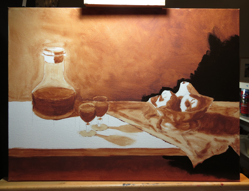
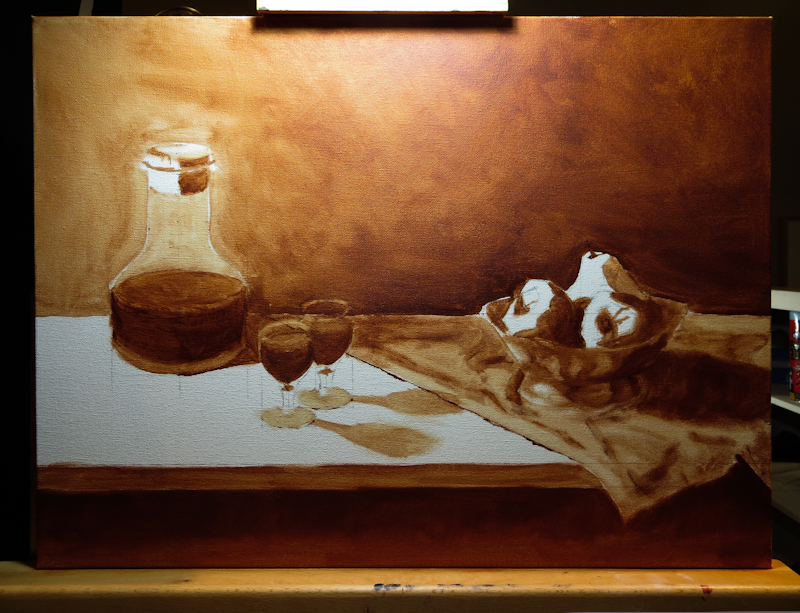
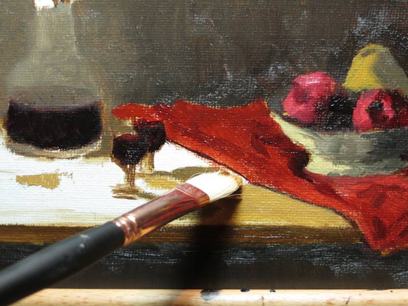
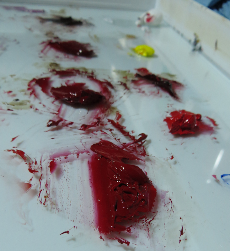
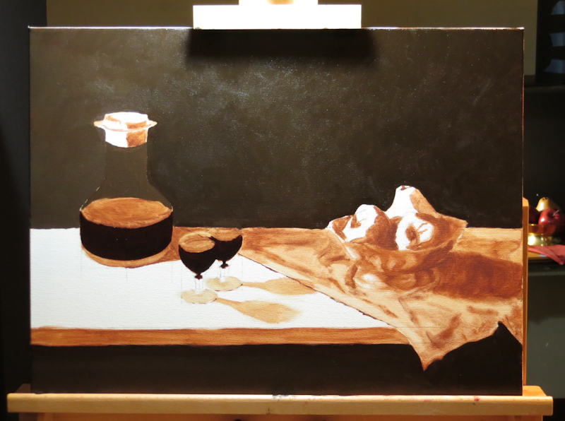
Today I mixed up some deep burgundies for the decanter and the wine glasses. I started with Permanent Alizarin Crimson, then mixed in some French Ultramarine to move more towards violet, then darkened the mixture with Burnt Umber.

I’ve been working to establish my darkest darks so that I will have some reference for my shadows and mid-tones. Soon I will need to nail down the other end of the scale by finding the light mid-tone value for the tabletop. You see, I need to reserve white for the specular highlights – when the painting is done, nothing will be white, except for the small reflections on the glass and the fruit. This means that the table top will need to take on a value more like the cloth but then the cloth will have to go darker, which will push the shadow on the cloth almost to black. When I lose white, the entire value range will compress.

Wine and Apples Background

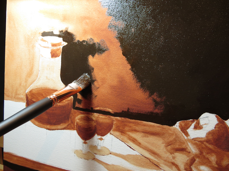
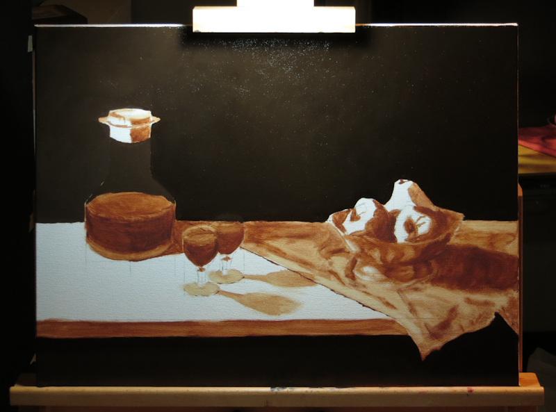
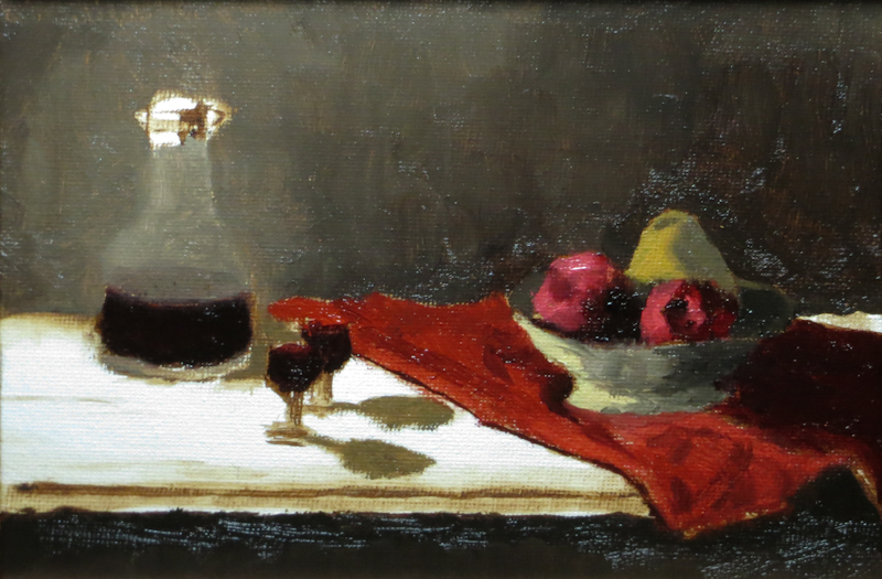
This evening I mixed up a string of dark, slightly warm neutrals for the background. I started with a mixture of Burnt Umber and Prussian Blue, which I lightened with Titanium White. As I got to the lightest darks on the left side, I found I needed to add a bit of Yellow Ochre and Burnt Sienna to keep the mixture warm enough. I like the dramatic chiaroscuro look of the painting, but think the darkest portion of the background on the right side needs to go darker.

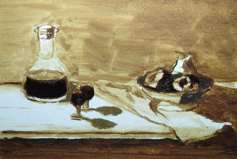
This was my first time painting with Neo Megilp. This strange sounding medium is added to the paint to make it settle and flow. Notice how the dark paint with Neo Megilp is velvety smooth, while the Burnt Sienna in the underpainting shows lots of brushwork.

Tomorrow, I hope start on the darks of the wine in the decanter and the glasses, probably with a mixture of Permanent Alizarin Crimson and Burnt Umber.

Wine and Apples Full Scale Drawing

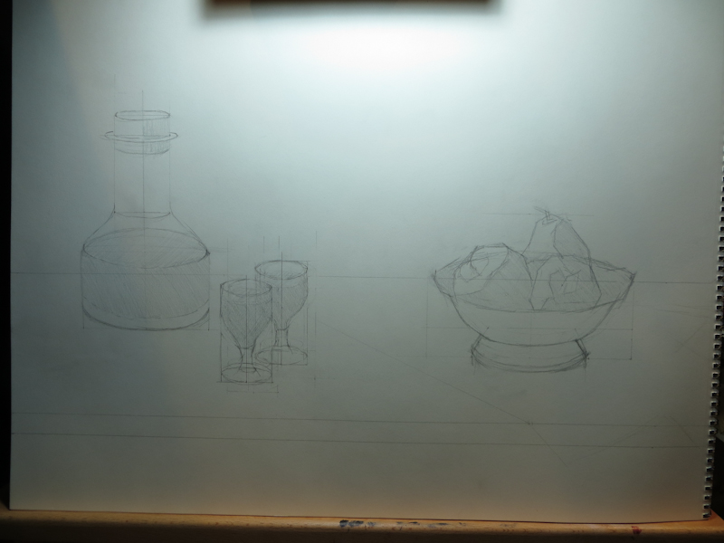
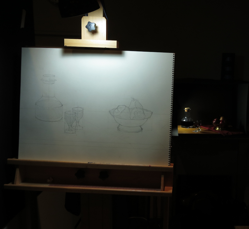
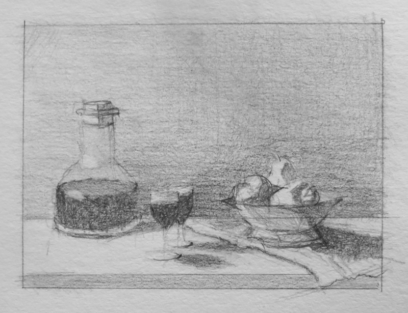
Made a bit of progress on my still life over the weekend. After finishing the color study, I did an 18″x24″ sketch in graphite to figure out the composition and the aspect ratios of the various ellipses. I tried a number of scales and small adjustments in item placement before settling on this design.

18″x24″ graphite drawing on paper.

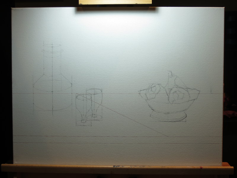
I redrew my design on my canvas using an Indian Red ink pen for the horizontals in the tabletop and the strong diagonal. My plan is to do an under painting in burnt sienna, so I’m hoping the inked lines will mostly disappear into the paint. The remaining items were sketched in vine charcoal. I didn’t use a fixative and am expecting the charcoal to fall away as I find the exact edges in paint.

18″x24″ canvas with Indian Red Faber-Castell Pitt pen and vine charcoal.

Originally my plan was to do all the drawing with a paintbrush directly on the canvas, but I had so much fun with graphite compositional study that I just continued on the canvas. I still expect that I will make significant adjustments with the brush in the under painting.

Tomorrow I will start an underpainting in burnt sienna.

Towering Easel

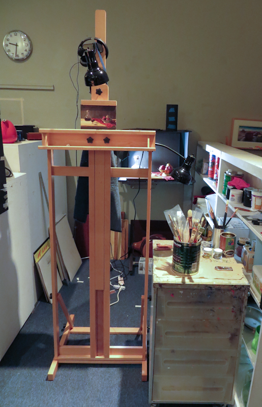
I really like my new easel, but I’m glad I’m 6’6″ tall as it must have been designed for basketball players. It is good that the the bottom tray goes really high because the top canvas holder does not go low. When I work with an small study, it is high in the air – about eye level for me while standing. I may have to make a magnetic backing board to position my smaller studies at a more reasonable altitude.

This is about the lowest possible position for my 6″ x 9″ study.

Small Study – Big Brush

During class I worked on finishing up the table top and the cork in the wine bottle. I am now getting used to using the large brush and working faster. For those that are interested, the brush is a very affordable #6 filbert Blick Masterstroke Pure Interlocking Bristle. Gary recommends these brushes.

It is amazing what you can do with a large brush.

Wine and Apples Color Study Update

In my last session, I assembled a new easel, balanced my lamps, and started mixing colors. My old easel was broken so Gage gave me a new Blick Studio Medium-Duty H-Frame Easel. This is a really nice easel for $89 and it even comes with the screwdrivers needed for the assembly. All of the components were well packed and well marked and the instructions were reasonably clear. One nice thing about this easel is that the carriage tray can be positioned anywhere from a few inches off the ground to five feet up. The high position is useful when working on really small pieces, like this 6″ x 8″ study, which I wanted at eye level.

Gary dropped by the studio after his perspective lecture and caught me with a tiny synthetic brush and told me to go back to the #6 bristle. He was right and I almost want to do another quick study with just the #6.

This string of reds for the apple included a tint of Daniel Smith Permanent Red, various combinations Permanent Red and Alizarin Crimson, and finally combinations of Alizarin Crimson with Burnt Umber. I liked everything but the tint (not shown), which looked like strawberry toothpaste.

At this stage, I’ve painted the two darkest reds and the two darkest neutrals.

All that remains for this study is the table top. After that, I’d like to revisit the colors in the apples and the pear and the metal bowl, either in this study or a new one.

Wine and Apples Color Study

After organizing my space and cleaning palette boxes and brush tanks, I finally got a chance to work on a color study for my wine-and-apples scene. Gary suggested working small and spending no more than two hours. This was to ensure that the painting remained in the realm of a study.

I decided to do a 6″ x 8″ study for a painting that will likely be 18″ x 24″. My approach was to draw the image with a paintbrush using burnt umber thinned with OMS, and then block in the value masses.

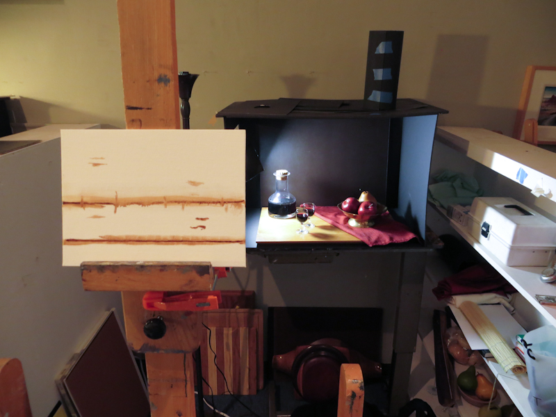
I spent about an hour working with burnt umber and had just started mixing up colors for the apples when I realized that the incandescent lamp on my easel didn’t match the 5500k daylight bulb on the scene. When I matched the paint perfectly at the easel and then brought a sample into the scene, it looked like a garish bluish purple. I decided to call it a day so that I could get another 5500k lamp for the easel.

As I was heading out, one of my classmates asked my why I did an under painting for a color study, instead of just laying color directly on a bare canvas. I suppose the answer was that I did it out of habit. When I started, my intention was to just draw the outlines in burnt umber, but then I got into it and kept adding more shadows and details until I had an under painting. I guess this is why Gary suggested keeping the entire exercise under an hour.

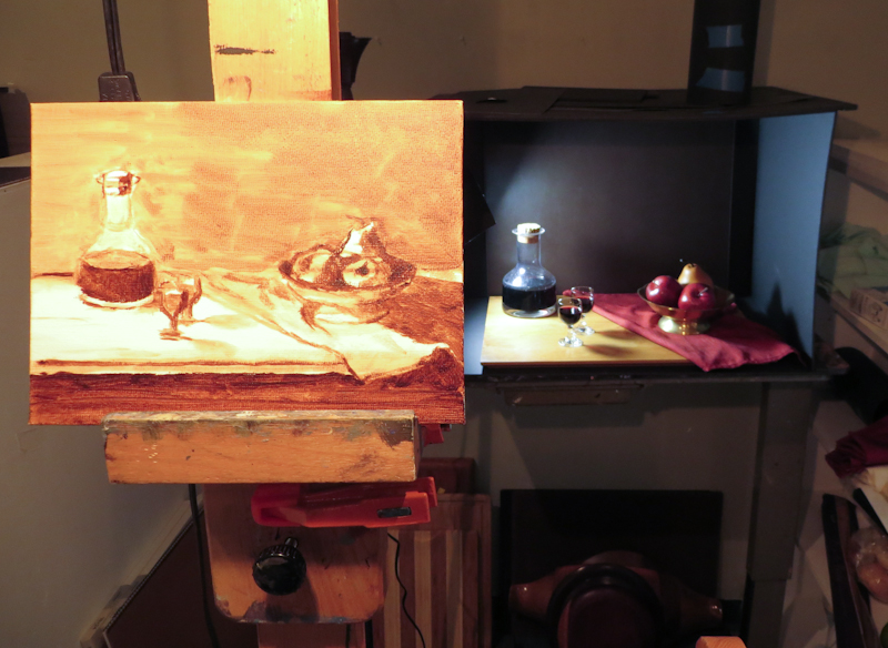
Blocking in the top and bottom of the tabletop, the decanter, and the bowl. Note that I have adjusted my viewing angle so that the vertical positions on the canvas align with the corresponding positions in the scene.

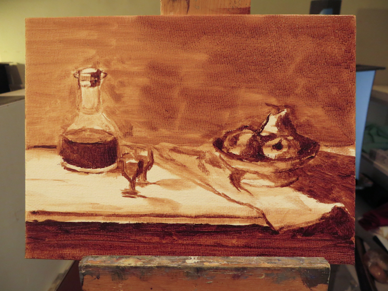
Here’s the view at the end of the session.

I spent about an hour blocking in the scene in burnt umber.

Preparations

I went in to the atelier this morning to paint a color study for my first still life assignment, but ended up spending a bunch of time preparing for my first brush stroke. When I joined the Classical Atelier last year, I put painting on the back burner while I focused on charcoal drawing and then printmaking. Now as I turn my focus back to oil painting, I am facing a seemingly endless amount of preparation, from cleaning palette boxes to finding matching light bulbs to excavating my shadow box from the closet to sorting paint. I know it will all be worth it and I will really enjoy my space and my tools, but still I want to be painting . . .

I really should have cleaned my palette when I finished my last painting, but I didn’t know back then that I was done . . .

Popping Tags

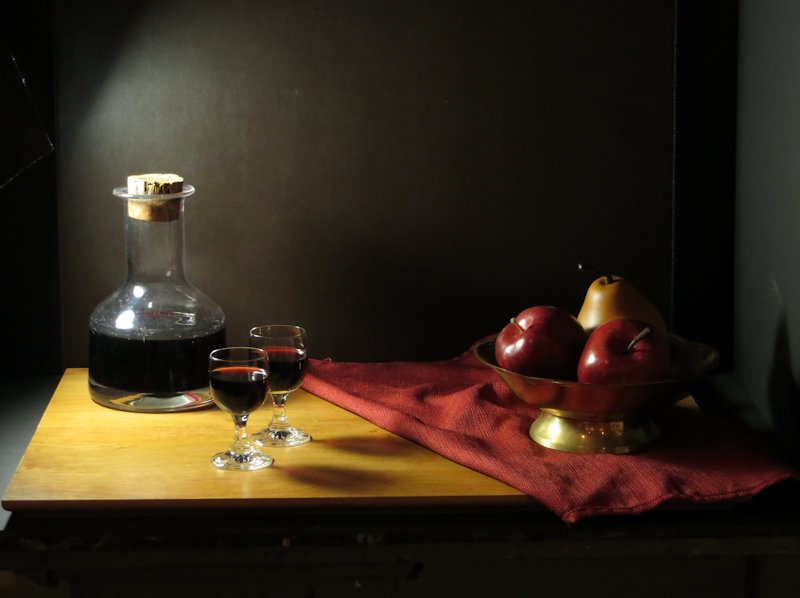
Went thrift shopping for props. Got a lot of interesting items which I can’t wait to paint. Here’s the first tableau. The wine is real, but the apples are fake. My classmates warned me that wine “evaporates” very quickly in the atelier and that I would need to top it off daily.

The actors are on the stage.

I spent about an hour trying out various arrangements and viewpoints before settling on this one. Then it was time to do a small value study before breaking out the paint brushes.

Twenty minute value study in graphite, 3″ x 4″.