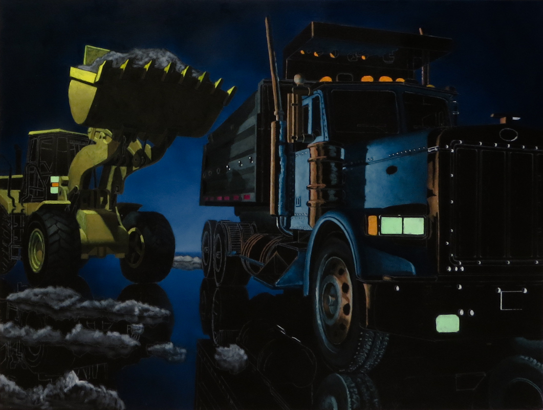
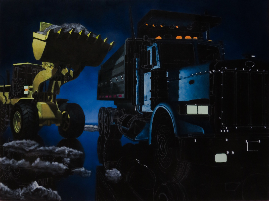
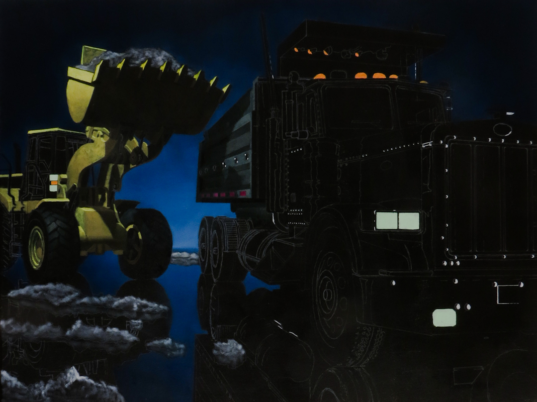
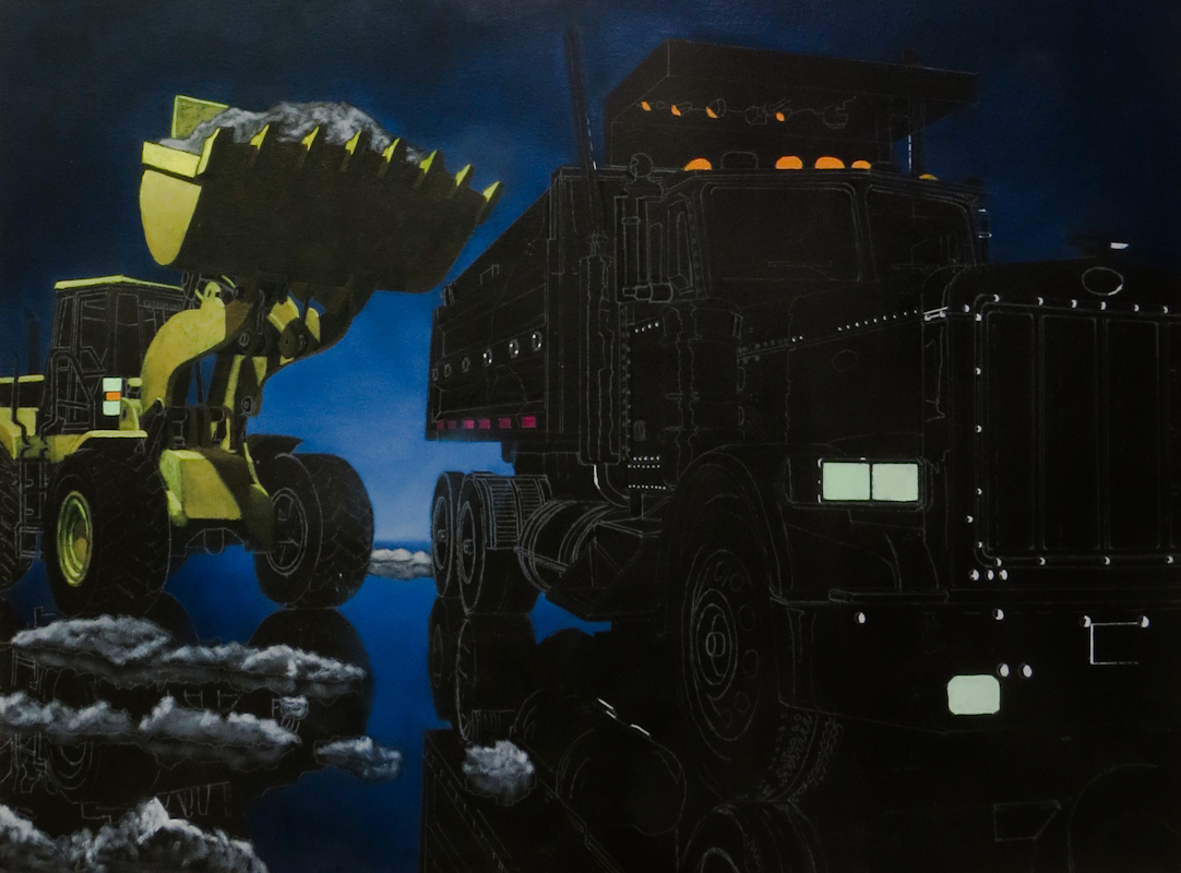
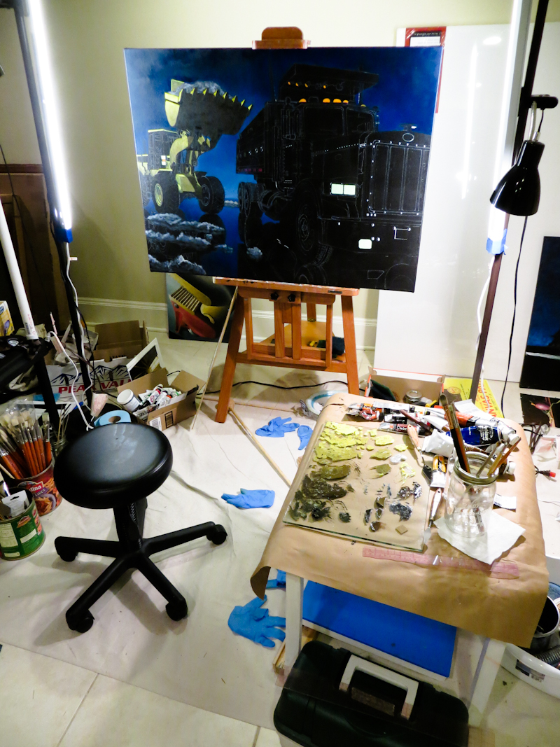
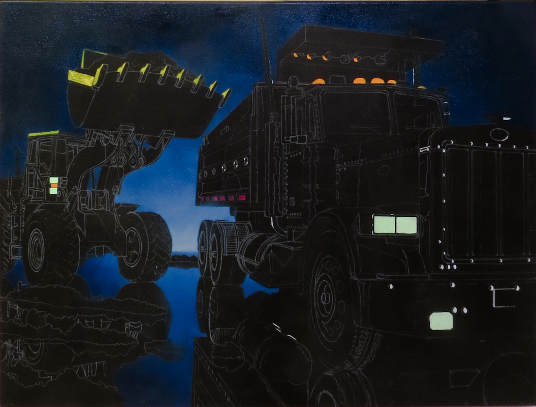
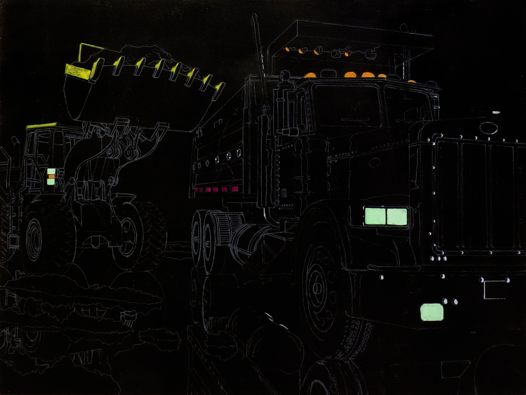
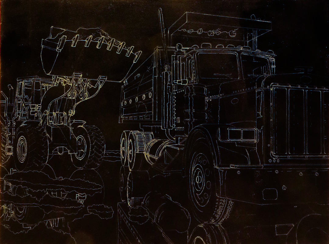
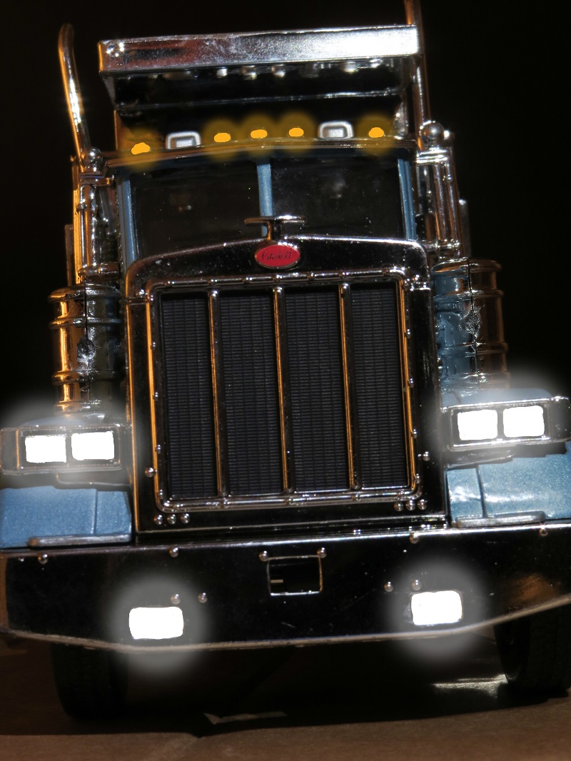
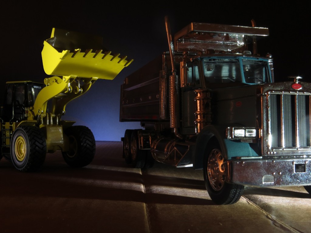
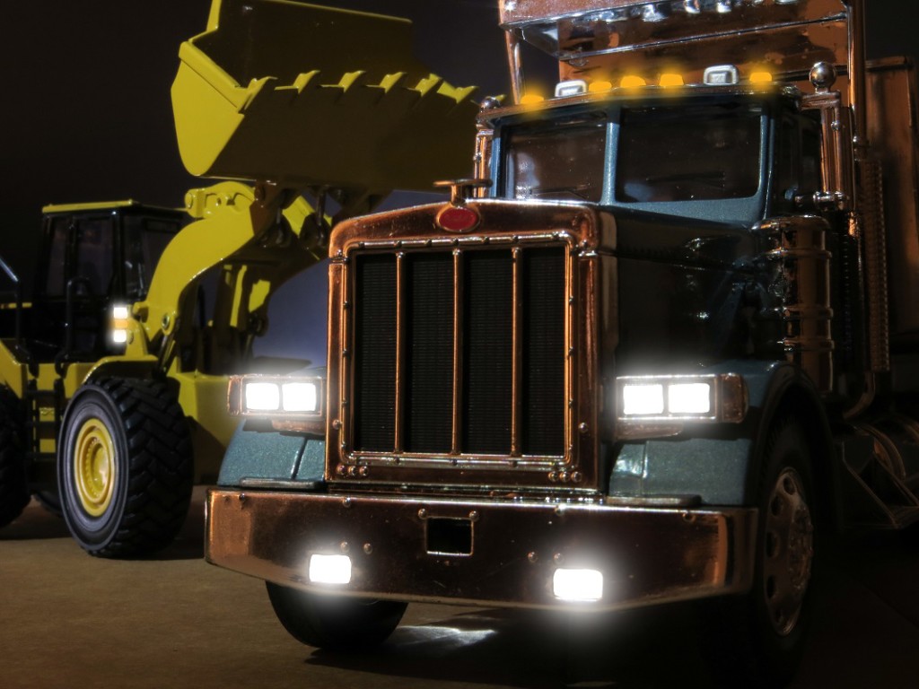
The Big Diagonal Cutters inspired me to explore uncomfortably close views of tools and machinery. I wanted to create the feeling of massive machines that almost wrap around the viewer. One idea to achieve this effect is curvilinear perspective, a technique I encountered while studying Rackstraw Downes and Antonio López Garcia.
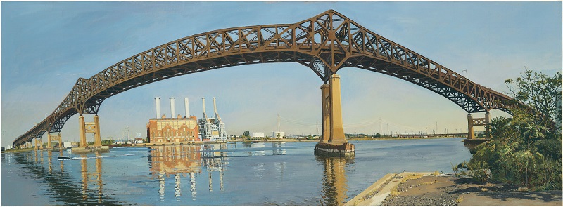
In the example below, Rackstraw Downes uses a form of curvilinear perspective to put the entire Pulaski Skyway in view from a close up vantage point:

The Pulaski Skyway Crossing the Hackensack River,
Rackstraw Downes, 2007
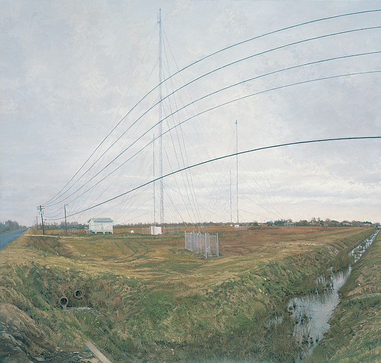
Here’s another example from Rackstraw Downes. In the scene the ditch on the right lies perpendicular to the road on the left. The power lines curve because they appear highest looking straight down the ditch and lowest as the approach the horizon ninety degrees to the left.

At the Confluence of Two Ditches Bordering a Field with Four Radio Towers,
Rackstraw Downes, 1995
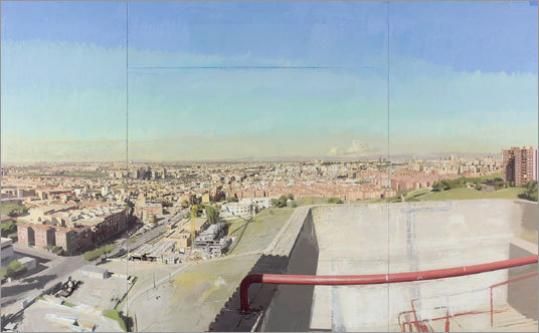
Antonio López Garcia uses a similar technique. Here the railing on the right and the road on the left curve along an upward facing arc.

View of Madrid From the Vallecas Fire Tower,
Antonio López Garcia
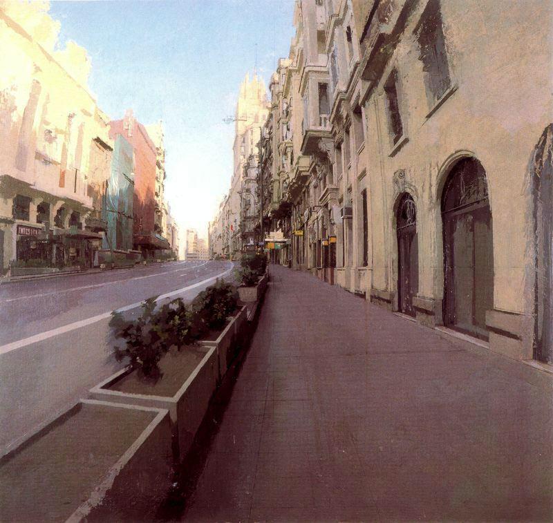
In this painting, the verticals on the buildings curve in towards the center.

Gran Vía-Clavel,
Antonio López Garcia
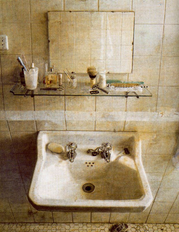
Here the bathroom wall curves away from the viewer at the top and bottom.

Lavabo y espejo,
Antonio López Garcia
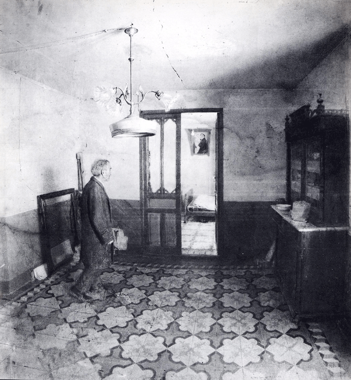
In this drawing the floor curves.

Retrato de su tío,
Antonio López Garcia
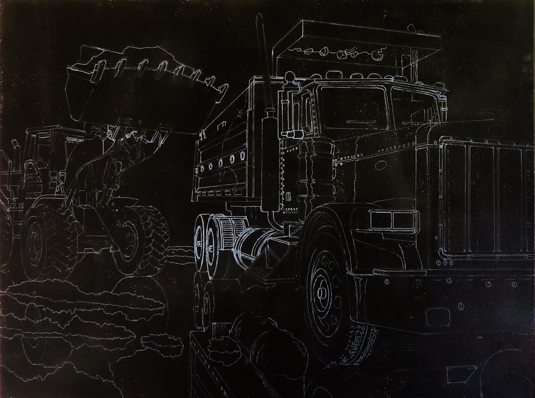
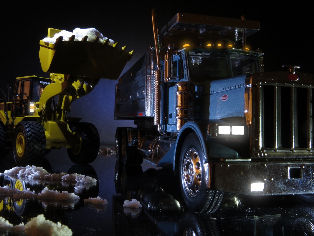
I wanted to try the same effect to give a feeling of a scene so large you have to turn your head to take it all in. Here’s my vantage point for Clearing Snow. The truck looks massive, but I wanted to use curvilinear perspective to exaggerate the effect.

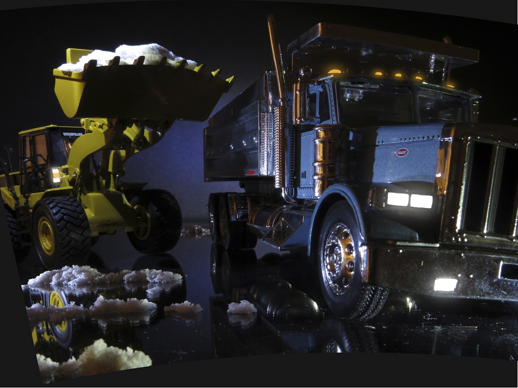
I used Photoshop to add a spherical distortion. This is not the same as curvilinear perspective, but it approximates the effect. Notice that the yellow loader now leans to the left while the truck sits on an arc so that its verticals tilt left towards the loader and right towards the edge of the frame. It is almost as if the vehicles are sitting on the small asteroid in Antoine de Saint-Exupéry’s The Little Prince.

The effect seems promising, but for me, the jury is still out with this particular image. The risk is creating caricatures of trucks like one might find in a children’s book. The effect may work better on a sweeping vista.

