June 5, 2014

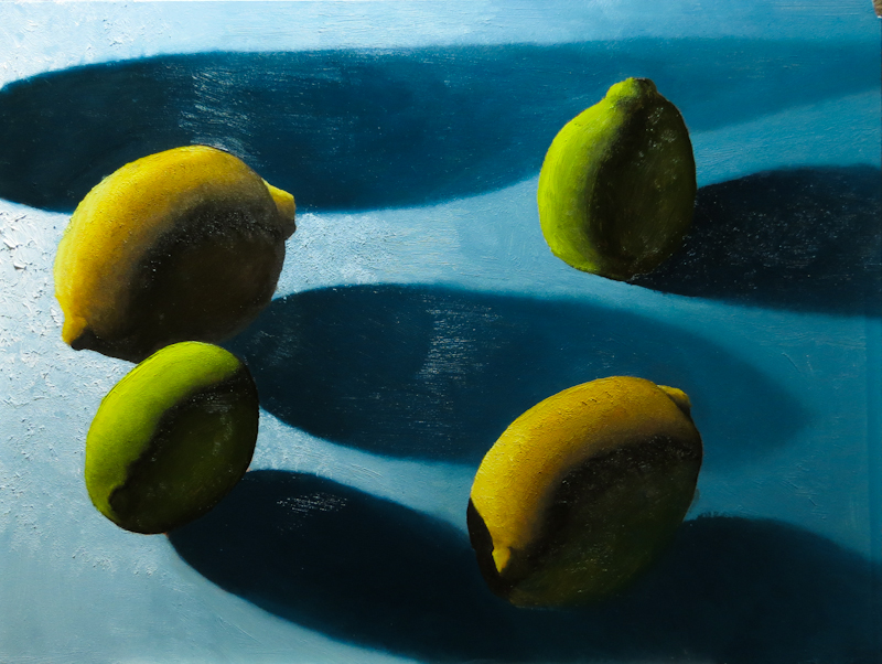
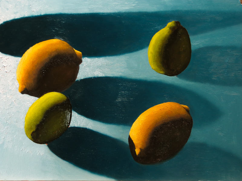
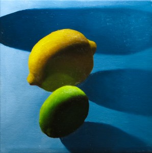
This painting started off well, but it didn’t really come together in the end. I loved the way the cast shadows faded from a deep dark blue, sharply contrasting against an impasto flecked pool of light to a soft blue haze that almost blended into the background.

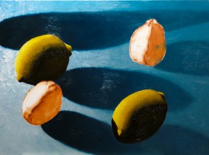
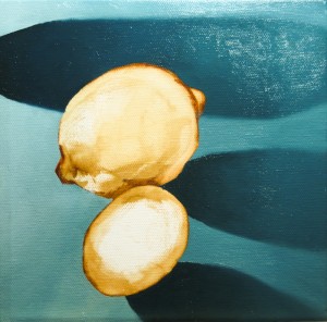
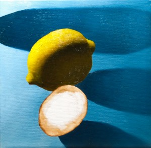
My problems began when I painted the lemons and limes and they began to hover above the surface of the table. Technically speaking, the issue was that the form shadows on the fruit were much darker than their cast shadow counterparts on the tabletop. From an artistic perspective, I had failed to unify the form shadows with the cast shadows.

The fix was to darken the cast shadows and lighten the form shadows until the fruit appeared to rest on the table as you can see below.

I am going to declare this one done and move on.

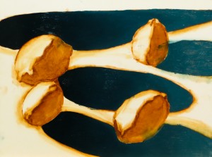
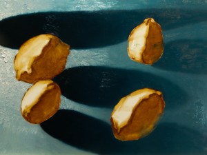
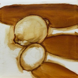
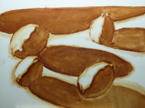
My biggest learning from this painting is that I need to mass in unified regions of shadow, painting the shapes I see instead of the objects. In the process series below, the initial underpainting is solid because all of the shadows are unified. I got off on the wrong foot on the second step where I painted the dark blue cast shadows as entities distinct from the form shadows on the fruit. I should have painted them at the same time with the same value and, that early in the painting, even the same color.

As second learning is that Ampersand Gessobord is really different than canvas. It takes the first layer of paint very well, but then is gets extremely slippery until the first coat has dried. At this point any contact with the brush is as likely to remove paint as to add it. This isn’t a problem, but it is different, and I will need more practice if I want satisfactory results on Gessobord. For now I think I am going to focus on stretched canvas and canvas panels.
Maple Valley Arts 10-20-40 Show

Had a great time at the Maple Valley Arts Center’s 10-20-40 show. Each participant invited 10 guests and created 20 paintings, each selling for 40 dollars to raise money for the arts center. The place was packed, the energy was immense, and we all lingered outside under perfect Pacific Northwest skies as the sun went down. Special kudos to Christina and all the Maple Valley Arts volunteers for a fabulous event!

Two More Limes

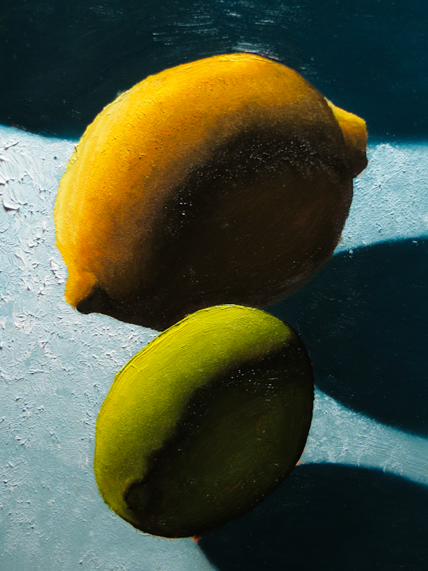
Tonight I worked on limes. I used a string that was a little less green this time, desaturating the Sap Green with Cadmium Orange in the lighter values and Burnt Sienna and Burnt Umber in the darker values.

I’ve really been struggling with the fruit in this particular painting and I think the problem is the smooth Ampersand panel. The paint will stick when I first apply it, but if I ever touch the wet paint, it moves around and shows the Burnt Sienna of the underpainting. I didn’t have this problem with the last Lemon Lime painting which was on canvas.

The lime on the left took about two hours. After a coffee break, I painted the one on the right in 15 minutes. It’s not that I got faster – I got wiser and decided to stop while I was ahead and wait for the painting to dry before continuing.

I think I will need to put another layer of paint on all four pieces of fruit before I declare the painting finished. I also need to figure out how to make the fruit really sit on the table. My best idea at this point is to darken the shadows under the fruit.

Two More Lemons

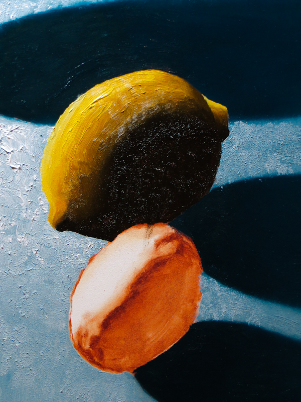
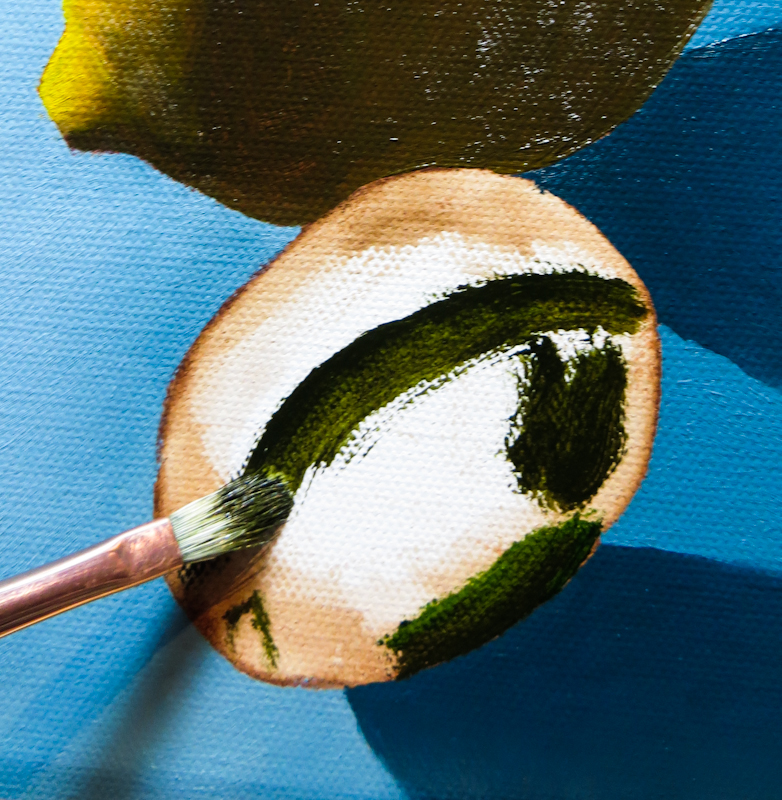
I spent the afternoon painting two more lemons. The close up below shows my experiments with using more expressive brush strokes to harmonize with the white impasto.

Here’s the view from ten thousand feet. I’m pretty happy with the lemons, but want to darken the cast shadows a bit more under the lemons to create lost edges. The lemon on the right is problematic because it has a fairly light shadow, so I will probably have to add more reflected light to the lemon in lieu of darkening its shadow.


First Lemon and Lime Painting Complete

Finished another! This one is for the Maple Valley Arts event.

My first step was to flat-shade the shadow on the lime, using a mixture of colors from the dark end of the yellow string and the warm green string. I used a bit of paint from the blue string to blend and lose the bottom edge of the lime in its shadow. Same for the lemon.

Then I painted the lit portion of the lime, and then went back and added reflected blue light to the form shadow of the lime and the reflection of the lime in the lemon’s form shadow.

Started a New Landscape

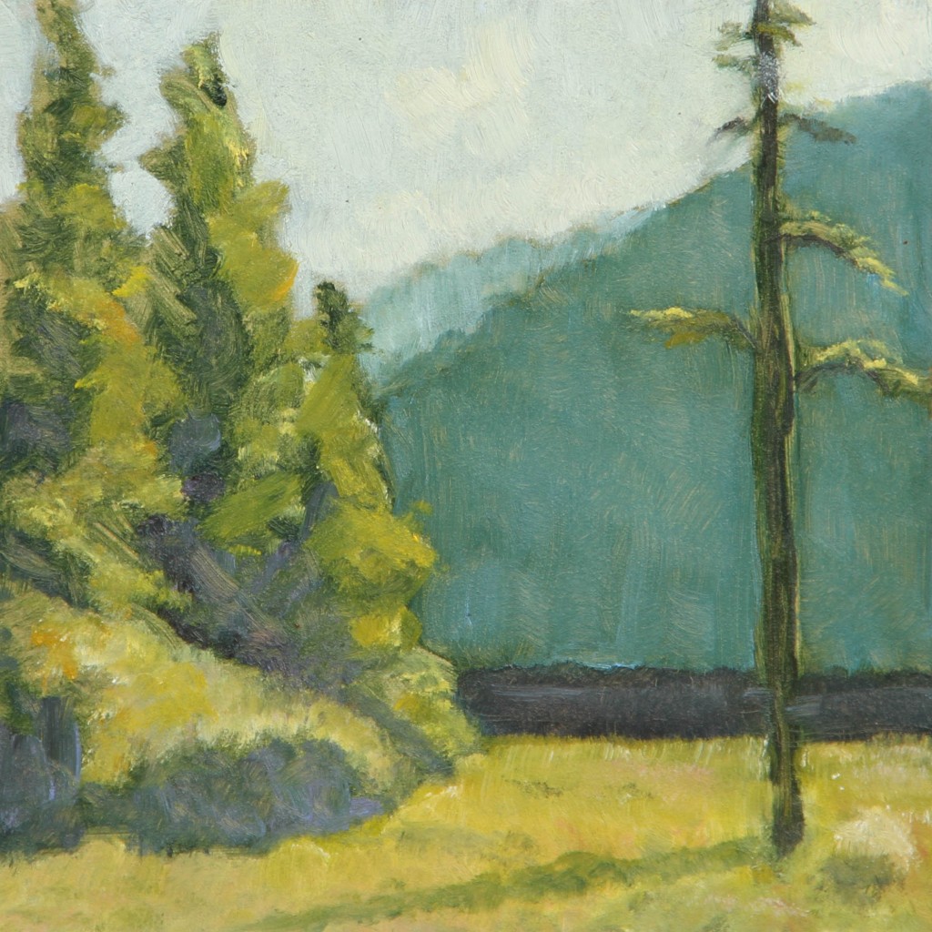
After a long run of citrus still life paintings, I decided to pull out some old landscape color studies and do a larger painting. Here’s the first study:

First study in green and yellow on a 6″ x 6″ Ampersand Panel.

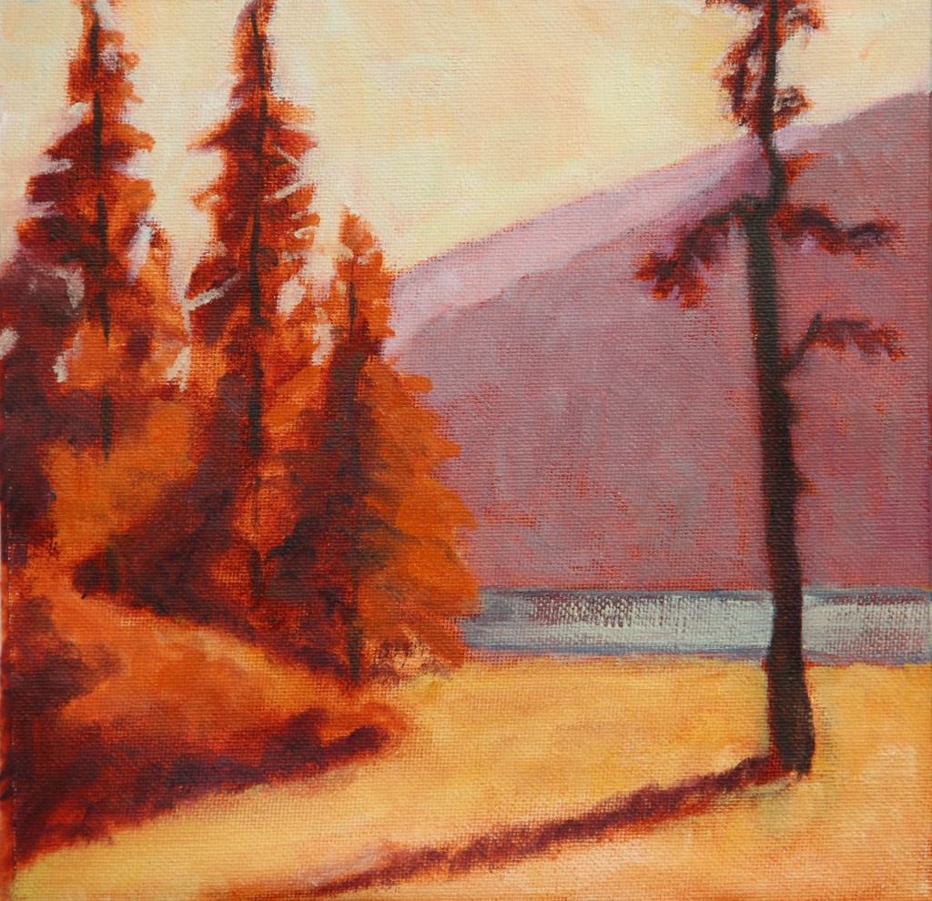
I decided to base the larger painting on the second study which has an autumn palette.

Second study in yellow and violet, 9″ x 9″, on Frederix canvas pad.

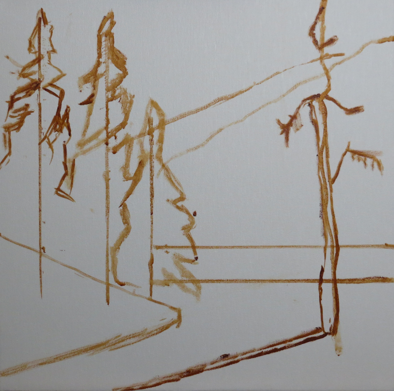
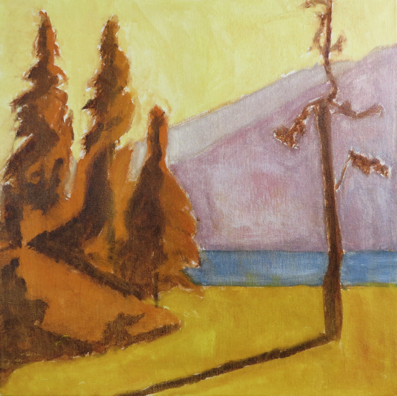
Here’s the block in on a 20″ x 20″ stretched canvas. My goal was for the trees and bushes to pick up and emphasize the diagonals and counter-diagonals of the ridgeline.

Block in on 20″ x 20″ stretched canvas using water miscible Burnt Sienna, thinned with water.

The under painting was done with water miscible Duo Aqua Oils by Holbein. I thinned the paint with lots of water in order to just stain the canvas, but found that the paint didn’t stick very well. Fearing adhesion problems in the subsequent layers, I vigorously scrubbed the canvas to remove all surface paint so that the only remaining color was from the stained fibers of the canvas. Since this was just an under painting, I didn’t take great care in mixing the colors. My intention is that the colors will better match the second study. I am hoping to use broken color in the mountains and the sky.

Under painting used dilute mixtures of Burnt Sienna, Cadmium Orange, Cadmium Yellow, Titanium White, Cadmium Red, and French Ultramarine. When I was finished painting, I scrubbed the entire canvas with paper towels to remove all but a light stain. My intention is that the colors in the actual painting will look more like the those in the second study.

Mixing Greens

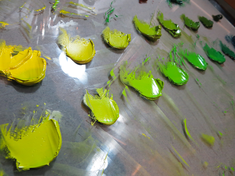
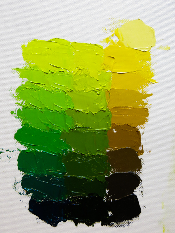
Mixing up warm and cool strings of greens for my limes.

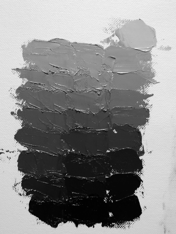
My plan is to experiment more with broken color, so I have attempted arranged the strings so that adjacent colors have the same value. The warm string uses Sap Green and Cadmium Yellow Light. The cool string is based on Viridian and Cadmium Yellow Light, with a bit of French Ultramarine added to the darkest step.

This black and white photo shows that I was able to match the values pretty well in most of the steps, although the three steps above the darkest level could use some work.