Painted a Lemon

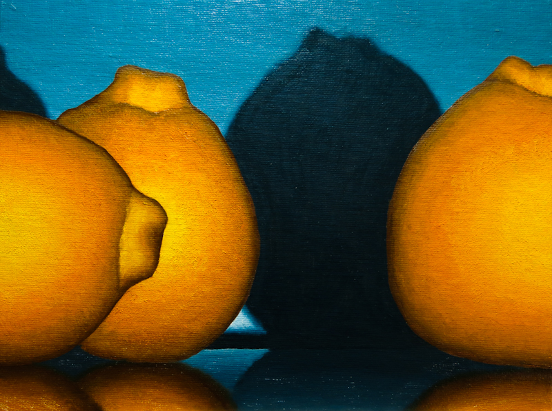
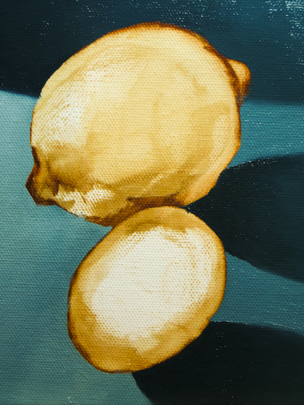
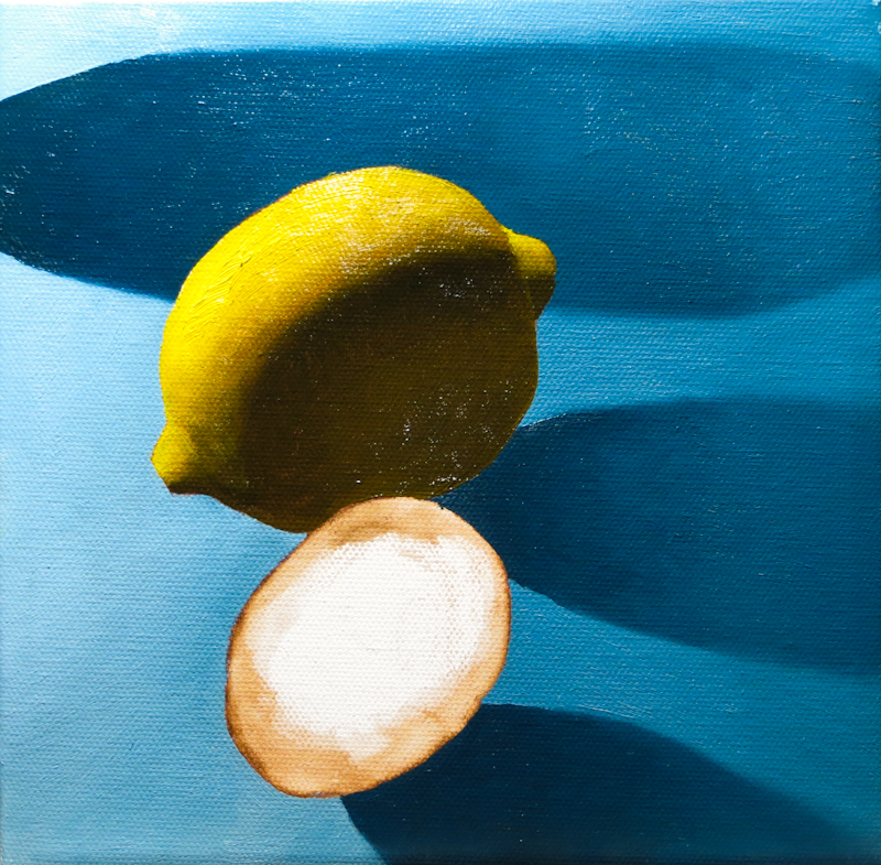
I painted a lemon this evening for my 8″ x 8″ piece for the Maple Valley Arts show. The painting itself went quickly and was much easier than painting front-lighted oranges which require very delicate gradations in the light.

I tried to match the value of the shadows in the lemon with the value of the adjacent blue shadow. They look pretty close now, so my next step will be to soften the edge between the two regions, while bringing some of the blue into the yellow. I will do this after painting the lime so that I can better judge how much “lime” light will bleed into the shadow on the lemon.

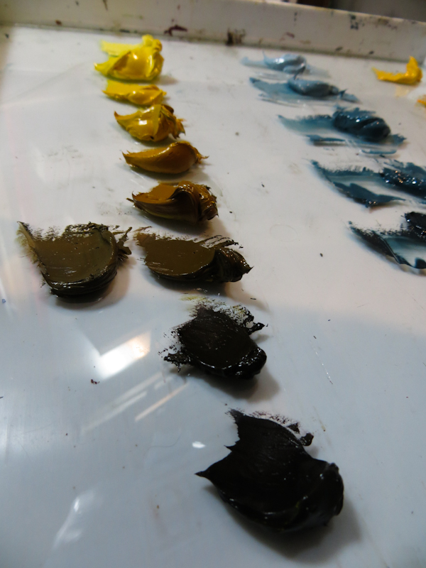
The bulk of my evening was spent mixing a string of nine yellows. The string is based primarily on a mixture of Cadmium Yellow Medium, desaturated and darkened with a blend of Quinacridone Magenta and French Ultramarine. The values above pure Cadmium Yellow Medium were lightened with a mixture of Titanium White and Cadmium Yellow Light, which is might lighter than Cadmium Yellow Medium. I did need to offset the cool greenishness of the Cadmium Yellow Light with just a smidgen of Quinacridone Magenta. The dark end of the scale is based mostly on a mixture of Burnt Umber and French Ultramarine.

Portrait Study III

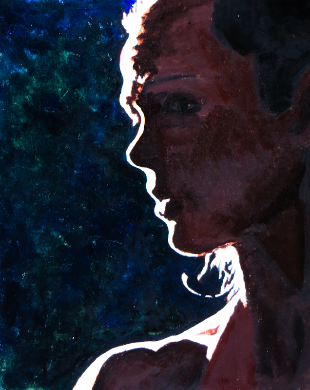
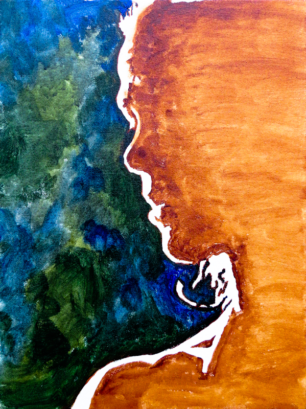
Did some more work on my portrait study, tightening up the boundary between light and shadow, and adding more cool and warm paint. The shape of the eye and the hairline still need a bit of work. Then I will go in and very carefully paint the forms in the shadow area.

This piece uses water miscible Duo Aqua Oils by Holbein, which have a nice buttery texture, but for some reason are very shiny. I had a lot of trouble seeing the image through all of the reflections as I painted and taking this photo was even harder.


Glazing Demo

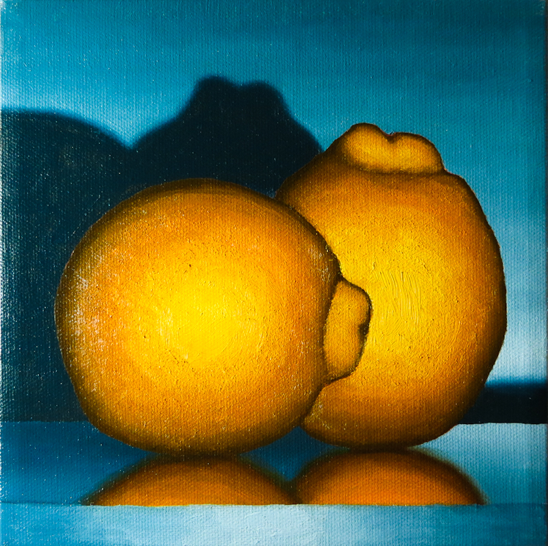
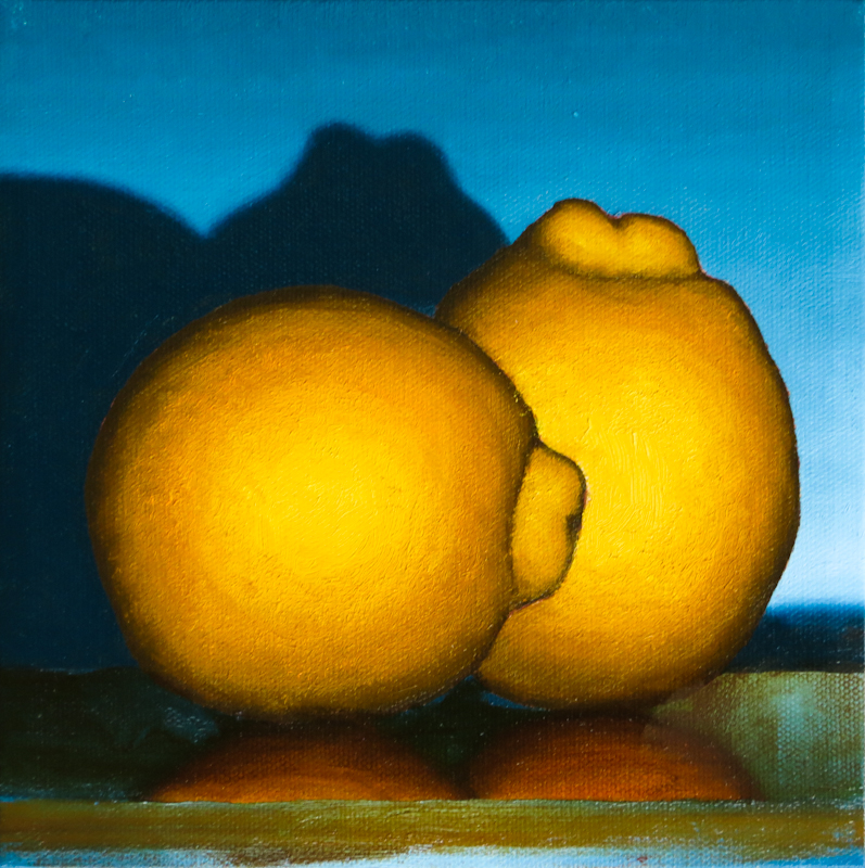
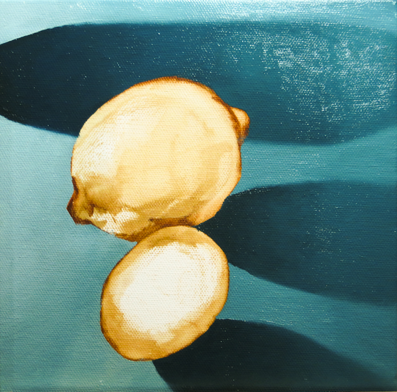
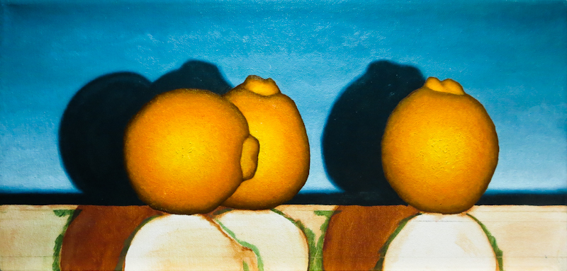
Today Gary demonstrated glazing on one of my Minneola paintings. He felt that the table top was too blue and that the reflections were too bright, so he simultaneously shifted the hue, lowered the saturation, and darkened with a glaze of Sap Green and Burnt Sienna, thinned with linseed oil. Check out the before-and-after:

8″ x 8″ painting before adding the glaze.

After applying a glaze of Sap Green and Burnt Sienna.

Mondrian or Calder?

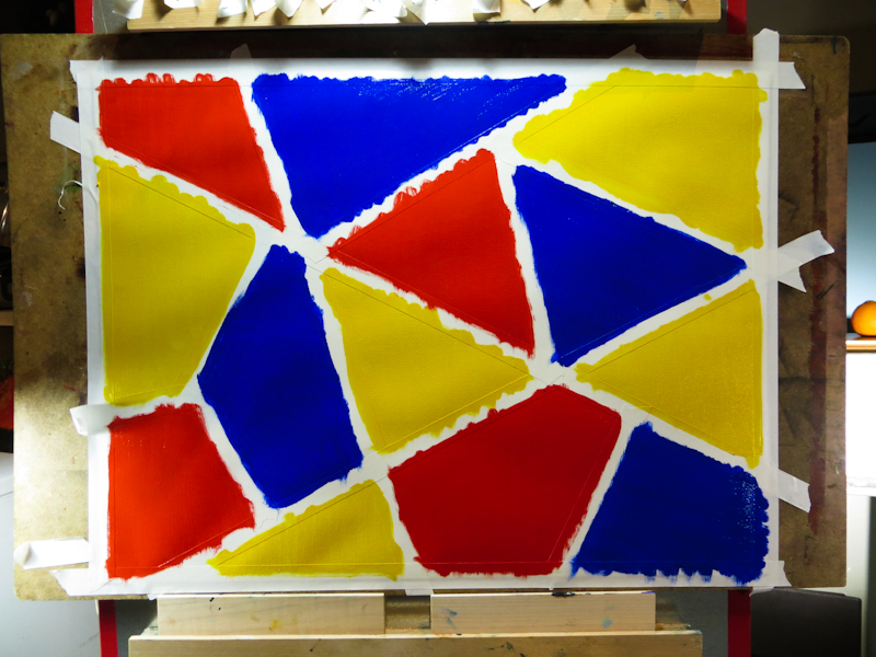
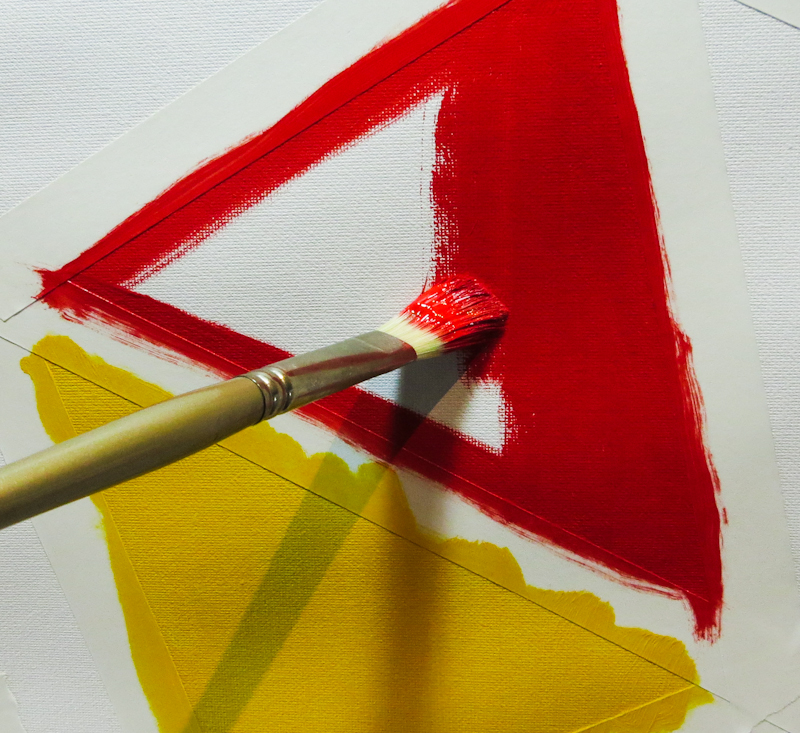
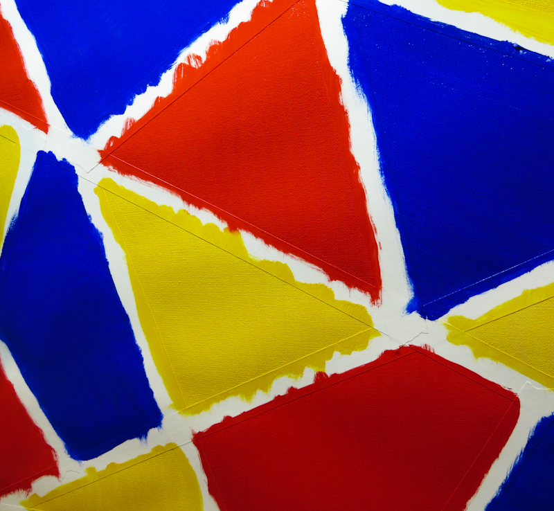
Is it a Mondrian or a Calder? Actually neither. I painted this backdrop to incorporate in a still life tableau with transparent glass containers filled with water. I’m hoping that the colors in the backdrop will make interesting shapes and patterns when viewed through the water. Once the paint dries, I will remove the masking tape and then add black pinstripe borders to each of the colored shapes.

Portrait Study II

This second study is an 12” x 16” under painting in oil. I am trying to explore how to leverage the shape information that I captured in my print design, while using the vocabulary of paint in a way that adds something valuable in its own right.

I was inspired by Gary’s demo of broken color and by my own experiments with impasto and warm/cool relations. My plan for the oil study is to go much darker, using cool broken colors for the background, and warm unbroken colors for the shadow part of the head. I will probably indicate the ear, eye, sternocleidomastoid, and hairline with diffuse darker marks. I’m thinking the portions of the head in the light will turn form, but use pretty heavy, almost impasto paint and I plan to make the background dark on the left to contrast with the rim light, gradually lighten towards the right to pick up more of the skull and hair in silhouette.