Wine and Apples Color Study

After organizing my space and cleaning palette boxes and brush tanks, I finally got a chance to work on a color study for my wine-and-apples scene. Gary suggested working small and spending no more than two hours. This was to ensure that the painting remained in the realm of a study.

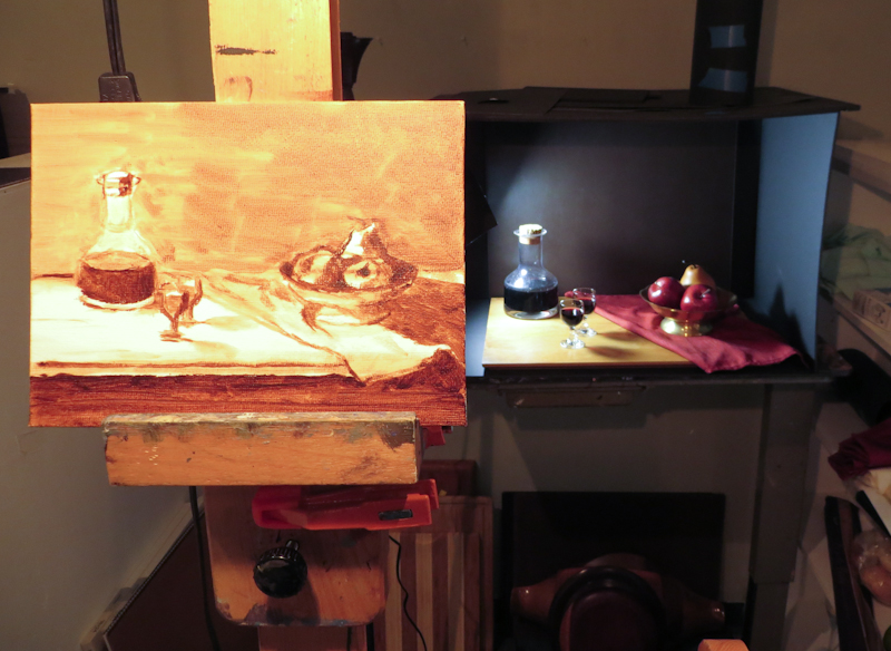
I decided to do a 6″ x 8″ study for a painting that will likely be 18″ x 24″. My approach was to draw the image with a paintbrush using burnt umber thinned with OMS, and then block in the value masses.

I spent about an hour working with burnt umber and had just started mixing up colors for the apples when I realized that the incandescent lamp on my easel didn’t match the 5500k daylight bulb on the scene. When I matched the paint perfectly at the easel and then brought a sample into the scene, it looked like a garish bluish purple. I decided to call it a day so that I could get another 5500k lamp for the easel.

As I was heading out, one of my classmates asked my why I did an under painting for a color study, instead of just laying color directly on a bare canvas. I suppose the answer was that I did it out of habit. When I started, my intention was to just draw the outlines in burnt umber, but then I got into it and kept adding more shadows and details until I had an under painting. I guess this is why Gary suggested keeping the entire exercise under an hour.

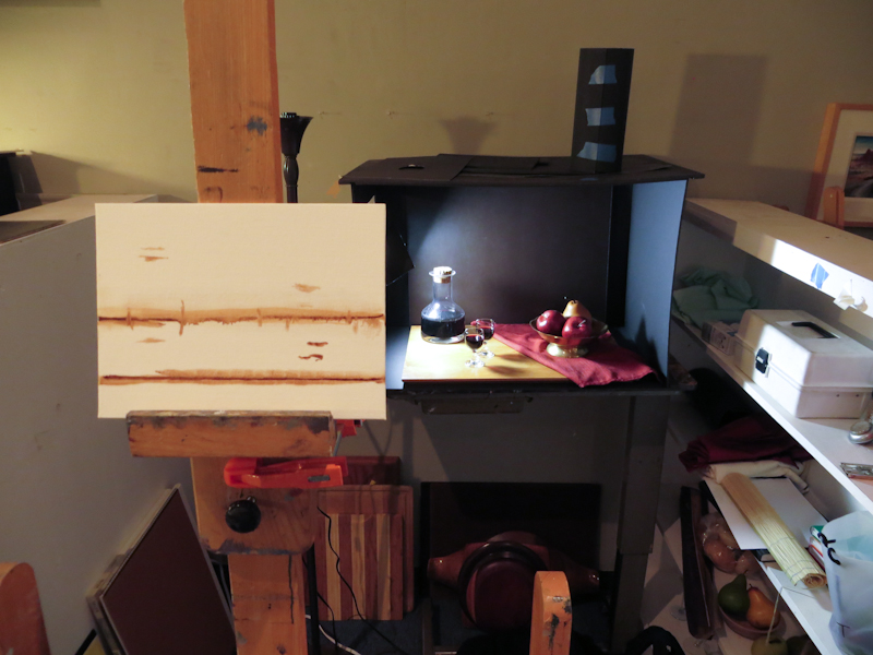
Blocking in the top and bottom of the tabletop, the decanter, and the bowl. Note that I have adjusted my viewing angle so that the vertical positions on the canvas align with the corresponding positions in the scene.

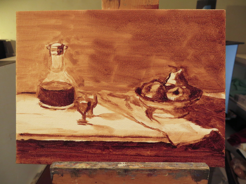
Here’s the view at the end of the session.

I spent about an hour blocking in the scene in burnt umber.

Preparations

I went in to the atelier this morning to paint a color study for my first still life assignment, but ended up spending a bunch of time preparing for my first brush stroke. When I joined the Classical Atelier last year, I put painting on the back burner while I focused on charcoal drawing and then printmaking. Now as I turn my focus back to oil painting, I am facing a seemingly endless amount of preparation, from cleaning palette boxes to finding matching light bulbs to excavating my shadow box from the closet to sorting paint. I know it will all be worth it and I will really enjoy my space and my tools, but still I want to be painting . . .

I really should have cleaned my palette when I finished my last painting, but I didn’t know back then that I was done . . .

Popping Tags

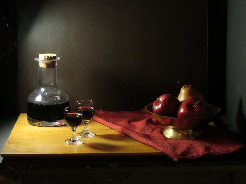
Went thrift shopping for props. Got a lot of interesting items which I can’t wait to paint. Here’s the first tableau. The wine is real, but the apples are fake. My classmates warned me that wine “evaporates” very quickly in the atelier and that I would need to top it off daily.

The actors are on the stage.

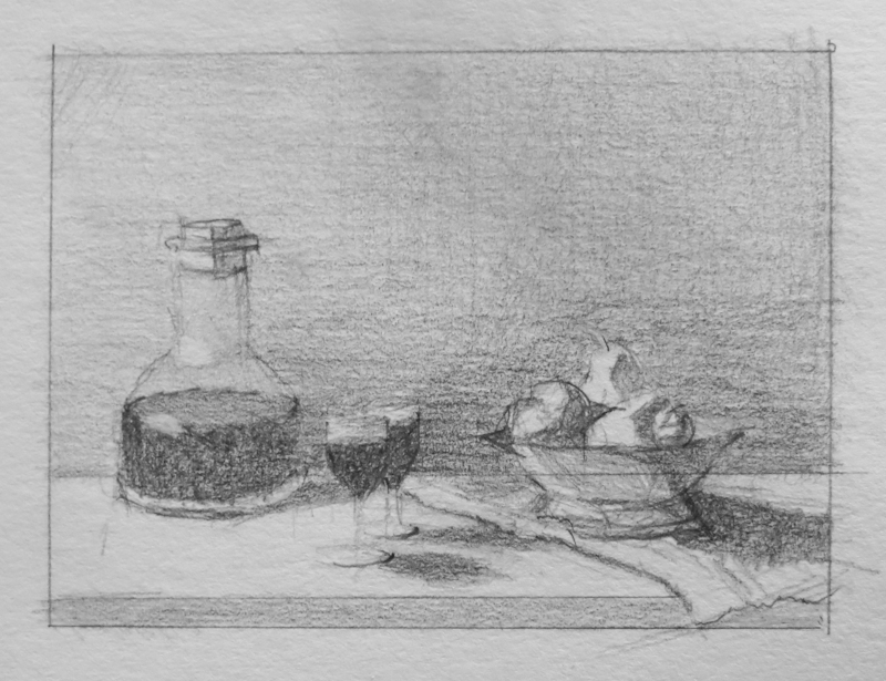
I spent about an hour trying out various arrangements and viewpoints before settling on this one. Then it was time to do a small value study before breaking out the paint brushes.

Twenty minute value study in graphite, 3″ x 4″.

Back to School

As summer draws to a close, we see less of the sun in Seattle and the nights grow cooler. It is time sharpen those pencils and head back to school!

This year I will be studying under Gary Faigin along with six other students in the Still Life Atelier at Gage Academy. I really enjoyed my time last year in Juliette Aristides’ Classical Atelier, but found that it was hard to keep up with the full time students while balancing work, family, and art.

Gary’s program is designed for part time students. Since the models are wine bottles and bananas, we can work any time of the day or night, and we never have to pay overtime. This is great for me, because I can put in a full week at Microsoft and still do art on evenings and weekends.

Our first class was a discussion and critique of summer projects. Now I am gradually moving in while acquiring props at the thrift shop and art supplies at Dick Blick. I already have most of what I need, with the exception of canvases.

One thing I learned in the first class is that still life is traditionally taught with life size paintings. When I asked Gary what size canvas or board to get, he said not to work with anything smaller than 18″ x 24″. It reminded me of my first year of figure drawing where we never worked smaller than 18″ x 24″ and sometimes worked even larger to get practice drawing with our arms instead of our wrists. I don’t think I have ever done a painting larger than 9″ x 12″, so this will be fun!

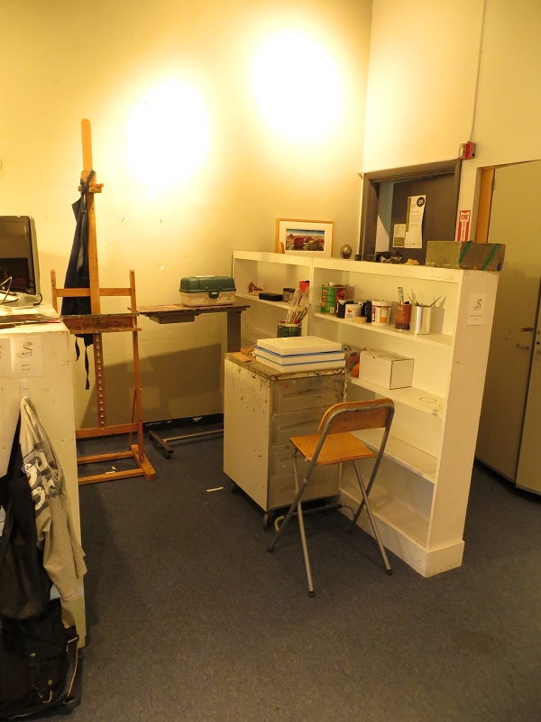
Move-in day, first day of classes, Gary Faigin’s Still Life Atelier. This is my studio space – probably the cleanest you will see it all year.

Frederic Church Master Copy

My son has a school project to do a master copy painting. He got to choose the artist and the piece. I urged him to pick something less ambitious like Malevich’s White On White, but he decided to go with Frederic Edwin Church’s Horseshoe Falls, Niagara. At least he didn’t choose The Heart of the Andes!

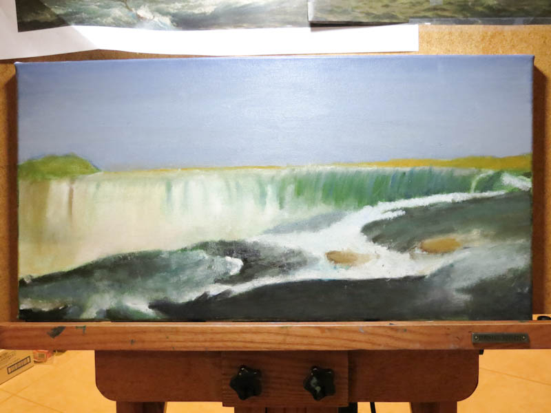
I am excited because I get to act as advisor – as long as I keep my mits off the brushes. My recommendation was that he start with a two-color wipeout underpainting with French Ultramarine for the sky and the darkest waves and Terre Verte for the waterfall. Here’s the underpainting at the end of the first session. I think it looks fantastic!

My son’s mastercopy project after completing a wipeout underpainting.

Gouache Your Troubles Away

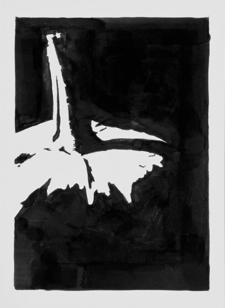
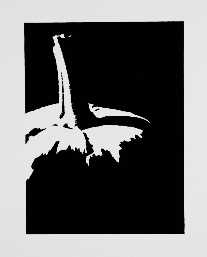
I was a bit disappointed in my first attempts at Halloween notan studies because I used India ink and it tended to show my messy brushwork. A single layer of India ink has a matte surface, but as brush strokes overlap, the shellac in the ink becomes glossy as you can see in the photo below.

Speedball India ink on Strathmore Bristol

One of my third year classmates, Scott McCall, suggested I try gouache instead and it made all the difference in the world. Gouache dries quickly like india ink, but it is also opaque and its matte finish does not show brushwork. You can work and rework the goauche and no one will ever know.

Holbein Artist’s Gouache on Strathmore Bristol