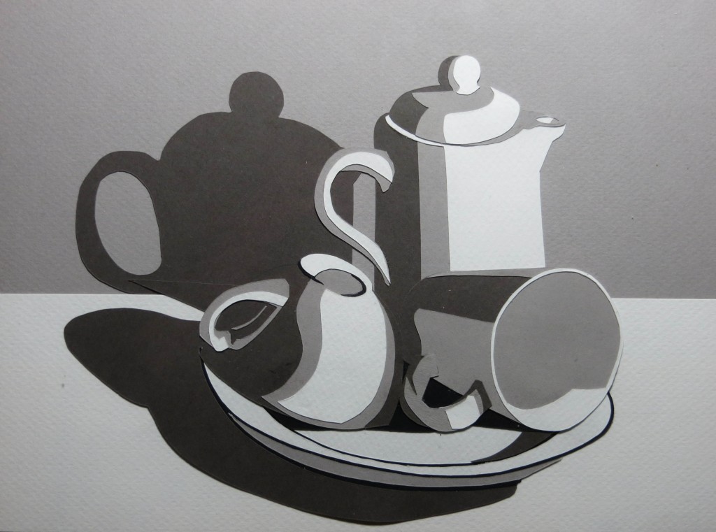
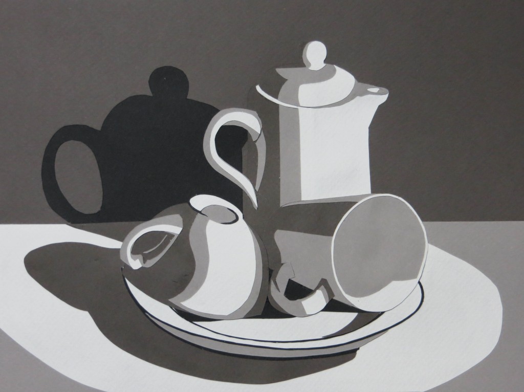
Just finished my second papercut value study for class – this time a still life that I set up in my studio. One of the nifty things about using cut paper is that I was able to try out two different value schemes for the background and the tabletop before gluing everything together.
Tag Archives: papercut
Nikki McClure Workshop
This weekend I attended the Nikki McClure workshop at the Bellevue Arts Museum. Nikki is a fantastic instructor and the fourteen students were all very talented. It was great to see a bunch of amazing and inspiring pieces at the end of the day.
Nikki began with a quick history and tour of papercut samples from around the world. It turns out the oldest known papercut is from fifth century China. The art of papercut has spread throughout cultures around the world, but it is especially prevalent in Japan.
Nikki did a demo of her technique and then we tried an exercise cutting a pattern that transitioned from black to white. Nikki’s example was leaves of a bush that started out thick and mostly black at one end and then gradually thinned out to white sky at the other end. I chose to use the reflection of pine trees in a pond for my exercise.
After the exercise, we spent the rest of the morning drawing our ideas for the afternoon project. I brought a lot of reference material, but in the end decided to work from a photograph of a couple crossing a busy street at night during a blizzard in Boston. The picture was challenging to render in just black and white, so I ended up something that was very stylized.
Probably the biggest challenge was getting enough white behind the couple so that some of their silhouettes would show up. Before cutting I did some experiments to see how I could make the headlights spill more white into the scene behind the people. The most promising approach was to add white streaks of snow around the headlights. I didn’t have time for this much cutting during the workshop so I just simplified.
I liked the final result and think that if I have some time to revisit the picture I can make something more faithful to that stormy day.
Papercut Value Study
This week’s assignment is to create a four-level mastercopy value study using cut paper. The goal of the assignment is to learn how to simplify an image and convey three dimensional form with a limited number of values. We use paper cuts instead of paint for two reasons: using paper ensures we don’t cheat by blending some extra shades of gray and the act of cutting discourages elaborate detail.
I chose to do Edward Hopper’s New York Office. The whole project took about nine hours and at one point I felt like I was playing with paper dolls. One big take away is that there are many ways to approach the design and some are better than others for structural and asthetic reasons. After a three hour false start, I realized it is better to layer the paper in the same order as the items in the scene – in other words, the background should be on the paper towards the back and the forground should be on paper towards the front. I also learned that it is often easier to cut holes that reveal the layer underneath than to cut small pieces to glue on top.
It turns out you can still cheat with papercuts by taking advantage of texture and shadows. One can represent subtle tonal changes with compositions of shapes that are all the same color. One can also use shadows between layers with the same color to represent very fine lines.
Platemaking with Paper Stencils
I found a really great way to make SolarPlate relief plates using paper stencils. For weeks I had been trying to develop a process that would allow me to make really crisp and clean relief plates with fine details. After many weeks of experimentation, I had managed to make a couple of excellent plates from negatives made out of glass covered with black adhesive vinyl. These negatives worked because the flat nature of the glass ensured perfect contact with the plate during exposure and the opaque black vinyl on the clear glass gave me super-high contrast.
While I was thrilled to be able to make these plates, I was a little disappointed because the process was complex and expensive and required lots of time with my mind outside of the artistic space as I scanned my artwork, adjusted it in Photoshop, converted edges to vectors in Illustrator, cut the vinyl with a Silhouette craft cutting machine, and transferred the vinyl to glass using special adhesive transfer paper. The plates were beautiful, but I felt like a technician and the process was stressful and riddled with opportunities for failure at every step.
My breakthrough came while touring the Nikki McClure exhibit at the Bellevue Arts Museum. Nikki specializes in papercut and the gallery was full of these beautiful, intricate works that looked just like prints, but were each cut from a single sheet of black paper. I realized that afternoon that I could dispense with the scanner, computer, and craft cutter if I picked up an X-ACTO knife and cut the paper by hand.
It wasn’t until I made my first plate from a paper stencil that I understood the true benefits of the approach. The paper stencils are great for reducing costs, but the approach really shines because it keeps me in the artistic space the entire time and the simplicity and fluidity of the process allows me to rapidly try out ideas and visualize the results as I go.
The reason it works so well is that paper is easy to cut and as I cut the negative I get a paper positive which gives me a pretty good idea of what the print will look like as I am working. I can easily rework an area or even cut a new piece if I make a mistake. With no risk of destroying the plate, I am free to try out different compositions, edge contours, and cutting styles – you name it – I can try it quickly and easily.
Then, once I get something I am really happy with, I can make a plate and I get to keep the positive to hang on the wall. The prints from the plate are hand-made original artist prints, but now I have this even more original, hand-made master stencil to admire. I also have the satisfaction of knowing that the entire process involved my direct touch instead of the cold hand of a computer.
An added benefit is that I don’t have to paint the original artwork. Don’t get me wrong – I really enjoy painting, but much of the emphasis in relief printmaking is on the edges of the shapes – not the interiors. When painting a flat image in gouache, some of the time goes into the edge work, but a lot of it is spent massing in the shapes. When cutting a paper stencil, you only pay for the edges and you get the masses of the shapes for free.
I think this approach has huge potential for learning design for printmaking – it teaches simplification and you can use it to prototype a multi-plate color print before going to the time and expense of creating the plates. Even if you are working in linoleum or wood block, it is nice to try out an intricate idea before committing.
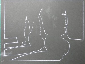
The first step is draw the image directly on black paper or copy it with transfer paper. I use a white chalk pencil or white transfer paper because it is easy to see, but graphite transfer paper has the advantage of not being as visible in case you want to clean up the positive stencil to save as another piece of original art. I used Strathmore Artagain paper because it is thin, making it easy to cut and smooth enough to give good contact with the plate during exposure.
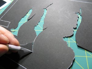
I use an X-ACTO knife to cut the stencil. This photo shows a knife that tightens at the bottom near the blade. The Gripster version of the knife that tightens at the top is much better for this sort of work because the blade won’t unscrew as the knife goes around sharp curves.
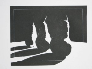
Cutting the stencil is a two-for-one proposition since you get the parts to make two stencils – one negative, and the other positive. The negative stencil is used to expose the plate. The positive stencil gives you a realtime preview of the final printed image, allowing you to make creative decisions as you cut. In the end you get a printing plate and a one-of-a-kind stencil suitable for framing.
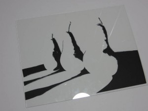
Once the stencil is cut, the negative portions are glued to a piece of glass using a gluestick. It is important to use a piece of glass that is slightly larger than your plate so that the edges of the glass don’t cast shadows on the plate during exposure. I use glass from inexpensive 8.5″ x 11″ document frames. You can get these frames for about $3 at places like Walmart.
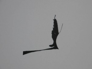
Another benefit of paper stencils is that you can recut individual portions of the negative if you make a mistake or just want to try another idea.
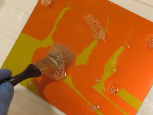
The last step is to expose and develop the plate. The stencil is perfectly flat and very high contrast, so it is easy to get a perfect exposure. Be sure that the paper-side of the glass is in contact with the plate during exposure.
Papercut Pear Studies
I’ve been experimenting with a new relief plate technique which uses hand-cut paper stencils as negatives for SolarPlate exposures. I got the idea while touring the Nikki McClure exhibit at the Bellevue Arts Museum.
One of the great things about using paper stencils is that I can see exactly what the print will look like as I am cutting. This allows me to make decisions about composition and shape as I go. It all feels very fluid and it keeps my head more in the artistic space.
The pictures below are all cut paper positives. These are the scraps I leave on the cutting room floor (or frame and hang on the wall) after reserving the other pieces to make the negatives that make the printing plates. Stay tuned for a post on making plates with papercut negatives.
Nikki McClure
I strongly recommend the Nikki McClure exhibition, Cutting Her Own Path, 1996 – 2012, at the Bellevue Arts Museum. Nikki has been creating paper cuts since 1996 and her work is compelling on many levels. As graphical designs, the pieces are interesting because the shapes are simplified to the absolute essentials, and yet they are still intricate. The compositions are strong and the knife work is excellent, but the thing that really makes the collection sing is that everything Nikki does communicates her life experience and philosophy. Her values and the world she lives in come across easily and naturally.
The exhibit showcases the papercuts, but it also includes many of Nikki’s calendars, books and album covers, along with essays from her friends in the music industry and an explanation of her process. My favorite book was The Great Chicken Escape. Check out the pictures in the book and then read the note at the end.
The exhibit runs through February 3rd, 2013.

